Class Blog

Data Visualization for Death Rates within the US

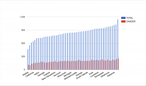
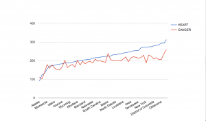
For this assignment, I chose to explore death rates of each state for various causes: heart disease, cancer, stroke, respiratory disease, accidents, vehicle-related accidents, diabetes, Alzheimer’s, flu, nephritis, suicide, homicide, and AIDS. The dataset also provides information on population, age distribution, and urbanization, which may allow viewers to find correlations between these factors and the various causes (e.g. higher deaths caused by respiratory disease in more urban regions). However, the time period on these death rates was not provided so I was unable to tell which year these deaths occurred in.

Since the data was already categorized by state, it would make the most sense to present it on a map. However, as the data contains various data types and measures, it may be difficult to present all the information without overloading too much on a single map. What I have done to divide up the dataset is separate each data type into different maps, which would make it easier for the viewers to comprehend the data. In addition, the maps are color-coded with the darker-colored circles showing higher rates and the lighter-colored circles showing lower rates. The size of the population is proportional to the size of the circle. Thus, the bigger the circles are, the larger the populations are and the smaller the circles are, the smaller the populations are. Hovering over each circle can offer more details about each state.

screen-shot-2016-10-24-at-10-57-10-pm

screen-shot-2016-10-24-at-11-01-33-pm-2

screen-shot-2016-10-24-at-11-02-01-pm

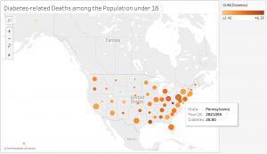
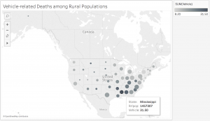
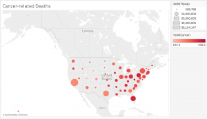
While geocoded maps are great at pointing out which states have the highest death rates for each cause, they make it difficult to establish correlations between the causes and the factors such as age or urbanization. In addition, in order to better determine these relationships, more information would be necessary. For example, data on other factors, such as air pollution or vehicle use, would be very useful in order to figure out if urbanization contributes to higher rates of respiratory diseases and related deaths. Since the dataset covered so many various causes, but lacked detail on the factors that could play a role in these deaths, it was difficult to create an overall visualization that would sum up the dataset. Perhaps a stacked bar graph would have been a good option for data visualization because the comparison of the ratios of deaths to the populations would be more visible.

Economic Data

Presidential approval and consumer confidence over time

I decided to analyze Economic Data from the Federal Reserve Economic Data. This data included unemployment rate, inflation rate, presidential approval, and consumer confidence for the years 1948 to 2016. After using Google Fusion tables to  look at relationships among the data, I decided to focus on presidential approval and consumer confidence in this shaded line graph because there is a clear correlation between these two elements. Presidential approval is the measure of the average approval poll rating for the incumbent president, and consumer confidence is measures the degree of optimism that consumers feel about the overall state of the economy and their personal financial situation.

When looking at this visualization, it’s easy to see the correlation between these two categories. The peaks and the valleys match up pretty consistently, and it makes sense that these two categories would be correlated. However, looking at the spreadsheet, I wasn’t able to see the relationship between them until I put it into a chart. Consumer confidence is on a higher scale than presidential approval is, so their numbers don’t match up, which makes it hard to see their relationship in the data set. It is easy to see through this chart that their slopes and changes over time do match up, suggesting that how much people approve of their present is related to how confident they are in the state of the economy. It is important to note that this visualization reveals a correlation and does not suggest any type of causation, but this information is still significant and shows how powerful a data visualization can be.

Written by Risha Sanikommu

Week 4: Post-WWII Elections Data

For today’s blog post, I decided to examine the voting data for presidential elections post-WII.

My first visualization lays out the number of votes for the Democratic and Republican candidate, as well as the total number of votes.

Number of votes per year

This allows us to see the trend in number of voters overall and for each party, as well as see which years the Democrats and Republicans won respectively.

My second visualization focuses on the vote difference between the winning and losing party.

Vote difference by winning party

The bars are highlighted with the party color of the winning party that year. Darker colors indicate that the party was the incumbent party. This visualization allows us to see that Republicans tend to win by higher margins than Democrats. Republicans also tend to win more when they are the incumbent party.

New York Tenements

wordle

I used our group dataset, titled NY Tenements. Our dataset catalogues links to photo records, in addition to date, some locations of photographs and content. A record in this dataset is made up of the categories Item URL, Note, Subject Topic, Date, Volume and Title. The data is pretty raw and hard to interpret.

Originally, I was planning on creating a gallery visualization of the photo collection through Palladio. However, because the links are to records of the photo, not of the photo itself, I had to scrap the idea. I can already see potential problems working with this data, as there is not much wiggle room to experiment with different data visualizations.

Fortunately, I was able to make a simple data visualization with Wordle. Wordle is a straight forward and easy to use platform that analyzes large amounts of text and creates word clouds. Words that appear with greater frequency are featured in larger sizes. After generating the word cloud, you can tweak it with different font sizes, colors, directions and layouts.

Before creating the visualization, I wasn’t able to see any patterns in the dataset. I only saw that the dataset included tenements located in New York and that they were taken in 1934. After generating the visualization I was able to see a few prominent things. First of all, most of the tenements are located in the Manhattan and Brooklyn area. A few of the tenements are in the Bronx area. In addition, there seem to be a large number of storefronts in comparison to apartments. The majority of photographs also seem to display vacant places or places made of brick.

These conclusions were definitely not apparent upon first glance. It impresses me that a tool as simple as Wordle can generate something with so many insights. I can see that the possibilities are aplenty for creating a narrative from this project and I think this platform is a great starting point for anyone looking to get a big picture view of their data. For example, we could correlate tenements listed with vacancies and locations with possible data on evictions in the area. We could also correlate the storefronts and their locations with storefronts in the same locations today to see how ownership has changed over time. We could also examine the vacant tenements to explore whether more apartments or storefronts stood empty.

Week 5 – Death Rates

While I thought many of the data sets were interesting, the one that stuck out to me the most was the set on Death Rates. It provided a look at death by various means such as heart failure, cancer, stroke, suicide, homicide, and more. The points of data are categorized by death type and by which of the 50 states the death took place in.

Though the excel sheet is labeled “Death Rates” it is unclear how exactly it is measured. It is clearly not a percentage since all the states have numbers over 100. Could it be a certain number of people within a population? Is it the number of overall deaths within a certain timeframe? Is it the number of people within certain regions of the state? Is it the number of people in an age group? More clarification would be significantly helpful.

While we do not have some of the context, the main extrapolation that can be made from this data is which of these causes of death affects the most people. I thought it would be interesting to see how much cancer plays a role in total deaths. To my surprise, it seems like cancer is, for the most part, pretty evenly distributed throughout the country. Though there are notably fewer cases in Alaska and Utah. What factors here led to fewer cases of cancer? Other things to take into consideration is that though there are fewer cases in these states, they make up a greater portion of the total deaths.

screen-shot-2016-10-24-at-11-13-52-pm

Another comparison that I thought would be interesting is the rates of death by heart failure compared to death by cancer. These are both common ailments, and this visualization helped to show what happens in each state. Cancer surpassed heart disease in Alaska, Colorado, Minnesota, Washington, Oregon, Montana, and Maine. I would like to know what factors, if any, led to the prevalence of cancer in these states. Could it be that there are factors that lead people to develop cancer here, or is it just sheer bad luck?

screen-shot-2016-10-24-at-11-21-53-pm

The data set was really interesting and provided a look at various diseases across the fifty states. This data was good for trends, but more context would be greatly beneficial, and allow for a more accurate understanding of what is happening in each state.

Oct 24 Blog Post Human Population

screen-shot-2016-10-24-at-10-51-07-pm

For my blog post this week, I decided to create a data visualization out of a simple data that shows the year (every 10 years) and the population at that time.  The dates are from 1790-2010, meaning there are 23 different dates, and the population skyrockets from 3 million to 300 million, a 100x fold in the increase in population.  However, simply looking at this table does not tell the whole story.  For example, just from looking at this data that only contains 46 numbers, 23 dates and 23 population, one cannot tell if the increase from 1790 to 1890 was an exponential increase, such as 2x increase per year, or a straight line.  Especially as the numbers are really exact, for example the 1790 population being 3929214, our cognition has a hard time doing the simple math on the seemingly simple numbers.  It comes down to our psychology, where there are too much information coming in through our eyes, which actually creates a sort of stress and anxiety on our cognition, not allowing us to see the truth.

However, through this visualization shown above, we are clearly able to see that even simple data that only contains 46 numbers have a story to it.  The data visualization shown above is a line graph, where the x axis is the years, every 50 years, from around 1790 to around 2010.  The y axis is the population, 100 million people from 0 to 400 million. First, it is important to note that thanks to the style of this visualization, our cognitive load is lessened.  Before, we had to deal with 46 numbers, 23 of them very cognitively demanding.  Now we are only shown around a dozen numbers.  The smaller graph on the right is a slider, where by moving the white vertical ovals left or right, you can see the change in number of population with respect to the year in a much closer view.

screen-shot-2016-10-24-at-10-51-07-pm

The first trend that we couldn’t deduce before from that data is the fact that from from 1790 to around 1940/1950, there is an exponential increase.  By moving the slider closer, it is more obvious that the graph is exponential, the population increase is very slow at first, but once it picks up, the population increases multiple folds.  The graph shown right above reveals the effect of moving the sliders on the bottom to show the years between 1800 to 1950.  We can see, up until around 1940, the graph is almost a quarter-circle shape, which is one of the key features of an exponential growth.  However, from 1940, we can see there is a drastic decrease in the population growth. How could this be?  It is evident just by looking at the year, which is around 1940/1950, that this is due to WW2, in which the US had a deep involvement and consequently, severe casualties.  Thus, the population dips and we can see that shown in the graph.  This is hard to identify when looking at the data in table form, simply because the population is growing, so the population number is constantly increasing that humans cannot deduce the decrease in the amount of increase. But from this visualization, it is evident that the growth was not much. One can also tell by looking at the our first graph that the population kicks off after 1940/1950, but not necessarily in an exponential way, but in a more normalized straight growth.  Therefore, our table was not simply just an exponential growth or simple straight growth all the way, but a hybrid! All of these analysis would have been impossible without the help of the visualization.  It’s interesting to see that even simple data that contains only 43 number can have so much to say just by changing it from table to line-graph form!

Data Visualization- NY Philharmonic

For this data visualization, I used my group’s data about the history of the NY Philharmonic. There is a lot going on in this dataset, so I wanted to create something that would help me grasp some trends in the data. I chose to look at the all composers whose pieces were part of a NY Philharmonic program over the 69 seasons that are contained within the dataset. I thought it would be interesting to see if certain composers were really popular at different times, or only at certain times, or whether there were a variety of composers that were used throughout the history.

I created a line graph to help illustrate change over time. Each line in the graph corresponds to a composer that appeared in at least one program over the 69 seasons. I think it does a good job of showing which composers were more popular over others during a specific season and it also shows which composers were consistently popular. However, it is not particularly good at comparing popularity between seasons as not all seasons had the same number of programs or the same number of pieces in each program. This being said, the graph makes certain composers look extremely popular because there were many pieces by the composer performed in that season, however in these cases there were also a large number of pieces performed during that season in general. For example, comparing the 1894-985 season with the 1900-01 season, it appears that Wagner had an insane increase in popularity in 1900-01 compared with 1894-95, however, one must take into account the total number of pieces performed (of which there were significantly more in 1900-01). Between specific seasons, it would be more accurate to compare each composer’s number of pieces to the total number performed.

This data visualization is definitely helpful in showing popularity, which would be difficult to see in the data when it is in a table form.

DC Data Visualization

DC Characters: Sex and Character Alignment

For this blog post, I analyzed DC Character data, a part of my group’s final project data set, to look at the relationship between the character’s sex (null, female, male, genderless, and transgender) and their alignment (good, bad, null, neutral, and reformed). I used Tableau to create a bar chart that parsed out the number of records we had. The various colored bars indicated the sex listed for each character: blue for null, orange for female, pink for genderless and turquoise for male.

As we can see from the chart, there is a high proportion of males to other character sexes. When looking at my data visualization, I can see this more clearly than looking at the data. I can also see that there are more bad characters than good. There is less of a difference in the male-female ratio for null or neutral labeled characters but it may also indicate that there are just a fewer number of those characters. The visualization shows that there are few genderless characters and no transgender characters. All or no gender is considered in the data but not all are necessarily represented. That was an important decision that the archivist compiling the data made and decided to include.

However, I cannot see the reformed characters data. It does not list the other genders as options (such as null, genderless or transgender) which means it was not recorded. It could also mean that I would have to clean and filter my data more precisely.


Week 4: Data Visualization for US Population Growth

The data set I decided to explore was the U.S Population data set that shows the overall United States population from 1790-2010 in each decennial census.

The data set was very sparse, containing only two columns. One column was the year the census was obtained while the other column was the recorded population. Each record was the population of the US per a given year. Since the data was so simple, I decided to use a line graph to visually represent the trend of population growth in the United States. A line graph was the best option for this data set as it represents change in data over time (change in population as year increases). Both the variables were quantitative, continuos data which also made a line graph ideal as it shows continuos trends efficiently. The year was plotted on the x axis and the population was plotted on the y because the population is dependent on the year recorded. I used Plot.ly to create this graph as it was very straightforward and easy to embed in the post.

The important thing that the graph shows is the rapid population growth that starts after the 1800’s. While you can see the growth in population from the data set as well, the graph gives viewers a quick and more impactful perspective. The concave up shape of the graph signifies a major growth trend in a visual manner that the records do not easily convey. Not only does it show the rapid growth beginning from the 1800’s, but one can infer from the graph that the U.S population is just going to continue to grow, as the line continues to rise steadily. Further research about population growth can be done simply by looking at this graph. For example, one can look into the events that happened in the mid 1800’s that would have caused a spike in population growth (e.g the Industrial Revolution creating more resources for population growth). It is also easy to add data to the records every decennial year and continue the line chart to see if the population is still growing rapidly or leveling out. If one didn’t have the graph to look at, it would be more difficult to interpret trends from the data because it is not as straightforward and intuitive to the eye when purely looking at numbers. Graphs are highly efficient when working with and presenting large numbers because they are less strenuous to look at and catch the viewers attention faster.

Data Visualization: Poverty Statistics

I explored the data set on poverty statistics, found here, which details the birth and death rates, infant morality rates, life expectancy rates of men and women, and GNP of 97 countries in 1990. One of the first things I noticed was that each country had been assigned a specific “region,” indicated by a number 1-6. Eastern European countries, such as Albania and Romania, were assigned region 1. South American countries, such as Brazil and Columbia were assigned region 2. Region 3 was compiled with mostly Western European countries such as France and Germany, but also included, interestingly, North America (U.S.A and Canada) and Japan. Middle Eastern countries such as Turkey and Israel were assigned region 4, and Asian countries, excluding Japan, made up region 5. Lastly, region 6 contained African countries, such as Kenya and Uganda.

I predicted that regions 3, 4, and 5, which described Western Europe, the Middle East, Asia, and North America, would likely have the highest GNP, while regions 1,2, and 6, which described Eastern Europe, South America, and Africa, would likely have the lowest GNP. I made many different visualizations to show the GNP of each region, but ultimately decided to use Raw to create a scatter plot. While all of the other visualizations I made were “cooler” looking, I chose this one because Nathan Yau said it was most important to choose a visualization that had the right visual cue. In the plot below, the GNP is located on the y-axis and the regions are located along the x-axis.

screen-shot-2016-10-24-at-8-57-10-pm

After seeing this, I took it a step further and estimated that the countries with the highest GNP (regions 3,4,5), likely had the highest life expectancy rates, and that countries with the lowest GNP (regions 1,2,6), likely had the highest birth, death, and infant morality rates. I used Google Fusion Tables to create data visualizations to see if my predictions were correct.

screen-shot-2016-10-24-at-9-15-27-pm

The graph above shows the average birth rates, death rates, and infant mortality rates across the regions, with the average rates located on the y-axis and the regions located along the x-axis. The visualization shows that the region 6, which contains the countries with the lowest GNPs, clearly has a higher average infant mortality rate, and a considerably larger average birthrate, but does not have a notably larger average death rate. In fact, the regions do not vary much in average death rate. Region 5, which has the 3rd highest average GNP, actually has some of highest birth, death, and infant morality rates, which I was not expecting.

screen-shot-2016-10-24-at-9-17-37-pm

The graph above shows average male and female life expectancies across regions, with the regions located on the y-axis and the ages located along the x-axis. This graph also makes region 6 stand out, but this time for its low life expectancies. Region 3 has a noticeably higher life expectancy than the rest of the regions, but isn’t too far ahead of region 1. This also surprised me, because region 1 has the second lowest GNP.

While looking at the data set, I assumed that I would be able to guess which countries had which rates with fairly high accuracy, but after looking at the data visualizations I can see that the lines are not so clearly drawn. It is clear, however, that in 1990, those living in Western Europe, North America, and Japan had much higher life expectancy rates and far lower death, birth, and infant mortality rates than those in other countries, while those living in Africa had almost the exact opposite.