http://introducingamericanfashion.com/logansfiles/index.html
Class Blog
Alex’s Webpage
Week 5 – Webpage
Blog 5: Kevin’s Website
Webpage
Week 4-visualizing death rates
This week I chose the dataset of death rates in the US for visualization and analyses because it offers statistic evidence to a unique topic, the culture of death in the US. The original data types were categorized by state. One data record includes several common causes of deaths and some related demographic information. First several reasons for deaths are crucial illnesses such as heart, cancer, stroke and respiration. Then there are deaths by other diseases including diabetes, alzheim, flu, nephritis, and aids. Then the spreadsheet shows the deaths by external forces such as suicide, homicide, accidents, etc. Although the original data are relatively clean a few data were marked as “null.” There are other problems with the original dataset too. Some data which are supposed to be whole numbers but they appear decimal. Also we don’t know which year or years those data were collected. Without any footnotes or other types of additional interpretations, we can only assume those data within the dataset represent information from the same historical periods and form certain comparable relationships among themselves.
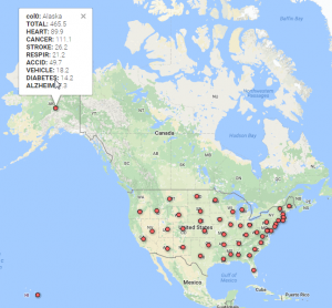
My first visualization was to geocode the data with Google fusion. The fifty states follow the alphabetical order in the spreadsheet so it was easy to notice Alaska but difficult to see data from Wyoming. We need to adjust the display to read a whole record too since it is rather long. For researchers, they usually need information from one or only a few states. This map uses dots to show the states within the same space. It breaks the original restriction of ordering in the original spreadsheet and offers all the record at once. To read a whole record one only need to point the mouse to the dot representing the state he or she intends to do research on. In this way, the map reorganizes the data and saves the researchers’ time.
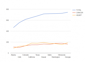
Then I visualize the comparisons of total deaths, deaths caused by cancers and by heart diseases between the ten states. Due to the large quantity of the deaths caused by cancers and heart diseases in any record in the spreadsheet is clear that cancers and heart diseases are two cruelest killers for humans in the States. But we do not really know the percentages of those deaths in the total deaths or comparisons between those biggest killers in the ten states because the spreadsheet cannot contain all the calculated information. This chart shows that generally speaking, neither cancers nor heart diseases constitutes even one third of the deaths in those states. So there are many other deaths responsible for the perishing of human lives. For some states like, Alaska and Minnesota, there are more people who died of cancers than of heart diseases. But for the states such as California, more people of heart diseases died. This chart is very useful in terms of studying how different public policies or local living habits in different states play a role in determining people’s deaths.
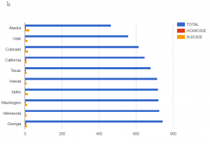
This third chart shows the ratios of total deaths, homicides, suicides in the same ten states. Because the original excel does not offer the percentage of any type of deaths in the total deaths, it is difficult to know how the data manifest different death cultures in different states. This bar chart at least shows how human’s willpower shapes different deaths in the chosen states. For example, Alaska has less total population than the other ten states but the bar of the total suicides is longer than that of any other nine state. It could indicate that Alaska people are more likely to feel depressed or desperate perhaps because of the financial difficulties, harsh weather or long nights in winter. The total population of Hawaii and Idaho don’t differ much but people in Idaho are more likely to commit suicides. For most of the states in the chart, the ratio of suicides to homicides is high but only in California and Georgia homicides and suicides are almost of the same length. So in those two states, the law enforcement should pay more attention to crimes to protect our safety.
Week 4 Blog: Data Visualization of “NY Tenements”
My blog for this week features the visualization of “NYC Tenement Photographs“. The dataset includes photographs taken by inspectors of the New York city tenement house department from year 1934 to 1938. Although there are as many as 1102 photos in collection, only 6 data types are present. This obviously leads to difficulty in both finding information about each photo and classifying by vague attributes. For example, the last datatype was “Title”, which is a combination of the name of the building in the photo and its corresponding address; some of the photos do not even have an address attached. Also, the photo urls in this dataset direct to the webpage that displays the photo, instead of the photo itself.  After looking into the coding system of digital collections at the New York Public Library, I discovered most of the true urls of the photos which unfortunately, still fail to display on Google Fusion Tables. Thus, the first tool that I utilized was Wordle , a website that creates word clouds according to the frequency of words used in the selected text. By entering the Title data, I was able to create this word cloud. It indeed tells some of the essential and most frequently used information, such as the heavily populated area (Manhattan) and the most common type of the buildings (storefronts). However, I still want a more clear and direct visualization.

I filtered out all of the photos with a building address by using OpenRefine. It resulted in 416 effective items, which I used Tableau to split the building type from the Title section, leaving lines of address alone in a new row. By optimizing the dataset, I was able to map the locations of photos.  And I think it provides a better visualization of the geographical distribution of NYC Tenements.
Week 5: Death Rates (Homicide vs. Suicide) in the U.S. (by state)
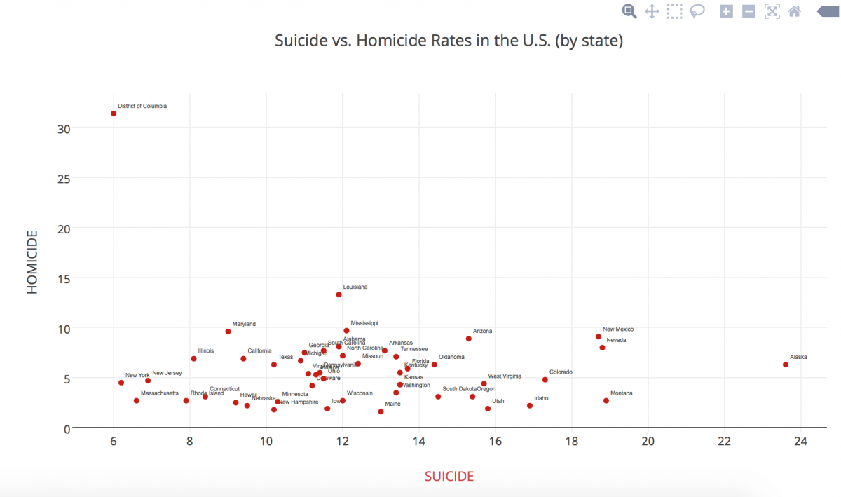
In this blog post, I actually let my roommate choose which data set I should use because I was interested to see what she would choose from such a wide range of subjects. Of course, she chose the “Death Data” data set… and I’m slightly scared of falling asleep tonight now….
For this data set, I initially tried using the Tableau Public data visualization tool, but the column that contained the states names (qualitative variables) did not even show up. So, I went back into the Excel document and added a title to the column itself in hopes of better setting up the data in Tableau… to no avail. I then tried opening up the data in the RAW website, which did not accept the data into regular code for some reason. It had changed colors even and it looked like the data was not properly being transferred over, so that obviously didn’t work. I also tried opening up Google Fusion Tables, but neither Safari nor Chrome was allowing me to open it up… there seemed to be an issue with public/private access.
FINALLY, I tried using Plot.ly, which consumed the data set beautifully! After playing around with different types of graphs, I settled on the scatterplot, mainly because it was the best way to show multiple types of deaths at the same time, especially being able to show individual states’ differences. I then played around with shape and color, something Nathan Yau mentions in his article as pertinent.
My graph shows a simpler visual distinction of how each state overlaps in death rates, crossing homicide rates and suicide rates. It is interesting to see the outliers in a visual manner. I noticed a positive trend in my data (excluding the outliers) as a result of the visual representation.
*Unfortunately I am unable to embed the link to my data set or visualization into this post because I need to pay for an upgrade to be able to share it, since I used “pro” features. Sorry!
Data Visualization for Body Fat

For this week’s blog post, I decided to create a data visualization for body fat. The data contains several statistics related to the measurements from 252 men including their total body fat, age, weight, height, neck size, wrist size, thigh width, and other statistics. I was particularly interested in seeing whether or not certain factors contributed or were an indication of body fat. I utilized a scatter plot in order to visualize the most common trends and determine whether or not there would be a correlation between values on the x and y axes. The first visualization I created compared age and body fat. I believed that as age increased, so would body fat. To my surprise, there was no direct correlation between body fat and age, as evidenced by the visualization.


Next, I tested thigh width, which appeared to be positively correlated with increasing body fat. Through this test I became curious as to whether or not other areas of the body gave such a strong indication of body fat. Interestingly, when comparing body fat and wrist size, the scatter plot demonstrated that generally, as wrist size grew, so did body fat. Overall, Google Fusion Tables was a very powerful tool when studying general trends that utilized quantitative measurements. It was really easy to switch between different groups of data by simply clicking on different columns in my data sheet. Unfortunately, while the scatter plots are great at demonstrating group trends, individual outliers are not effectively represented and therefore, when addressing causality, one cannot say that any of these factors is a true indication of body fat (or any other correlated data set).
U.S. Causes of Death

The dataset I examined recorded death rates in the U.S. by state and by cause of death. I used Tableau to look at the data, and I placed the different causes of death on the y-axis of a bar chart, while putting the number of deaths in the U.S. on the x-axis. This compiles the data in a holistic view, so that the national causes of death can be easily compared.
The chart shows two distinctly high death rate causes: cancer and heart disease. Looking at this data in an excel sheet wouldn’t have warranted an easy extraction of this same information displayed in the chart above. You can also easily find the least frequent causes of death: nephritis and suicide. Seeing this dataset in a bar chart highlights the stark contrast between the two leading causes of death with all the others, creating a very salient understanding of the United States’ causes of death across the nation.