Class Blog

Blog Post #4:

For this week’s blog post, I chose to do my data visualization on the topic of my final project- the characters of the DC comics. The dataset provides information on the identities, physical description, and appearances of each other characters. For my visualization, I utilized Google Fusion Table to represent the identities (public vs secret) of the characters, comparing between bad and good characters. Figure 1 represents the identity of the bad characters and Figure 2 displays the identity of the good characters. Immediately, two key things stood out to me from an initial glimpse.

screen-shot-2016-10-23-at-3-14-39-pm

Figure 1: Identities for Bad Characters

screen-shot-2016-10-23-at-3-10-07-pm

Figure 2: Identities for Good Characters

First, I noticed the additional blank bar, which indicated the number with no values. I did not realize how many of the characters on the dataset had missing information and how much it will affect my analysis. Our group has not cleaned our data yet, but now, I realize the crucial decisions and judgments we will have to make on nearly 600 missing identities. This information severely hampers the narrative we would like to tell, such as how more good characters have public identities as opposed to the bad ones.

Second, as I looked to distinguish between bad and good characters, I instantly looked at the pattens by length. As Nathan You, explains in his article, visual cues are one of the key components of data visualizations and is used to make comparisons. He goes on to explain, length is most commonly used in the context of bar charts and the longer the bar, the greater the value. Additionally, he chooses to display an example of a misleading bar graph, where the axis does not start at zero. This exact misconception occurred with me. For the second figure, I immediately deduced the number of public identities to be double the number of secret identities because the bar length looks double in length. It took me a few attempts to figure out that this was because the axis started at 500 rather than 0.

In conclusion, this data visualization made me realize the extent of missing information we have and the rigorous process of data cleaning I must undergo. Additionally, I also realized how misleading some bar graphs may be because my brain immediately deduced a pattern by length, without looking at the numbers first. Graphs can thus be very useful, but also misleading if not careful.  


Investigating Economic Data with Visualization

For this week’s assignment I chose to look at the Economic Dataset from here. The data types consist of the Post-WW2 Election Year and the Unemployment Rate, Inflation Rate, Presidential Approval, and Consumer Confidence for that given year. Original data comes from the Federal Reserve Economic Data (FRED), a Gallup Poll, and a University of Michigan study on consumer confidence. I thought providing a visualization for this set would allow us to get a better understanding of economic trends, how they relate to one another, and provide us with a better direction for further research.

I chose to work with Google Fusion Tables to create a linear graph (“continuous variable chart”) using year on the X-axis and the numerical rating on the Y-axis for both the unemployment and inflation rate. I used this type of visualization so we could better understand how these rates have changed over time as well as how they may relate to one another. The visualization is below and can be accessed here as well.

Unemployment & Inflation Rate by Year

Data from the Federal Reserve Economic Data

In Data Points, Nathan Yau discusses several visual cues and principles that we are built to recognize and make sense of—I kept these all in mind to create a visualization that would be well-received by the viewer. First, I used the visual cue of position by choosing a continuous variable chart because the viewer will first look to each point and where it is relative to others to understand it. I chose the “continuous” graph instead of a scatter plot so there would be a line created, thus allowing the longer segments in the graph to communicate a significant change. Lastly, the angle and direction of the continuous shape show sharp increases and decreases in the data to allow the viewer to quickly determine differences in the graph so further investigation can be taken.

By using these principles to guide the creation of the data visualization for the Economic Dataset, it’s much more visible and clear that the inflation and unemployment rate tend to change with one another; meaning, unemployment tends to rise as the inflation rate rises. This does not show causation but rather these two economic indicators are most likely affected by the same variables. However, we also notice a breach in this assumption in the years 1948 and 1980. In 1980, inflation shot to a record 14.2, while unemployment was comfortably at 6.3 and descending. This occurrence is able to be clearly seen through my data visualization due to the spatial gap and positioning that communicates an obvious breach/gap from the normal trend. Although this information is present in the original spreadsheet, it was nowhere near as apparent because the spatial gap and change in direction are not visible in the spreadsheet.

After being able to analyze the trends from the data visualization, it would allow me to take a more specific direction if I were to continue economic research. For example, I would obviously look to the economic and fiscal policy that governed the late 1970’s-early 1980’s to try and analyze why/how the inflation rate increased to such a high rate so quickly while the unemployment rate was descending and at a comfortable rate. I could also use this to create a humanities research question, using literature, movies, or songs that discuss the consequences of the high inflation rate as an indicator for the social sentiment of the time period. Whichever research direction I decided to take, whether it be policy or humanities driven, the decision can be attributed to the findings from my data visualization that showed me variables that are worth further investigation. I also acknowledge that much more advanced data visualizations could be constructed from this data but as a beginner I thought this was a simple visualization that had great impact!

Blog Post 4: Data Visualization

I did a data visualization of “Darts,” a data set of a Wall Street Journal experiment that threw a series of darts at random and then compared the results to expert predictions of the stock market, and what the stock market actually did. The goal of the experiment was to see if expert predictions were actually any more accurate than random probability.

https://public.tableau.com/profile/laurel.scott#!/vizhome/Darts_1/Sheet1

screen-shot-2016-10-23-at-3-56-58-pm

With the use of this data, it is much easier to see that neither the darts nor the expert predictions seem to have any correlation to what actually happens in the stock market. While the darts line has more random dramatic jumps here and there, oftentimes the expert opinion line will decrease dramatically at the exact same time that the actual stock market will increase. This stock market seems determined to avoid any of the dramatic increase or decreases that both the darts and the experts are constantly predicting.

It took a surprising amount of time to “clean” the data for this visualization; I had to reformat all of the “date” information into a way that Tableau would recognize it, and aggregate much of the original data into new columns displaying the average values.

New York Tenements and Ethnic Locations

ethnic-locations

        I chose to build a visualization of the New York Tenements dataset.  I selected only a portion of the data to map, knowing that visualizing all of the data would have been a challenge.  Using ZeeMaps, I depicted the restaurants, businesses, etc, that were clearly identified as a particular ethnicity.  For example, “Gessi Antonicelli Italian American Groceries” was clearly indicated as catering to Italians in New York.  I wanted to map this data to see if locations catering to certain ethnicities were clustered around the same area, potentially depicting that Italian Americans grouped together in one part of New York, while Chinese Americans grouped together in another.  While the New York Tenements dataset is not comprehensive of all ethnic locations that existed in the city around the 1930s, it is a good starting point to see the distribution of ethnic tenement communities. 

screen-shot-2016-10-23-at-3-57-17-pm

        ZeeMaps provided a way for me to visually represent the geographical point of each location, as well as which ethnic locations were in the vicinity.  The data itself would not have been able to convey this as well as a visualization.  Nathan Yao’s principles, outlined in Data Points, discuss important aspects of data visualization.  He asserts that visual cues work “because your brain is wired to find patterns, and you can switch back and forth between the visual and the numbers it represents”.  Taking this idea of patterns into consideration, the main visual cue I used was position.  With a clear position indicated for each location on the map, the data was much easier to understand.  The viewer would not need to know where certain streets or Manhattan or Brooklyn were, or even how close they were in relation to each other.  Instead, the viewer could just see all these things -and comprehend them much more quickly -on the visual map provided.  The map would be a way to see the patterns, as Yao mentions, clearly.

screen-shot-2016-10-23-at-3-49-23-pm

       The other visual cue I utilized in this interactive map was color.  According to Yao, “differing colors used together usually indicates categorical data, where each color represents a group”.  This is exactly how I chose to organize my data points: red, purple, blue, yellow, bright green, and black represented Chinese, Italian, French, Hungarian, Czech, and Romanian, respectively.  This way, the viewer sees each color and easily understand where certain ethnicities tend to be clustered, as well as the number of locations there were for each ethnicity (based on this dataset).  Although Yao mentioned the problem with red and green, and the potential colorblindness of many people, I chose to keep red and a bright green.  There were already 6 colors being used, so it was difficult to find another very distinct color, as well as the fact that I thought the bright shade of the green may help differentiate it from the red.

Data Visualization

I chose to look at data visualizations of “Best City in Florida” from one of the data sets offered using the Google Fusion Tables tool. Based on 20 cities in Florida, the data analyzed several different points of quality of life. The different data points that determined quality of life is based on the factors of income, commute, job growth, physicians, murder rate, rape rate, gold, restaurants, housing, median age, recreation and literacy.

From this data you see 20 cities ranked on these scales, yet they do not have the name of the city so it is difficult to see trends in location within the state. I chose to look at a scatter plot of median age on y axis and job growth on x axis. From this I saw a fairly clustered upward trend that showed the older the average age of the people in the city; the more job growth there is. I find this interesting, as you would assume the younger populations would be in the cities that has a faster job growth rat. The data does not show population size of the cities, but from the visualization of job growth to average population age you can infer that the cities with the younger median age and higher rates of growth will be some of Florida’s biggest cities in the next couple of decades, as there will be more births and job opportunities in these areas from the younger couples.


screen-shot-2016-10-23-at-12-01-14-pm

Another visualization I made to analyze was to look at a Stacked Line graph to compare the safety of neighborhoods with housing price and income. The X-Axis shows the rape rate within the city and the y-axis is in dollars, comparing housing prices and average income in that city. Visually seeing the data was fairly reasonable as the areas with the lowest rape rate had some of the highest house prices, which is what I would expect But, there was one city that had one of the highest rape rates and also the most expensive housing and largest average income. I would assume that this city is one of the bigger cities in Florida as typically rape rates are higher in high density, urban areas.

Comparing the average income and house prices you to see a fairly similar shape in both their trajectories as typically cities with higher housing prices also have higher incomes to be able to afford the housing.

screen-shot-2016-10-23-at-12-01-07-pm

When I just looked at the data it seems that locations where there is a higher income, you would assume you are making more money but my visualization shows that there is a direct relation between housing and income; so even though you are making more, a higher percentage of income will be going towards rent.


Data Visualization for MOMA

graph

I choose to create a data visualization pertaining to the Museum of Modern Art (MOMA) dataset which I was assigned to in my group. The MOMA dataset contains numerous files regarding artists and their artworks. I specifically chose to review the artist dataset and these files contain information that include where the artist was born, their nationality, what artworks are in the museum, their birth and death.

For my data visualization I chose to represent the artist nationalities. I created this bubble chart in order to clearly show the various nationalities and their representative sizes in the MOMA collection. I used the tableau application and selected all of the nationalities of the artists to create this chart. I thought this would be useful as the research question I proposed to my group was “Over the past 50 years, in what was has the museum expanded and incorporated non-western artworks into is collection in order to broaden the scope on a global perspective?”. Supporting the assumed nature of my question, it is clear that American artists overpower all other nationalities. Furthermore, the bubbles that are larger than others encompass countries of the Western world such as Germany, France and Great Britain.

As one scrolls directly on to each individual bubble, a pop up appears showing the name of the nationality as well as the number of records. It is interesting to note that the second largest bubble with 2446 records has no name for nationality. This aids me in my research as it shows that there are many artists in the dataset who do not have a nationality recorded. This suggests that I need to take out these artists out of my dataset or manually enter their nationalities in order to get a more representative graph.

Through this graph, one can clearly see nationalities that have been barely represented through the museums collection. This is evidenced by the majority as exemplified by countries such as Malaysia, Costa Rica, and Cameroon only having 1-2 artworks displayed in the museum. It is also interesting to see the integration of non western artworks as countries such as Japan, Brazil and Argentina that have a larger concentration of artworks compared to other non western nationalities.

Another issue that shows within this graph is the idea that only the larger represented nationalities have their names on display while the less represented do not. However, overall this bubble chart is helpful in determining data that needs to be cleaned as well as helping the narrative of my research question.

Week 4: Data Visualization for MOMA

Our group was assigned the Museum of Modern Art (MOMA) datasets. The two separate datasets contain records corresponding to pieces collected by the museum from 2006-2016, including the artists of those pieces (gender, ages, nationalities) and artworks (color composition, size).

I chose to work with the artists dataset. My group hasn’t begun data cleaning, so it was easier to work with the artists dataset, which was much smaller, had fewer complications (like empty cells, language issues, repetitions).

Being new to data visualization, I chose to keep my visualization small and simple:

sheet-2

Using Tableau, I created this bar graph as a quick and simple way of visualizing the gender ratio of artists whose works are collected by the museum. The bar graph makes it clear that there are far more male artists featured than female.

I designed this bar graph with Nathan Yau’s principles of data visualization, as outlined in Data Points, in mind. Looking at the data in an excel spreadsheet, you cannot determine the disparity between male and female artists easily, for there’s just so much data to work with. If the point of a visualization is to communicate an idea that is not completely obvious in the dataset in a clear, simplistic way, I think my bar graph gets the job done.

The first principle I focused on was length. When comparing the two variables male and female (I’ll get to null later), a bar graph with a clear difference in length communicates the thought that female artists are not as highly represented in the collections as men. The lengths of the bars are fitting, with the male bar being a little under five times as large as the female, visualizing the data which shows that there are almost 5 times as many male artists as female (9,792 male vs. 2,171 female). I even included the actual values at the top of the bars to emphasize this point.

The second principle I focused on was direction. English speakers read left to right, thus I thought it was appropriate to orientate the graph in an increasing left-to-right manner. This aides the viewer and is an accurate way of representing the data.

The decision to leave in the “Null” data was difficult. Null represents artists for which their gender is unknown or left out of the dataset. When the data is cleaned for the final project, we might choose to leave it out, depending on what narrative we are trying to convey. On the one hand, leaving null distracts from the purpose of the visualization. However, to simply ignored this data in the visualization would not be an accurate representation of the dataset. Thus, I left the data in to remain true to the dataset.

Overall I’m proud of my data visualization and my first experience with Tableau. I realize it’s not very flashy, can easily be made using excel, and is not very complex. I think it visualizes the thought I am trying to convey, which is good enough for now. Going forward it would be interesting to view this data using different mediums. I think a pie chart could convey the same message, but I steered clear of a pie chart because of what Professor Posner mentioned in lecture (data viz people hate pie charts). It’d also be interesting to experiment with different color compositions, whether changing the color of each individual bar would aid the viewer or distract them from the overall message.


Blog Post 4: Body Fat Data Visualization

I chose to analyze the data set on men’s body fat measurements where the statistical data was provided by the Journal of Statistics of Education website. This specific data collection consists of different types of measurements of fat, ranging from their overall body fat to specifying measurement size of certain body parts, such as the abdomen, hip, knee, wrist, etc. From the metadata, I wanted to see if there was a relationship between body fat and certain sizes of a particular body part. If so, what kind of relationship?

Using Silk, a data visualization generator website, I was able to test my hypothesis using a line graph. Originally, I wanted to use a scatter plot graph, but it restricted me plotting two columns showing the only one set of data. The line graph can be misleading because the magnitude between each point shows that there’s some sort of relationship between all the each individual data point, but in fact that there’s no relationship between let’s say participant 156 and participant 87.

From the data visualization attached above, we can see that as the those who has more body fat tend to have a larger abdomen, as evident in the upward trend under abdomen. However, what I discovered was that body fat doesn’t necessarily have an affect every single part of your body. When I graphed all 252 men’s wrist size, I was able to see that there was a constant line, averaging around 18.2. One could easily assume that one’s wrist size could have a direct relationship to the how much body fat one has. With this visualization it was a lot easier to see the kind of relationship body fat has to the size of other body parts. Similar to what Nathan Yau said in “Data Points: Visualization That Means Something,” “With visualization, when you know how to interpret data and how graphical elements fit and work together, the results often come out better than software defaults.” If one were to view it from the excel sheet, it is definitely a lot hard to spot this trend.

Week 4 – Data Visualization NY Philharmonic

Our group was assigned the New York Philharmonic data set which included the dates of different performances from early 1800’s to the early 1900’s. Once receiving it, one aspect that I was interested in was to see if there was a trend of amounts of performances throughout the years. Thus, I decided to make a visualization based on that question. I used the google fusion table to create this visualization.

data

From this visualization, we’re able to see how many different performances there were throughout the years. It could be a bit hard to interpret the data, but to make it simple, all you have to understand from this visualization is that each point represents a different performance- you can ignore the vertical position of the points. I wish I could have created a bar graph that would have explicitly show the number of programs per year but I didn’t know how to alter the data to show this, so the closest I could get was to plot the different performances by the ID.

From this visualization we can see that there was an increase frequency of dot plots as the years went by which signifies that the New York Philharmonic added more shows towards the end of the 1800’s. We can also see that towards the end of 1800’s, it seems like the New York Philharmonic started playing annually, unlike in the early 1800’s. One surprising thing I found was that the New York Philharmonic did not play at all during the years 1849-1852 and 1862-1685. It made me wonder if the data set is missing or if this was true. If it was true, it would be interesting to know why the Philharmonics did not play during these years.

Another interesting aspect that would be interesting is to color code each plot depending on which group performed. This data set showed that there were 4 different groups that performed (NY Philharmonics, NY Symphony, members of NY Philharmonics, musicians from NY Philharmonics). Currently, this visualization doesn’t show any distinction between these groups, so it would be interesting to see if there was a trend on when these groups performed.

Week 4 Blog Post- Data Visualization

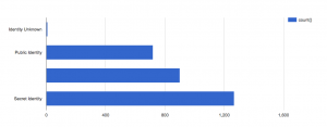
For this assignment, I was interested in the Diamond Prices Database. This database included prices of cut diamonds, along with data on color, clarity, and ratings agency. It was taken from the Journal of Statistics Education online data archive. It includes data from 308 round-cut diamonds, taken from a newspaper ad. It had a column for ID number, color, clarity, rater, and price of the diamond. I had to manipulate the data-set itself in order to make it presentable in a visual way.

The first thing I did when I opened the data-set was remove the column for Identification Numbers because this was just numbers 1-308 numbering the diamonds in order. It was useless to me. Then, I deleted the column called Rater, which showed which one of three independent rating agencies rated the specific diamond. I was not interested in who rated the diamond, so this information was useless to me.

The next thing I did to the data-set was change the Color column from alphabetic data to numeric data. Color refers to the degree of color purity in the diamond. In the legend of the data, it said that the color of the diamond was rated on an alphabetic scale from D-I, where D represents the top color purity grade, lesser than D is E, then F, then G, then H, then I. I though that numbers from 1-6 would do the exact same job of representing the color purity of the diamond, and would be easier to present visually. I changed all the D’s to 1, then the E’s to 2, then the F’s to 3 then the G’s to 4 then the H’s to 5 and then the I’s to 6. In my opinion, using an interval scale from 1-6 to rate color with 1 being the best and 6 being the worst color is much more clear and simple than using letters of the alphabet starting with D to represent color, so that is why I made this change in the data-set.

Finally, I copy and pasted all this new data into RAW. I chose to use a scatter-plot to analyze and present the data.

dh


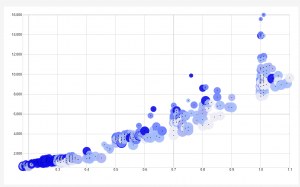
The X-Axis of the scatter-plot corresponds to the weight of the diamond, in carats. The Y-Axis of the scatter-plot corresponds to the price of the diamond in Singapore dollars. The size of the radius of the data points corresponds to the color, where the smallest data points have a color rating of 1, which means that they are the best color. In other words, the smaller the radius of the data point, the better the color and the bigger the radius of the data point is, the worse the color is.  The color of the data- points correspond to their clarity (presence or absence of minute flaws). In the data-set, IF means internally flawless. Below IF, the second best clarity is VVS1, which means very very slightly imperfect, then VVS2, then VS1, which means very slightly imperfect, and finally the worst clarity is VS2.  I created a blue color scheme to portray clarity. The brightest blue represents the best clarity (the IF), and the second brightest blue represents VVS1, then the third brightest blue represents VVS2, and so on until the worst clarity is associated with the lightest blue color of the visualization.

I love my visualization and I am very proud to have created it. I think that it is the best visualization for this type of data, because the most interesting component of the data is the weight of the diamond vs the price. This visualization shows me that generally, as the weight in Carats goes up, the price of the diamond goes up. This is interesting and it shows me that weight is really the biggest determining factor of price. Weight matters much more than color and clarity when determining price, because the size and color of the data points (corresponding to color and clarity, respectively) fluctuates over the entire graph. However, there seems to be a strong positive linear relationship between price and weight of the diamonds, as seen in the X and Y axis.

Another very interesting thing that the visualization shows me that I never noticed in the data was the fact that the diamonds with the best clarity as generally the smallest diamonds. I can see this because the brightest blue points are clustered near the bottom left of the graph, which shows that they are the smallest and cheapest diamonds. It seems that clarity decreases generally as size increases. This makes sense because the bigger a diamond is, the more space there is for imperfection.

Another interesting thing that I noticed in the visualization was that all the outliers (the points that do not strongly adhere to the positive linear relationship between weight and price) are all tiny data points, which mean that they are the best color. This shows me that diamonds with exceptional color can be sold for more than they are worth from weight alone. So even though weight heavily determines the price of a diamond, it appears that diamonds with amazing color have the ability to be sold for more than their weight is worth.