Week 7: Network Analysis

For this week’s blog post I chose to read Whatever Happened to Interracial Love, a short story by Kathleen Collins that appears in Granta 136: Legacies of Love.

Whatever Happened to Interracial Love follows the experience of Cheryl (whose name is only revealed at the very end of the story), an African American woman living in NYC in 1963. Cheryl is in an interracial relationship with Alan (identified as “white freedom rider” initially), and much of the story revolves around how people in Cheryl’s life react to the relationship. There’s Charlotte, her bohemian college-liberal roommate, and her yuppie friend group who react a little too enthusiastically, contrasted with her and Alan’s parents reaction of disgust. Cheryl is a dynamic character trying to come to terms with the expectations she places on herself, along with those placed by her parents and society going through an upheaval.

I made a simple network graph using Google Fusion Tables to outline the various relationships that exist in the story. I defined a relationship as any interaction one character has with another (whether it is active conversation, flashback, or the narrator mentions each other being together, all of these interactions are weighted equally). The characters are the nodes while their interactions are the edges connecting them.

network-analysis

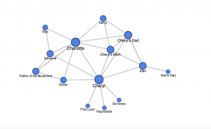
My network graph’s strength lies in its display of centrality. It is clear that Charlotte and Cheryl are the main characters due to their centrality in the network. They exhibit degree centrality, for they are the one’s who have the most interactions in the story, thus they have more edges connecting to more nodes.

My graph leaves much to be desired in terms of analysis; it is an unweighted network. While it shows who the main characters are, it does not demonstrate the significance of the side characters, for each is weighted equally. For example, Skip and Alan’s dad are both off to the sides of the network, giving off an impression of equal insignificance, but Alan’s dad actually plays a much more prominent role than Skip.

If I were to go deeper with my network graph, I would correct it for significance by making certain nodes (of the more important characters) larger. I would also incorporate different colors to show who belongs to what friend group (Alan’s Parents are one color, Charlotte’s friends another).

Week 6: Digital Harlem

For this week’s blogging assignment I chose to continue exploring Digital Harlem, the project we began to dissect this past Friday in lab.

Digital Harlem is a virtual exploration of what the authors claim is everyday life in Harlem, NY 1915-1930. The sources for this project include closed case files from the New York DA’s office, newspaper records, and pieces from the Writers Program Collection. The researchers’ process then included organizing these sources by date and location. All of this information is presented using a google map.

I have a lot of issues with this project so bear with me.

This map is confusing and hard to use

While I applaud the research team on the specificity of their search functions, this project presents itself less like a map and more like an index. When I think of a digital map, I think of something that is interactive, guides the user. The way this map is set up, you have to know exactly what you are looking for (ie dates, types of crime, location) to actually view something of worth. There isn’t a lot of opportunity for true exploration, and this leaves the overall narrative and user experience lacking.

What even is everyday life?

Digital Harlem claims that their project is about everyday African New Yorkers, writing, “this project focuses not on black artists and the black middle class, but on the lives of ordinary African New Yorkers.” But aren’t artists, the middle class, and their respective cultures a part of everyday life in early 20th century Harlem? This is an example of Turnbull’s assertion that, “A map is always selective. In other words, the mapmaker determines what is, and equally importantly, what is not included in the representation” (Turnbull, Exhibit 2, 1).

Thus, if a grim crime record this is what the researchers at the University of Sidney believed everyday life to be, then I cannot argue with them. They may believe that crime is worthy of record, but family history is not. However, I believe there is more to everyday life in Harlem’s past than what they have presented and claimed to communicate.

All this map does is reveal a pattern of depressing crime statistics, with little individuality or narrative. By claiming that this map, this project, depicts everyday life at the time, they are obscuring the facts and presenting a biased side of history, a side only told by police records and newspapers.

My solution

To present a DH project that is true to everyday life in early 20th century Harlem, I’d begin with changing the sources. When I think of everyday life, I’m not thinking of major events or crime statistics. Instead, I think about culture, experiences, family, and the everyday interactions that give each human a unique perspective on the universe. Thus, I would search for sources that exemplify these qualities, like family photographs, pictures of apartment interiors, popular advertisements in the community, and music. I would then present this information on a map that doesn’t require a search function to be fully utilized. I would want my user to feel completely submersed in the world I communicated towards them, with a simple legend that allows the user to isolate content by its medium (ie art, music, family photos instead of date, location, type of crime). I wouldn’t necessarily omit evidence of crime, for that too is a part of everyday life, but I would make sure it isn’t the only interaction the user is left with.

Week 4: Data Visualization for MOMA

Our group was assigned the Museum of Modern Art (MOMA) datasets. The two separate datasets contain records corresponding to pieces collected by the museum from 2006-2016, including the artists of those pieces (gender, ages, nationalities) and artworks (color composition, size).

I chose to work with the artists dataset. My group hasn’t begun data cleaning, so it was easier to work with the artists dataset, which was much smaller, had fewer complications (like empty cells, language issues, repetitions).

Being new to data visualization, I chose to keep my visualization small and simple:

sheet-2

Using Tableau, I created this bar graph as a quick and simple way of visualizing the gender ratio of artists whose works are collected by the museum. The bar graph makes it clear that there are far more male artists featured than female.

I designed this bar graph with Nathan Yau’s principles of data visualization, as outlined in Data Points, in mind. Looking at the data in an excel spreadsheet, you cannot determine the disparity between male and female artists easily, for there’s just so much data to work with. If the point of a visualization is to communicate an idea that is not completely obvious in the dataset in a clear, simplistic way, I think my bar graph gets the job done.

The first principle I focused on was length. When comparing the two variables male and female (I’ll get to null later), a bar graph with a clear difference in length communicates the thought that female artists are not as highly represented in the collections as men. The lengths of the bars are fitting, with the male bar being a little under five times as large as the female, visualizing the data which shows that there are almost 5 times as many male artists as female (9,792 male vs. 2,171 female). I even included the actual values at the top of the bars to emphasize this point.

The second principle I focused on was direction. English speakers read left to right, thus I thought it was appropriate to orientate the graph in an increasing left-to-right manner. This aides the viewer and is an accurate way of representing the data.

The decision to leave in the “Null” data was difficult. Null represents artists for which their gender is unknown or left out of the dataset. When the data is cleaned for the final project, we might choose to leave it out, depending on what narrative we are trying to convey. On the one hand, leaving null distracts from the purpose of the visualization. However, to simply ignored this data in the visualization would not be an accurate representation of the dataset. Thus, I left the data in to remain true to the dataset.

Overall I’m proud of my data visualization and my first experience with Tableau. I realize it’s not very flashy, can easily be made using excel, and is not very complex. I think it visualizes the thought I am trying to convey, which is good enough for now. Going forward it would be interesting to view this data using different mediums. I think a pie chart could convey the same message, but I steered clear of a pie chart because of what Professor Posner mentioned in lecture (data viz people hate pie charts). It’d also be interesting to experiment with different color compositions, whether changing the color of each individual bar would aid the viewer or distract them from the overall message.


Week 3: Gender Breakdown of City Workers by Department

From the LA Controller’s Office, I chose to examine the dataset denoted “Gender Breakdown of City Workers by Department.

The source of the data was the city payroll department, which provided information on the distribution of wages as an aggregate, as well as divided between the two genders. The city’s process of organizing this data consists of transcribing the data onto a spreadsheet, uploading it onto the city controller’s website. The dataset was presented using a simple spreadsheet the user can navigate, but there also included the option to view the data through a series of data visualizations (bar/pie graphs, etc.)

screen-shot-2016-10-16-at-11-15-08-pm

*view of the user, notice the many options for visualizations

The record in the dataset consists of the following: the year, department titles, employee count (# of  male, # of female, % of male, % of female), female total salary, male total salary, female average salary, male average salary, % of total payroll to women, and % of total payroll to men.

In Wallack and Srinivasan’s paper, they describe datasets ontologies’ as “systems of categories, and their interrelations by which groups order and manage information about the people, places, things, and events around them” (1). Thus, the city’s ontology for The Gender Breakdown of City Workers by Departments is an attempt to communicate the distribution of wages between male and female city workers in specific governmental departments using a variety of percentages and aggregate wage amounts.

This data is not hard to read, thus it can make sense from many points of view. However, if they city’s goal is to provide an unbiased view of gendered employment within the government, this data raises more questions than answers. I think many feminists groups would find this data illuminating and outraging, for it is clear that women are making far less than men in nearly every department. In addition, government officials can refer to data like this during hiring practices, as well as anti-discrimination lawsuits.

This is where the problem of mismatched ontology comes in. Wallack and Srinivasan write that “States’ attempts to promote ‘development’ are thus limited by the information loss between the community ontologies that define development and meta ontologies that guide their actions” (3). The information “lost” here would be more specific job titles, how long individual’s had been employed, and relative satisfaction one has with their job. I realize this is out of the scope of what the city entailed for this data, but it would go a long way to promoting communication between the community (who may be upset by datasets like these), and the government which is working towards diminishing gender-based discrimination. I believe the city has good intentions in making this data public (many governments would never do this out of fear of lawsuits and citizen complaints), but by leaving out specific job titles, and limiting the data to a single year, they are raising more concerns than answers.

If I was to completely start over with data collection, I would work to provide more data, encompassing multiple years and specific job titles. This would provide a more accurate picture of gendered employment in the government, and whether the disparity between male and female wages is diminishing, bridging the gap between the community’s ontology and the meta-ontology promoted by the government.

Week 2: Finding Aid for SLDC

I chose to investigate the finding aid for the Sleepy Lagoon Defense Committee Records, 1942-1945. The finding aid follows a traditional format, and I am immediately drawn to the abstract, a summary of the research the records follow. The abstract, in addition to the “history” section of the finding aid, outlines the purpose of the committee, and the context in which the committee existed.

The Sleepy Lagoon Defense Committee was a group organized in 1942 as a reaction to the unlawful murder conviction of 22 Angelenos; all but one were Mexican-American. The committee promoted public awareness of the injustice through publications and education programs, and raised funds to appeal the verdict. In a response to t public outcry, the conviction was overturned in 1944.

The finding aid informs me that all the materials are available on microfilm at the Department of Special Collections at the Young Research Library, yet the physical collection is stored off site, unavailable due to its fragile condition.

Based on the materials in the collection, I can tell the main historical narrative presented is the story of the 22 wrongfully convicted boys, and how their trial plays a role in racism in Los Angeles. The collection includes the transcript of the trial, a primary source that provides deep insight into the murder and conviction. Other primary sources like publications and petitions provide a context for what was going on outside the lives of the suspects.

The collection presents a historical narrativevin an incredibly deep and illuminating way. The sheer amount of sources and evidence provide an accurate picture of the time, as well as humanizes the defendants. For example, an excerpt from a letter written by Manuel Reyes (one of the defendants) outlines how even while he was in jail, a victim of a failed criminal justice system, he still loved his country and joined the navy to fight in the war.

The collection also includes content from after the trial. For example, an article written by Alice Greenfield called “What comes next for the Sleepy Lagoon boys?” provides a more forward looking outlook and a sense of future relevance for the historical collection.

Even though this collection is very thorough and does provide a very good picture of the trial and the defendants, I think additional data to put this trial in the context of other failed trials at the time would expand the scope of the research and leave a more lasting impact on the reader. I think this collection serves its purpose well: to outline the history of the Sleepy Lagoon trial. The collection also does a striking job of outlining the intersection of the government, media (Hollywood, celebrities included), and public at the time of the trial, how they all influenced one another. However, if they included some more hard data like how many wrongful convictions of Mexican-Americans were overturned at the time, or how many Mexican-American enlisted in the military (like Reyes), it could provide a more detailed picture of racism at the time, with numbers saying even more than words.
Viewing the narrative in terms of cause and effect too shows where this research is lacking. The effect is clear: the injustice of the trial, the public outcry (as seen through publications and photos), the impact on the lives of the 22 men (as seen through letters of correspondence). However, the causes are lacking, there could be more info on racism at the time, life in Los Angeles for those of Mexican descent. Adding some form of data (a census, racist propaganda, etc.) could solidify the causes further, expanding the narrative.

Week One: Reverse Engineering Photogrammar

For my first blog post, I chose to reverse engineer Photogrammar, a map-based platform built by a Yale University humanities research team. Photogrammar allows the user to search through photos sanctioned by the United States Farm Security Administration and Office of War information (FSA-OWI), beginning with the Great Depression and ending with World War 2.

These photos offer a snapshot of life during a pivotal time in American history, a time beset by severe poverty and population diaspora. To me, photogrammar offered a more personal view of the Great Depression. For example, a photo taken by Dorothea Lange presented a car full of dust bowl refugees, their faces offering a visual example of the despair of the Great Depression and the farming crisis.

dust-bowl-refugees

(photo credit: Dorothea Lange)

Navigating through a series of photographs showing slums in San Francisco, abandoned homes in Utah, and marching soldiers in Virginia provided me with a more emotional view of the 30s and 40s, one that a simple text never would.

The Yale research team used the FSA-OWI photos as their main source for the project. From there, the team’s process included scanning the photos into a digital format as well as geocoding the primary sources into a digital map in which users like me can isolate a location in the United States to search for the photos taken in that area. The team used two systems of organization, narrowing the database. One was a hierarchal system previously developed by Paul Vanderbilt in 1942, a method that included categories like “Transportation” and “War.” This system allows readers to view photos associated with one, expanding one’s education of the time period. The second system of classification diversifies the user’s search options, allowing them to isolate photos by their location, date, and photographer.

Part of the team’s presentation includes a large “Start Exploring” button, which directs users to the main map, the core of the project. This illuminates purpose of their project: to provide a clean, interactive format in which users like me (non-historians) can learn about US history in a visually appealing way. The map is aesthetically pleasing, with deep green indicating a wider array of photos to choose from as opposed to the lighter green locations. The map also included a “dots” mode, in which the user can search for photos across the map by photographer. The user can narrow their search by using a timeline at the top of page, isolating photos by not only county and photographer, but by year. 

screen-shot-2016-10-01-at-7-45-52-pm

Their map was presented using CARTO and leaflet technology.
I find that the diversity of search options make this project a huge success for users like me who are new to digital humanities. The wide array of search options helps segregate the 170,000 photos; without diverse search options the user could become either overwhelmed or bored.  I find the project visually stimulating, informative, and easy to use, a welcome introduction to the world of digital humanities.