DH101

Introduction to Digital Humanities

Author: FrancescaAlbrezzi (page 17 of 38)

Week 6: One More Last Stand network


I read Callan Wink’s “One More Last Stand” about an ongoing affair of two friends who only saw one another at a battle scene reenactment.

http://granta.com/one-more-last-stand/

Network Graph

This graph illuminates how the affair Perry and Kat are having is only known by one side of the network. Andy, Perry’s wife, has no idea about what is going on. However, Kat’s husband John is more connected to Perry, and could therefore figure out the affair based on his connections. The limitations of this network graph is that the strength of each relationship  cannot be explained. As a matter of fact, the graph only shows that a relationship or connection exists, and not to what extent or what that connection is.

Here is a screenshot of the network graph.

One More Last Stand Network Graph


The Seventh Man by Haruki Murakami

I chose Haruki Murakami’s short story “The Seventh Man,” which poignantly recalls a tragic childhood accident. It beautifully deals with selfishness, fear, guilt, and catharsis, so despite the somber subject matter, it was an enjoyable read! I’ve always wanted to check out Kafka on the Shore or Norwegian Wood, so this is a great introduction to Murakami’s writing.

I decided to build a network graph of explicit character interactions. Because so many of these figures are friends and family with one another, a “who-knows-who” diagram would not be useful.

Screen Shot 2015-11-08 at 1.36.25 AM

Interestingly, while the story deals with the narrator’s relationship with his childhood friend K, the visualization makes him out to be a minor character. K’s explicit interactions are with the dog and narrator only, even though his life touches many others.

This discrepancy shows that we need to be careful when making judgments from visualizations and graphs. There may be hidden biases and misrepresentations that can cloud the truth.

Stars and Stripes Network Graph

I chose to make a network graph for the short story Stars and Stripes by Santiago Roncagliolo in “The Best of Young Spanish-Language Novelists” edition.  The story follows a unnamed narrator and focuses on his relationship with Carlitos, the boy who lives next door to him in Lima, Peru, who is obsessed with all things America. Since there was almost no dialogue in this story, I defined a connection between two characters as them having mutual knowledge of each other.

Screen Shot 2015-11-07 at 10.41.30 PM

The graph can be accessed online here. (For some reason I’m having trouble embedding the graph.)

I think the most challenging part of making this graph was deciding what constituted a “character” and what constituted a “connection.” Most of the characters are not given names, and there are characters only mentioned in groups or without details like “bodyguards,” “immigration officers,” and a “waitress.” I decided to only include characters who were easy to define as a single entity and who had a clear role in the narrator or Carlitos’ life. I think my representation in the network graph is not quite accurate because, for example, I included the narrator’s cousin who is only mentioned once, but left out the group of bodyguards who were always with Carlitos and his family.

For the connections, it was not always clear who had a relationship with whom. For example, the narrator has intimate knowledge of Carlitos’ father, describing his work, his eventual death, and even telling about how he saw Carlitos’ father walk around the house in his underwear. However, nowhere in the story does it mention the two having any interaction or whether or not Carlitos’ father knows who the narrator is. In this case, I decided that the two did in fact know each other. One could assume that Carlitos’ parents and the narrator’s parents knew each other, but since the story does not mention either having knowledge of the other, I didn’t link them in the graph.

Once I made all these decisions, the process of making the fusion table was very simple. After putting all the relationships into an excel doc, the fusion table put the network graph together just how I imagined it should look, with Carlitos and the narrator as the two largest, most central nodes.

Network Graph

Graph
The short story I read is The Girls Resembled Each Other in the Unfathomable by Carlos Labbé. This story is found in Granta 113: The Best Young Spanish Novelists. It’s a great story to graph because it revolves around an interesting web of relationships that center around the disappearance of two siblings and one mysterious narrator. In the story we learn that, though the siblings, Bruno and Alicia Vivar, were never again seen together, over the years, there are sightings of each of them separately.

I took the names of all the main characters of the story and created an excel sheet with two columns. In one column I wrote the name of a character. In the second column, I wrote the name of a character he or she was in a scene with. I did this for all of the nine characters. What the graph shows us is who knows whom for sure because they were seen interacting at some point in the story.

It was surprising to see how many people, Jose Francisco Vivar, the missing siblings’ father, is connected to. His role doesn’t seem as pivotal in the text. It’s as if the writer is deliberately trying to hide Jose Francisco’s importance by only alluding to his complicity in the disappearance of his children. But, the graph clearly shows us that Jose Francisco knows a lot more than we are led to believe in the narrative, simply because of the people this character is connected to.

With a little more experience and by asking the right questions of my data, I think it may be possible to  figure out who the mystery narrator is. The clues seem to be tangled up in the web of relationships, but some further network analysis is needed. I reached out to my classmate, Jonathan Calzada, to see if he might be interested in taking the work I’ve done and asking some further questions of the data to see if he could extrapolate more information that might point us towards who the mystery narrator is or who is responsible for the missing Vivar siblings. I look forward to seeing what he finds.

What the graph cannot answer is why the siblings were never again seen together nor can it clarify if Bruno Real, Bruno Real Yañez, and Francisco Virditti are, in fact, the same person.

Blog #6 Google Fusion Tables

This is my Google Fusion Table. This table was created off of the story “Her Lousy Shoes” by Tracy O’Niell. This story is about an unhappily married teacher named Douglas. He is married to a woman named Miranda who has a secret lover. 

Untitled

The fusion table that I made was made with the characters as the nodes who are to be connected. The nodes are connected with edges. The edges that I used when making my metadata on excel was which characters knew one another. I at first had wanted to find a way to display what specifically were the relationships between each character but it was difficult to be consistent with all the characters since most characters are only mentioned a couple times and it is difficult to map out all of the relationships that each character holds.

After I had read the short story and published my Fusion Table I realized that there was an option for weight. I decided to redo my data so that I could introduce weight. I wrote down the number that each character was mentioned in the text and used that as my measurement of weight and the result is the table seen above. This is the reason why Douglas has a larger node icon, a larger circle, compared to less significant characters like his students.

The chart is useful because it helps to unpack why certain events happen in the short story as they do. For example, Douglas’ wife Miranda has a secret lover that Douglas has not confirmed exists but suspects Iit. A reason why Douglas has not been able to confirm his wife’s affair is because her lover Neil as no edges to any other character that can be traced to Douglas other than his wife who obviously won’t confess. This is both a strength and a weakness of the table. While the chart shows the relationships of characters, it does not portray how much information can travel through these characters or what information (when it happens to be specific pieces of information) are reluctant to travel throughout the network. One of the limitations of the chart is that it lacks a dimension of depth as to how strong the relationships are and the specifics of the information. This is an ongoing issue with technology simplifying human relations as information is lost. That is not to say that this data does not give a new meaning when reading a short story when one can see the connection each character has at all times as we read. All the relationships are accounted for and easy of the reader to keep in mind when the network is displayed visually.

Scavengers Network Graph

After reading the short story, Scavengers, I made a network graph representing the connections between character (nodes) based on the relationship who they know (edges.)

The network graph shows that most of the characters know Rikidozan because he has the most edges touching him. Google Fusion even made his node larger to put emphasis on the fact most nodes have edges touching him, which mean the story probably revolved around him.

However, the graph does not tell us that the entire story is coming from the narrator’s point of view and about the fascination the narrator has for Rikidozan. I think combining the knowledge one gets from reading the short story and using a network graph, one can start to make more interesting comments. For example,  everyone seems to be connected to Rikidozan and most seem to be connecting to the narrator, but they still don’t have an edge connecting them together. How does the lack of edge between them shape the story?

Screen Shot 2015-11-07 at 12.16.32 AM

Link to my network graph: https://www.google.com/fusiontables/DataSource?docid=14IGfLBdSL5sU-Pzf5F3y27KOXDAlu4JFeRJ6HfAP

My data table:  Blog november 9th: Scavengers

Network Graph

For this blog, I have chosen the short story Enzo Ponza by Joanna Walsh to create my network graph. The network graph that I have made for this short story was honestly harder than I thought. After having done this graph, I realize an edge list play a vital role as to how your graph will look like. Although a network graph software can create a graph for you, it is still up to the creator to decide what connections they want to show, what information to include, what information to exclude, etc.

My Network Graph

Screen Shot 2015-11-04 at 11.39.32 PM

As you can see from the graph, the narrator talks about Enzo Ponza the most as indicated by the thicker lines. This indicates that the narrator is most influenced by Enzo Ponza and she focuses mostly on Ponza. As we can also see, the characters each talk to the narrator the most showing the importance of the narrator to the story. There is a group of characters who has no connection with the narrator  because they don’t talk to the narrator in the story. These group of character’s play of little role to the point of the story.

Although this graph can tell the audience quite a bit, i feel like the graph is limited to the amount of information that is inputed by the creator. Some columns were not represented in the graphs because there was not an option to put more information due to the complication of having more than 3 elements, thus limiting possible connection that can tell us something.


Blog 6 – “One Ridge Over” Network Graph

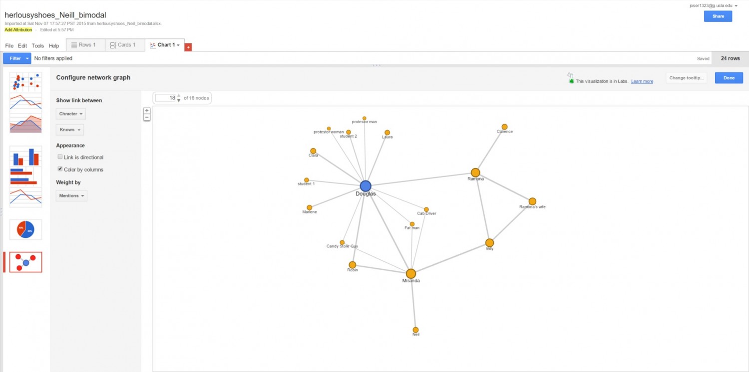
For this network graph activity, I read Josh Weil’s short story “One Ridge Over,” which is a first-person narration of Weil’s experiences living in a mountain valley. The way I constituted a connection for the purpose of my network graphs was from the Weil’s (the narrator’s) description of the characters, which indicated their relationships. While there were scenes with character interaction, there were many more characters mentioned that could not have their relationships defined by interactions, like the Woodsman’s mother and Junior. It was also not feasible for me to base connections on dialogue, as there is really only dialogue between three of the fifteen people mentioned in this story. Therefore, I used Weil’s mention of specific relationships, but also had to extrapolate for some. For instance, I assumed that Sis and Junior had a connection because Weil said they were married, even though the text of the story does not show the two of them interacting. This did lead to some tricky situations. In the case of Russell’s wife and son, I could assume that Russell’s wife “knew” her own son because she gave birth to him; however, Russell’s wife had been gone for twenty years and there is no indication if she was there to raise her son. Therefore, I decided that she had a connection to her son, but that her son did not “know” her, because it was never explicitly mentioned.

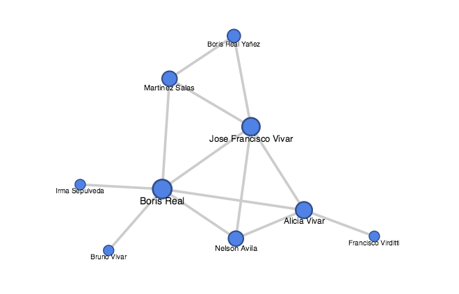
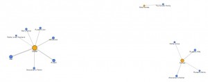
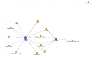
Below is a (small and blurry) screenshot of the main network graph I created – clicking on it will take you to the Google Fusion table itself which is easier to see. This graph uses directional arrows to indicate connections, and the larger circles indicate that the person is more well-connected. This graph shows that Weil is the most connected of any character (which makes sense since he is the narrator and everything is told from his point-of-view), and that Russell is the second-most connected character. It also demonstrates some holes in interpreting Weil’s narration; Mattie Jones and her husband are separate from the network graph since they are not mentioned to have known anyone else except each other, though it could be very likely they did know other characters in the story.

bp6 - character knows

However, I think this graph has issues. Foremost, I am unsure how the directional arrows were determined because each edge only uses a single-direction arrow. This is odd because many of the connections go both ways since the two parties knew each other, which ought to imply that the arrow should point both ways. In fact, the two relationships that should use a single-direction arrow have it pointing in the wrong direction. As mentioned above, my data indicates that Russell’s Wife knows Russell’s Son, but that Russell’s Son does not know his mother – yet the arrow is pointing from the son to the mother in the graph. Additionally, the Sarvers Family was not mentioned to interact with anyone but themselves, though Russell had observed them in their activities. Therefore, I indicated that Russell knew the Sarvers, but not that they knew him – yet the arrow points from the Sarvers to Russell. I might be misinterpreting how this network graph uses directional arrows, but the way the arrows are used seems to conflict with common sense.

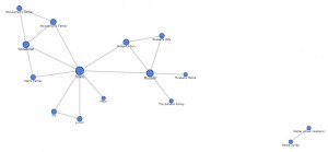
I also made a network graph that shows the distribution of gender in the story:

bp6 - character gender

This graph does not show much useful information, and feels especially disjointed because the Sarvers family includes both males and females.

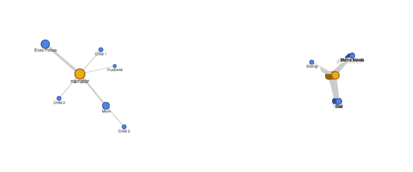
However, using gender, I made another network graph that shows which genders knew which people:

bp6 - gender knows

This graph is somewhat useful, as the thickness of the lines pointing to a character indicate the extent of their gender connections. For instance, Weil was connected to more male characters, whereas Russell was connected to more female characters. This information may or may not provide information about character personalities. However, this graph also has its limitations. Once more, the Sarvers family proves to be a tricky plot point because they had members of both genders – in this graph view, they do not even appear, there is just a point for “Male/Female.”

All in all, I think Google Fusion Tables provides a simplistic way to approach network graphs, as it can illustrate basic network connections. However, it does have somewhat limited functionality and aesthetics, and uses directional arrows in a way that contradicts logic.

Website

I kept messing up and having to redo everything, and then couldn’t figure out how to upload…  So sorry this is late :/.

http://www.americanlabormovement.com/kiannawebsite/blog2.html

Nov 2: HTML Exercise

http://www.americanlabormovement.com/bettychen/index.html

This is what it looks like. The IMG path is currently not working.

Screen Shot 2015-11-02 at 1.51.03 pm Screen Shot 2015-11-02 at 1.50.49 pm


Older posts Newer posts

© 2026 DH101

Theme by Anders NorenUp ↑