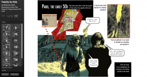
This week, I had the opportunity of taking a look at the digital project, Totality for Kids. Originally found on Vectors Journal and based on a book by McKenzie Wark, this project was made by designer Erik Loyer in collaboration with comic artist Kevin C. Pyle. In its Editors’ Introduction, Totality for Kids “forays into the pre-history of the SI, beginning in post-war Paris with the group’s predecessor the Lettrist International, and continuing through the apotheosis of political radicalism marked by the general strike of May ’68.” Interestingly, this project ties in both artistic aesthetic with and interactive interface, allowing users to literally click on designated images on the site to read descriptions, definitions, and themes present.
An intriguing aspect I first noticed was the employment of almost mundane, every day words to explain concepts present from Wark’s book and during that time of political radicalism and unrest; words such as ‘history’ are given social and cultural contexts that, strangely, differ from its dictionary definition. The words are also placed on or near symbolic images, possibly to underline the profound vision behind this digital project. This particular design decision, I find, is fitting in how visually-dependent the interface is; the illustrations flow into each other to have viewers go in order across each comic book ‘page.’ There is also a feature to ‘track’ how you read the designated words– so in a way, the design of the interface does tell a story about the story itself (Mindblowing, right?!).
The home page of this project, which starts at page 1.
I absolutely love how the overall design of the interface just comes together to make your typical comic book layout, but has extremely deep lessons with each analysis of Wark’s text on the pages. However, I did find some things to have been left unexplained from both the project’s interface and its Editors’ Introduction. First off, I have no actual clue as to what Wark’s work was about; the only information I was given from the Editors’ Introduction was the “history of SI” up until some sort of strike in 1968– which even then, I’m not too sure about. I hoped there would be some sort of About This Project page or a History of SI page that I could read about to get a better sense of what this project was trying to achieve. I also can’t really grasp the intention of the project; artistically, it seems quite abstract in the fact that the genre is a comic book, yet the text that occupies it does nothing to denote a comic book’s purpose– I somewhat feel that the comic artstyle may have been random, at best. Or there may be another reason to choosing this type of illustration, but again, having a page that would explain the reasonings behind these decisions would help drastically.
The comic book theme is amazing– but what purpose does it serve other than to make the project look like and be read as a comic book?
Overall, I really do like this project. Totality for Kids, in a nutshell, is really, really cool despite some faults here and there. In essence, I do get how useful this type of project would be, especially seeing it as a possible example to model other text-analyzing projects after. The mesh of art and text definitely works here– although much more could be explained by the creators to really make this project shine. I definitely agree with the Editors’ Introduction in how “the written passages perform a deep interweaving of annotation, quotation and allusion,” and I can see myself, a digital humanist, to truly count on constantly improving, unique, and cutting-edge interfaces to showcase a different way of thinking to the world.

