DH101

Introduction to Digital Humanities

Tag: blog post

Totality for Kids: Interface’s Possibilities and Limitations

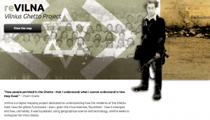
This week, I had the opportunity of taking a look at the digital project, Totality for Kids. Originally found on Vectors Journal and based on a book by McKenzie Wark, this project was made by designer Erik Loyer in collaboration with comic artist Kevin C. Pyle. In its Editors’ Introduction, Totality for Kids “forays into the pre-history of the SI, beginning in post-war Paris with the group’s predecessor the Lettrist International, and continuing through the apotheosis of political radicalism marked by the general strike of May ’68.” Interestingly, this project ties in both artistic aesthetic with and interactive interface, allowing users to literally click on designated images on the site to read descriptions, definitions, and themes present.

An intriguing aspect I first noticed was the employment of almost mundane, every day words to explain concepts present from Wark’s book and during that time of political radicalism and unrest; words such as ‘history’ are given social and cultural contexts that, strangely, differ from its dictionary definition. The words are also placed on or near symbolic images, possibly to underline the profound vision behind this digital project. This particular design decision, I find, is fitting in how visually-dependent the interface is; the illustrations flow into each other to have viewers go in order across each comic book ‘page.’ There is also a feature to ‘track’ how you read the designated words– so in a way, the design of the interface does tell a story about the story itself (Mindblowing, right?!).

Screen Shot 2015-11-23 at 1.56.30 AM

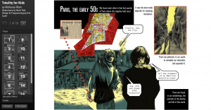
The home page of this project, which starts at page 1.

I absolutely love how the overall design of the interface just comes together to make your typical comic book layout, but has extremely deep lessons with each analysis of Wark’s text on the pages. However, I did find some things to have been left unexplained from both the project’s interface and its Editors’ Introduction. First off, I have no actual clue as to what Wark’s work was about; the only information I was given from the Editors’ Introduction was the “history of SI” up until some sort of strike in 1968– which even then, I’m not too sure about. I hoped there would be some sort of About This Project page or a History of SI page that I could read about to get a better sense of what this project was trying to achieve. I also can’t really grasp the intention of the project; artistically, it seems quite abstract in the fact that the genre is a comic book, yet the text that occupies it does nothing to denote a comic book’s purpose– I somewhat feel that the comic artstyle may have been random, at best. Or there may be another reason to choosing this type of illustration, but again, having a page that would explain the reasonings behind these decisions would help drastically.

Screen Shot 2015-11-23 at 2.10.19 AM

The comic book theme is amazing– but what purpose does it serve other than to make the project look like and be read as a comic book?

Overall, I really do like this project. Totality for Kids, in a nutshell, is really, really cool despite some faults here and there. In essence, I do get how useful this type of project would be, especially seeing it as a possible example to model other text-analyzing projects after. The mesh of art and text definitely works here– although much more could be explained by the creators to really make this project shine. I definitely agree with the Editors’ Introduction in how “the written passages perform a deep interweaving of annotation, quotation and allusion,” and I can see myself, a digital humanist, to truly count on constantly improving, unique, and cutting-edge interfaces to showcase a different way of thinking to the world.

reVILNA: Vilnus Ghetto Project

Screen Shot 2015-11-15 at 9.13.22 PM

This week, I had the pleasure of exploring reVILNA: Vilnus Ghetto Project and taking a look at the maps provided. The project’s overall purpose is to be a digital mapping project that helps understands how people lived in the Ghetto. how it emerged and functioned as a structure, and how it was ultimately liquidated of its residents.

Screen Shot 2015-11-15 at 9.14.15 PM
At the home page, one can click on a button that says ‘View Map’ which will lead them to a different page; the page is full of numerous ‘stories’ that users can click on. Among these stories are the formation of the Ghetto, Aktionen, Judenrat, Health & Education, Art & Culture, and so on.  Each of these stories contain a description of the content and a gallary of images over a map; once exited, users can see what significance each story has within the Ghetto. Below the bar of stories, however, there is a button to ‘View on your own’ which when clicked, refreshes the page to become the interactive map alone.

Screen Shot 2015-11-15 at 9.10.46 PM

Accompanying the map is a sidebar that acts as a timeline and description of significant locations and events, as well as a legend on the other side that one can select and deselect to view either all at once or individually.

This digital mapping project is very well done in how it takes users back to a place that many may not have even known to exist in a time of such conflict and turmoil; I myself did not know about this particular ghetto. reVILNA is thorough in the stories given and effort had been clearly made to make sure each description, image, and location is as accurate as restored as possible. Everything from the home page to the map itself is understandable and most importantly eye-opening in how it engages users to look through real-life stories on their own, to truly learn about what life was like in this place and who these people were.

On the other hand, the only thing that this project, I feel, is lacking in was a more detailed introduction to the project. I did not know that Vilnus was a Jewish Ghetto, nor did I know where it as located until I navigated the site a bit more; I think it would have been better to have that information in a more accessible place, like on the home page, so users aren’t confused as they interact with the map and whatnot. Although the interface is organized and aesthetically pleasing, the map is the only real ‘meat’ of this project, for lack of words– maybe, to complement the map’s purpose, digital 3D renditions of the living quarters, recreated recordings, and other methods of mapping and visualization would be nice.

An interesting alternate map would be to layer over other ghettos during this time to better visualize what these places did and did not have in common, as well as both conferring and contrasting facts about each place. It would also give great aid in visualizing the reality of the Jewish ghettos; by layering over images it can really show the sheer size and ethical implication they posed to the Jewish population during WWII.

I Like Being a Woman (And I Hate Hysterical Women): A Network Graph

The short story, “I Like Being a Woman (And I Hate Hysterical Women)” by Leila Guerriero is a partly introspective and recounting narrative that explores underlying themes of feminism, shame, obligation, and self-identity that plagues women around the world. Leila’s interpretation stems from descriptive encounters with family members, friends, strangers, and her husband as her life progresses. Each paragraph contains an instance with another person, fitting for a network graph. Interestingly, however, the process of creating the graph and analyzing the relationships between Leila and others proved to be more informational than originally imagined, and with this short story I found myself appreciating the art of writing and the deeply relative and personal connections it can mirror onto readers.

I first started my analysis by creating a Google sheet to track the characters’ interactions by name and scene. For example, I have Leila’s name in one column, and a character she interacted with in a scene on the next column. I repeated her name in the first column while adding names onto the second one as the story carried on. In one scene, both Leila and a classmate, Paola, encounter two characters at the same time. Thus, I put Paola’s name in the first column after Leila’s, and repeated the characters they interacted with in the second column accordingly.

Screen Shot 2015-11-08 at 7.33.21 PM

Once I finished the sheet, I exported it as a .csv and uploaded it to Google Fusion Tables. Finally, I created a chart with my data. I found the above graph to fit best, as it demonstrates how Leila is the main character and narrator. It also shows how connected she is to all of the people mentioned; yet at the same time, the others are not connected to each other. From further analysis, one can come to the sense that this is perhaps what the writer wanted to illustrate to readers– with Leila being both an un-proclaimed feminist and a soft-spoken, inquisitive individual, it better portrays the double standards applied to women. The lack of connection between the other characters aside from Leila also may bring about the absence of direction for Leila to follow, thus highlighting how contradictory it is to be a women in a world dominated by contempt, masculine influence, and the abasement of both sexual and physical freedom.

Screen Shot 2015-11-08 at 7.45.44 PM

All in all, having a network graph to accompany a short story has allowed me to better understand the broader applicability of the themes present, has given me great achievement in exploring what it means to be a universal learner, and engage humanities material through employment and experimentation with digital tools.

*on a sidenote: I’m not sure how to embed the chart. I tried putting the embed code onto this post but it only displays the code. Maybe I’m not using the right code or placement?”


HTML and CSS in Action: A Blog Post

Here it is!
( http://www.nydishes.com/krystalblog/index.html )

Visualizing the Tragedy of the Titanic

This week’s topics were a bit challenging, as there are quite literally hundreds of ways to create data visualizations! With so many options, it did get a bit overwhelming, but as the week progressed I found myself to understand them a little better. With data visualizations, it is important to first look at the data and find visualizations that will best interpret it. I had a chance to experiment and do this with one dataset, aptly called Titanic, which has data from the first– and last– voyage of the famous Titanic. A rather simple dataset, the file proved more difficult to interpret and demonstrate as a visual than initially thought.

Right off the bat, as I opened the Titanic.XLS file, I noticed that the data was numerical; however, the numbers actually represented qualitative, categorical data! For example, documenting the passengers’ ages with 0 for child, or 1 for adult; a 0 for female, 1 for male, so on and so forth. I thought that although pretty smart in making the records easier to read in general, especially with the legend present on the side, transferring the file into a visualization tool turned out to be more problematic than it seemed.

Screen Shot 2015-10-25 at 5.00.27 PM

According to Yau in “Data Points,” data should be represented “with a combination of visual cues that are scaled, colored, and positioned according to values.”  Keeping that in mind, I decided to use RAW for this dataset, as I felt that the multiple choices and customization options of the visualization tools it offers was fitting with the data I chose. Since the numbers in each content type did stand for something else, I felt that an alluvial diagram best fit the data, as this method of visualization represents flows and correlations between categorical data. Therefore, I went ahead and plugged the file into RAW. And that’s where I encountered some problems…

Screen Shot 2015-10-25 at 5.12.53 PM

WHAT HAPPENED?!

This is where I realized that something was wrong– well, not wrong, but off! I figured that because the original data used the 1’s and 0’s as markers for other meanings, it then translated into the alluvial diagram. Above, it’s pretty evident that although the data is there, the categories aren’t even labeled, but just left with the markers.

At this point I had also tried different visualizations on the site, but they all yielded the same results as the alluvial diagram with only 0’s and 1’s. I figured that the only way to really illuminate this data is to go back to the original Titanic.XLS file and change the numerical markers to their intended meanings; this meant that I would change the 0 representing female passengers to “Female,” and the 1 representing male passengers to “Male.”

Screen Shot 2015-10-25 at 6.44.54 PM

Luckily, I was able to do this in no time on Excel; though afterwards I realized that it may have been even more time-saving if I had used OpenRefine! So now, with the data practically cleaned and more able to be transferred onto RAW, I replugged the adjusted dataset and tried the alluvial diagram again.

titanicRAW

“Visualization is what happens when you make the jump from raw data to bar graphs, line charts, and dot plots.” – Yau, Ch.3

This time, it was a success! Now, one can view the correct categories for the content: starting with class, then age (adult or child), filtering down into sex, and finally if the individual had survived or not. Looking at the diagram, it is extremely clear to see the data, which itself was startling as I was cleaning and transferring it. Most of the passengers who had died were adult males, coming from the ship crew and most of the Third Class. What’s even sadder is that, although a very small amount, some male children did not survive.

In conclusion, I am happy to say that practicing with this dataset helped me better grasp what data visualization is and how it enhances data. By having something physically representative to put into perspective, I feel that one can really see how much of an impact (no pun intended) such data poses on human history; in this case, the tragedy of the Titanic is still as shocking and eye-opening as it was a hundred years ago.With that being said, the visualization tools presented to us definitely help to emphasize the importance of recording, archiving, and preserving human experiences of all kinds.


© 2026 DH101

Theme by Anders NorenUp ↑