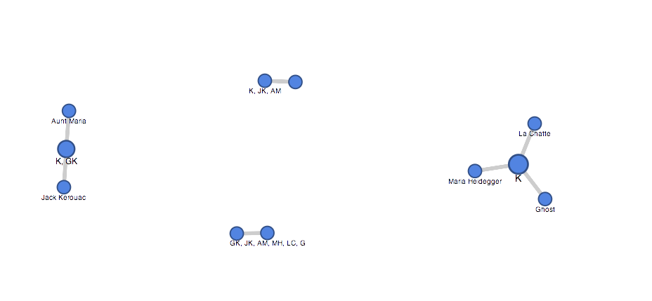
I chose to read Anne Carson’s “Krapp Hour.” Her text appears to be a play featuring a made up game show in which the main character, KRAPP or “K” interviews both historical figures and “fake” characters such as a ghost. I had a hard time really understanding the premise of the show and what the storyline was really getting at. It was somewhat confusing in the show to understand when characters had scenes together. The text would sometimes make note of when the character had exited and other times the text would just state “AM gets up, moves down couch, sits, blackout” and then for the remainder of the text the character would not speak. For this reason only I chose to create my table based on characters that directly spoke to each other, not characters who just shared scenes together.
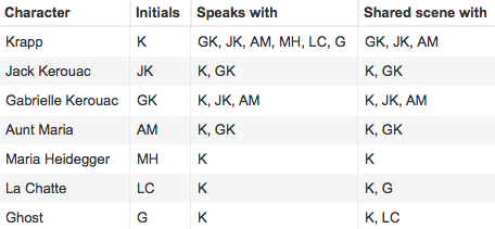
The fusion table did not really enlighten me on any connections between the characters. In fact the diagram made it a little more confusing for me. I think this tool would be better implemented in situations where most of the characters were connected by more than just one character. Because in the original excel sheet you can indicate more information I believe this is more helpful in understanding relationships between characters. It is important to understand what tool works best with what data and google fusion chart it not the best tool to use with this storyline.