I visualized data about air quality in 41 cities in the United States on a map using Tableau Public. The data was obtained from A Handbook of Small Data Sets, edited by D.J. Hand, et al. Air quality was measured in terms of sulfur dioxide levels. Sulfur dioxide is a toxic gas with a pungent, irritating and rotten smell that is released during the manufacturing process.
I chose to use a symbol map to graph the data because of the geographic nature of the dataset. From the user’s perspective, it’s convenient to have a form of data visualization that is both quantitative and geo-spatial. That being said, the map gives users a sweeping view of which areas in the country have the poorest and highest air qualities and how bad their air quality is. It would make less sense for the data to be visualized in a bar graph, given that there’s a geographical significance to each number in the data set.
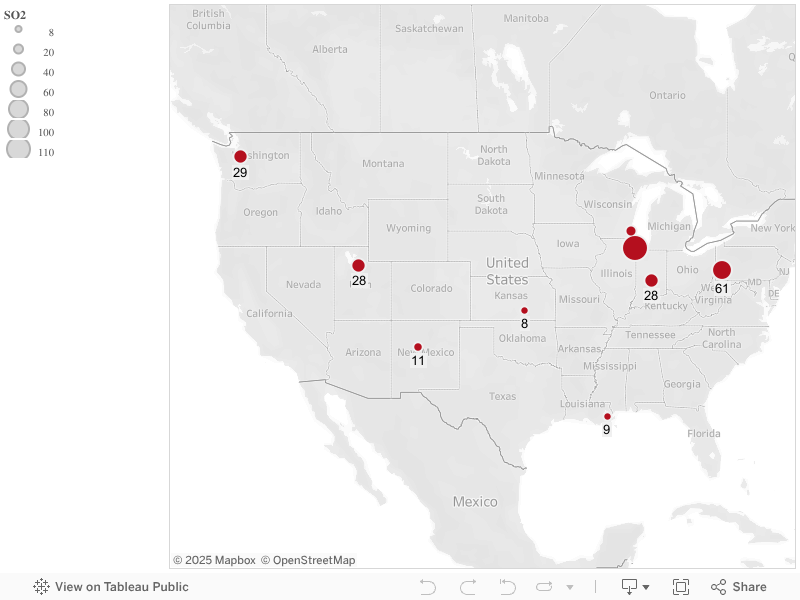
When looking at the data itself, it’s hard to notice that air quality in the midwest and along the east coast is worse than that in the west coast. Chicago, with an SO2 level of 110, has the poorest air quality followed by Providence, which has a SO2 level of 94, out of the 41 cities taken into account. On the other hand, cities in the west coast, such as San Francisco and Seattle have SO2 levels of 12 and 29, respectively.
However, it’s important to note that most of the cities in the dataset are those in the mid-west and east. Major metropolises on the west coast, such as Los Angeles, are not indicated on the map. Considering the lack of diversity in data measurements, the mid-west and east coast may not actually be worse than the west coast in terms of air quality. We would need more records about cities in the west coast to make such conclusion.