Introduction: Mapping the Republic of Letters is a digital humanities project spearheaded by Stanford University that chronicles various interactions between historical century intellectuals and their peers. Through various case-studies of these influential thinkers, the project constructs a fascinating, but incomplete, social network of correspondences.
Source: The sources are highly variable for each subject. Some are in non-English languages (D’Alembert), pull from existing databases (Voltaire and Oxford University), or lack a large number of correspondences (Galileo). Furthermore each case-study has different project leads, start dates, and teams.
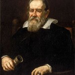
Galileo’s Case-Study: Galileo’s case study is challenging because many of his letters were destroyed purposefully during his trial, or carelessly by his heirs. Either way, the project claims the source material is limited. The material available is from Antonio Favaro’s Edizione Nazionale delle Opere di Galileo Galilei.

Voltaire’s Case-Study: Oxford University’s Electronic Enlightenment Project provided the correspondence metadata. This information was collected in portions that Oxford called “Tranches” that sourced from the New York Public Library, Morgan Library and Museum, Besterman’s Select Letters of Voltaire: Translated into English, and more.
Process:
Again, because of the various case-studies and team leaders, there aren’t unified processes. The Republic of Letters is an aggregation of various smaller projects under the same theme. As Stanford creates new research partnerships, new digital correspondence studies are added. Many of these projects are not even hosted directly on the site. For example, John Locke’s information is hosted on the researcher’s GitHub page.
Galileo’s Case-Study:The letters are organized and segmented by year, recipient, and destination city. These different categories were then statistically processed to create charts and graphs. The database was built from written publications, they had to be entered to be digitally organized.
Voltaire’s Case-Study: The original documents were already compiled by entities like the New York Public Library or authors like Besterman. The leaders of the Electronic Enlightenment Project had to organize them in a digital database for other scholars to easily access.
While the Stanford team did not disclose how they proceeded with the various forms of data visualization, there are many aspects at play for this case-study. The data had to be quantified and statistically analyzed to make visual representations like bar-graphs and pie-charts, segmented for geographic maps of the correspondences, and organized into various categories for the colored keys.
Presentation:There are many visual aspects, like a mapped network of the correspondences between intellectuals and their recipients, or graphs and pie charts showing statistical data regarding information like the number and frequency of letters. Because of differences in the available metadata, not all case-studies are visualized in the same manner.
For the website as a whole, there is definitely a need for UI improvements. It’s never really clear where you should be going–links to visualization are not always clear, some image elements are missing, and the homepage does not effectively explain how to use the website.
Galileo’s Case-Study: The project performed numerous types of metadata analysis to visualize the number of letters Galileo sent per year, Galileo’s recipients, and a calendar of letters categorized by the destination city. The data is not interactive or searchable, because the project only presents the final results as images of graphs and charts with color-coded keys.
Voltaire’s Case-Study: The presentation aspect of this case-study is much more complicated, and is hosted on DesignHumanities.org. By choosing a date range for the letters, three data visualization options are available.
- The first is a map of the geographical locations of his correspondence destinations, made interactive by circles. By clicking these, you get access to a table of information like recipient, date, and a URL to the transcript hosted on the Oxford EE Project.
- The second portion is a stacked bar chart with colored segments. These colors are categorized by “milieu” of the recipient, like “Letters and Sciences,” “State Officials,” “Elite Society,” “Military,” etc. It can also be categorized by gender or nationality.
- The third portion has a visualization of the different combinations of gender, nationality, and milieu.