This week, I took the morbid route of examining the death rates that vary from state to state. Within each of these states, there are all various kinds of causes of death, such as stroke, car crashes, and heart failures. However, I was extremely interested in comparing the suicide rates side by side with one another that varies from state to state. The data that I received my information that I utilized can be found on http://www2.stetson.edu/~jrasp/data.htm. I decided to use the Google Fusion data visualization tool, as I feel that it does an excellent job of allowing the user to choose a way to visualize the data in order to show comparisons. I initially selected the data to be represented by a pie graph, but I felt like this was simply not sufficient in terms of grasping how the suicide rates differed from state to state. So I opted to visualize the data in the form of a bar graph which can be seen here:
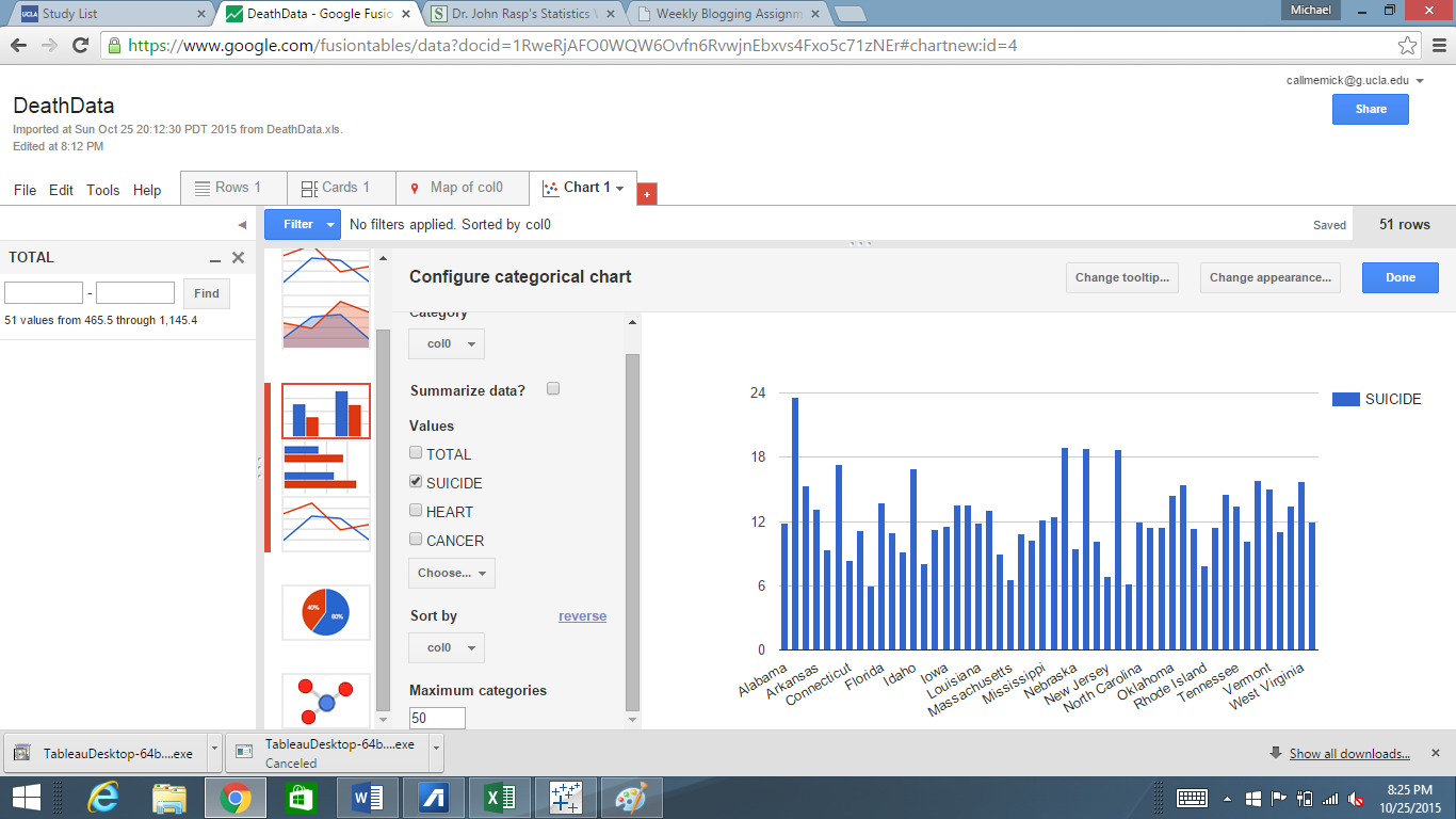
One point of data that immediately sticks out like a sore thumb is Alabama. It seems absolutely wild that almost 25% of all of the deaths that occur in Alabama are due to a result of suicide. New Mexico, Nevada, and Montana are the next three states with the largest suicide rates, as they all amount to about 20% of all of the deaths there. This chart gives the user the unique ability to be able to be able to pinpoint the exact causes of death and be able to compare them to other states. This ability actually serves as a very useful function for those interested in solving these death problems. Take the way I chose to represent my data, for example. A field of psychologists now have the ability to see which states are in the most need of psychiatric treatment. They can ask, why exactly is it that Alabama has the highest rates of suicide, and what can we do to prevent it? If the data was left in the cluttered excel sheet it would be much more difficult to see the relational differences from state to state. I could have also went so many different routes with the google tools; for example, I could have decided to compare heart related deaths from state to state, and the bar chart would have immediately showed which states are in the most dire need of heart health education in as a preventative measure.
This same principle can be applied to any of the many causes of death that the data set records. By putting the data into a convenient bar graph health professionals can come to better understand which states we need to target and in these states which can kind of programs we need to enact in order to help people live a longer, fuller life. I never knew that by simply creating convenient visualizations of data, lives could possibly be saved.
-Michael Mathis, 10/25/2015