The Digital Harlem project is used to display the “everyday life in New York City’s Harlem neighborhood in the years 1915-1930” (Digital Harlem “Welcome”. The creators chose to source information primarily from legal records – District Attorney files, Probation Department files, investigation reports – newspapers, and W.P.A. Writers Program Collection. They present the data as a map.
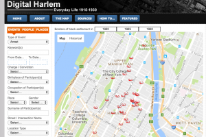 Although maps are often viewed as universally understood, factual, and objective, this is not the case. As discussed in the Drucker reading, humanities visualization is not without interpretation and bias – even in a map. The subjective perspective of Digital Harlem stems from its limited and very specific sources. This map focuses on crimes (police and investigation sources) and events deemed newsworthy (newspaper sources), clearly reflecting the perspectives of the police and reporters of the time. Though the subtitle of this project is “Everyday Life 1915-1930”, it really can not be an objective depiction of everyday life if the focus of its data centers on sensational events. How can an holistic depiction of “everyday life” consist only of criminals that broke the law and events that were reported in the paper? David Turnball asserts that “maps are selective: they do not, and cannot, display all there is to know about any given piece of the environment” (Maps are Territories exhibit 1, page 3).
 Digital Harlem exemplifies exactly what Turnball says. It is not inaccurate per se, it merely leaves out important information that should have been considered. This map reveals the noteworthy events that shaped life in Harlem, but obscures the ordinary happenings that also played a large role. While life events like “Wedding”, “Bowling”, and “Party” are included, it leaves out the common school, work, and home life that makes up the majority of “everyday life”. Digital Harlem makes the assumption that the most influential happenings in everyday Harlem are those 72 that it lists and maps. This is, of course, a subjective decision.
An alternate map could be one that did include more daily events, such as school, work, birthdays, cooking, laundry, etc – events that are more frequent in everyday life. However, these can not necessarily be pinpointed on a map, so perhaps a written section on the side could describe characteristics of daily happenings and include pictures. This would give a more well-rounded, comprehensive illustration of what daily life for “African New Yorkers” looked like. I also imagine that the map could include a photo or newspaper clipping of the events, when a viewer clicks on a map datapoint. By providing this, the viewer may be able to further visualize, empathize, and understand the history of life in Harlem.