DH101

Introduction to Digital Humanities

Author: FrancescaAlbrezzi (page 15 of 38)

Horror Story

I read a Horror story that was about a couple that moved into a haunted house. The couple heard mysterious noises and things kept disparaging from their home. The solicited help from many different people but nothing seemed to work. when they researched their home they found that horrible things had happened in the house throughout history. The wife of the narrator wants to move, but the narrator is strangely connected to the home. The story ends with the narrator finally seeing some of the ghosts in their bed, a couple similar to their own relationship.

Screen Shot 2015-11-08 at 11.01.44 PM

This the first network graph I made. It shows all the characters and if their are alive or a  ghost. It is a pretty clear graph but it fails in showing the other connections between the characters. It is very simple and does not give a view of the complex relationships in the story. It is also unclear in that the ghosts are assumed because they are people who have died in the house, but only two of the ghosts on the graph were actually seen by the narrator, but there was not a clear way for me to show that.

Screen Shot 2015-11-09 at 9.05.27 AM


This second graph I made shows the relationships between characters. It is biased because the narrator and her wife are the two central characters so they all connect back to them. Most of the other relationships are assumed because they were not explicitly mentioned in the story. While this graph provides more relational analysis, it is not the most accurate because it does not show what relation each person has to the other.

The Man at the River

I chose to create a network graph for the characters in the short story “The Man at the River.”  The story is about an American Man who bikes to a river in Sudan with his Sudanese friend.  When they get to the river, the American man is afraid of getting an infection in the water so he decides not to cross.  The Sudanese Man crosses the river where his other friend, Friend 2, tells him to have the American Man cross over the river.  Friend 2 asks the Fisherman to help them by using his canoe to get the American Man across.


This is my node and edge list excel sheet I used.Screen Shot 2015-11-09 at 12.04.43 PM

This is the network graph I created:

Screen Shot 2015-11-09 at 12.04.56 PM

The nodes are the characters in the story. The edges connecting the nodes are who talked to who in the story.  The network graph has limitations because it doesn’t represent the strength of the relationships between the characters.  It doesn’t show who knows who better.  For example, we do not know how long the American Man knew the Sudanese Man or how long the Sudanese Man knew his other friend.  The network shows that the central node of the story is Friend 2 because he interacts with the most characters in the story even though the story didn’t mainly focus on him.  Although, the graph does a good job at displaying which characters interacted with each other in this single situation.

Possession

This week, I chose the story, Introduction: Possession, by Sigrid Rausing from granta.com. In this narrative, Rausing tells a short narrative about her family’s adopted dog, from the time they had adopted him to the time he passed. Rausing describes the passing of her dog and how it brings about a grave sense of ownership, or possession along with death and sadness, which is the theme of the series from this collection.

I took all of the characters in this story and created a network chart on Google Fusion Tables. My network shows simply which characters know who. There are eight characters mentioned in the short narrative, which are (in the order mentioned): the Author (narrator), Daniel (authors son), Leo (family dog), Leo’s breeder, breeder’s husband, the Vet, Vet’s assistant, and Author’s father. They were put on an excel spreadsheet listing all of the connections one by one, making two variables – creating nodes and edges.

I then imported the sheet and created a network table using Google Fusion tables that looks like this.

Screen Shot 2015-11-09 at 11.17.00 AM

By examining this table, it gives a visual representation of how the characters are connected, in this case, if they know each other. As Rausing, the author, is the narrator of this short story, she is the central node in this table. Her son is also one of the larger more central nodes in the chart, as Rausing speaks of her family. Because there is such little information on the characters because these are from a short story, there isn’t too much of significance shown on just the table. If we had more information about the characters and added more variables and edges, we could possibly create another table or a more complex network to show the similarities and differences. This chart only shows how the characters know each other, but if we added something like the characters’ preferences or how long they’ve known each other, or even added more characters that could exist, there will be more content to analyze, thus creating more intricate edges.

Something interesting is that, like discussed in class, the fact that the central node is always the first person we speak to holds true in this network. As we see things from the author’s perspective, there are only characters the author personally know or know of. This creates unavoidable bias in the chart. This may be something to keep in mind when doing our projects for class.

Week 7: Google Fusion Social Network Graph


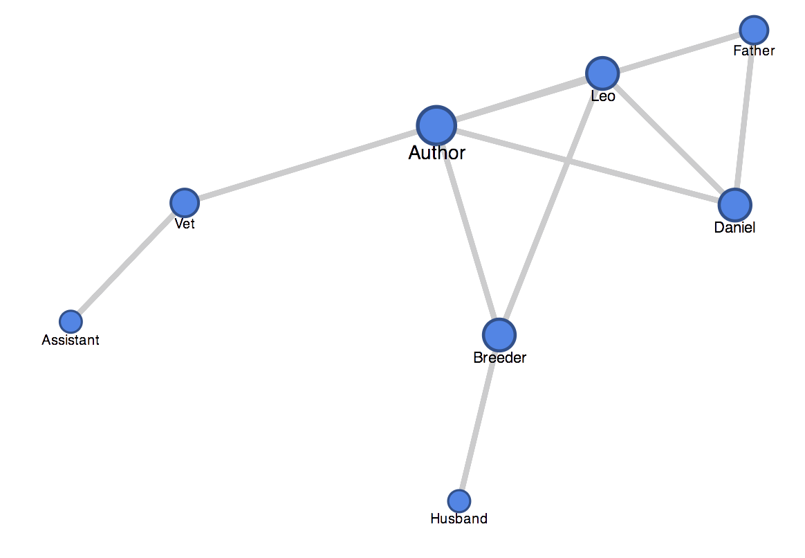
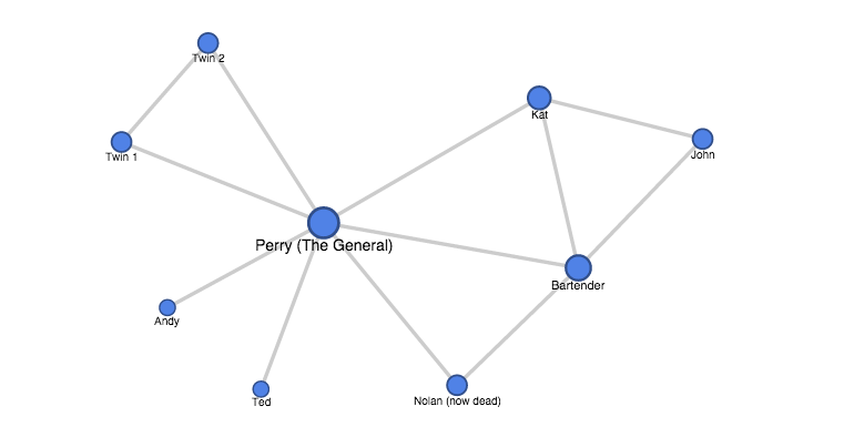
The story I selected was “We Have no Minorities” by George Bowater. This narrative is a reflective memoir about the narrator’s experiences in Turkey and Armenia. The narrator himself is a long-time British reporter and journalist interested in Middle East. Throughout this memoir he describes five key  scenes where he meets different people.

Summary of Story: The first, takes place in a small Fiat, were he meets Sedat, a Turkish Intelligence agent. The second scene happens at an accountant’s office, where he meets Celal the accountant and is also introduced Mr. Ombudsman Bulent, the head of the local branch of the Communist Party.  At this point it is revealed that the author himself is a visiting British writer.  The narrative is somewhat confusing and complex because it involves a lot of historical and political events from the past, which introduce new names and groups in the story; however, the only relationship that could be inferred is that of ideological influence on the main characters. Thus, they were not included in the present network.

The third scene takes place in at the district administrator’s office. The man is referred to as Mr. Kaymakam. He is superior in position and title to all the others.

The fourth scene takes place in Yerevan, Armenia. There, the narrator tell of a time he was invited to tea with an Armenian philologist, where they discussed the social and political tensions between Armenia and Turkey.

The fifth scene takes place also in Yerevan. The author comes across an architect named Armen, who turns out to have previously been near the eastern village of Mush, where the narrator said he came from. As they engage in conversation, Armen tells a story about how he and his good friend had once crossed through a village nearby. They had stopped at a teahouse, where they met a Kurd from whom Armen bought a silver belt – an artifact of Armenian culture that is given to newly-wed women.

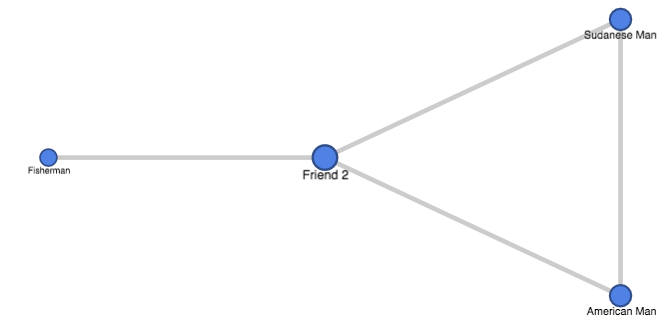
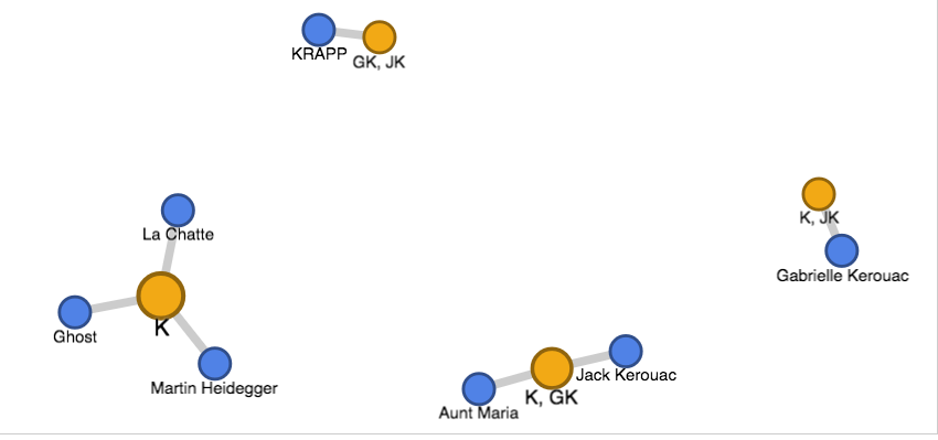
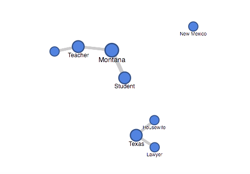
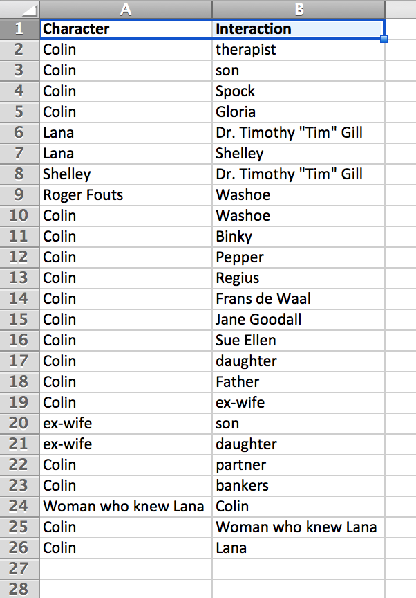
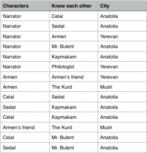
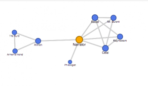
Analysis of Network Graph: For my network graph, I selected my nodes to be the names of people in the story, and the edges show connection between people who know each other (but are not necessarily in the same scene). In my table I also included a column to show which city each character was from, but Google Fusion couldn’t provide a tool to visualize that information. From the graph it is apparent that the narrator is the most central person in the entire network. It is nice that Google Fusion grouped the people whom the narrator met in Turkey in one cluster (Celal, Sedat, Kaymakam, and Bulent). In the other cluster, I decided to include Armen’s friend and the Kurd because they take up an important place in the overall narrative, although they are in no way directly connected to the author. Lastly, we see how the visualization isolated the Armenian philologist because none of the other characters are affiliated with him, except for the author. The colors are coded by nodes – we see that the yellow node – the Narrator – is the most central to the network. Size also plays a role. The Narrator is the biggest because he has edges connecting him with five others. Sedat and Celal are second largest in size as they have four connections each. The philologist, is, naturally the smallest figure because he is only connected to the narrator. This table does a very good job showing the rudimentary connections between key characters in the story. However, a lot of rich data about the quality of their relationships is missing. For example, it is stated that the Kaymakam is superior to anyone else from the Turkish characters. Also, there is a part where the author senses a mutual dislike between Celal and Sedat. These details can in no way be inferred from the present graph. Using an alternative tool, however, it could be possible to express these qualities by adding direction and weight to the edges and/or by adding extra features to the nodes (borders, shadows, etc.). Another aspect of the relationships that this graph neglects to show is time. We see that Armen is connected to Armen’s friend and the Kurd; however, unless we actually read the narrative we’d never know that this connection happened  serendipitously nearly twenty years before Armen and the narrator ever met. Using another tool, this information could be illuminated by perhaps adding a layer to this cluster that would make the colors appear less bright and more faded.


One More Last Stand- Network Graph

I chose to work with Callan Wink’s short story titled, “One More Last Stand.” In the story, Perry is an actor in the Custer’s Last Stand re-enactment and travels to Little Bighorn Valley for the three day show. He involves himself in an affair with another actress, Kat, each time they meet.

I built my edge list with the criteria of who each character knows (broadly). For example, it is never explicitly stated that Kat knows the new bartender, yet she received Perry’s request which supposes that Kat knows the bartender and has talked to him. I also excluded people who were just mentioned and did not add to the story.  I surprisingly had a lot of difficulty in making my nodes list, too, which I definitely was not expecting. Considering that the short story is told mainly from Perry’s point of view, I expected that Perry would link with the most number of people.


Screen Shot 2015-11-09 at 11.09.30 AM

After looking at my network graph, my initial hypothesis is correct. However, the new Bartender is actually linked to many people as well. I likely could’ve graphed this by hand because the connections between characters was fairly straightforward and not as complex. While this illuminates that Perry and the Bartender are the most popular/ people with the most connections, this network graph doesn’t demonstrate how people know each other (including marital link, location, time frame). Finding a way to show all of these would likely produce the best network graph for the short story.

Network Map of a Poem


John Rauch

DH 101 Blog

I chose to read ‘Krapp Hour’ by Anne Carson from the ‘American Wild’ issue of Granta (http://granta.com/krapp-hour/). This is a poem, but written in the form of a screenplay. The poem itself is not very long, and thus, does not have many characters or events in it. All I was really able to do was gather information about when these characters spoke to one another. This is what my table looked life for this poem:


Screen Shot 2015-11-09 at 10.22.31 AM

I then made my network graph according to this parameter:

Screen Shot 2015-11-09 at 10.28.27 AM

And this was the visual result:


Screen Shot 2015-11-09 at 10.22.20 AM

If you ask me, this network graph is rather disappointing. There appears to be no real relationship between characters, other than they all talk with KRAPP, who is the host. This is not surprising information that could only be known from the graph. This network graph is limited by its lack of information. I realize now that a poem, which is quite abstract, is difficult to create a network map for because there is no clear story plot. This screenplay is sort of random and confusing to me, to be honest. However, I am not well versed in poetry so perhaps I am unable to see its significance due to my lack of knowledge. Anyways, what I took away from this project is that not all things create a useful network map. Or in other words, just because you can make a network graph of something, doesn’t mean you should do it. Not all graphs are meaningful.

Blog 6 – Short Story Network Graph

The Story I chose came from the American Wild issue, titled “Exotics” by Callan Wink, which follows a man named James through troubling times trying to find himself.

James, is seemingly going through the loss of a significant other, whom he was going to propose to, but something came in the way.  It never fully approaches who she is or what exactly happened but we do follow the scene in which, James is with another lover whom seems to be the woman he cheated with.  The story is somber and follows a mid-west teacher, trying to find himself in a short summer mixed with Texas accents and hard work. James admires his wealthy brother, who is married and seems to live the ideal life.  However, after staying a short time with him brother , Casey, he decides that the perfect life isn’t for him and travels to Albuquerque. James begins working on a ranch in New Mexico, where he feeds wild life and mends fences, becoming a “real man.”

While, James seems to doubt his abilities.  He receives a call from his brother who longs for a life Jmes leads filled with drinking beer, and being out in nature. But James, then realizes that that life isn’t for him nor his brother and contemplates with his boss Karl, what he should do.  They began talking about a zebra as an analogy.  The zebra does not belong in Texas, it instead belongs in the Sahara.  In Texas it would get hunted down for game, and would not succeed.  Whereas in Africa nature may have a better chance of taking its course.  James then decides to quit avoiding his own problems and return back to Montana.


screenshot

The above image is how I have categorized the character’s in the story mentioned.  Some know James, other do not.  James is considered indecisive because he does not know himself well enough to identify. I tried to include the graph link, however I had a hard time identifying the html format.  However, below I have included the graph images that correspond to my excel image above.

The connection to all of the characters leads back to James, and how they have evolved changed, and made the story more interesting.  They are split up by relation, occupation, place and their knowledge of James.  I realize my flaw in putting relation, because I should have put James for all the related people except Ellen Realbird.  However, since I did it this way the nodes will not all correspond to James, but rathe r a different set of nodes of how they know James instead.

Screen Shot 2015-11-09 at 11.19.12 AM

Screen Shot 2015-11-09 at 11.19.24 AM


Screen Shot 2015-11-09 at 11.18.56 AM

It is interesting to point out the sense of place within this story as well, because it ventures to 3 different locations varying ” American Wild” which relates back to the original theme of the issue. Supporting that place is beneficial to James, and the story itself.

Please Tim Tickle Lana

For this week’s blogging assignment I chose to read the essay, “Please Tim Tickle Lana” from Granta’s magazine themed “Do You Remember.” The story is about the author, Colin McAdam, and his interest in studying chimpanzees and how this study has affected his life. He mentions many different characters throughout the essay and although he does not meet most of the people he talks about, they all have something to do with his memory. 

I first wrote down all of the characters that Colin mentions throughout the essay and compiled them into a list: This became my character list. I then proceeded to create my edge list, by choosing to connect people based on their interactions with each other as told by Colin McAdam, our narrator. Below is a screenshot of my edge list. 

Screen Shot 2015-11-09 at 1.36.16 AM

Then, using Google Fusion Tables, I created a network graph that very clearly shows how Colin in the central figure in the story. Screen Shot 2015-11-09 at 1.39.22 AM

This is not new information, however the chart shows how central he is, and how close all the other relationships are outside of him. We see that Colin is a very central player, but this is his memory, therefore we don’t actually learn any new information about his relationship to the other characters. We see that some of the people Colin are connected to are actually connected to others through the memory he has of them, but unfortunately, it does not tell us anymore information about their relationship. 

One More Last Stand

This short story, centered around Perry and Kat’s affair, takes place during their 7th year participating in a reenactment of Custer’s Last Stand.  Through the story, it is clear that they are both the central figures of the plot.  The network graph below depicts the implied relationships or interactions with characters.  In it, Perry and the bartender are shown as central figures.  Perry, being the center of the narrative is understandable in this, the bartender, however, is less of a predictable center.

In the story, it is revealed that he is related to Kat and knows her grandmother and husband.  At the same time, he interacts with Perry.  While this is fitting with the stereotypes of his job, it does not necessarily tell us anything about the story or the interactions that take place. visualizations

What the network graph does do a good job in depicting is how separate the various spheres of Perry’s life are.  Which is understandable considering his extramarital affair with Kat.

While slightly helpful, this network graph is not the most effective way for understanding these connections.  There are so few characters in the story that one can be aware of al the connections without the visualization.

Week 7: Short Story Network Graph

For this assignment I focused on Last Man in Tower by Aravind Adiga, which follows an old man’s day in Mumbai. The man, Masterji, reflects and encounters a number of different people throughout the story so I knew any graph I made would like result in his being as the center of all connections.

Last Man in Tower


The network graph I ended up creating draws connections between the characters based on who they know. Though obviously Masterji is at the center of the chart, I thought it was interesting how the graph was able to reveal the influence of Sonal, Masterji’s daughter-in-law, in his life. This is especially significant since Sonal acts as the would-be antagonist in some ways since Masterji dislikes her, and he seems somewhat disappointed in her raising of his unnamed grandson. The chart is limited in that it fails to define the relationship that connects the characters. Having read the story I can see that the chart clearly divides into Masterji’s family and then his acquaintences and neighbors. Something I had trouble with was deciding whether Masterji’s dead wife Purnima would have had all the same connections as he did in terms of neighbors, etc. and though its more than likely she did, I felt it best not to assume since it wasn’t explicitly stated in the text. Assuming she did know all those people the chart would shift to Purnima being just as central as Masterji, signifyng just how devasting her loss was to Masterji’s everyday life which is a central point in the story.

Older posts Newer posts

© 2026 DH101

Theme by Anders NorenUp ↑