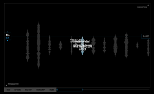
I examined the project “Blood Sugar,” a voice archive compiled from painstakingly recorded interviews with participants in an HIV prevention and needle exchange program in Oakland, CA. This is taken from vectors.usc.edu
When first opening the project, there is a long voiced narrative playing with long sound wave shaped figures moving. These figures shrink and grow and change shape. On the bottom of the screen, there is a menu bar that runs with four options: Help, Options, History, Transcription, and Index, with more sub-options within options, to control the audio.
From my observations, I think this site is very easy to navigate and is user friendly overall. The project is very aesthetically pleasing and engaging to the user. However, when I first opened this project on my computer, I was a bit confused as to what my options were in navigation. Like many other websites and projects, I assumed there to be a short audio and visual introduction before displaying the content of the project. I sat in front of my computer and listened to this voice talk for several minutes after realizing that the voice was not an introduction- it was the content of the project. The different sound waves were the interview pieces of each different person. As I started clicking around, the voice still played and I discovered options to mute, play, and otherwise control the audio, and the transcription pieces and other written content of the project. That was when I fully understood how this project was designed. However, most of the content was not at all hard to navigate.
My other criticism for this project are the layers of the pages. The background and audio continue to be present in the background as a faded backdrop. However, as we click more and more pages, they all overlap one another is the “close” button is not clicked. This makes the pages somewhat hard to read, and confusing as we close all the pages to clear the main page of the interface.
Although there are a few design elements I disagree on, this project is successful. The idea behind the project as stated by the editor, is said to create a “subtle parity between the “user” of the interface and the IV drug “user” who is, for many of us, ordinarily held at a distance if not ignored entirely.” Unfortunately, I personally don’t think I would have understood this concept had I not read the editor’s statement and just explored the project on my own. After examining both, I understand the design of the project, but nowhere in the project does it explain or give obvious clues to the reasoning of it.
