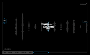
For this week’s interface blog assignment, I chose Sharon Daniel and Erik Loyer’s Blood Sugar. Blood Sugar is a “voice archive” that features interviews from participants of an HIV prevention and Needle Exchange program in Oakland, CA. The audio details the experiences and feelings of intravenous drug users.
Blood Sugar has a theme and aesthetic that captures the same feelings of intimacy , isolation and closeness that are heard in each of the users confessions. I was definitely left with a new understanding of addiction after each addict’s testimonial.
The site was powerful in its authenticity but in stark contrast was unclear in terms of navigation. Before you even commit to launching the interactive flash site, it is not explicitly clear that Blood Sugar is about intravenous drug users. There are several definitions of blood and sugar and details about the project’s collaborators but no outright description of its purpose.
Once I launched the site, there is an introduction by Sharon Daniel that explains the purpose but not how to effectively navigate the site. I then just began clicking different names and hearing corresponding stories. Each story comes with a set of terms to click on and deeper explore issues connected to drug use. But if you aren’t careful you can accidentally click on a different users terms while another users confession is playing.
The design process for Blood Sugar was a particularly arduous one, and a reminder of both the dangers of technological determinism and the value of face to face collaboration.
Erik Loyer, Blood Sugar Designer
The above quote is found in the Vector Journal’s introduction of Blood Sugar. I think it highlights the collaboration problems that led to Blood Sugars confused interface. Technological determinism theory basically asserts that technology provides social change. I assume Erik Loyer is saying there was difficulties in collaboration because the creators weren’t working face to face. The narrative and the technological aspects of Blood sugar clash and that makes it hard to navigate. I think the collaborators were effective in the emotional impact of the project but had different views on how the layout should be connected to each story. Its obvious there was a decision to have stories overlap but because boundaries weren’t clearly defined certain things got muddled. I think if they wanted to keep the interwoven aspect of the site they should have had better communicated to the users how to go about those connections with out mixing up the visual and audio portions.
