I choose to work with the Pollution dataset that provides the, “air quality measurements on 41 U.S. cities,” from data gathered from, A Handbook of Small Data Sets, edited by D.J. Hand, et al. This content model of this dataset includes eight content types: City, S02, Manuf, Pop, Temp, Wind, Precip-in, and Precip-day. This is very limited data as it does not provide any information about what year/s the data for each city was collected, or represents. Also the content type “Manuf,” I am assuming refers to “Manufacture,” which I believe refers to industrial production in each city, but I am not completely sure.
I used google fusion tables to develop two different charts to visualize the data. Firstly I made a horizontal bar graph that lists all 41 cities included in the dataset and the levels of SO2 in the atmosphere.
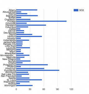
This visualization is able to simultaneously display the numerical SO2 outputs for each city and which city has the highest SO2 output. It also allows you to compare the SO2 outputs of each city in relation to one another. However, this visualization does not show you the exact number of SO2 output, that the dataset provides. This data visualization is problematic because it does not provide any information about the time periods in which this data refers to. Thus, the data visualizations I created, I believe could be misleading, or used to misinform just like the examples we looked at in class last week.

This Visualization allows you to correlate the SO2 output, population, manufacturing, and temperature in any given city. One can draw comparisons between these different elements to prove that one affects the other. However, this graph gives the allusion that you are tracking these rates over time because the lines are all connected, when in reality they are separate cities.