19th Century Caribbean Cholera
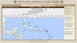
The 19th Century Caribbean Cholera maps the series of outbreaks on both a timeline that is shown on the timeline bar provided above the map, as well as the geographic locations of which the outbreaks occurred at those time periods. Through the utilizations of maps, the viewer can visually grasp a more clear understanding of how cholera spreads amongst countries in a given amount of time and how the disease can just as easily travel across sea as it travels across land. Furthermore, the timeline presents the 3 main periods of which cholera outbreaks were particularly significant (1833-1834, 1850-1856, 1865-1872), providing the details of each individual affected location within those three periods through a brief written explanation.
Although many people may consider this data to reflect the people who were affected by the disease during these time periods, I personally feel that this map reflects a statistician’s, or medical analysist’s, point of view of cholera outbreaks. As what any type of mechanization may do, the map only illustrates the data of the numbers of people affected by cholera rather than articulating those people as individuals with agency, stories, and pain. And it is with this nuance the distinguishes the audience that this map is really meant for. The mapping does a great job with the factual descriptions of the numbers of people who have died from such outbreaks; yet, it fails to measure the humanity in which the data is supposedly supposed to reflect. Therefore, I believe that this map better reflects the outsiders who do not face the outbreaks of cholera and simply study it as factual statements.
The map reveals the way in which cholera travels across a landscape, and more importantly, how cholera seems to instantaneously arise in random locations “out of nowhere.” When scrubbing the timeline, the viewer can see the little mapping markers pop up in the various locations that cholera suddenly outbreaks in. For the most part, the markers stay conglomerated around the area of Cuba. However, after a long period of no cholera outbreaks, one suddenly appears in other countries . And to me, it reveals that no one is immune to disease and that one country’s pandemic issue really becomes everyone’s issue as well. The map does obscure certain locations, because some of the points are located in the middle of the ocean — and if no one is there, then no one can get the disease in the first place. So due to some possible location miscalculations, it does beg the question of the map’s validity.
An alternate map could potentially be a map that is more focused on the humanity of the cholera outbreaks, catering more towards the people who actually faced the hardship of these outbreaks rather than servings towards the analysts. However, as far as the visualization of the maps go, it could be more interesting to have the maps be colored in a way that there is more intensity in the color’s hue in locations with higher deaths by cholera rather than all points having the same color and marker.