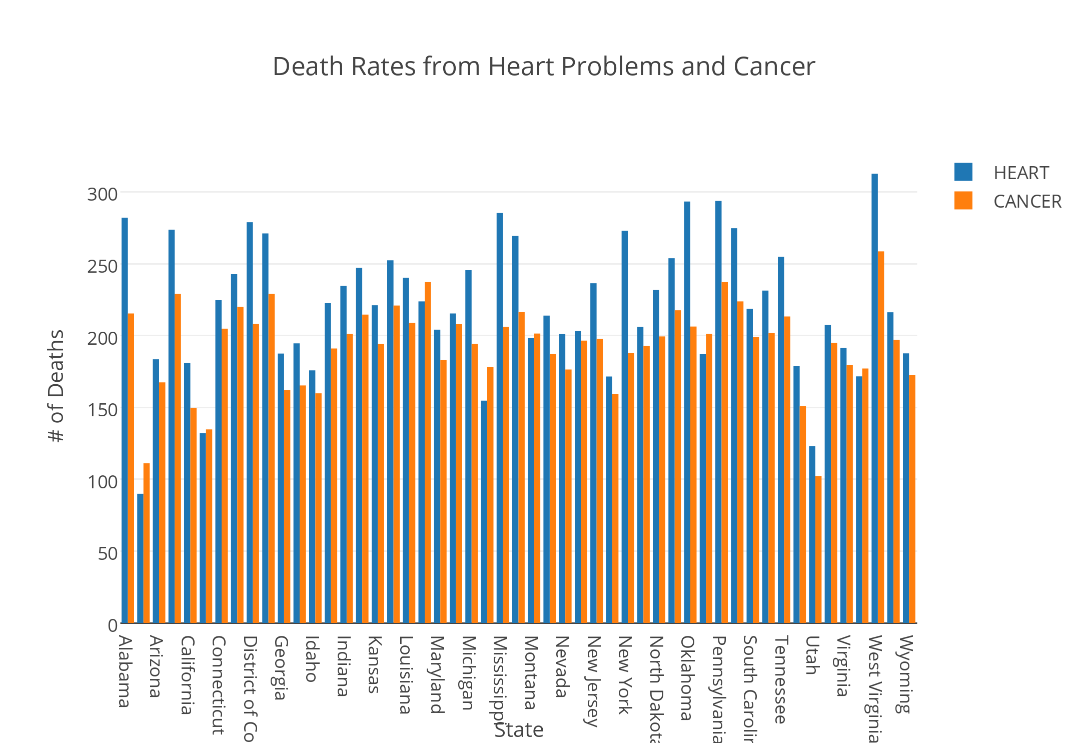
The visualization tool I chose to use was Plotly. I created a double bar graph using the death rates data. The x-axis listed all of the states included in the data, and the y-axis contained values from 0 to 350 that represented the number of deaths in each state. Unfortunately, the year that this data was collected was not included in the file. I chose to represent the death rates caused by heart issues and cancer. By viewing these bars side by side, the user is able to discern a relationship or a potential correlation between the number of deaths caused by heart problems and cancer.
The juxtaposition of the two bars side by side reveal that spikes in the number of deaths caused by cancer were coupled with spikes in number of deaths caused by heart issues. States that exhibited these spikes included Alabama, Arkansas, Mississippi, Pennsylvania, and West Virginia. This bar graph could lead to more research in exploring the reasons for these spikes. I would assume that environmental factors coupled with lifestyle differences in these states led to these increases in heart conditions and cancer. However, I would need to conduct more research to confirm this.
Overall, the states have higher rates of death caused by heart conditions than deaths caused by cancer. There is one exception to this observation: Maine. Maine has a higher occurrence of cancer than heart issues. It would be interesting to explore this correlation. But, it is important to remember that these correlations do not imply causation. While a digital humanist can research factors in Maine that could lead to higher rates of cancer, these factors would not definitively provide a reason for the relationship of the data.
Despite this exception, there still seems to be a relationship between the number of deaths caused by heart problems and number of deaths caused by cancer. Both are proportionately increasing and decreasing across states. To further explore this relationship, one could research what similarities and differences persist across the states that could have caused these related fluctuations.
Ultimately, this data visualization tool revealed a relationship between the categories I plotted on the y-axis. In this way, it created new research questions and opened doors to discover more about the states themselves. Data visualization enables the researcher to view the data from a different perspective. This lens can enrich the conclusions that the researcher arrive at and answer questions that the data alone was not able to answer.