Course blog

Week 8: 8 Rules, 4 P’s

The importance of “consumer-centricity”.

I was really interested in this week’s piece on the “Eight Golden Rules of Interface Design” by Ben Schneiderman because of its explanation of what attributes generally make for a successful website. In these rules, Schneiderman explicitly details features like shortcuts, consistency, communication, and ease in relieving troubleshooting errors. As someone who is new to web building and design, some of these details were a little too technical for me to totally grasp. Technical terms and concepts aside however, I was very excited to notice Schneiderman’s repeated emphasis on the specific UI issues he pinpoints for the explicit purpose of making all aspects of the site cater to the user as much as possible. I read many of the DH 101 posts this week and enjoyed exploring the gorgeous, streamlined, unique websites that were shared. Perhaps most remarkable to me after exploring these sites was realizing the sheer amount of ease I had navigating each and every single one, despite my basic computer skills and lack of experience with each website. I had always wondered what kind of skills made for an enjoyable website and always imagined these skills being some kind of “coding superpower”, when in reality, as this week’s reading demonstrates, a website’s success is more so ultimately dependent on its creator’s attention to his/her audience. (After all, what good is a website if no one can figure out how use it?)

The Four Principles of Marketing.

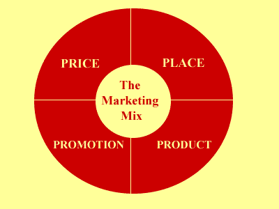
These stipulations and their overall focus on the end-user and their experience of a site struck me as an extension of the more broad principles dictating marketing strategy. Called the “4 P’s (Principles) of Marketing”, these principles broadly dictate a marketing strategy as built upon product, price, placement, and promotion. Thus, in order for a marketing strategy to be successful, it must acknowledge and make clear to its customer base the product involved, the price of the product must be clear and competitive, the placement of the product that will allow the customer access to it, and the promotion of the product to inform the audience of all these details. While all of these details, when delved into, are incredibly technical, these rules, like those delineated by Schneiderman, are overwhelmingly customer-centric. A product is only as useful as it is useable by its customer, as it is affordable it its consumer, as its is available to its consumer, and as it is acknowledged and understood by its consumer. As a fellow consumer of products and services, whether it be a chocolate bar or a website, it is certainly incredibly comforting to know that these products and services are invested in making these products and services for its consumer and, more importantly, that these products and services are only as successful as they are invested in their consumer.

Schneiderman’s article: http://faculty.washington.edu/jtenenbg/courses/360/f04/sessions/schneidermanGoldenRules.html

Marketing Mix: http://www.3msage.com/?p=197

Digital Fetishism?


In “So the Colors Cover the Wires: Interface, Aesthetics, and Usability”, Matthew Kirschenbaum mentions how our desktop views  in laptop and/or computer systems are “oddly unlovely, dull and listless”. I find this interesting because technology seems to be advancing at a rapid rate, so we can see the many changes that go into interface design, especially with computer systems and also cellular “smart-phone” devices. One personal example would be my experience with Windows XP. With this interface design, all you had was a desktop with a background and various icons, a start button, and some utility icons on the bottom right. Compared to contemporary interface designs, Windows XP seems too flat and boring. There were ways to customize your home interface screen by downloading different interfaces online, but for the most part, the theme remained the same. You can also change your background wallpaper, but that was pretty much it for customization. The look for this interface remained for a long, long time until Windows 8 came out. With Windows 8, we can definitely see a drastic shift in design. Your homepage is no longer the desktop screen but a colorful arrangement of tiles and icons that display the top files or the most useful applications. Here, we can tell that Windows focused much more on the artistic design of the interface, perhaps to appeal to the touchpad or tablet device market.

Windows-7-vs-Windows-8-slim_thumb

I bring this up because, in his essay Kirschenbaum quotes a passage from Nathaniel Hawthorne’s “The Artist of the Beautiful”. In this passage, we read about how a tiny, mechanical butterfly flutters forth from a jewel box. Hawthorne describes this butterfly in such a life-like, real, and beautiful way that it seems like the butterfly was not man-made. This butterfly seemed more than real; it had some sort of character that was spiritual, perfect, and captivating: “‘Wherefore ask who created it, so it be beautiful?’ … ‘it may well be said to possess life, for it has absorbed my own being into itself; and in the secret of that butterfly, and in its beauty … is represented the intellect, the imagination, the sensibility, the soul of an Artist of the Beautiful!” The artist’s creation is a reflection of his soul, an energy or an aura that pulls the interactor into the artist’s sense of being in way where our being emerges with the creation. I thought that this was fascinating because I can see a pattern these days especially where people become attached to their phones  (ex. Iphones) in peculiar ways. Without their cell phones, they feel naked and lost. It’s as if their phones are an extension of themselves or at least carry a part of them. Whatever it is, there is definitely some sort of technological or digital fetishism that is occurring these days.

Week Eight: The Importance of Design

Matthew G. Kirschenbaum’s article “So the Colors Cover the Wires”: Interface, Aesthetics, and Usability” reminded me a lot of chapter one “What is Design” in Design for the Real World by Victor Papanek.

Kirschenbaum’s discussion of interfaces as “layers” and the “distinction between different layers of interface…and ‘content’ is one that runs counter to decades of work in literary and cultural criticism, where form and content are almost instinctively understood as inextricable from one another.” To developers, the interface is computationally distinct from the content it intends to portray. However, Papanek states, “Design is the conscious and intuitive effort to impose meaningful order.” By designing an interface, the developer is imposing an order on the content that cannot be separated from the visualization. The biggest question in design is whether the design should be functional or aesthetically pleasing. Papanek describes six parts of the functions of design in order to answer the question. These fuctions are as follows: method (tools, materials, processes); association (education, culture); aesthetics (gestalt, perception); need (goal formation); Telesis (technological bias); and use (as tool, as communication). All designers need to take these six functions into consideration in order to produce a functional and aesthetically pleasing design. However, many designers strive for a more concise statement that the six functions: they seek precision, simplicity. For Papanek, “the particular satisfaction derived from the simplicity of a thing can be called elegance. When we speak of an elegant solution, we refer to something that reduces the complex to the simple,” much in the same way developers seek to create an elegant yet simple interface.

An example of an elegant interface I have recently discovered is Freunde von Freunden’s website. In April, FvF published the article “Rethinking Storytelling and Usability: FvF’s Approach to Digital Publishing.” It details the development of a new interface “as a matter of usabilFreunde-von-Freunden-Richard-Phillips-Dev-791x692ity in synergy with content and aesthetics.” Since FvF publishes many interviews with guests that involve exploring their neighborhoods and studios, they decided to redesign the individual story pages that “interweave visuals with writing.” In the article FvF discusses their steps in developing the new interface, including a new feature they had to develop from scratch in order to “combine image, text, and video into seamless stories.” This article directly ties back to Kirschenbaum’s about the difficulties of creating interfaces, as well with Papanek’s writing on successful design.

Beneath Technological Surfaces

iPhone-Interface-Beauty-Shot

Have you ever thought about the importance of computer interaction? Because of its recursive nature, these magnificant interacting tools are often seen as a prioty or necessity, rather than a precondition found in todays computing experience. Matthew Kirschenbaum wrote in , “So the Colors Cover the Wires’: Interface, Aesthetics, and Usability”; his chapter he discusses how the much stake is rest in the interface communications. He brought about a few examples when humans fell due to the failures of machines, for example in the case of Therac-25, many people passed because of radiation overdose when machine began administering higher doeses due to interface failure. He also brought up other examples of interface defects which resulted in a planes machine failure, causing it to crash.  You may ask, what is an interface? He describes it as a surface or boundary where two or more systems, devices come into contact and interact. The point of interfaces is to have no interfaces; a well thought through interface will allow the user to ignore the seperation grap found in these disconnected systems, and instead left as the machines little “secret.” Interfaces allow us to believe in a computer realm where almost any humans can connection and intermingle with others. This article presented excellent examples from an aray of fields, he even mentioned Frankenstein! I appreciated the stress placed on beauty, as he states that aesthetics may be the most crucial part of the computing experience. There is a distinct divide in the computer life between human and machine. But because of the beauty in interactive experience, the hidden nature of interfaces, and the easy essence of these machines, we disconnect from hardware which produces these experiences, and instead use it as an extention of the mind.

This weeks reading made me think about the personal computer and these smart phones that are in the hands of oh so many humans. What is  life with these technologies like, how is it that we have developed such a deep relationship with these devices? I think it is because of the hidden nature of interface communications and the real-time experience of the Internet. These devices are the key into this virtual world, where everyone gathers, shares, experiences, and so much more. There are moments where I feel like these technologies have disconnected us our reality, and into this indirect sphere of constructed identity. But at the same time, I see the beauty in the communciation, and the love that can be shared in these friend circles. Yet I am afraid of the underlining power and dependence that will only continue grow over years, I mean what will they think of next…


Digital Complementing

Occasionally, I come across certain projects or public archives that really stand out to me in how they utilize digital capabilities to present the information in an organized, clear, and unique way. This week, I felt this way while taking a look at Evan Bissell and Eric Loyer’s Freedom Ring. The project focuses on Martin Luther King, Jr.’s “I Have a Dream” and allows the user to explore this speech through audio, written text, images, and other related media. Not only is the focus interesting, but the way everything presented is very attractive standing alone; the website uses an auto-scroll, presenting drawings, posters, and other images, while playing the audio of King’s speech and giving the option for the written text to be displayed. This project, in my opinion, uses the digital in a captivating way to complement the element of humanities, which is how all digital humanities projects should approach presentation.

Although the interface is not quite the same, I was reminded of the Los Angeles Holocaust Museum while looking at Freedom Ring, mostly because I also really enjoyed the way the museum used the digital for their presentation. The LA Holocaust Museum revolves around storytelling, capturing an endless amount of stories of survivors as well as biographies of famous European-Jewish people alive during and affected by the Holocaust, including Sigmund Freud, Peter Lorre. Since the museum presents so much information for visitors to choose from, they use an interactive interface for easy accessibility and sorting. They also offer iPod Touches and headphones for free to aid this experience. Through the use of the iPods as well as the touch-screen interface of many parts of the exhibit, visitors can go through a wide variety of survival stories, biographies, and descriptions of historical artifacts pertaining to World War II, Judaism, and/or the Holocaust. What really attracted me to the way the museum presents the archives is how visitors can shape their experience, which is through the interactive interface that allows them to choose what they want to learn about. Personally, I listened to a lot of the biographies and stories because I already know quite a bit about the event itself, so I wanted to take advantage of all the new and personal information pertaining to the specific individuals included in the archive; although others’ experience could do nearly the opposite, which the interactive interface allows. The interactivity of the interface would not allow as much variability if the museum neglected digital capabilities.

IMG_5802.JPG

Week 8 – Problems with Target’s Interface

This week’s readings got me thinking about the efficiency of many of the websites that I use regularly. I am a frequent online shopper. One of the websites that stands out to me as being inefficient is, sadly, Target.com. In reality, I love Target, and would go there over Wal-Mart or any other store. In contrast to Target stores, The Target interface looks cheap and outdated. I was looking at it with some of my friends and one of them commented that it looks like a “fake, scam website”.

Screen Shot 2014-11-24 at 12.23.04 PM

Other than the physical appearance of the Target website, it also fails to adhere to some of Shneiderman’s “Eight Golden Rules of Interface Design”. For example, the fourth rule, “Design dialogue to yield closure”, is defined as, “Sequences of actions should be organized into groups with a beginning, middle, and end. The informative feedback at the completion of a group of actions gives the operators the satisfaction of accomplishment, a sense of relief, the signal to drop contingency plans and options from their minds, and an indication that the way is clear to prepare for the next group of actions (Shneiderman). Target.com should employ a more controlled vocabulary. When I looked up “pillow” over 2,000 results came up. Some items that do not relate to pillows also appeared, indicating that there metadata is inconsistent. Frequently I will google something, be directed to the Target website and then the results on the page will not be what I looked up. For example, I’ve done searches for a jacket and have been given some jackets and other random items came up in the results too.

When describing the “Eight Golden Rules”, Shneiderman uses positively reinforced diction, such as, “accomplishment, sense of relief…modest” to convey that the user should feel comfortable using the designed interface. Technology is meant to make things easier and more accessible, but when we face technological problems, many people become extremely upset because they don’t know how to fix them, and feel powerless and confused. This concept is reflected in the 6th rule, “Permanent easy reversal of actions”. An easy way to go back is meant to make unfamiliar users feel less stress and encourages them to try new things because if it is wrong they will be able to get back. Trial and error, and exploration are necessary when learning a new technology. Most of the time, I can figure technical problems out when I just experiment and try a few new things. My grandparents struggle with technology because they are afraid to mess up and become panicked when there are too many options presented to them. Luckily, the internet has the back arrow, which alleviates this problem for the most part.

A Poorly Designed Interface

After reading Shneiderman’s “Eight Golden Rules of Interface Design”, I was immediately reminded of the shortcomings of my online Spanish course. Half of the class I am enrolled in this quarter exists online, with online tutorials and lectures, homework assignments, and study guides. However, I constantly find myself frustrated with the layout of the website, as the location of certain things within the site is not the most intuitive. I have to waste so much time just trying to find certain parts of the website in order to complete my work, when it could be much more streamlined and time efficient. I have decided to compare Shneiderman’s rules to my Spanish course website and see if its shortcomings can be attributed to the breakage of them. The following rules are broken:

(One can only see the website if you are enrolled in the class, so I have provided a screenshot of the page a student spends most of their time on [but ironically is NOT the homepage] to hopefully better understand what I am talking about.)

Screen Shot 2014-11-24 at 11.20.49 AM

1 – The website is not consistent with the way it words it’s items. For example, I can reach certain tutorials under the “Tutorials” tab on the bar, but not all tutorials are listed there. To view others, you have to go under “Course Materials” and then try and remember what specific chapter your question falls under, then look under that file in order to find the rest of them. This splitting of all tutorials makes it very difficult when searching for help on something specific.

2 – There is no opportunity for the user to create shortcuts to best suit his need. He has to go through a few pages in order to reach the homework section each time, and from there click on the specific activity each time to complete it. There is also no bookmark feature to save helpful tutorials to review again. You have to go through the painstaking process of searching for it (described above) every time you need it.

3/4 –When completing a homework series, one completes different activities that are independent of each other. Only when every activity is complete is the assignment complete. However, nothing notifies you when you have completed the assignment, so you must constantly go back and check that you did not miss any activity. Also, the activities are designed to be in sequence with each other by building off the tutorials and increasing in difficulty. However, it is up to the individual teacher to assign the sequence of activities, and many times it is inconsistent with how the activities were designed. As a result, the topics of the activities jump around and there is no set beginning, middle, and end.

5/6 – There is a big possibility to make serious error as a user, such as exiting out of an activity before you are done. There is no opportunity to reverse this action once its complete, and therefore you are unfortunately stuck having to do the entire activity again.

Since I am so familiar with the downsides of having a poorly-designed interface, hopefully I can help my group avoid these errors when we design our own!


Week 8: Interface Design and Apps

When it comes to any digital platform, an extremely important element is the interface design. In the reading by Ben Shneiderman, her explains the “Eight Golden Rules of Interface Design”. We already know that design is important when it comes to the digital platform of the internet and websites.  Although the interface design of websites is that we will be more focused on in this class, something else I find interesting is the interface design of apps.  In today’s modern world, all of my peers have smartphones that they rely on.  On these smart phones, especially the iPhone, there are built in apps and supplementary apps that can be downloaded.  These apps must be designed to be user friendly and therefore follow the eight golden rules of interface design.

An example of an app that is extremely popular, and therefore must have a good interface design is Instagram.  Almost every person I know has an Instagram, and although I’m sure it can’t account for all of the success, I am sure some of Instagram’s success can be attributed to a successful interface design that is easy for users to operate. The first golden rule is to strive for consistency. An example of a way that Instagram maintains consistency is that all pictures are presented in the same format.  It is very easy to see when a picture was posted, and by who because it is always displayed in the same way. The second is to enable frequent users to use shortcuts. Something that could be considered a shortcut is that instead of looking for a person’s picture on the newsfeed, the user can also type in and search a person’s name if they know it. The third is to offer informative feedback. The main source of feedback is the number of likes and comments which lets a person know how popular their picture is.The fourth is to design dialog to yield closure. The dialog to yield closure is the loading bar and then check mark that signal a photo has been successfully uploaded. The fifth is to offer simple error handling. An example of these simple errors that can be handled are spelling errors that can be corrected with autocheck. If there is a simple spelling mistake in a caption it will often be identified. The sixth is to permit easy reversals of actions. . If something is posted accidently, or the person changes their mind it is very easily to delete pictures or comments from Instagram. The seventh is to support the internal locus of control. The user is the one in control of the actions because they are given the tools to edit the picture and post it how they want it to look. Finally, the eighth is to reduce short-term memory load.  The simple design of Instagram with the one main feed that can be scrolled through is optimal to reduce short term memory load.  Users can open Instagram and just scroll until they reach a picture they have already seen.  Once they reach that picture they will know they have seen all of the new pictures.

http://instagram.com/

Week 8: User Experience and Interface Development

martin

I learned a lot from reviewing the presentation by Jess James Garrett about the elements of user experience. He relays the information in a very concise and structured manner that makes it easy to digest. Furthermore, the way he unveils each layer and places them on a spectrum from abstract to concrete stuck out to me because I’ve never considered these elements connected in that fashion. However the concept of dividing each component into ‘product as technology’ and ‘product as information’ is not new to me since I’ve learned at least from a computer science point of view that websites are composed of a front-end interface and an equally important back-end that controls the function and the look. Yet, this presentation as a whole successfully illustrates the amount of detail that goes behind what the general public sees.

Afterwards, I used Garrett’s presentation as well as Schneiderman’s “Eight Golden Rules of Interface Design” to analyze Bissel and Loyer’s projects. To reiterate, Garrett’s definition of user experience design is, “the design of anything with human experience as an explicit outcome and human engagement as an explicit goal.” Although ‘The Knotted Line’ had a very interactive experience for the user, which accomplishes the first half of the definition, I felt like I quickly lost my interest in the interface because of how difficult it was to navigate the line and get to the informational dots hidden behind it. What actually kept my engagement from wavering was reading other people’s answers to the changing questions along the bottom of the screen. On the other hand, ‘Freedom’s Ring’ was a beautiful compilation of Martin Luther King Jr.’s iconic “I Have a Dream” speech. It not only dissected the speech into comprehensive snippets that linked to outside sources, but also displayed background images which flowed across the screen and brought the speech to life. In this sense, the site required minimal user interaction, but did a better job in keeping me engaged for a longer period of time than the previous project.vsim

Personally, this past week marked the subtle end of my research work for my professor and Shneiderman’s article allowed me to reflect on what I’ve learned in terms of asking the right questions to create the best way to display information for optimal user experience and to analyze a program’s interface that would facilitate both components. I feel like there are definitely more things to consider outside of the eight rules such as graphical implications and placements of certain functions, knowing who the audience is, and clearly conveying the intent of the project, which Garrett briefly describes as the ‘product’s personality.’ After working on the VSim project for over a year, I can proudly say that the prototype manages to accomplish many of those elements. And even though I wasn’t part of the decision-making process in designing the interface, the program had allowed me to compile a large amount of data in an efficient way, albeit an occasional bug or two, while presenting them using a relatively new method. Being able to critically analyze the software from the perspective of a user while having insight on why certain decisions were made, gave me a better appreciation for the amount of effort and consideration it takes to develop a piece of software.

Week 8: Interface as Art?

In his essay, “’So the Colors Cover the Wires:’ Interface, Aesthetics, and Usability” Matthew Kirschenbaum argues that today many users think of computer-aided interactivity in binary terms through the separation of application and appearance. According to Brena Laurel, the interface is what humans “talk” with, it is the thing that mediates humans and the inner workings of the machine. Although Laurel was arguing against this prevailing viewpoint, Kirschenbaum reminds readers that interfaces are both conceptually and computationally distinct from the applications they allow users to navigate.

IMG_4449Aliah Magdalena Dark’s “I’m So Glad You Came,” at the 2014 MFA exhibition.

In line with this view, I was reminded of a work of art I saw at this year’s DMA MFA exhibition, “.CALM.” If user interfaces are traditionally thought of as the medium through which an observer or user navigates a physical or digital environment, what happens when that medium becomes a piece of the application itself? The piece by Aliah Magdalena Dark, entitled “I’m So Glad You Came” invites observers to control the digital space on the screen by touching what appears to be a ceramic penis and pushing two white circular buttons to the right of the object. As the user becomes more comfortable with the idea of using this phallic object to navigate the space in front of them, it becomes clear that the ceramic penis in the interface is actually translated on to the monitor, and the buttons produce sperm, which “fill up” a variety of different objects on the screen. Regardless of the artist’s intended message, the piece brings up an interesting question of using interfaces design directly as an artistic component with the application or artwork itself. I think part of the reason which makes Dark’s piece so fascinating is the fact that application and appearance are blurred.

IMG_9919“Sneaky Cactus, Cactical Espionage,”at the 2014 International Games Day in Powell Library.

Another similar piece of interactive artwork reminded me of the possibility of artistic overlap between the interface and the application at the 2014 International Games Day at Powell Library entitled “Sneaky Cactus, Cactical Espionage.” This game requires that the player use actual cacti to navigate the virtual environment. As I was taking photos I watched numerous participants touch their fingers, seemingly worried about getting needles stuck in their palms. I think this game raises wonderful questions about the very nature of tactility in interfaces.

Dark’s piece and the Sneaky Cactus game take Kirschenbaum’s view that “computers compute, of course, but computers today, from most users’ points of view, are not so much engines of computation as venues for representation,” a step further by expanding the “venue of representation” to include the user interface.