Week 9 – 3D Modeling in The Sims

Last winter, I took a class taught by Dr. Favro, so I was very interested in the article she wrote, “A Personal Walk Through Historical Simulation Modeling at UCLA”, from this week’s reading. In the class I took with her, we used the 3D Model of the Roman Forum for a project where we wrote a narrative about someone walking through the Forum and used the model as a visual accompaniment to our story. The narrative was supposed to inform readers about how different classes of people felt experiencing the different parts of the forum. When I did this project, I thought the Roman Forum model was really interesting and complex, but I did not realize how much went into creating it. In this article, Favro discusses the phases of the project – Phase 1: Formation, data aggregation and interrogation of process and Phase 2: Geo-temporal interrogation and increased kinetic experimentation. As someone who has experienced the 3D Model of the Roman Forum, it was very informative to hear Dr. Favro’s account of her experience making the model. Prior to taking her class, I did not know there were so many projects focused on digitally recreating historical sites. In fact my only experience with 3D modeling had been games like the Sims and Zoo Tycoon.

I played the Sims 2 and Zoo Tycoon in elementary school because I thought they were fun, but in retrospect, games like the Sims and Zoo Tycoon are a really great example of 3D interactive modeling. The programs offer a lot of room for creativity and freedom. Most of the time you built your house or zoo entirely from scratch. If you were a interested in architecture, the Sims could be a great tool for practicing building houses. As new versions of the Sims came out, they became even more detailed and realistic. The Sims 2 is the first to offer 3D visuals. I found some really beautiful examples of modern and contemporary homes built on the Sims 2.

sims_2_modern_black_and_yellow_hillside_mansion_by_ramborocky-d5awhkg small_modern_house_by_ramborocky-d595crk MTS_sarahrose-1020972-Sims2ep92009-10-2117-23-49-122


These homes probably weren’t built by the average Sims player, but it’s still kind of crazy to think these can be built on a computer game designed for children. I stopped playing after the Sims 2, as new versions came out the 3D visuals in the Sims got even better. Here is an example of a house built using the Sims 3.

maxresdefault

These houses are from the newest version, the Sims 4.

The-Sims-4 TS4_054_PE_HOUSE_02_001

From the pictures, it is evident that the 3D graphics got better and more realistic with each version of the Sims. The houses from the Sims 2 look very flat compared to 3 and 4. Playing this game as a kid is probably what sparked my interest in architecture. I always paid more attention to designing their houses than actually playing with the characters. 3D models are becoming more and more accessible, and are great tools.


Week 8 – Problems with Target’s Interface

This week’s readings got me thinking about the efficiency of many of the websites that I use regularly. I am a frequent online shopper. One of the websites that stands out to me as being inefficient is, sadly, Target.com. In reality, I love Target, and would go there over Wal-Mart or any other store. In contrast to Target stores, The Target interface looks cheap and outdated. I was looking at it with some of my friends and one of them commented that it looks like a “fake, scam website”.

Screen Shot 2014-11-24 at 12.23.04 PM

Other than the physical appearance of the Target website, it also fails to adhere to some of Shneiderman’s “Eight Golden Rules of Interface Design”. For example, the fourth rule, “Design dialogue to yield closure”, is defined as, “Sequences of actions should be organized into groups with a beginning, middle, and end. The informative feedback at the completion of a group of actions gives the operators the satisfaction of accomplishment, a sense of relief, the signal to drop contingency plans and options from their minds, and an indication that the way is clear to prepare for the next group of actions (Shneiderman). Target.com should employ a more controlled vocabulary. When I looked up “pillow” over 2,000 results came up. Some items that do not relate to pillows also appeared, indicating that there metadata is inconsistent. Frequently I will google something, be directed to the Target website and then the results on the page will not be what I looked up. For example, I’ve done searches for a jacket and have been given some jackets and other random items came up in the results too.

When describing the “Eight Golden Rules”, Shneiderman uses positively reinforced diction, such as, “accomplishment, sense of relief…modest” to convey that the user should feel comfortable using the designed interface. Technology is meant to make things easier and more accessible, but when we face technological problems, many people become extremely upset because they don’t know how to fix them, and feel powerless and confused. This concept is reflected in the 6th rule, “Permanent easy reversal of actions”. An easy way to go back is meant to make unfamiliar users feel less stress and encourages them to try new things because if it is wrong they will be able to get back. Trial and error, and exploration are necessary when learning a new technology. Most of the time, I can figure technical problems out when I just experiment and try a few new things. My grandparents struggle with technology because they are afraid to mess up and become panicked when there are too many options presented to them. Luckily, the internet has the back arrow, which alleviates this problem for the most part.

Week 7 – Digital Karnak TimeMap

From this week’s reading, I found the post by Alan McConchie and Beth Schechter entitled “Anatomy of a Web Map” to be very informative and easy to follow. I learned that Google maps and Google earth, tools that I use daily, are so efficient because they are “slippy maps”. McConchie and Schechter explained that most web maps utilize tiles and slippy maps are effective because the tiles adjacent to the tiles you are viewing are pre-loaded so when you scroll over, they are already loaded and you don’t have to wait. Mapquest became so irrelelvant because it wasn’t a slippy map and everytime you scroll over to a new tile, the whole page has to reload.

Last year, I took Architecture and Urban Design 10A and one of the projects we had to do was based on a web map made by Diane Favro at UCLA. The project can be found at Digital Karnak. The project contains a timemap of the Karnak site in ancient Egypt and shows when each pharaoh made renovations to the site. The map goes from 200 BCE to 500 CE. When I was taking this class, this project was super helpful because it was an interactive, visual example of the different architectural structures being made and taken down as time passed and each new ruler took charge. In ancient Egypt, each new pharaoh wanted to assert his or her dominance and did so in the form of new architectural feats. When I took this class and studied Karnak, my research was focused on Hatshepsut and her son, Thutmose III. Until recently, Hatshepsut had been overlooked in the history books because there were no records of her rule. This is because her son was resentful of her power and defaced all of her statues and tore down many of the temples she resurrected. Without humanities work uncovering the ruins of Hatshepsut, her legacy would have been forgotten forever. Without digital humanities projects such as the Digital Karnak, this information would not be as accessible and easy to understand for the public.

Web maps really are a useful tool and I think their accuracy, efficiencies and capabilities will continue to grow. My younger brother has always been interested in maps, but was hesitant about studying geography because cartographers are no longer needed; however, I am going to tell him about the field of web mapping as I think that combines two things that he really enjoys and will only expand in the future.


Week 6 – Social Networks

When most of us hear the term “social network”, we think of Facebook, Instagram, Twitter or any other popular social media applications. In the article, “Demystifying Networks” by Scott Weingart, Weingart gives a much more simple definition of a network. He defines it as “a net-like arrangement of threads, wires, etc”. So Facebook is a network because it connects us to those we communicate with in various ways (pictures, chat, messages and status updates). Social media networks allow you to have a much larger “network” of friends than you would be able to if you only talked to those in your network in person. In a similar article, Social Network Analysis, A Brief Introduction, it is described that social network analysis is “the mapping and measuring of relationships and flows between people, groups, organizations, computers, URLs, and other connected information/knowledge entities”. This article also provides a helpful visual and example of a “Kite Network”, where two nodes are connected if they regularly talk to each other. If two nodes are not directly connected, but appear on the same network, the groups they are representing could be considered “mutual friends”. They may not know each other, but know someone in common. This is probably how Facebook suggests “People You May Know”. There is probably a network in their data base set up like this and the more mutual connections you have to someone, the more likely they are to be suggested because you are more likely to friend someone you have 50 mutual connections with as opposed to only two. Instagram also recently started suggesting pictures you may like under the explore tab of the application. When you open any of the posts, it will say if it was suggested “based on people you follow” or “popular in your country”. I think this version of the explore tab is much more effective than the previous “popular” tab, which just displayed the most popular pictures on Instagram because the suggested photos are much more personalized and you are more likely to like something that is similar to other photos you’ve liked than just what is popular among everyone. Instagram’s new explore tab and Facebook mutual friends show the importance of social networks and how they are used in social media. Now when I hear the term, “social network”, I will think of the interlocking nodes behind it and not just Facebook in general.


Week 5 – Bridging the Gap

Whenever I tell anyone I am a Digital Humanities minor, they always ask me what that is and what can I do with it.  Since it is a small and new minor, a lot of people have never even heard of it before. I am usually able to give them my own brief interpretation of the still vague concept of digital humanities, but sometimes struggle with how it will help me later on in life. The article, “The Promise of Digital Humanities” by Adam Smith gave a great example of how using data mining, a tool that falls under the category of digital humanities, can be beneficial and enhance our understanding of historical data. In the article, Smith states “Proponents of data mining herald the approach for its alleged potential to close the gap between the ‘two cultures’ of the humanities and the hard sciences by allowing us to subject historical texts to quantitative analysis”.  Data mining is a practical, tangible thing that can be used in the future to make better use of the information we have.  It can take our current understanding to a whole new level by offering a further analysis of data.


Smith’s statement reminded me of phrases I’ve read regarding my major, Human Biology and Society, here at UCLA. For example, the about page for Human Biology and Society says, “[it] bridges the cultural divide between life sciences and human sciences effectively as it uses interdisciplinary teams of scientists to address essential research questions”. I had never really made such a connection between my major and minor before, but now it is apparent that there is a lot of overlap between the two and they are both based around the idea of bringing in different areas of study and technology to enhance our understanding of data and research. I really am drawn to the idea of intersections in education because I think it is important to be intellectually well rounded. The “society” part of my major can help me apply the science facts that I learn to real life and the “digital” portion of my education will help me further convey this information and make it accessible and easy to understand.   I am also very indecisive and am unsure of what I want to do with myself so having broad, intersectional majors appeals to me. My major and minor do not clearly fit under the traditional categories of north campus or south campus, life sciences or humanities or social sciences. I think in the future, there will be more degree programs like these that serve as a bridge between various areas of study because the world is also becoming less and less traditional.


UCLA Institute for Society and Genetics

Week 4 – 12 Graphs and Charts that Perfectly Illustrate What It’s Like Trying to Get Ready in the Morning

enhanced-7340-1400009601-5

This week I was drawn to the book, Data and Design, by Trina Chiasson, Dyanna Gregory and many other contributors. I flipped through a lot of the pages of this book and was impressed not only by the helpful information that was presented, but also by the pleasing visual display. Immediately, I saw a lot of similar terms and ideas as I had seen in my Stats 10 book. I had just taken my first midterm for that class this week so all the different definitions of qualitative and quantitative data were fresh in my mind. I could personally attest to the premise of this book that data visualization and data in general can be overwhelming and confusing for “non-math” people. My brain is math oriented, but I had never taken a stats class before and I haven’t taken any sort of math class in over a year, so I was a little rusty. Both my stats book and Data and Design have helped me to see how certain types of graphs better display different types of data. For example, a pie chart is better for categorical data and a histogram is a more appropriate data visualization for numerical data.

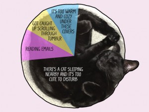
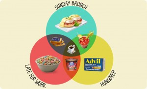
All this talk about graphs and data visualization reminded me of some of the fun Buzzfeed graphs I had come across when I was procrastinating one day. Typically, we think of graphs and charts as boring and inapplicable to daily life, but these graphs demonstrate that data visualization can be humorous also. My favorite set of graphs and charts from Buzzfeed is “12 Graphs and Charts that Perfectly Illustrate What It’s Liike Getting Ready in the Morning” by Adam Ellis, Buzzfeed Staff.

http://www.buzzfeed.com/adamellis/graphs-and-charts-that-perfectly-illustrate-what-its-like

These graphs depict information that we can all identify with and do it in a fun whimsical way. This article would not be as effective if it was just called “12 Things We Can All Relate To When Getting Ready In The Morning” and for #5 Types of Breakfast, Ellis just wrote there are different types of breakfasts depending on how the morning is going, but there is almost always coffee. These graphs take data visualization to a whole new level because they include actual pictures that make the data more appealing and memorable for the reader. Although, these graphs and charts do not have vital or completely accurate information, I think the authors of Data and Design would very much appreciate their design and creativity.

original-29965-1400005596-11

Week 3 – Netflix / 8tracks

When I saw the reading list for this week, I was immediately drawn to the article about Netflix, “How Netflix Reverse Engineered Hollywood” by Alexis C. Madrigal. I consider myself to be an avid Netflix binge-watcher, so I was intrigued to see what this blogger had to say about Netflix. The other day my friend and I were talking about how there’s so much on Netflix, but sometimes I still don’t know what to watch. The different categories can be overwhelming to say the least. Madrigal’s article furthered this point I had and opened my eyes to the absurd amount of movie categories Netflix has. This got me wondering if the genres that didn’t even have any movies in them served a purpose at all. Was it supposed to let Netflix know if they should add more to the “”Feel-good Romantic Spanish-Language TV Shows” genre because people were searching for it?

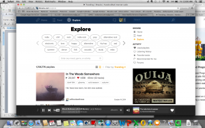
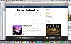
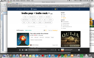
The way Netflix categorizes movies and tv shows reminded me of the “explore” feature on http://8tracks.com. 8tracks is similar to Pandora in the fact that it’s a free Internet radio, but the difference is that you look up playlists compiled by other users rather than stations by an artist or song. When searching for a playlist on 8tracks, you can go to the “explore” tab and from there, you search through the 1,706,776 playlists available using preset tags or by searching for something specific.

Screen Shot 2014-10-17 at 10.00.52 AM

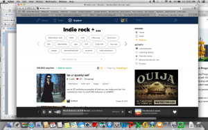
8tracks’ system is different because you can add multiple tags. And the tags aren’t just based upon genre; you can also find the right playlist by typing in “any mood, genre or activity”. For example, when I’m looking for playlists to listen to when I study, I normally start with the tag “indie” and then from there depending on my mood, I normally either go with “chill” next or sometimes “folk”.

Screen Shot 2014-10-17 at 10.01.04 AM

Screen Shot 2014-10-17 at 10.01.24 AM

Screen Shot 2014-10-17 at 10.01.11 AM

When I’m working out, I start with “running” and then normally either chose “hip hop” or “pump up”. Even if you search for the same tags every time, you’ll find new playlists because they are constantly being added by other users. I think it would be helpful if Netflix had a similar system for searching through their database. Netflix has so many specific tags, but I always find it somewhat difficult to find something that fits what I want to watch exactly unless I know that I’m looking for something specific like “Grey’s Anatomy” or “Gossip Girl”.


Week 2 – Gender Classifications

In his article, “Classifications and its Structures”, C. M. Sperberg-McQueen gives readers an idea of the complex nature of classifications and the nearly infinite possibilities that we may encounter when trying to classify certain pieces of information. The section on “One-Dimensional Classifications” describes nominal classifications, which “consist simply of a set of categories: male and female; French, German, English, and other; noun, verb, article, adjective, adverb, etc.” (Sperberg-McQueen). This notion of a nominal classification of gender reminded me of the binary gender system I learned about when I took Gender Studies 10 last spring. Most of society assumes that there are only two finite choices in terms of gender, male or female; however, in actuality there are over 50 gender options. It has taken time and a lot of effort on the part of feminists and others who fight for gender equality, but Facebook now recognizes 51 different categories when asking users to identify their gender. I found an article entitled, “What Each of Facebook’s 51 New Gender Options Means” by Debby Herbenick PhD and Aleta Baldwin on thedailybeast.com (http://http://www.thedailybeast.com/articles/2014/02/15/the-complete-glossary-of-facebook-s-51-gender-options.html), relating to this foreign concept of many different gender identities.  Before I took Gender Studies 10, I had always identified myself as female and had never encountered any sort of problem when asked to pick between the common gender classifications. Since I did not have a problem with them, I naively disregarded the people who do not fit within the binary gender identities of male and female. Now, I see that the politically correct way for me to classify myself is “cis female” or “a female who identifies as a woman/ has feminine gender identity”. Even though the classification of gender is still nominal, as there is a discrete number of choices, it is much more complex than the majority of us realize. If you identify yourself as “gender nonconforming”, but must pick between the two categories of male or female when filling out paperwork at the DMV, you may face an internal conflict and feel marginalized. By recognizing a wider array of gender identities, Facebook is helping to eliminate the binary gender system and raise awareness about the complexity of gender classification. Sperbeg-McQueen recognizes that most classifications are even more complicated than “one-dimensional classifications” and fall under the category of “N-dimensional”. If something like gender, which seems so straightforward, is actually much more complex, I cannot even imagine the effort and time that goes into correctly classifying multivariable data sets.