http://www.haohaohuang.com/project.php?id=38
http://kindred.stanford.edu/#/path/full/none/none/I5457/I3904/
This week’s readings included a database site titled Kindred Britain that offers a beautifully visualized network of nearly 30,000 individuals within the British culture who are connected through familial terms such as through blood, marriage, or affiliation. First began as an individual research project by Stanford University English professor, Nicholas Jenkins, who was mainly interested in examining the family connections in British culture and history, the project eventually developed into a collaboration amongst designers, coders, developers, and digital visualization specialists that produced Kindred Britain. Much like Jenkins, multi-media designer Hao Hao Huang was also interested in the extensive study of a national and family history – and Huang’s own role within it. Huang’s codified visualization, Mapping Time in comparison to Kindred Britain offers a juxtaposing counterexample of another artist’s approach to examining a heritage.
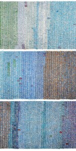
Data Vis 2, an extensive, book collection of the most compelling data visualization work across the world features Huang’s work on a two page spread and manages to document the artist’s laborious process. Working with a primary collection of information from past events and genealogy, Huang codifies his timeline onto a 25-metre scroll that covers the entire floor with hand-written numbers. He paints these numbers by hand, marking “official” facts colder shades while indicating personal events with warmer shades. The artist works his way slowly, but surely, across his timeline of landmark events within his national and family history.
Although the mediums of data visualization are obviously different, the overwhelming database is strikingly apparent in both Kindred Britain and Mapping Time. Huang chose to mediate his database into a handwritten scroll, perhaps an ode to his Chinese heritage. However, because of the intricacy of his tedious system, the end result of his scroll visually appears like columns of colorful code on a screen. Kindred Britain definitely offers a more interactive experience in finding the connections amongst the thousands of individuals while Mapping Time can only offer a more static representation of the insights made of Huang’s national and family history. Although Kindred Britain is an extremely impressive accomplishment within digital visualization, the team’s process can only really be understood through their FAQ page. Huang’s solo trek in mapping a similar subject like Kindred Britain was physical, using just his mind to compute his data. What is strikingly beautiful and humanistic about Huang’s work is that his process is clearly evident by observing the scroll itself. Every irregularly shaped circle that he painted himself shows nearly everything a viewer needs to know about Huang’s process.
