Week 9 – “Stellarscope” Interactive Music Video Game

“If a picture is worth a thousand words, an interactive 3D simulation is worth tens of thousands,” says Diane Favro, UCLA professor and director of the Experiential Technologies Center. Favro explains in her essay, “Meaning in Motion” the development of digital modeling and reconstruction of historical environments here in the Graduate School of Architecture and Urban Planning back in the late 1990s. The initiative for this research on digital technologies was definitely new and unknown territory for scholars and researchers like Favro which coincided with a generally undefined and unregulated environment to work within. The Cultural Virtual Reality Lab, established by Favro and Professor Frischer, attempted to establish guidelines with their five principles for creating these high-performance computing, historical simulations. Their five principles definitely adheres to the same principles and attributes of digital humanities, echoing key words like metadata, knowledge representations, and generally combining scientific methods with studies in humanities.  Today, especially with the launch of Google Earth, web-based geographic computing systems are readily accessible and increasingly user friendly. The standard for historical representations are only getting higher and higher and a polysensorial experience for users are not only immersive, but also becoming expected.

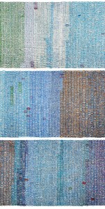
A colleague of mine, Nikita Arefkia worked on this project, “Stellarscope” alongside her bandmate, Lionel Williams. The creative duo collaborated to incorporate an interactive music video/game to pair as a visual for their band’s track, “Stellarscope”. Designed as a generative process, players are invited to essentially explore the interactive environment and create their own visuals while listening to the song. Sounds are incorporated into the environment that can only be accessed through close proximity. The represented environment takes inspiration from historic temples and outer space, but is virtually imagined from the duo’s minds. The simulations of Favro’s historic environments immediately reminded me of “Stellarscope” despite the obvious differences. For one, “Stellarscope” is made for purely artistic value while Favro focuses her work on academic and scholarly progression. However, I appreciated that Favro emphasizes the importance of forming a relationship between motion and meaning. Acknowledging the Roman importance of combining physical movement and mental thought, Favro strives to create the ultimate kinetic experience that stimulates a user’s multiple senses.

With “Stellarscope”, the interactive environment incorporates this same crucial concept, by allowing users to essentially form their own personal memories and experiences each time they explore the game. Although the game was made with no scholarly objective nor did it face the challenge of documenting historic data, it does act as an example of interactive reconstructions that aims to give a polysensorial experience for the user.

Week 8: Adobe InDesign User Interface

Screen Shot 2014-11-24 at 1.38.52 PM

As a loyal user of Adobe programs for years now, I have become fairly adequate in using programs like InDesign, Illustrator, and Photoshop. Adobe offers more useful programs like AfterEffects, Lightroom, Dreamweaver, and Audition, but I find that their top three essential programs for a graphic designer would be the first three mentioned earlier. While going through the short and sweet list of Ben Shneiderman’s eight golden rules of interface design, each rule seemed to bring back flashes of the programs. The majority, if not all, of these golden rules are applicable to the construction of Adobe programs. The popularity of Adobe programs usage definitely is based on the merit of their well designed user interface. Since I am most familiar and comfortable with InDesign, I decided to run through Shneiderman’s rules as a sort of check-list to see if the program fulfilled his guidelines. First, the consistency of the language and terminology used within InDesign is definitely consistent not only within itself, but also carries over into Illustrator and Photoshop. However, users of Photoshop will find that although all three programs share terminologies, the process of executing an action is varied. We can compare an example like if we were to drop in an image into InDesign and Photoshop. In InDesign we can easily crop and maneuver the image to whichever size we would like without damaging its quality and original image size. Photoshop makes this process a bit more hidden to the user meaning that the user will have to actually change the image size, calling for a longer process. Although between the programs the language and actions may not be consistent, I think that each individual program is well-designed in terms of the user interface. The challenge for Adobe would be to better connect the consistencies between these programs so that the user can easily transition into each program masterfully. Shortcuts are readily available within Adobe programs and are clearly labeled next to each tool for future reference. These shortcuts are definite help for advanced users and lessens the amount work time. The informative feedback is fairly consistent and frequent, but I think the responses can be more simplified and helpful. The messages are usually a bit vague and uses terminology that would not be familiar to a beginner user. The sense of closure in Adobe is acceptable, but it would definitely help if the program utilized more sounds as a part of their feedback. Usually it only responds with a error sound if I do something wrong, but it might be worthwhile to implement some sounds when you do something right. Error handling is fairly simple in InDesign and users can easily utilize layers or keyboard shortcuts to undo a certain action. Adobe is definitely given less credit than it deserves as an interface for highly critical designers. I always hear designers complaining and even cussing out the programs while using them, but in the end they make great work through Adobe. I think that Adobe has done a fantastic job in managing to brand their identity so strongly, while still keeping the user interface design objective as possible. When I open up InDesign, I only see a blank canvas surrounded by tools. The aesthetic of its design does not inhibit me from creating my ideas. I think this is an important factor when it comes to user interface design, especially for an interactive system developed for users to create and design projects in.

Week 7: Web Map Anatomy and Hoon Kim’s Broadway Soundscapes

walk-01

http://whynotsmile.com/project/walkshow.html

Alan McConchie and Beth Schechter provided a very minimal, but informative presentation on the basic structure of a web map via the hackable “Big” system which I fully enjoyed. First off, I truly appreciate this presentation tool and the way it implements minimal hacking to whip up a browser-based presentation that can be shared easily and quickly. I hope to see this form of presentations to be utilized and accessible by a simple click of a hypertext.

Moving on to the content of the presentation, McConchie and Schechter basically dissect the anatomy of a web map, comparing it to the likes of our own human body and how we have systems that are interconnected. They then go more in depth about the layers that create this multi-layered data cake of a creation. Being able to identify and dissect each layer allowed me to approach web maps with more confidence. I’m especially glad to be learning about what makes a web map since there is a definite trend of creative map design that may look geographically accurate, but are in fact based on the designer’s subjective associations which lean more towards a mind map.

Data and content layers definitely sparked my attention since I felt that this was where the creative direction came in. Data layers can essentially be simply points, lines, and polygons marking the tiles that formulate the base layer. However, I can see the vast potential with data layers and its design direction. I also realized at this point that the addition of data layers is ultimately establishing the narrative and objective of your web map. The base layer is your map and your data layers are your pins and tacks.

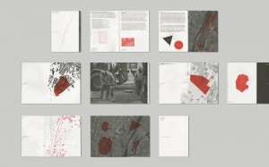
Although my reference is not a web map, designer Hoon Kim and Sarah William’s research collaboration used various geo-reference data like satellite images and documentary data like NYC 311 Noise Complaints which are logged by location and time. The result of this research was “Walk on Red EX1”, a book and exhibition that showcases an analysis of the registered noise complains in Manhattan in correlation to population densities and mixed property usages around four Manhattan neighborhoods including SoHo, Wall Street, Midtown, and Inwood. Although ambitious, “Walk on Red Ex1” is a very intriguing attempt to visualize the geo-spatiality of sound related events. Kim and Williams utilize the data layers of found web maps of the Manhattan neighborhoods to serve their objective of analyzing and visualizing the neighborhoods’ unseen soundscape. I can definitely see this project expanding into a web based map which would be a nice way to tie up the loose ends of this project seeing that the research for this project first began with web map references.

Week 6: Twitter Network Analysis

In his blog post, Scott Weingart offers his explanation of how a network works. He gets down to the fundamental basics of what makes a network and simplifies them into terms even people with little-to-no background in math can understand. He acknowledges the flexibility of the network as a tool, which can be applicable to any data studied within network analysis. However he warns that the network tool should not be abused and should be selectively used. He also warns that the appropriation of data, especially when it comes to that of humanities scholars who are, “often dealing with the interactions of many types of things, and so the algorithms developed for traditional network studies are insufficient for the networks we often have.”

Weingart breaks down the components of any network to ultimately be simply “stuff and relationships.” These components are interdependent and their connection cannot exist without each other. He then performs a run-through of a very simple network formation starting with books as nodes before connecting their variety of attributes to form relationships, or edges.

After reading Weingart’s post, I came across an impressive, preliminary study on Twitter’s billion-scale network conducted by Masaru Watanabe and Toyotaro Suzumura of Tokyo Institute of Technology. While reading through their process and concluding results, I was delightfully surprised at how I was at least able to identify key terms in their comprehensive study after reading Weingart’s explanation. This made it a lot easier to approach Watanabe and Suzumura’s study which I found to also be fairly straightforward in general. The process of their study however is far from straightforward and seems highly complex considering the amount of data they collected among 469 million users between the months of July to October 2012. They categorized the data, which included follower-friend information, into two formats, XML and CSV and also utilized the analysis tool, Apache Hadoop and later HyperANF to compute the degree of separation.

Inspired by a Facebook network analysis study conducted by Lars Backstrom who managed to compute a degree of separation using graph analysis tool, HyperANF and resulted in a surprisingly low number of 4.74. The network structure of Facebook is more friend-based that resembles the way human relationships work in the real world, while a social graph like Twitter is based more on interests and differs from Facebook due to its directed graph. Directed graphs allow everyone to follow someone freely while an undirected graph like Facebook requires approval. Considering that Facebook and Twitter have a different network structure, Watanabe and Suzumura analyzed Twitter’s network in an attempt to compute a degree of separation and diameter. Interestingly, both degree of separation  and diameter are used to measure networks in terms of scale and graph. Degree of separation is found by the average value of the shortest-path length of all pairs of users while the diameter is given through the maximum value. For the data collected within July to October 2012, the analysts concluded in a degree of separation of 4.59 in the Twitter network. After reading a simplified explanation of what makes a network and its analysis, it was interesting to see this applied to a large-scale network like Twitter.

http://www2013.wwwconference.org/companion/p531.pdf

Week 5–Invisible Australians

This week’s reading features a web-based data visualization that accompanies the project, Invisible Australians. A research collaboration instigated between Dr. Kate Bagnall and Dr. Tim Sherratt, Invisible Australians was created to identify and reveal the true face of the so-called White Australia during the early 20th century. During this time in White Australia, thousands of non-Europeans residing in the country faced discriminatory laws and policies that denied their rights as Australians. Although shunned and marginalized as a Australian minorities, these non-Europeans, including Chinese, Indians, Japanese, Syrians, and Malyans, were ironically well-documented through government records. Bagnall and Sherratt have taken advantage of these extensive records in order to develop a database intended to commemorate and identify the thousands of non-white Australians who made up the true face of “White Australia”.

While browsing The Real Face of White Australia, I also kept in mind Johanna Drucker’s distinction between capta and data. She emphasizes the need for humanists to utilize conceptual tools like capta and stray away from tools and methods developed from fundamentally epistemological disciplines. This distinction is definitely a core concept to understand when approaching any kind of archived information. When data is presented in a way to prove a certain opinion or thesis, this is essentially converting this hard, cold data into capta. Capta, in Drucker’s definition, carries a constructed interpretation of the data it came from. The Real Face of White Australia is a great example of humanizing data and presenting it in a way to prove a point. The simple composition of “the real face of white australia” at the header of the browser accompanied by a grid layout of all the collected images of these discriminated Australians is for the most part a self-explanatory. A visitor first sees the header and is immediately gratified with Bagnall and Sherratt’s findings. With the documented identities that Bagnall and Sheratt have found, they are ultimately imposing the idea that the true face of Australia was formed by the non-white residents of that time.

Drucker’s distinction between capta and data is a definite step in the right direction for how people typically analyze so-called data visualizations. I feel that we have come to a point where we give the term data too much authority. Too many times have we trusted a visualization that claims to be based on a found set of data, only to later find that certain kinds of data was omitted, duplicated, etc. We need to realize that data is extremely vulnerable to be skewed and constructed to fit the data miner’s own opinionated agenda or perspective.

One project that came to mind was photographer Giles Revell and graphic designer Matt Wiley’s collaborative project called “Photofit: Self-Portraits”. Using a now outdated and disregarded Penry Facial photofit kit from the 1970s which were used for constructing police sketches of suspects, the creative duo called upon a number of test subjects to use the kit to compose their own indetikit image purely by memory. These participants  put together the tactile components of the kit which include paper strips of various facial features. The result of these participant interviews and Photofit assemblies reveal the complexity of these participants’ relationship with their self-identity suggesting that their distorted compositions of themselves show more about the subject’s personality than a straight-forward photograph would.

Here the photograph could be considered as the straight-forward data and the test subjects’ photofit compositions of themselves are the capta. Each participants’ own personal perspective about their appearances converts the data of their facial topography into the capta of what they view themselves as.

http://gilesrevell.com/files/photofit2.pdf

Remembrance Project’s “Living Museum”

The Trans-Atlantic Slave Trade Database offers an easy to use resource for exploring and examining more than 35,000 voyages made across the Atlantic Ocean from 1501 to 1866. An incredibly ambitious content matter to begin with, this database system was the result of several decades of a research by a vast amount of international scholars. The website took two years of development by a multi-disciplinary team including programmers, administrators, and historians to digitize this extensive database. The website offers a variety of resources including tables, timelines, and maps of estimated figures dealing with these numerous voyages made from various European and North American locations. Another resource it offers is an African Names Database where the user can actually search for a specific African victim. It is this resource that especially grabs my attention since it offers a more personal outlook of the millions of African slaves forced to make the agonizing voyage across the sea. Users can browse through 91,491 results of identified African names that also includes his or her corresponding age, height, gender, voyage ID, ship name, arrival date, and embarkation/disembarkation location. Being able to put at least a name to the vast amount of numerical figures offers a humanization of the data, giving each individual a small commemoration. The origin for the data of these African Names redirects to the African Origins page, which is another database site made in conjunction with the Slave Voyages database.

Over the weekend I visited the Japanese National Museum in Little Tokyo and viewed one of its ongoing exhibitions, “Common Ground: The Heart of Community”. The exhibition incorporates hundreds of artifacts that chronicles 130 years of Japanese American history, beginning with the early days of the Issei generation through the unconstitutional World War II incarceration and to the present. The end of the exhibit displays an original structure of a barrack saved and preserved from an actual concentration camp in Wyoming. In this barrack were two computers displaying a archival website called Remembrance Project, which is a recent initiative and phase one of the online project. The simple website was created in commemoration of the 70th anniversary of the Japanese American incarceration.

The website is easy to use and relies heavily on outside contributors and donors who are willing to submit tribute stories of incarcerated loved ones, but only in exchange for a donation to the museum. In this case, the database of this online endeavor remains open and is created solely by its potential donors. The website serves mainly as a skeleton of a database system that waits to be updated with tribute stories. Contributors are instructed to first donate and then submit a 4,00- character story or letter along with a picture of the victim(s) and their location details during the incarceration. The museum then reviews and processes these submitted stories before featuring them online, possibly to check for errors and accuracy.

In comparison to the Slave Voyages database, the Remembrance Project is a definite work in progress using a vastly simplified system for both data collecting and data presentation. However, I find that both projects share a similar objective to commemorate and document the vast numbers of information that were dealt with in both historical events. Although the Remembrance Project is just phase one of this online initiative, the endeavor could definitely use the Slaves Voyages website as a model system to emulate.

Manzanar Map

Remembrance Project Site

http://www.slavevoyages.org/tast/resources/slaves.faces

http://african-origins.org/african-data/detail/199914

http://www.remembrance-project.org/

The Napoleon Dynamite Problem

http://www.nytimes.com/2008/11/23/magazine/23Netflix-t.html?pagewanted=all&_r=0

http://genresofnetflix.tumblr.com

http://www.netflixprize.com

As just one of the millions of Netflix subscribers and self-diagnosed binger, I have definitely spent many long nights getting familiarized with the altgenre system implemented into the streaming media site. I’ve been avidly using Netflix since 2011, but I’ve only really started taking notice of some of its extremely specific genres until just this year. With thousands of titles to sort through on Netflix, their personalized genres are definitely useful, maybe a bit absurd, but still useful. My personal favorites are “hidden gems” or “visually-striking movies” where in these categories I can usually find many independent and quirky films that are difficult to describe.

It is apparent that there is a growing trend of implementing these personalizing algorithms into more and more media sources including the likes of Spotify, Amazon, and Soundcloud. What I find most intriguing and even slightly disturbing about Netflix’s system is the crossover of both human and machine intelligence. It has come to the point where you can probably learn a lot about a person’s interests by simply looking through their Netflix account. In order to achieve this, Netflix engineers definitely had a strong input in creating micro tags for these films based on the Netflix Quantum Theory which makes me question how objective the algorithm system remains to be. There seems to be an ideology similar to the whole “I know it when I see it” expression that is crossing into Netflix’s system.

Netflix has evolved their past system that was based more heavily on numerical values and user ratings to a more human method of introspection. Todd Yellin, VP of product innovation at Netflix had this to say about their new approach:

“Predicting something is 3.2 stars is kind of fun if you have an engineering sensibility, but it would be more useful to talk about dysfunctional families and viral plagues. We wanted to put in more language,”

I think it was a very progressive approach for Netflix that also reveals some very interesting quirks about the relationship between categorizing systems and human nature. Atlantic’s article on Netflix’s genre algorithm system mentions the $1 million prize that the company had offered back in 2006 which reminded me of the Napoleon Dynamite problem. As a film, Napoleon Dynamite seems to be the most difficult movie to pinpoint and recommend to Netflix users. The quirky film remains to be the most stubbornly unpredictable movie as it is attracts many users to rate the film while still being hard to predict. This imbalance, while probably a headache for Netflix developers and engineers, is to me a very humorous quirk in the system that shows how difficult it is to categorize human interests and behaviors.

Week 1 Blog

Mapping Time


http://www.haohaohuang.com/project.php?id=38

http://kindred.stanford.edu/#/path/full/none/none/I5457/I3904/

This week’s readings included a database site titled Kindred Britain that offers a beautifully visualized network of nearly 30,000 individuals within the British culture who are connected through familial terms such as through blood, marriage, or affiliation. First began as an individual research project by Stanford University English professor, Nicholas Jenkins, who was mainly interested in examining the family connections in British culture and history, the project eventually developed into a collaboration amongst designers, coders, developers, and digital visualization specialists that produced Kindred Britain. Much like Jenkins, multi-media designer Hao Hao Huang was also interested in the extensive study of a national and family history – and Huang’s own role within it. Huang’s codified visualization, Mapping Time in comparison to Kindred Britain offers a juxtaposing counterexample of another artist’s approach to examining a heritage.

Data Vis 2, an extensive, book collection of the most compelling data visualization work across the world features Huang’s work on a two page spread and manages to document the artist’s laborious process. Working with a primary collection of information from past events and genealogy, Huang codifies his timeline onto a 25-metre scroll that covers the entire floor with hand-written numbers. He paints these numbers by hand, marking “official” facts colder shades while indicating personal events with warmer shades. The artist works his way slowly, but surely, across his timeline of landmark events within his national and family history.

Although the mediums of data visualization are obviously different, the overwhelming database is strikingly apparent in both Kindred Britain and Mapping Time. Huang chose to mediate his database into a handwritten scroll, perhaps an ode to his Chinese heritage. However, because of the intricacy of his tedious system, the end result of his scroll visually appears like columns of colorful code on a screen. Kindred Britain definitely offers a more interactive experience in finding the connections amongst the thousands of individuals while Mapping Time can only offer a more static representation of the insights made of Huang’s national and family history. Although Kindred Britain is an extremely impressive accomplishment within digital visualization, the team’s process can only really be understood through their FAQ page. Huang’s solo trek in mapping a similar subject like Kindred Britain was physical, using just his mind to compute his data. What is strikingly beautiful and humanistic about Huang’s work is that his process is clearly evident by observing the scroll itself. Every irregularly shaped circle that he painted himself shows nearly everything a viewer needs to know about Huang’s process.