Course blog

Designing Data- Image Atlas (Taryn Simon)

The book Data and Design was an extremely interesting read. I enjoyed its clear and cohesive approach at drawing out the relationship between good design and presenting information. I love the fact that Coale not only encourages us to “present information” but to design an “information experience”. I think this is important in understanding the fact that data cannot be completely objective as the very act of organizing and visualizing it is in turn emphasizing certain elements and bringing attention to select elements of the research through design. He goes on to describe in his chapter “Importance of Font, Color and Icons”, principles of design such as minimalist approaches, utilization of color theory etc. that lead to more effective absorption of visualized data. An example shown in the book that inspired me was Florence Nightingale’s “Diagram of the Causes of Mortality”. The beautiful and cohesive design of the Coxcomb diagram is an iconic method of displaying data that is still used in a contemporary environment. It goes to show that good design is something that is universally recognized; a language that although not everyone speaks, any pair of eyes will understand. Another interesting point that I think he made was his reference to the fact that humans have been using methods of visualizing data with icons and pictograms as far back as the Neolithic ages. This is interesting to me as it shows that man has always had the ability to visually communicate information and the inclination to express themselves with something more than words.

Taryn Simon is an American artist that is fascinated by categorization and classification. Her work often involves extensive research to gather data which she then formalizes in the medium of photogrpahy, text or graphic design. Her project Image Atlas was something I immediately thought of upon looking into visualizing data. Her website http://www.imageatlas.org/ “interrogates the possibility of a universal visual language and questions the supposed innocence and neutrality of the algorithms upon which search engines rely.”- as described on her portfolio. The structure of her image atlas is interesting as it compiles the top results of an image search using the same keyword from different countries that use local search engines. E.g. If I wanted to compare the the images a user in China and a user in Korea would see after typing food, Image Atlas would compile the top results of their local search engines (Baidu and Naver, respectively). Although this is not an entirely scientific method of acquiring insight on the topic of search, it is an interesting way of communicating differences in terms of exposure to data and cultural iconography within each country. My favorite part of this website is the fact that North Korea is listed, but has zero results listed no matter what the search is.

Week 4: When Excel Can’t Excel

A bug in 2007 version of Excel.

In the online-guide “Data + Design”, various authors collaborated to discuss the complexity of comprehending and organizing various forms of data. Alistair Croll’s piece on data aggregation was particularly interesting to me because it was the first document I had ever seen that grouped and explained different kinds of ways data can be combined and explicitly delineated the logic behind the rules of these combinations. Particularly striking was the piece’s definition of “summable multiseries data”. A group of data connected by their representation of a larger statistic, these “subgroups” are often more fickle to identify and arrange than they seem. Using their example of coffee consumption, a statistic on how many cups were served to men and how many cups of regular cups of coffee were sold cannot be compared because their basic subgroups (for a visual aid, think of subgroups as “graph axes”) are not the same – one breaks down consumption by gender, the other by the kinds of coffee purchased. Even further, as Croll demonstrates, these figures cannot be leveraged against each other to “back” into the statistics of another subgroup. For example, just because you know 36.7% of cups were sold to women DOES NOT mean that 36.7% of regular cups of coffee were subsequently sold to women – those two figures did not correlated with each other and thus, do no indicate something about the other. Thus, data and context are equally important in statistics.

However, as the article points out, subgroups and categories are strictly anthropological. While working on a set of important excel data, I once made the mistake of selecting every piece of data to generate a graph, instead of the more specific set of data I intended to work with. As a result, I got an unintelligible set of strings of lines instead of the orderly, legible graph I was expecting to work with, similar to the image in the above. While I immediately registered the graph as incorrect, Excel however, never once issued an error signal. Thinking the graph was an accurate amalgamation of the data it was fed, Excel couldn’t tell the data I selected did not make sense and proudly generated the tangled lines I had before me – slapping one line charting evaluations cores over time over another line plotting satisfaction per class. While Excel is very good at interpreting data, human logic is obviously a whole other ball game it is far from winning.

The New York Times + Data + Design

Screen Shot 2014-10-27 at 11.38.42 AM

I was reading Trina Chiasson’s compiled online source book on Data + Design, and I just have to say it’s one of the coolest resources on the internet. I really enjoyed the final product because I know compiling all this information, and making it accessible and understandable to users can be a huge challenge. Within the past year, I’ve really become interested in how data visualization can make unsurmountable numbers of data digestible and surprisingly, enjoyable. It just looks so good. Whether it be through infographics or interactive data visualizations, is a great way to digest information in the 21st century.

As beautiful as this may look. Chiasson’s online book almost takes away the fascination shown in data visualization. What I mean is it is a lot of hard work. In my opinion, there are so many things that can go wrong when compiling and organizing the data. I have so much respect for people who go through the means of creating these visualizations.

One of the best uses I’ve found for data visualization has been through journalism. The New York Times is my favorite in terms of how it creates data visualizations that can apply to any reader, and they are also super interesting, too! The one I would like to talk about is their most popular data visualization of 2013: How Y’all, Youse, and You Guys Talk.

Screen Shot 2014-10-27 at 11.39.22 AM

This data visualization map takes 350,000+ survey answers that were taken from August to October 2013, and creates a map for where different phrases are said within the United States. The interesting part is that you can take the 25 question quiz, which tells you from where your unique dialect derives from.

This NY Times visualization was based on the Harvard Dialect Survey conducted by Burt Vaux and Scott Golder, which actually began in 2002. After taking this quiz, and seeing how personalized it can be, I can only imagine the number of steps needed to be done in order to visualize this information. I wish that they had shared exactly how they created and organized the data collected instead of having a short “About this Quiz” section.

As someone who is becoming more interested in digital humanities, it really holds importance when sharing data visualizations. Though The New York Times is a journalistic source, we can assume that the information is true, but it’s always good to share that information with readers who want to know more.


Sources: http://www.nytimes.com/interactive/2013/12/20/sunday-review/dialect-quiz-map.html

Data + Design: A Simple Introduction to Preparing and Visualizing Information, https://infoactive.co/data-design/titlepage01.html


Week 4: Interactions with Databases

When I started this week’s reading, I kind of dragged my feet. I had a very singular image of what a database was and what it could do. For whatever reason, I was restricting myself to imagining databases as endless accumulations of data, minimalistic in presentation, which could only be decoded by people trained for such a job. The Companion to Digital Humanities did say that the database has an important place in humanist research, “whether it is the historian attempting to locate the causes of a military conflict, the literary critic teasing out the implications of a metaphor, or the art historian tracing the development of an artist’s style,” but it was still difficult to imagine using a database unless for dedicated research.

It wasn’t until I started to casually browse the New York Public Library’s Articles & Databases page (itself something of a database) that I realized the number of purposes databases could serve. Many stored immigration or genealogy information (similar to the Transatlantic Slave Trade Database); others were archives of printed articles. Many of these were interesting enough, but they fit into the descriptions of databases provided by our readings. I wasn’t really surprised by what I found until I saw the listing for the International Movie Database (IMDb), which I recognized. Although IMDb claims to be a source for entertainment news, most people use it to figure out if they really do know an extra in a movie from something else.

It is possible that the majority of databases are used as directories or otherwise in the pursuit of research. To some extent, I have not reconciled my preconceptions about the utility of databases, but I can see how it is possible for a database to function more as a search tool in everyday life. I noticed that a lot of people see iTunes as something of a personal database that they use frequently, which makes me wonder if there are any more traditional databases that could be considered overlooked.

Week4: Graphs and Charts

After spending so much time and focus on metadata, I believe I have a pretty good understanding of it. Now it was interesting to read the book about the presentation of data, using this metadata we have just studied. Talking about data can often be very confusing, but the food preparation analogy, made things a lot clearer and helped me to understand what each step was, and how it contributed to the overall data representation. Of all of the steps, I found the section on visualizing the data to be the most interesting.
I have made many charts and graphs in my time, and am sure I will continue to make even more in my time in the digital humanities minor, as well as in the future, so I am sure that these tips and tricks given in the data visualization section will be very helpful. Most of the information in Chapter 14 “Anatomy of a Graphic” were tips that I had heard before, but the one thing that really stood out was the point about not cluttering a graph. When trying to make a graph informative, I do have the tendency to over-clutter it, because I worry I am not putting enough information on otherwise. Although this was a point I am very happy I have addressed now, the chapter that I was extremely interested in was Chapter 15.

In Chapter 15, the subject was the importance of color, fonts, and icons. I had always enjoyed playing around with colors, fonts, and icons when making visual representations of information, but I had not realized how important these aspects actually are. One of the first things that stood out to me was that they acknowledged that color is important, but stressed that the data must first all be laid out before adding color. Another idea that was extremely interesting to me and I hadn’t thought about before was the importance of white spaces. When showed the comparison between charts and graphs with white margins and those without, I was impressed by how much cleaner and clearer the representations with margins looked. With this knowledge I decided to search the internet for interesting graphs that depicted some of the techniques I had just studied.

image001-2This is an example of a representation that did not use color well. There are no color differentiations between any of the descriptions near the top, which makes it confusing to understand. Although this is a silly chart, it shows a confusing example of the point the person is trying to make, because of the coloring of the image.

image002
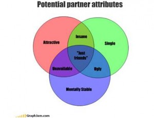
This other fun chart is clear, because color is utilized to show overlap in the graph and differentiate between attributes. In this visual representation, the color only benefits the representation.

Week Four: Effective Data + Design

After reading Data + Design, I immediately remembered an example of a particularly effective combination of data & design I had seen several months ago, an interactive map of major South Asian migration flows. What particularly makes this infographic effective is it’s place within the context of the entire website. Striking-Women, “an educational site about migration, women and work, workers’ rights, and the story of South Asian women workers during the Grunwick and Gate Gourmet industrial disputes,” seeks to highlight a facet of history that is not well known or often discussed in mainstream circles (Striking-Women). The homepage of the site highlights four distinct issues: migration, women and work, rights and responsibilities, and strikes. Each section includes an introduction, relevant historical background, and present-day issues. The migration section is the only one with an infographic. This infographic allows the user to explore various migration flows by allowing users to click on a specific migration flow to learn more about it. For example, by clicking the solid blue arrow that leads from South Asia to Canada, a webpage replaces the map and details the history of “Post 1947 migration to US, Canada, Australia and New Zealand.” I found the map not only educational, but visually striking as well. I could see why “Maria Popova…said that data visualization is ‘at the intersection of art and algorithm’” (Data + Design). Laid out like a physical folded map and highlighting several specific countries, the different colored arrows illustrate movement otherwise invisible or ignored. In many ways, this map harkens back to the “native essence” of data visualization—especially answering questions of “‘Where am I?’ [and] ‘How do I get there?’” This map and it’s included informational pages helps to illuminate the reasons why one finds large numbers of South Asians in the UK and the Gulf States, among other countries.

Finishing Data + Design helped me understand the sheer amount of work that must have gone into the map of South Asian migration flows, as well as the well-thought-out nature of it’s design. The reasons the site creators chose specific colors, fonts, and arrows became clearer to me after completing the design section of the book, as I never would have thought serif would be more distracting to readers than san serif! I also was able to note the slightly 3D nature of the map after reading about the dangers of using 3D. However, in this cause 3D seems to help solidify the nature of the map as a map creating the appearance of folds. I am now excited make my own data visualization!

Databases: My Everyday Connections

MIND-webAs I click on the tab to open David M. Kroenke’s book Database Concepts, I began to digest the concepts he is creating and lying down for his audience. He uses phases like the key component and the heart of organization operations, to describe this concept we know as databases. This is one of “those” words which is commonly used but when trying to establish a definition comes across as quite difficult, but for the most part it can be looked at as a type of program which is uniquely and strategically designed to interact with users organization needs, or a personal filling system. Naturally my next step is to find ways I use this tool in my everyday life, which unfortunately in my case I use on a daily bases. I say unfortunate not because of the product but just the thought of how much data I personally am responsible for up keeping.

 database-backups-for-peace-of-mind-part-2

At this very moment, I am sitting in front of my computer with all of my data up on the scene, and with all honesty don’t know how I would be able to upkeep my responsibilities without all of my electronics keeping these data in a very approachable way. But with that, the fact that my life is this way because of these staple pieces and their uses. Now this is the point in my thoughts were I fight my internal struggle with technology, and I sit and ponder about all of the possibilities I now have at my finger tips, but out of laziness I choose to search though Pinterest, which is too a database all of its own! It really is funny how it all works like that.

My current occupation is a student, but what that entails is completely self-determining. I currently work as a Student Supervisor at an on-campus restaurant called Feast. Many of you may know of it for our all you can eat pho and sushi, but because of my job I know more than I will ever what to again care about food and hourly wages. And this is point were my job begins a.k.a the databaser. Every person that steps into the restaurant, counts as 1 patron, every plate counts as 1 serving, and each food item is measured out for portions per plate. The service runs for 3 hours as each headchef keeps a record of product and plates taken, and at the end of the shift provides me with a the number of portions served at each station. With new information, I divide the product taken to the amount of patrons who visited, to come up with a take rate per dish. This number is then recorded in a database, which will tell us a ton of information about what we can do for the next shift, such as cost and preparation, and  while also keeping record of what items the students do and don’t like. Now this is only the beginning tasks of my job and only one of the ways a database is used in our restaurant and in my life as its user. And if you were curious, one of our most popular item is California Rolls, and once I calculated had a take rate of 232%, now that is 3,480 sushi plates given in one 3 hour shift! Our lives currently go back to these technological programs, which is one reason why it is so awesome to find small these connections between technology and its creators.

Week 4: Dazed about Databases

Databases are the ultimate archive. They allow for efficient storage and retrieval of information on a simplified level, and provide comprehensive lists of data that can be processed, updated and maintained by a variety of users. Databases serve the purpose of holding data in an organized and highly structured manner for easy search and access actions. Some of the most important documents and data can be found in database-like formats such as encyclopedias and telephone books. As more and more information is accumulated overtime, strategies and formats for organization change. What is important to note, is that although databases come in a variety of formats, the system of order is based on similar relational models and terms in order to create some level of consistency.

Although I enjoy technology and consider myself mildly tech-savvy, the information presented in A Companion to Digital Humanities was quite overwhelming, so I sought to incorporate my passion for photography into my research in order to make it more relatable. The Photography Database provides factual information about photographers, public photographic collections, commercial galleries, photographic exhibitions, and citations to the many published sources used to compile biographical, collections, and exhibitions data. The database contains over 97,000 entries and is updated on a continual basis.


Screen Shot 2014-10-27 at 12.03.41 PM

I decided to do some site searching to see what would come up when I entered my favorite photographer, Vivian Maier. The results listed her birth and death dates, her hometown, her nationality, her active photographing years, her website, and a link to the galleries and exhibitions her work has been shown at. Although the website is not as aesthetically pleasing as the Trans-Atlantic Slave Trade Database, it serves its purpose as a functioning and organized database.

Through further exploration of the site, I found a significant reoccurring, problem; one that could proposes major challenges for users. The database provides information on galleries and photographers, but only once the user searches for specific gallery titles and names of artists. It doesn’t allow for alternative search options for those not as informed on the happenings of the photography world. Even as an experienced photographer in both academic and photo-technical settings, I minded very much that there weren’t filter options available to search for unfamiliar photographers and exhibition names. That being said, I think it is a useful resource for students, amateur photographers, and professional photographers alike who wish to learn more about an artist and his or her background, all while conveniently providing an external web browser link to conduct further research if desired.


Week 4: Urban Dictionary, Yelp, and Redundancies Amongst Databases

Screen Shot 2014-10-27 at 1.17.16 PM

http://www.urbandictionary.com/define.php?term=Derpes

http://www.yelp.com/biz/sushi-gen-los-angeles

http://www.yelp.com/search?find_desc=dinner+date&find_loc=Santa+Monica%2C+Los+Angeles%2C+CA&ns=1&ls=18a1fe2a08cbb764#attrs=RestaurantsPriceRange2.2&l=p:CA:Los_Angeles::Santa_Monica

Stephen Ramsay’s “Databases” in A Companion to Digital Humanities is a technical description of what databases are and the progression of the design models there have been. Database systems allow “for the efficient storage and retrieval of information”. Without databases, we would have an enormous amount of unsorted data with so much potential, but with no easy way to access particular datasets.

One early problem with databases was that they carried “inefficiencies that often resulted from redundancies in the underlying data representation”. For example, on Urban Dictionary (urbandictionary.com), a open-source dictionary for slang, there are multiples of every word available because everyone has different definitions for the word. The word “derpes” is, according to the first result, is a transmitted disease, but according to the third definition is “a contagious form of right-wing rhetoric”.

Yelp does a fantastic job of eliminating these redundancies. Because I’m from NorCal, I use Yelp every time I want to find a new place to eat at in LA. My boss recommends me a place and I search on Yelp and never find two or redundancies of whatever he suggests. I recently went to Sushi Gen (which I highly recommend), and before I went I yelped it. Sushi Gen popped up as my top search, and when I click on the restaurant, its page comes up with reviews, tips, location, pictures, etc. Every piece of metadata relating to Sushi Gen is attached to that one Sushi Gen; there are not multiple Sushi Gens.

Additionally, “the purpose of a database is to store information about a particular domain (sometimes called the universe of discourse) and to allow one to ask questions about the state of that domain”. Going along the idea that everything is correlated to what you search for on Yelp, you are able to ask questions about the state of that domain. Let’s pretend that I want a solid dinner date place in Santa Monica that is relatively cheap. Yelp’s efficient metadata filters allows me to search “dinner date” and filter it to Santa Monica and two dollar signs. I have many options – “The Misfit Restauarant + Bar”, “Upper West”, “Fritto Misto Italian Café”, the list goes on. Sushi Gen, for example, would be a search result of a highly rated “sushi” place in Little Tokyo that is on the more expensive side. Yelp is a great example of a successful, user-friendly database.


Simple Database Concepts

Databases are used everywhere in work, school, online, and even on our cell phones. I read David Kroenke’s Database Concepts to get a better understanding of what databases are and how to create/use them. Databases are not only used for people in the work force or computer programers it is used to help people keep track of things. The most important part of a database is the splitting lists into tables of data. Databases differ based on their design and techniques for dividing the data the tables contain.

Over the summer I had a job at a brokerage firm called, Kepler Inc., in New York City as an intern. My jobs consisted of regular intern work, such as, filing, organizing the copy room, and of course using databases to sort, file, and record documentation. Using that trusty tool we all love known as Excel my job was to keep track of who were current clients, what did those clients do, how much growth they made, etc. I had to also find and record IARD and SEC numbers to make sure all of Kepler’s current customers were active and SEC registered. If they were not that usually meant they were not located in the US and I had to create another column describing this. I had to make sure all the customers were in a folder known as KYC and that every customer folder had certain files in their databases as well as in a hard copy filed in the building.

My job was very important and I had to make sure to provide all and accurate, up-to-date information so the people working there in the compliance department, trading flood or sales can do their job while not second guessing the information provided for them by me. As I read Kroenke’s interpretation of problems with lists it reminded me of a time when I wanted to delete a client from an old database who was inactive. When I went to delete this client I forgot to delete the whole row and instead just deleted the cell. This forced the data in the clients column to move up one cell making my data inconsistent. Luckily, I caught myself and fixed it without too much problem. Separating these many lists and checks was made much easier by putting all the information I had gathered in to one database called a relational model. A relational database contains a collection of separate tables and the content in each table relates to one theme. This makes it so everything related to the first column was sorted into different tables no matter how many.

https://ccle.ucla.edu/pluginfile.php/744822/mod_resource/content/0/3.Kroenke_DataBase_1.PDF