After spending so much time and focus on metadata, I believe I have a pretty good understanding of it. Now it was interesting to read the book about the presentation of data, using this metadata we have just studied. Talking about data can often be very confusing, but the food preparation analogy, made things a lot clearer and helped me to understand what each step was, and how it contributed to the overall data representation. Of all of the steps, I found the section on visualizing the data to be the most interesting.
I have made many charts and graphs in my time, and am sure I will continue to make even more in my time in the digital humanities minor, as well as in the future, so I am sure that these tips and tricks given in the data visualization section will be very helpful. Most of the information in Chapter 14 “Anatomy of a Graphic” were tips that I had heard before, but the one thing that really stood out was the point about not cluttering a graph. When trying to make a graph informative, I do have the tendency to over-clutter it, because I worry I am not putting enough information on otherwise. Although this was a point I am very happy I have addressed now, the chapter that I was extremely interested in was Chapter 15.
In Chapter 15, the subject was the importance of color, fonts, and icons. I had always enjoyed playing around with colors, fonts, and icons when making visual representations of information, but I had not realized how important these aspects actually are. One of the first things that stood out to me was that they acknowledged that color is important, but stressed that the data must first all be laid out before adding color. Another idea that was extremely interesting to me and I hadn’t thought about before was the importance of white spaces. When showed the comparison between charts and graphs with white margins and those without, I was impressed by how much cleaner and clearer the representations with margins looked. With this knowledge I decided to search the internet for interesting graphs that depicted some of the techniques I had just studied.
 This is an example of a representation that did not use color well. There are no color differentiations between any of the descriptions near the top, which makes it confusing to understand. Although this is a silly chart, it shows a confusing example of the point the person is trying to make, because of the coloring of the image.
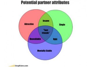
 This other fun chart is clear, because color is utilized to show overlap in the graph and differentiate between attributes. In this visual representation, the color only benefits the representation.