Virtual Reality for Social Change

Our reading regarding Virtual Reality was pretty specifically focused on historical simulation modeling, but I found that a lot of articles about VR technology did not discuss that particular usage as significantly as they did utilizations in science and gaming. However, The Telegraph published an article by Monty Munford that explores the idea that virtual reality, so often depicted as exact and utilitarian, can be a manifestation of empathy.

The examples provided in the article, such as using Oculus Rift to comfort the terminally ill or pairing Virtual Reality with a social justice campaign to improve “understanding,” might not be exactly what digital humanities scholars have in mind when they consider how to employ VR technology. Instead, Virtual Reality refers to reconstructions of three-dimensional reconstructions of artifacts and virtual renderings of ancient locations. Most projects that employ Virtual Reality could be interesting outside of academia, but like Snyder mentions in “Virtual Reality for Humanities Scholarship,” the average person might not find them as impressive as scholars do because they are exposed to similar effects in media and are not familiar with the subject of the project.

However, I found the author’s argument about how Virtual Reality can be used to bring humanistic concepts to a wider population interesting, if at times questionable. The article seems to be inspired by very specific, individual instances of VR use rather than by a trend with a lot of potential. Additionally, the author seems to overestimate how “real” Virtual Reality can truly be. When discussing the practical application of Virtual Reality for empathetic purposes, he writes that “the ability to be taken to other parts of the world to ‘feel’ what it is really like to be afflicted with Ebola or cowering under fire in Syria will be a very powerful experience and one that is likely to lead to more understanding. It will certainly have more topical impact that re-recording a song about African that was relevant in 1984, but is now almost offensive in patronizing the people that well-meaning pop stars are trying to help. A few sessions for these singers strapped to a VR headset and a real African experience would certainly improve their lyricism, if not their attitude.” I definitely think employing Virtual Reality in order to bring attention to social issues is an innovative idea, but the experience that is created for the user through Virtual Reality technology is still someone’s perception of reality and should not be confused with reality itself.

Week 8: Challenges in Interface Design

The readings this week focused on interfaces, and there was a lot of focus on how interface design shapes the user experience. Certain pieces even attempted to determine the fundamentals of interface design, which could be referenced regardless of how innovative the designer chooses to be with the interface. None of the articles really use language that restricts the concept of “interface” to operating systems and webpages, and we did see examples of creative interfaces with “The Knotted Line” and “Freedom’s Ring,” which experimented with layout and multimedia use. However, advances in technology have created the potential for interfaces with less obvious “surfaces” that often require an even greater degree of interaction.

I found an article that describes several different examples of next-generation interfaces, many of which employ a tactile component. Some of the technology discussed is already fairly prevalent, but almost none of it seems capable of replacing more traditional interfaces. Certain examples, like gesture interfaces and brain-computer interfaces, seem like they would never be able to deliver consistent results while others, like the Tangible User Interface and wearable computer, seem to improve very little on what is already available.

The article posits that the development of different user interfaces helps to create a more immersive computing environment. But it could be challenging to find routine uses for some of these interfaces. Even “smart watches,” which seem to be the most ubiquitous of the listed interfaces, are fairly limited to displaying email notifications and the day’s weather. In a way, the issues that can come up in adapting next-generation interfaces for commercial use are reflected in people’s reactions to the two websites we were supposed to explore for this week’s reading.

“The Knotted Line” especially was visually very interesting, and while the content was probably equally important, I do not think I was alone in finding navigation of the site challenging and the content difficult to access. While a more stimulating interface seems to complement a virtual exhibit like “The Knotted Line,” its interface would probably not be adapted for a website that is intended for more regular use. I am sure there are examples of creative and interactive design elements successfully integrated on less thought-provoking platforms, maybe even on a smaller scale, but I have difficulty believing that some of these interfaces would be accepted for mainstream use.

Week 7: Utilizing Mapping Technology

Our reading this week was all about mapping. Both Alan McConchie and Beth Schechter’s “Anatomy of a Web Map” and Jim Detwiler’s “Introduction to Web Mapping” were intended to teach people to create their own web maps, but “Introduction to Web Mapping” is less instructive, as it includes more information about the history of web mapping. Detwiler lists four generations of web mapping, as recognized by BYU researcher Brandon Plewe, the last of which is characterized by 3D globes and immersive environments. These are elements of applications that strive to create more realistic renderings of our environment; examples include Google Earth, Microsoft’s Virtual Earth, and NASA’s WorldWind.

Although “Anatomy of a Web Map” considers Google Earth to be separate from the realm of web mapping, the application is included in Detwiler’s article as a global web mapping technology. Both articles seemed really interested in exploring the popularity of interactive elements in modern map-making, whether they take the form of “pop-ups” over locations of interest or the ability to zoom and pan. I think it can be interesting too to see how this interactivity ends up being utilized by consumers. A service like Google Maps can be kind of overwhelming—even though it gives us the power to explore almost any area we can think of, the first place most people want to search for is their own address, and its only obvious function is generating directions. Google occasionally showcases certain interesting places, but a lot of other websites have popped up featuring coordinates of beautiful locations, lists of embarrassing street view incidents, and rules for innovative games.

Abandoned%20Homes
Abandoned buildings on Ha Island in Japan featured on Oessa (+32° 37’ 39.72”, +129° 44’ 17.73”)

Most of these “guides” have popped up independently of Google and each has their own philosophy behind how to best supplement Google Maps. Time wrote briefly at one point about Oessa, a blog that is especially active in featuring creative Street View locations and includes coordinates in every post so that readers can explore the photographed area on their own. In an interview, the blog’s creator said that she did not find Google Maps compelling in and of itself, but that the world was inspiring and she appreciated that Google allowed her to access it. Although an application like Google Maps can be considered an impressive achievement in web mapping, it is still a tool, and it is often employed in ways that its creators did not exactly intend or foresee.

Week 6: Applications of Social Network Analysis

I really genuinely enjoyed reading Kieran Healy’s “Using Metadata to Find Paul Revere” this week. However, because the network being analyzed was active centuries ago and has already been documented to such a great degree, it would have been easy to dismiss Healy’s application of social network analysis as not especially relevant or groundbreaking. I found that using the narrative of the American Revolution was a very creative way to introduce the concept of social network analysis and create an analogy for current policies regarding metadata use. Although the story of the “Royal Security Agency” keeping an eye on the patriots was used as a framing device for an explanation of social network analysis, the story was interspersed with several tongue-in-cheek references to our own security agencies’ use of “metadata” to track “terrorists,” demonstrating the power of social network analysis and its potential use in the modern world.

I found another article about the application of social network analysis that might be helpful if anyone didn’t pick up on some of Healy’s allusions. “Life in the Network: the Coming Age of Computational Science” argues that because of the amount of data we generate over the course of the day, it would not be very difficult to get a comprehensive picture of our lives given access to said data. Social network analysis, or computational social science, occurs on a grand scale at large companies and government agencies, but the authors of “Life in the Network” maintain that even if computational social science were to be adapted to fit a model focused on academia, it would not offer the general public any more access to knowledge.

There appear to be many issues associated with social network analysis, especially regarding privacy concerns, which can be seen as either an obstacle in the advancement of computational social science or an argument against the practice of social network analysis. The article provides several examples of data collection in the area of computational social science, like the examination of group interactions through email data and the use of GPS to track movement, and offers ideas as to the questions such studies could address. The data that is involved in those studies is considered “self-reported.” However, because data is now generated at such an overwhelming rate and in so many different ways, it does seem possible that plenty of data is being collected and analyzed without us being entirely aware.

Week 5: An Application of “Humanities Approaches to Graphical Display”

The theme of this week’s readings seemed to be responsibly representing humanities-related information visually. In the article “Humanities Approaches to Graphical Display,” Johanna Drucker expresses concern that the way people are approaching graphical displays of information lends them too much authority, especially when the graph’s subject is not easily quantifiable, a common problem in humanistic work. When confronted with data visualization, people often forget that what they are viewing is an interpretation of phenomena rather than a duplication of the phenomena. She introduces the idea of differentiating between “data” and “capta,” capta being the constructivist equivalent of data used in humanistic inquiry.20130810_GDC178_1190_1

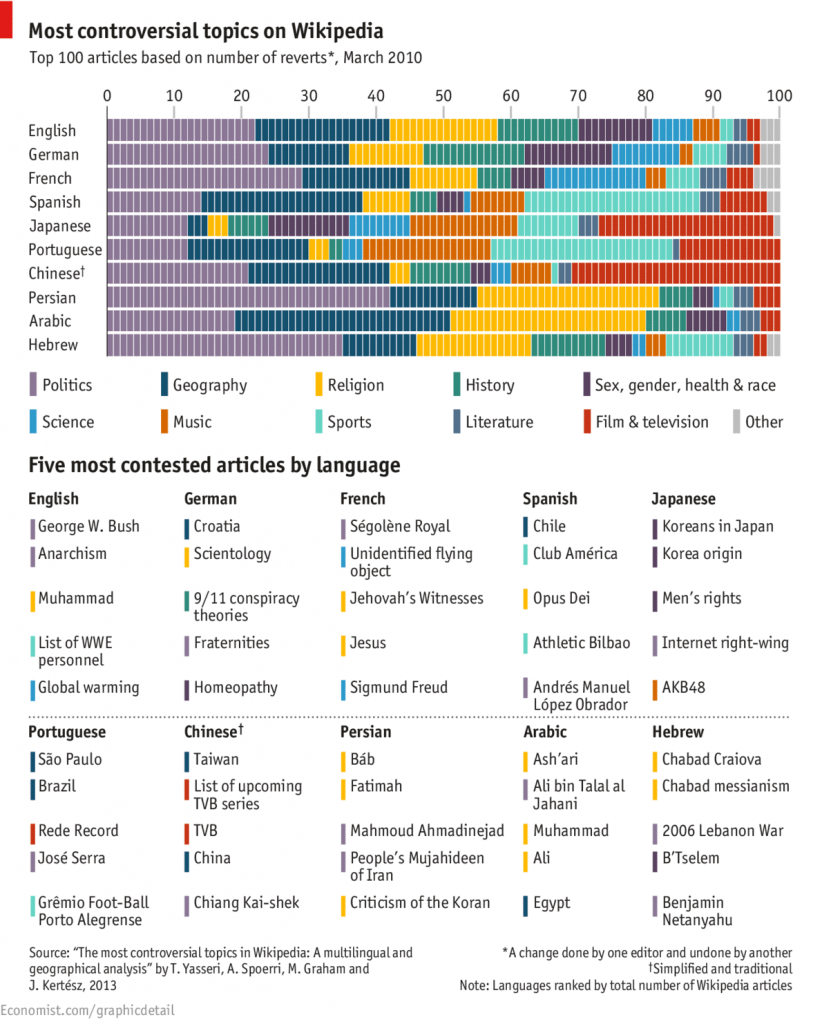
Drucker’s article about the limitations of data visualization led me (naturally) to start thinking about controversial data visualization. Instead, I found a chart about controversial topics in different languages, and although it was not exactly what I set out to find, I found it interesting, especially when I tried to think about it in the context of some of Drucker’s arguments.

At the end of her article, for example, Drucker begins discussing a map that displays the frequency of cholera outbreaks and their geographical location. However, the visualization as it has been composed does not take into consideration an individual’s “profile, age, size, health, economic potential, family, and social roles.” Likewise, The Economist’s chart only displays what articles on Wikipedia have received the most “reverts,” and although it is not difficult to guess why, in some cases, an article was so frequently edited, the article itself does not reveal the reason the content of an article would be contested, making it challenging to interpret international results.

Additionally, it seems important to Drucker that assumptions about data not be made too readily. Therefore, it is important that the results not be interpreted too broadly. It would be misleading to assume that the graph represented the most controversial topics in a given country, because people who edit articles on Wikipedia is a bit of a niche, and therefore the articles they give the most attention to do not necessarily represent the priorities of the general population. The average English-speaker, for example, probably does not have any opinion on WWE personnel, but the people who do might be argumentative and active enough online that the frequency of changes made to that Wikipedia page register among the five most contested topics.

“Humanities Approaches to Graphical Display,” along with the other articles we read the last two weeks, provided helpful information about approaching data visualization. While most charts and graphs, like this one, are not misleading, intentionally or accidently, the people responsible for data visualization set parameters deliberately, so it is important to try to understand their reasoning when determining the validity of the finished product.

Week 4: Interactions with Databases

When I started this week’s reading, I kind of dragged my feet. I had a very singular image of what a database was and what it could do. For whatever reason, I was restricting myself to imagining databases as endless accumulations of data, minimalistic in presentation, which could only be decoded by people trained for such a job. The Companion to Digital Humanities did say that the database has an important place in humanist research, “whether it is the historian attempting to locate the causes of a military conflict, the literary critic teasing out the implications of a metaphor, or the art historian tracing the development of an artist’s style,” but it was still difficult to imagine using a database unless for dedicated research.

It wasn’t until I started to casually browse the New York Public Library’s Articles & Databases page (itself something of a database) that I realized the number of purposes databases could serve. Many stored immigration or genealogy information (similar to the Transatlantic Slave Trade Database); others were archives of printed articles. Many of these were interesting enough, but they fit into the descriptions of databases provided by our readings. I wasn’t really surprised by what I found until I saw the listing for the International Movie Database (IMDb), which I recognized. Although IMDb claims to be a source for entertainment news, most people use it to figure out if they really do know an extra in a movie from something else.

It is possible that the majority of databases are used as directories or otherwise in the pursuit of research. To some extent, I have not reconciled my preconceptions about the utility of databases, but I can see how it is possible for a database to function more as a search tool in everyday life. I noticed that a lot of people see iTunes as something of a personal database that they use frequently, which makes me wonder if there are any more traditional databases that could be considered overlooked.

Week 3: Data-produced Original Content

The article “How Netflix Reverse Engineered Hollywood” from this week’s readings discussed the author’s project to dissect Netflix’s genre system. He considered everything from the site’s tagging process to the syntax behind its famously niche genres. Though Alexis C. Madrigal was interested in Netflix’s data collection, his focus was largely on how the data contributed to Netflix’s unique categorization system. At one point in his story, Madrigal visits Netflix’s VP of Product, Todd Yellin, and although “he seems impressed at [Madrigal’s] nerdiness, he patiently explains that we’ve merely skimmed one end-product of the entire Netflix data infrastructure. There is so much more data and a whole lot more intelligence baked into the system than we’ve captured.” Madrigal’s focus was rather specific, fitting considering he was analyzing genres known for their alarming specificity, but his conversation with Yellin hinted that Netflix is employing data in many innovate ways, including in the production of original content.

Netflix’s foray into original content is interesting because it has flouted many of the conventions of Hollywood filmmaking. For example, the website releases its content all at once instead of making one episode each week and its executives have refused to publish ratings because they are irrelevant to Netflix’s system. Such policies have produced many a think-piece about the television industry’s potential for change, many of which focus on how Netflix’s access to user data fuels the company’s original programming decisions. Although plenty of studios lean on statistics and ratings, Netflix has a pretty honest view of not only what people are watching but how. According to Yellin, Netflix knows if a user “plays one title, what did they play after, before, what did they abandon after five minutes?” (The Guardian) I’d be interested to learn if Netflix’s data is more helpful than that available to more traditional content creators and if other media platforms feel pressured to adopt certain features of Netflix’s data-driven model.


Source: http://www.theguardian.com/media/2014/feb/23/netflix-viewer-data-house-of-cards

Week 2: Classification of Music

One of our readings this week was “Classification and its Structures” (Sperberg-McQueen), which explained the potential uses for a classification scheme and described different types of classification schemes. Nominal classifications were the first to be introduced, and they appeared to be the simplest: the different classes in the scheme are “discrete classes which, taken together, subdivide the set of things being classified.” Nominal classifications are easy enough if the different classes remain distinct; however, problems can emerge when the data grows over time to such an extent that the classification scheme demands additional classes, many of which have the potential for shared characteristics.

Every Noise at Once - Home Page
Every Noise at Once is an interactive representation of musical genres.

The article described this situation as a classification scheme that allowed for “variable depth.” Sperberg-McQueen’s example of the Dewey system subdividing the class of English drama (itself already a subdivision) by period made me wonder if anyone had tried to apply a similar system to music. iTunes sorts everything into about twenty generic classes, but it is pretty clear that a label like “Alternative” is so broad that it has the potential to encompass many very divergent acts. After a little research, I found the project Every Noise at Once, which displays impressive specificity in its attempt to represent every music genre conceivable.

Every Noise at Once - Indie Rock Artists
Clicking on the arrow next to a genre brings you to a page displaying relevant artists.
Every Noise at Once - Pop Genres
The page displaying artists also displays related genres and what could be considered their opposites.


According to the website, Every Noise at Once is “an ongoing attempt at an algorithmically-generated, readability-adjusted scatter-plot of the musical genre-space, based on data tracked and analyzed for 1284 genres by The Echo Nest.” In addition to that brief description of the project, the home page also includes ins tructions for browsing the website, and although the “calibration is fuzzy,” there does appear to be some sort of order to the visual representation of the data. Although the site might not function very well as a music discovery tool, the website incorporates so many subdivisions that finding relevant acts becomes a surprisingly efficient process. Understandably, there is some overlap between genres when searching by artist, and the website does not attempt to explain the distinctions that are being made, but it is still a very systematic look at a data set that had a number of possible organizational schemes.