Invasion of the Icons

Having worked at an app development company as a UI/UX Design intern over the summer, I found the “Elements of User Interface” interesting as it comprehensively broke down the design process involved. The visualization also largely helped to explain the principles of an interface and how they were linked. The reason I love the diagram he uses is because in a company, the vision behind the function of an application and how it is designed are usually designated to different people, which often creates a divide in how the app is envisioned. This usually does not translate well in an interface as it violates rules that Schneiderman brings up in his “Eight Golden Rules” such as consistency. This is why generally there are only a few senior designers who push their vision of the product while others in the department work to supplement the structure they have established.

Another part of the reading I found interesting was Kirschenbaum’s account of balancing form and function within an interface. TextArc, which is the example he uses, is described as an analytic engine which compares novels and texts. However he explains that its success was due to the interesting visuals the tool used to present information. Set in a contemporary context, I would argue that youth culture (especially digital natives) heavily rely on aesthetics more so than function as a means of judging whether or not to use an interface. The increasing popularity of using icons and images within GUIs is an example of our generation’s need to condense and quickly identify information through visuals as opposed to text. This is evident through changes in the organization of information through the years through operating systems such as Windows. If we look at the images we can clearly see that smaller graphic icons have been replaced with larger objects which make it 1) easier for a user to interact and select options, 2) aesthetically pleasing as information is given space and neatly separated from other elements. A nicely designed interface also speaks for itself- any modern task has about 50+ methods of using technology to be completed, therefore marketers have to rely on presentation, style and aesthetics to attract users as well as differentiate themselves from other competitors.
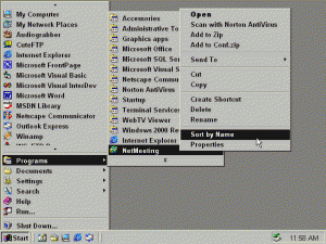
Windows 95- Text based menu options
Windows 8.1- graphic start menu

Riding bikes, still getting fat

What I found interesting about this article was the fact that Drucker essentially annihilated our preconceived notions of authority pertaining to knowledge in the form of graphical representations. Our understanding of a certain statistic is based on our ability to relate one set of data to another. She describes our existing paradigm of communicating information in the digital humanities as a process that is based on a fundamentally different set of epistemological assumptions drawn from disciplines that are “at odds with a humanistic method”.

An immediate connection I made when reading this article was the June 2014 Coca Cola advertisement “Happy Cycle”. The happy cycle is a Goldberg contraption designed to deliver cans of coke by getting a user to exercise on the bike. Coca Cola reported that it would take a 140 pound male or female around 23 minutes to burn off the amount of calories in one can of coke on this over-sized bike. Bystanders who who took a turn on the bike were given a can of coke as a reward. However, the problem was that most Americans weigh over 140 pounds, therefore the statistic used by Coca Cola is largely irrelevant as it pertained to a small sector of the population. Statistics from the article collected by the CDC show that an average 20 year old American man weighs approximately 196 pounds, 50 pounds well over what Coca Cola uses as a standard. The misleading assumption of a person being able to burn off a can of coke through a uniform exercise pattern throws any notions of human diversity out the window. It does not take into account individual differences from person to person such as rate of metabolism, gender, fitness, BMI just to name a few. Furthermore the idea of having to do 23 minutes of exercise pedaling on a bike to burn off the sugar in a can of coke, also neglects other health aspects of coke such as cholestrol or blood pressure. (God knows what they put in Coke.) Representation of information is not only about the capta itself, but largely pertains to the medium by which a person digests it through. Their initial exposure to the data largely shapes the way in which they perceive and formulate an opinion on the matter.

http://www.businessinsider.com/coke-happy-cycle-ad-calorie-statistics-2014-6

Designing Data- Image Atlas (Taryn Simon)

The book Data and Design was an extremely interesting read. I enjoyed its clear and cohesive approach at drawing out the relationship between good design and presenting information. I love the fact that Coale not only encourages us to “present information” but to design an “information experience”. I think this is important in understanding the fact that data cannot be completely objective as the very act of organizing and visualizing it is in turn emphasizing certain elements and bringing attention to select elements of the research through design. He goes on to describe in his chapter “Importance of Font, Color and Icons”, principles of design such as minimalist approaches, utilization of color theory etc. that lead to more effective absorption of visualized data. An example shown in the book that inspired me was Florence Nightingale’s “Diagram of the Causes of Mortality”. The beautiful and cohesive design of the Coxcomb diagram is an iconic method of displaying data that is still used in a contemporary environment. It goes to show that good design is something that is universally recognized; a language that although not everyone speaks, any pair of eyes will understand. Another interesting point that I think he made was his reference to the fact that humans have been using methods of visualizing data with icons and pictograms as far back as the Neolithic ages. This is interesting to me as it shows that man has always had the ability to visually communicate information and the inclination to express themselves with something more than words.

Taryn Simon is an American artist that is fascinated by categorization and classification. Her work often involves extensive research to gather data which she then formalizes in the medium of photogrpahy, text or graphic design. Her project Image Atlas was something I immediately thought of upon looking into visualizing data. Her website http://www.imageatlas.org/ “interrogates the possibility of a universal visual language and questions the supposed innocence and neutrality of the algorithms upon which search engines rely.”- as described on her portfolio. The structure of her image atlas is interesting as it compiles the top results of an image search using the same keyword from different countries that use local search engines. E.g. If I wanted to compare the the images a user in China and a user in Korea would see after typing food, Image Atlas would compile the top results of their local search engines (Baidu and Naver, respectively). Although this is not an entirely scientific method of acquiring insight on the topic of search, it is an interesting way of communicating differences in terms of exposure to data and cultural iconography within each country. My favorite part of this website is the fact that North Korea is listed, but has zero results listed no matter what the search is.

Week 3: Suggesting the Right Thing

  1. Peter Lunenfeld wrote in his book The Secret War Between Uploading and Downloading: Tales of the Computer as Culture Machine- “All animals download, but only a few upload anything besides shit and their own bodies.” Through the use of suggestion algorithms such as the one that Netflix designed, users are essentially automatically uploading information every time they select a movie or post a rating.

    My Facebook is able to tell me who I may and may not know. My twitter is able to show me news based on interests or previous activity on my handle. My web browser predicts what I’m going to search and gives me options to choose them before I am even done typing. My computer basically seems to know me better than I do.

    Different social media platforms have different functions to me. Facebook is a social tool that I primarily use to connect to people, whereas Twitter is more of a place where I can think aloud in 140 characters. Through the perception that each platform can provide something different for me, my persona becomes depicted differently in each situation. In turn the things that appear on my news-feed or dashboard across each account are vastly different. Suggestions as a feature allow users to explore content that they may be interested in based on previous navigation, but arguably also restrict and discourage freely surfing other topics. Some apps and programs have taken this to the next level by completely abolishing the search function, and replacing it with ‘programmed content’ based on its relevance to you.

    The app Yeti is an example of an app that shows you content, not based on search, but location. Evolving from its conceptual predecessor “At the Pool”, Yeti utilizes one’s location to generate a feed of content generated from other users nearby.

    Sources:
    http://yeti.ai/#firstPage/discover
    Peter Lunenfeld- The Secret War Between Uploading and Downloading