Week 9: Exploring Virtual Reality Through Childhood Memories

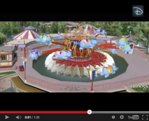
disneyScreen Shot 2014-12-01 at 1.10.14 PM

I have always had a fascination with constructing my own realities; from building my own version of Polly Pocket World as a young girl, to later developing a more advanced virtual theme park from Zoo Tycoon as a preteen. It has always been a passion (and obsession of mine) to control and manipulate architecture. The ability to build your own, personal theme park gave me a sense of power and authority and ultimately led to my strong sense of leadership and decisiveness later on down the road.

As I took a trip down memory lane exploring the ropes of Zoo & RollerCoaster Tycoon again, I wondered if one of the most famous and successful theme parks in the world used the same technologies to develop their own infrastructure and park mapping plans. Disneyland, as I discovered, has an online site dedicated to the virtual representation of it’s sister park, Disneyland Paris Resort in 3D. Through Google Earth, users are able to tour Disneyland Paris at their own leisure and explore the park’s sites from every angle imaginable. The perspectives provided in this virtual reality are incredible; you can view the park through the eyes of a tourist on the ground level, or even as a passenger on any of the rides! I appreciate the immense respect to detail and the incredible precision that the engineers of this program created. Every color pigment, umbrella, drinking fountain, and tree are represented to an exact replica of the original park. I think it would be very valuable and to speak with the creators of this program to see how they constructed all the elements so accurately, what tools they used to create such a realistic experience, and to discover how long it took to construct the site from start to finish.

The presence of virtual realities online are a useful tool in exploring not only current, physical locations, but also, the future development of a theme park, office building, or other architectural site. It gives viewers are accurate portrayal of the dimensions of the land site, and offers a new and exciting way to see and imagine reality. In the near future, I can see these virtual maps taking over traditional paper maps in theme parks to help park-goers have a more realistic view of the park. This new technology has the potential to incorporate live satellite views to show other attendees a live representation of lines and waiting time. Using virtual reality technology can help to construct a better theme park experience…and this is just the beginning of all the possibilities.

 

Week 8: Apple’s OS X Yosemite, a ‘Hike’ in the Right Direction

os_x_yosemite_roundup

For weeks now, my MacBook Pro has tested my patience by constantly reminding me to install the new software update for my laptop: OS X Yosemite. I was reluctant to update because firstly, I thoroughly believed that I didn’t have enough time to restart my computer and install the software (assuming it would take two hours to download), and secondly, my hard drive crashed over the summer and I was afraid that such a large installment would mess with the functionality of my laptop. I was also subconsciously unwilling to adapt to all the new changes the new layout and design would propose. We become so comfortable with the ‘known’ that anything new or seemingly foreign is undesirable. I finally caved into the download when my Google Drive browser was deemed incompatible with the current software that I had, so I was forced to update. To my surprise, the download took less than 20 minutes and none of my applications, documents, or bookmarks were deleted in the process. I had heard horror stories from friends updating to the new OS X Yosemite and losing all their precious documents, so I was very relieved to see that everything was right where I left it. The new streamlined design is more simplified than ever. However, as a self-proclaimed ‘neat-freak,’ I enjoy the simplicity and think it leads to a less cluttered user experience. I find it interesting how in the past, we have put so much focus into making the user experience progressively more realistic, and then all of a sudden switch gears to a flat design. The Flat vs. Realism debate is graphically depicted on flatvsrealism.com and has a very captivating approach to compare and contrast the two design preferences. Realistic textures and luminosity triumph in realism, where simplistic lines, colors and shapes are the focus in flat design. In 2014, flat design is definitely the more popular choice, at least when it comes to Apple’s preferences. As stated in Shneiderman’s  8 Golden Rules of Interface Design, consistency is key with design and terminology and Apple has definitely made that it’s focus for their new software. Between the new iOS 7 & 8 updates, and the new OS X Yosemite software, Apple has ensured that their brand is consistent, accessible and recognizable. They are pioneers on the technological front, and I don’t see that status changing anytime soon.

Week 7: “I Honestly Don’t Know How We Managed So Well Without GPS”

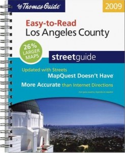
picture-242Thomas_Guide_Los_Angeles_County_Easy_to_Read_2009


Traditional maps are said to date back 8,000 years ago as cave drawings in Ancient Mesopotamia. Fast forward through the 16th and 17th centuries when cartographers realized that the world is not in fact flat, all the way up to the digitization of maps, it is undeniable the incredible transformation maps have made in the past 20 years, let alone the past 8,000.

Upon reading through the Anatomy of a Web Map presentation by McConchie and Schechter, I found myself nostalgic of the times when I was younger and watched my parents input addresses into MapQuest online. The more I thought about how useful MapQuest was to my family in the early 2000’s, the more I wondered how the heck did people get around to unknown locations before the invention of web maps? Of course there were paper maps, but how were people able to account for traffic, or choose the quickest routes to a location with just a paper map? I proceeded to text my mom the same question and she promptly responded…

“We used Thomas Guide, or went to AAA to get specific city maps. Every gas station worker/owner would give you directions, but I honestly don’t know how we managed so well without GPS.”

The same could be said about the invention iPhones. Every American seemed to be able to function quite well upon the era of the “flip phone,” but ever since Steve Jobs’ legendary technological invention, individuals have no idea how they would be able to carry out their lives without this device in their presence each and every day–myself included. We are a generation that is becoming more and more dependent on new technologies, and in effect, we are seemingly less functional if we are ever not in the presence of these devices. In Information Studies 20 last year, Professor Srinivasan forced us to take a “Digital Detox” day, where you were not allowed to use any technology for a full 24 hours. Based off a camp in Northern California where campers are stripped of all technologies in order to find their personal peace again, the assignment really taught myself and all my fellow classmates how much of a presence these devices are in our everyday lives. At the end of the day, we need to be able to detach ourselves and “unplug” from the digital environment in order to ensure the only presence we have is not an online one.

Week 6: Networking with LinkedIn

Networking in this day and age is extremely important, and in some cases, it may be more important than the major listed on your degree, or your previous work experience. Through some of the most popular, modern day networking sites like Facebook and LinkedIn, users can establishes connections based on similar job experiences, interests, and professional relationships with coworkers. Upon searching through LinkedIn’s website, I discovered an article discussing the importance of networking in the connection sense, but also about networks in the visualization sense. Through LinkedIn’s new product titled, InMaps, users can envision their professional network through an intensive visualization.alisnetwork-1This interactive, visual representation of an individual’s network helps to understand the relationships one has with their connections. With this graphic, one is able to identify job opportunities, gather important insights, or leverage the visualization to seek helpful advice. The map is colored coded to help distinguish between different groups, companies and other affiliations. It also helps to separate out connections that are based from high school, college, or past job experiences.

What I thought was really unique about the visualization was seeing how one’s professional network was created over time. Unfortunately, upon attempting to create my own InMap, I discovered this tool was discontinued. However, the information and connections established on personal profiles can easily be copied over and put into another visualization application to create a similar graphic. Stat Silk is a site that creates a variety of interactive visualizations when sufficient data is input. One of the features from Stat Silk that I found particularly useful was the map function. This will be extremely useful for my group’s final project, which is based on geotagging Food Trucks in Los Angeles. It has interactive qualities which will be helpful in constructing a user-friendly site where consumers can click around a map of Los Angeles to see where specific food trucks are at the current time.

Although networks are important, they shouldn’t be applied to everything, according to Weingart’s article, Demystifying Networks. In a humanities sense, this complex interlocking system of relationships is uncertain, flexible, and not easily defined; however, they help assert a sense of organization. Through LinkedIn’s unique data visualization, InMap, professionals are capable of seeing how their connections establish a broad and diverse network over time, and help to organize them into different fields to make the research process more efficient.

Week 5: Visual Connections

I have always been a visual learner. Flash cards with bright colors and images were not only beneficial for my academic pursuits, but were an outlet for me to creatively express myself through my studies. I pursued my artistic abilities early in high school through the outlets of photography and music, further extending myself into the realm of the arts, while pushing father and father away from the left side of my brain. In reading Humanities Approaches to Graphical Display, I was reminded of the growing disparity between humanities scholars and the “scientific world.” Although it seems that collaboration between the two fields could lead to greater findings and realizations, the fact of the matter is, the learning styles and ontologies between these fields are so different because of a fundamental dissimilarity in the basics of understanding capta. The creation of data visualizations attempt to bridge this gap and provide a balance of art and algorithm so both end-users find this data as helpful tools in scholarly research.

Constructing data visualizations allows individuals to interpret data in an alternative form that has the potential to heavily influence its users. Data is unbiased in nature, however, the inherent assumptions humanities scholars have when constructing these graphs and visualizations weigh a considerable bias on the interpretation of the module. Regardless of the unavoidable biases, data visualizations help to create more context and evidence for a multitude of purposes from historical studies to competitive analysis to even determining the factors that influence and attract individuals to certain food truck locations (the latter is a real example from our final project).

After looking at the various visualizations provided in this week’s readings, I thought back to a friend of mine who is currently a student at Stanford in the Product Design & Engineering school, as well as an active member of the Design for America program. Her website promotes her unique thinking process, her design skills, her marketing and communication skills, her successful work experience, and of course, her charming personality. I selected a segment of her website that highlights her design thinking and saw a variety of clean and aesthetically pleasing visualizations that she had created for a project about the homeless in California.Screen Shot 2014-11-03 at 1.06.56 PM Screen Shot 2014-11-03 at 1.09.22 PMScreen Shot 2014-11-03 at 1.07.13 PMNot only has she created visualizations for various projects and job experiences, but also, she creates logos, pamphlets and other designs for her other extracurriculars. I am so beyond impressed with Katie’s ability to communicate with people so clearly and effectively through the medium of data visualizations and design, and she gives me hope that the world of humanities will continue to become a more prominent and important part of our society.


Week 4: Dazed about Databases

Databases are the ultimate archive. They allow for efficient storage and retrieval of information on a simplified level, and provide comprehensive lists of data that can be processed, updated and maintained by a variety of users. Databases serve the purpose of holding data in an organized and highly structured manner for easy search and access actions. Some of the most important documents and data can be found in database-like formats such as encyclopedias and telephone books. As more and more information is accumulated overtime, strategies and formats for organization change. What is important to note, is that although databases come in a variety of formats, the system of order is based on similar relational models and terms in order to create some level of consistency.

Although I enjoy technology and consider myself mildly tech-savvy, the information presented in A Companion to Digital Humanities was quite overwhelming, so I sought to incorporate my passion for photography into my research in order to make it more relatable. The Photography Database provides factual information about photographers, public photographic collections, commercial galleries, photographic exhibitions, and citations to the many published sources used to compile biographical, collections, and exhibitions data. The database contains over 97,000 entries and is updated on a continual basis.


Screen Shot 2014-10-27 at 12.03.41 PM

I decided to do some site searching to see what would come up when I entered my favorite photographer, Vivian Maier. The results listed her birth and death dates, her hometown, her nationality, her active photographing years, her website, and a link to the galleries and exhibitions her work has been shown at. Although the website is not as aesthetically pleasing as the Trans-Atlantic Slave Trade Database, it serves its purpose as a functioning and organized database.

Through further exploration of the site, I found a significant reoccurring, problem; one that could proposes major challenges for users. The database provides information on galleries and photographers, but only once the user searches for specific gallery titles and names of artists. It doesn’t allow for alternative search options for those not as informed on the happenings of the photography world. Even as an experienced photographer in both academic and photo-technical settings, I minded very much that there weren’t filter options available to search for unfamiliar photographers and exhibition names. That being said, I think it is a useful resource for students, amateur photographers, and professional photographers alike who wish to learn more about an artist and his or her background, all while conveniently providing an external web browser link to conduct further research if desired.


Week 3: Is Technology Dividing Cultures?

There is seemingly an infinite amount of ways to categorize information. In most cases, classification is biased towards an individual or a cultural preference, giving priority to the social norms of each respective community. However, in our digitized world, cultures lacking modern technology are deemed incapable of making these classification decisions, and this notion incorrectly contributes to the ever-growing digital divide. This idea unethically promotes a division between cultures who have access to new technology, and those who don’t. We must understand that in some cases, modern, digital technologies aren’t relevant or useful in certain culture’s practices.

Modern technology is thought to provide a more efficient and powerful way to accomplish tasks, but as we investigate cultures and their practices, we find that new digital and technological advances aren’t always the most practical. Last Winter, I took a class taught by Professor Ramesh Srinivasan in the Information Studies Department. We thoroughly discussed the concept of the digital divide and how cultural appropriation in regards to promoting new technologies must be a slow and adaptive process, as different  communities stress different needs. One article in particular struck me, as it fought the urge to close the gap the digital divide is apparently creating. A sociotechnical experiment took place in India in the early 2000s that documented the results of a technology influx: several computers were setup in a rural farming village in Southern India with the expectation for residents to become educated on the various modern technologies in hopes of bringing the community up to speed on the digital age. Instead of appropriating the new technology into their lives for the benefit of their community and economic infrastructure, the children were seen playing video games and creating an unnecessarily competitive environment that took away from their studies and daily chores. This agricultural village had no apparent need for the technology, nor did they understand how it could provide a benefit to their community, as they were very comfortable in their way of doing things.

i-slate

What is important to note, is that the individuals who provided the technology were only present for the setup and removal of the devices, and didn’t make themselves available to facilitate the usage of the computers. This is ethical in terms of cultural appropriation standards, as it allowed the community to learn for themselves how to use the devices, as exemplified in the success of the Plateau Peoples’ Web Portal. However, introducing such a foreign object into the community requires more mentoring and technical assistance than there was provided. With the assistance from computer experts, this community could’ve benefitted from learning how to track weather patterns and the prices of goods to help their agricultural economy improve. There is a balance between introducing and enforcing knowledge on other cultures, and with the abundance of new technologies, we must be careful in the ways in which these devices are presented in order to maintain the unique practices and the integrity of cultures around the world.

Week 2: Preserving the Past, Present & Future

The emergence of new technologies has created an inevitable shift in the perspectives and paradigms of researchers, students, and community participants alike. The abundance of preservation software and digital archives has only increased throughout the last decade as archivists and scholars are realizing the importance of maintaining documents crucial to the political and social histories of communities around the world. However, as days, months, and years go by without correctly storing these important academic and cultural findings, we are losing integral parts of our worldy culture that cannot be restored.

Reading through Gaffield’s article on her search for the Haitian Declaration of Independence initially excited me, as I am a history junkie who relishes the idea of having my own National Treasure moment, excavating historical documents and treasures deep inside the Pyramids of Giza or the mysterious lost city of Atlantis. I appreciate how she thought outside the box and conducted thorough and unique research on the involved participants to draw more conclusive findings than any previous researcher had done before her. In similar ways to Gaffiled’s innovative research, Noriega’s work with UCLA’s Chicano Research Studies Center, utilized creative methods to preserve all forms of media related to the field of Chicano Studies. I admire the focus on protecting important historical documents for the use of both academic institutions and cultural communities.

In my last quarter at UCLA, I had the honor researching important projects and documents related to the city of Los Angeles and its past and present infrastructure. Naturally, as a Digital Humanities Minor, I was drawn to the Los Angeles Aqueduct Digital Platform (LAADP), an online archive of articles, documents, and other relevant information contextualizing the history of the Los Angeles Aqueduct. This platform revealed the various social, political, and environmental impacts the aqueduct has made on the community and the nation. Through the compilation of various text and media samples such as photographs, maps, newspapers clippings, and pamphlets, the public is able to look at past archives to discover the historical significance behind the Los Angeles Aqueduct. This platform enables scholars and students alike to assess how the community has managed water over the past century, and provides ideas on how to continue maintaining it throughout the next century and beyond. The nature of databases proves to be unbiased because they draw from so many different sources, libraries, and other research institutions. The LAADP is fashioned in the same way, putting heavy emphasis on the diverse list of resources it pulls from. It provides permanent samples from over a century’s worth of historical events, cultivating dynamic conversations over the innovative perspectives it reveals.

la_aqueduct_frontpage

The emphasis on a depth and breadth of information in archives and databases adds to the credibility and usefulness of the source itself. Gaffield’s extensive research in combination with Noriega’s variety of preservation methods and the accessibility of the LAADP contributes to the value we put on digital archives in our world today.

Works Cited:

Bon, Lauren, and Metabolic Studio. Los Angeles Aqueduct Digital Platform. UCLA Library

Gaffield, Julia. “Haiti’s Declaration of Independence: Digging for Lost Documents in the Archives of the Atlantic World. The Appendix 2, no. 1 (January 2014)

Chon Noriega, “Preservation Matters,” Aztlan 30:1 (2005)