Week 9- Google + The Cardboard Project

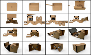
google VR viewer


Technology has evolved at such a fast pace, but it’s given us incredible opportunities to learn about the world we live in like never before. I am a huge fan of 3D modeling, which I became relatively familiar with this past year at UCLA. I learned about all the really cool things students and professors are doing,

I was thinking about the other day how privileged we are as UCLA students to be surrounded by this leading work in the world of 3D academia. But how can other people experience this cutting edge technology in virtual realities? Besides video games, is it becoming more accessible?

Then, I thought about The Cardboard Project by Google. The purpose of this project is to bring the experience of virtual reality to the public. Making it easy and accessible, was their goal. This is made possible by creating a cardboard VR (virtual reality) viewer. Only drawback? You need an Android smartphone. But let’s face it, smartphones are more common for our generation. And it’s much easier to see someone our age have one. But that’s besides the point, the Cardboard Project is really cool because the viewer only costs less than $10. The Cardboard Project website also gives a how-to create your own cardboard VR viewer.

With your smartphone, you can load various 3D virtual reality visualizations. From experiencing a virtual roller coaster to collecting coins in a 3D game, virtual reality comes to life and in your own hands, and simply from a smartphone. I have to admit that’s pretty incredible in our world today.

This is really great for people who can’t afford video games or have access to expensive 3D modeling softwares. The experience may not be exactly the same, but it’s still something that helps bridge the technological gap some people experience everyday.

Like Favro mentioned in her article, virtual reality technology is really important in the world of humanities. The humanities search for ways to better understand our surroundings. And I honestly believe that with 3D modeling, it takes that understanding to a whole new level. I think 3D modeling should be more used in all aspects of academia. From studying ancient Roman ruins to creating objects with 3D printers, there is so much we have yet to explore. And like the Cardboard Project, I think we need to create new ways bring this cutting edge technology to the public.
Week 8 – Automatic Playing Videos. Please Stop.

Photo Credit: econsultancy.com

This week’s readings really helped me better understand what user experience design really is. I have a friend majoring in computer science, and he was always telling me how important UX design skills are in today’s job market, and that it is worth learning. I can see why now! Employers are always looking for new ways to make content online more interactive and build engagement with their users.

I visit multiple websites every day because I’m constantly reading random articles that I see shared on Twitter/Facebook or links sent to me from friends and family. I’ve had my encounters with really good websites with amazing user experience design, and others, not so much. Often, I stay away from returning to websites that I found have terrible user experience design.

One of the things I automatically consider to be a bad user experience design involves videos on the page. I love watching videos. I would rather watch a video than read an article most of the time, but when a page requires me to watch a 20 second advertisement before being able to move on OR automatically playing an unrelated video next to an article, it turns me off as a user. News websites tend to do this a lot. I understand this can be an advertising situation, but I feel like there can be better ways to incorporate advertisements onto a website. The Guardian used to do this a lot, but they recently updated their user experience design to be much better than in the past.

On the subject of videos, they have become a really important form of multimedia that is becoming more commonly used in websites. It’s one of the best forms of communication in today’s age. And also, it’s really important to think about how multimedia is presented on a website. I think Ben Shneiderman’s, “Eight Golden Rules” made me think about how important it is that multimedia follow these golden rules. Because you are adding more elements and structure to the website. Therefore, whoever is designing the website must pay attention to consistency and ease of using the site. I almost feel as if there should be a 9th Golden Rule that pertains to how the page is designed for multimedia. This is especially important now as websites become more and more interactive and complex as different elements are incorporated into the website. As Jesse James Garrett mentioned in his, “Elements of User Experience” presentation, user design is all about the human experience. Whenever I encounter sites with bad use of video user experience, it ruins it for me.

Source: http://faculty.washington.edu/jtenenbg/courses/360/f04/sessions/schneidermanGoldenRules.html

Web Mapping In Politics

Screen Shot 2014-11-17 at 11.17.51 AM
CNN.com

Ever since I can remember, local and national political election results have always been represented, in some way, through maps. It’s one of the more common ways media has been able to convey information to its viewers. Of course, the data represented in these maps can often be inaccurate, which is something we discussed in past lectures. Though I do not want to focus my post on this particular aspect, it’s just goes to show how powerful data visualizations used in media can easily reach the masses and relay incorrect information.

I definitely developed an interest in politics at an early age, and always watched election results on TV while at home. Now that the internet has become my generation’s more common way of accessing information, media outlets have shifted and included more of this access to election results online. The internet is how I now keep up with election results, simply because I don’t have a TV with me here at college.

Maps, in my opinion, are one of the best visualizations for elections. I think it would be odd to show results without the classic outlined map of the United States with each state turning red or blue as results are confirmed. There’s some sort of novelty in that. Because I had work during the recent 2014 Midterm Elections, I went online to check results. From CNN to the LA Times, it seems like every news outlet used “maps” in some way or another to relay election results.

Interactive: When I hovered over Colorado CNN.com
Interactive: When I hovered over Colorado
CNN.com
How LA Voted In the recent 2014 Midterm Elections Interactive Map LAtimes.com
How Counties Voted Interactive Map
LAtimes.com

And I noticed something very important about these map visualization: the election map results I often saw on TV were also being included on websites, and in an even better way. It allowed me to access all the information (e.g. election result numbers) for the particular states or counties I cared about. Interactive continent maps allowed for the user to personalize his/her experience while using the map, versus a television with a reporter looking at specific areas that a viewer might not care about as much.

It’s very interesting to see how important web mapping has played in the history of politics and how it has affected how viewers expect to see results shown. For me, it’s just not right to not include a map visualization. There’s some part of me that enjoys seeing whether not this swing state will go red or blue this time. And honestly, it’s a little bit odd to think about elections in that way.

Sources:

https://www.e-education.psu.edu/geog863/book/export/html/1904

http://www.cnn.com/election/2014/results/race/senate

http://graphics.latimes.com/2014-election-supe-3-precincts-map/

Week 5: Networks + Linkedin

I really enjoyed learning about networks from Scott Weingart’s post, “Demystifying Networks”. It made me realize how common networks are in today’s digital world, and also how often they are utilized by websites we commonly visit. One of the social sites I thought about while reading was Linkedin.

Linkedin is very much a literal representation of how networks work. It’s a site that lets you connect with other professionals who are in the same career field as you or career fields that interest you. Based on the people you know, Linkedin will also provide recommendations for you to connect with individuals it thinks belong in your “social circle”, as you might say. One of my fellow classmates discussed the idea of “six degrees of separation”, which means that it means you are connected to someone in some way through 6 other people. Linkedin is a somewhat good example of that. If you don’t know someone, you’ll often see that you know someone that does.

Linkedin used to have a data visualization feature that allowed you to see how you connect with those around you. Unfortunately, it no longer supports it. Personally, I wish they still kept it because it’s a very visual representation of your professional network, and it’s represented in an interesting way.

The photo above is an example of what the feature used to be able to show you when you wanted to see what your network looked like. It would use “edges” to connect you from your name to the person you were connected with. The color of the edges determined how you knew that person. Whether it be through the “social media” field or others. This person, obviously, has a huge number of connections, which can be seen here in their networks. And though this particular individual’s networks are extremely complex, it just shows how interconnected we are.

I believe the reason Linkedin stopped this feature is because it really wasn’t a central point to their site. Weingart touches upon this subject in his article, that “networks” should not necessarily be used for everything. To him, they’re used far too often and for the wrong reasons. That’s true, and I understand this feature wasn’t ultimately Linkedin’s priority. They may have thought of it as something that looks pretty, but serves no purpose. Personally, I think it’s just a nice additional feature to have on the site, but I understand why they wouldn’t want to waste their money or time maintaining that feature for their users.

Source: Scott Weingart, “Demystifying Networks

Linkedin.com


Week 5: The Importance of Presentation for Text Analysis

Screen Shot 2014-11-03 at 1.12.12 PM

In regards to to “The Real Face of White Australia” project by Tim Sherratt, I saw a few of my fellow classmates discuss categorization, and how it includes not only ideas, places or things, but also people. This is an aspect that I also find incredibly interesting, but decided for this particular blog post to focus on a different aspect: the power and importance in choosing the right format to present your data, especially text analysis.

Upon clicking the link to Sherratt’s site, a collage of faces appear with the title of the project as the header text. When you click on a photo, you can see the form for each individual that immigrated to Australia. The site also includes only two exhibits, ‘home’ and ‘about’. After scrolling and navigating the site even more, I concluded that this was an incredibly powerful way to present all of this document information. What if the creator of this site had simply listed the immigrants’ names, and you had to click on each name to see each photo? For the most part, I think people can agree that another format for this site would not have been as effective. It would not have been as engaging for the user. And the creator chose this format for specific reasons.

This made me realize just how thoughtful of a process it is when creating the “face” of your project, the presentation. Especially for a digital humanities project on text analysis, text can be a turn-off for readers, so how can we keep them interested? These are things all of us working on a digital humanities project have to consider. We have to go through the pros and cons of what to include on our sites, and take ourselves away from the project to consider what may be clear to the creators, but not be clear to our users.

“The Real Face of White Australia” was very engaging and it definitely kept me interested. In fact, it made me want to learn more. Now I can assume that Sherratt wanted to keep the site at its bare minimum where it gave me the information I would need, and would leave me wanting to learn more. At the same time, as a user, I wish there was more on the site so that I didn’t have to click on more links to learn more or search for more information myself. I wish there was more information or maybe even another form of categorization on the site that would allow me to filter and see specifically where each immigrant was from.

I guess this just puts into perspective that the person creating this is doing it for a greater purpose, especially if the information is being published online publicly. It is important to keep in mind the user and help them understand what the project is about and for what purpose, give them the information they may need to fully understand. Especially if they know nothing about the subject matter.

The New York Times + Data + Design

Screen Shot 2014-10-27 at 11.38.42 AM

I was reading Trina Chiasson’s compiled online source book on Data + Design, and I just have to say it’s one of the coolest resources on the internet. I really enjoyed the final product because I know compiling all this information, and making it accessible and understandable to users can be a huge challenge. Within the past year, I’ve really become interested in how data visualization can make unsurmountable numbers of data digestible and surprisingly, enjoyable. It just looks so good. Whether it be through infographics or interactive data visualizations, is a great way to digest information in the 21st century.

As beautiful as this may look. Chiasson’s online book almost takes away the fascination shown in data visualization. What I mean is it is a lot of hard work. In my opinion, there are so many things that can go wrong when compiling and organizing the data. I have so much respect for people who go through the means of creating these visualizations.

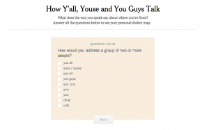
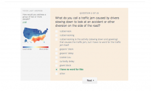
One of the best uses I’ve found for data visualization has been through journalism. The New York Times is my favorite in terms of how it creates data visualizations that can apply to any reader, and they are also super interesting, too! The one I would like to talk about is their most popular data visualization of 2013: How Y’all, Youse, and You Guys Talk.

Screen Shot 2014-10-27 at 11.39.22 AM

This data visualization map takes 350,000+ survey answers that were taken from August to October 2013, and creates a map for where different phrases are said within the United States. The interesting part is that you can take the 25 question quiz, which tells you from where your unique dialect derives from.

This NY Times visualization was based on the Harvard Dialect Survey conducted by Burt Vaux and Scott Golder, which actually began in 2002. After taking this quiz, and seeing how personalized it can be, I can only imagine the number of steps needed to be done in order to visualize this information. I wish that they had shared exactly how they created and organized the data collected instead of having a short “About this Quiz” section.

As someone who is becoming more interested in digital humanities, it really holds importance when sharing data visualizations. Though The New York Times is a journalistic source, we can assume that the information is true, but it’s always good to share that information with readers who want to know more.


Sources: http://www.nytimes.com/interactive/2013/12/20/sunday-review/dialect-quiz-map.html

Data + Design: A Simple Introduction to Preparing and Visualizing Information, https://infoactive.co/data-design/titlepage01.html


The Importance of Language in Classification: Netflix and Reddit

Screen Shot 2014-10-20 at 1.27.01 PM

I really enjoyed Alexis C. Madrigal’s “How Netflix Reverse Engineered Hollywood” article. My curiosity is now somewhat satisfied because I have a better understanding of how Netflix has been so darn good at making recommendations for me. It’s amazing how capable the site is of categorizing 76,897 unique ways to describe types of movies. That number for me is hard to wrap my mind around. In many ways, the purpose of categorization is to help make finding information easier, but can it ever be too much where the opposite is done and the purpose of categorization is lost?

The author of the article, Madrigal, mentioned something that I found interesting. We also touched upon it in class, and that is: the importance of language in categorization aka controlled vocabulary. Madrigal states in the article, “Netflix created a vocabulary” that was used in determining how alt-genres would be categorized on the website. To even begin categorization, there needs to be some sort of agreement made by everyone who will be contributing to the categorization. So those at Netflix had to come up with a specific vocabulary that they could understand and that the audience could understand, no matter where they were from. And like Madrigal stated, they did quite a good job in pinpointing the best terms to use. I mean, “20th Century Period Pieces Based On Real Life”? It’s almost scarily too accurate, which is why Netflix is so good at making recommendations for its viewers.

This also reminded me of the extent other websites try to manage the vast number of categories on the web, and how sometimes it does not work well. Netflix, as a private company, created the language used on the site, which users have to agree with. But that is not the case on forum-like websites where the users create and agree on the common language. Reddit, a very popular site that I’m sure many of my fellow college students know all too well, has for the most part, successfully categorized a large number of sub-categorizations. There are about 6000 active subreddits online. The title of each subreddit, has in some way, been agreed upon by the users. For example, the subreddit, /r/aww features pictures, videos, and stories of all things cute (mostly animals). It might seem like a minute change of detail, but what if someone were to search for /r/awww, instead? (an added ‘w’ included in the word ‘aww’)

The official /r/aww subreddit:

Screen Shot 2014-10-20 at 1.12.29 PM


The very similar /r/awww subreddit:

Screen Shot 2014-10-20 at 1.12.46 PM

There are users on both subreddits and both are active, meaning posts have been submitted within the past 24 hours. And as you can see, both have users on each site, though one has far more. For those using the subreddit /r/awww, they may not know of the common agreement that /r/aww is a more popular subreddit among users, and that separates them from being able to get the same information.

Screen Shot 2014-10-20 at 1.41.24 PM

Reddit has acknowledged the differences between subreddits and has begun to direct users to the other, more popular subreddits minimizing the number of categorizations on the site.

Source: Alexis C. Madrigal, “How Netflix Reverse Engineered Hollywood,” The Atlantic, January 2, 2014

Week 2: #Metadata (on Twitter)

3013208-inline-inline-3-these-amazing-twitter-metadata-visualizations-will-blow-your-mind

I finally understand.

Metadata is a term I’ve heard thrown around a lot by some friends and coworkers, but never completely understood until now.

I’m an avid user of social media, especially Twitter and Facebook. Some people can say my obsession is a disappointing quality of my character, but I love it for a very specific reason. Social media is almost like a science that can conclude more about us than what is on our profiles. A scary thought in terms of privatization, but fascinating nonetheless.

Like many other social media outlets, Twitter utilizes many aspects of metadata that can record your location, what language you speak, interests, and learn a great deal about you just by monitoring your behavior on social.

I knew about how much information about me was being recorded, but I never knew what it was called or where it was going. According to Neal Ungerleider’s Fast Company article, Twitter can determine what language you speak based on messaging metadata, meaning the language in which you sent messages was recorded. This information can then use geographic data from your location of sent tweets to determine where you live, essentially.

Another interesting aspect of metadata that I thought of while reading the article, “What is Metadata?” are hashtags. The hashtag is its own form of metadata that groups related things to one another in an incredibly vast, and almost daunting un-navigable digital space. It has actually been used in the metadata world for quite some time to categorize. But in the world of social media, has only really become commonly used when social media outlets like Twitter and Vine emerged. The use of hashtags is where metadata shines. By using hashtags in regards to certain topics, people can connect with those who share in similar interests.

10721214_10204874311362659_993161795_n

The world of Twitter and even social media in general utilize metadata and the form of metadata in HTML as its asset. It creates a digital space for users from all around the world to connect and make it easier to connect in conversation through hashtags or “suggestions to follow” from the web application itself. By using data to collect more information about you, Twitter is enhancing a user’s experience and, in many ways, positively enhancing the way we use metadata in our every day lives. Especially with the millennial generation’s use of it, it seems to be working.

“These Amazing Twitter Metadata Visualizations Will Blow Your Mind.” Neal Ungerleider. Fast Company. 2013. http://www.fastcompany.com/3013208/these-amazing-twitter-metadata-visualizations-will-blow-your-mind

National Information Standards Organization, “What is Metadata?” (Bethesda, MD: NISO Press, 2004)