Week 6: Networks and Social Networks

For week 6, I particularly enjoyed the reading about Demystifying Networks. In this blog entry, Scott Weingart laid the groundwork for understanding networks.  Although I had an idea of networks before reading this article, there were definitely some elements of networks that I didn’t really understand, so just ignored.  The detailed post explained each level of the network.

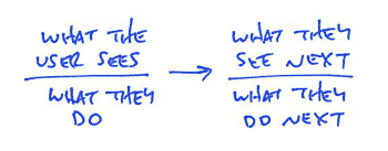
Scott explains that a network is made up of stuff and really any stuff.  Each item of stuff is referred to as a node. These nodes are then divided into different types of nodes. For example titles of books and authors of books would be two different types of nodes.  The relationships between these nodes are referred to as edges.  He explains that a key to these edges functioning properly is that edges can only connect two different types of nodes and not nodes of the same type.  There are also two different types of edges that can connect the nodes.  A directed edge describes the kind of edge, with which you cannot swap out Node 1 and Node 2. The other kind, unsurprisingly, is an undirected edge.  With an undirected edge, Node 1 and Node 2 can be interchanged and are connected with a simple line.

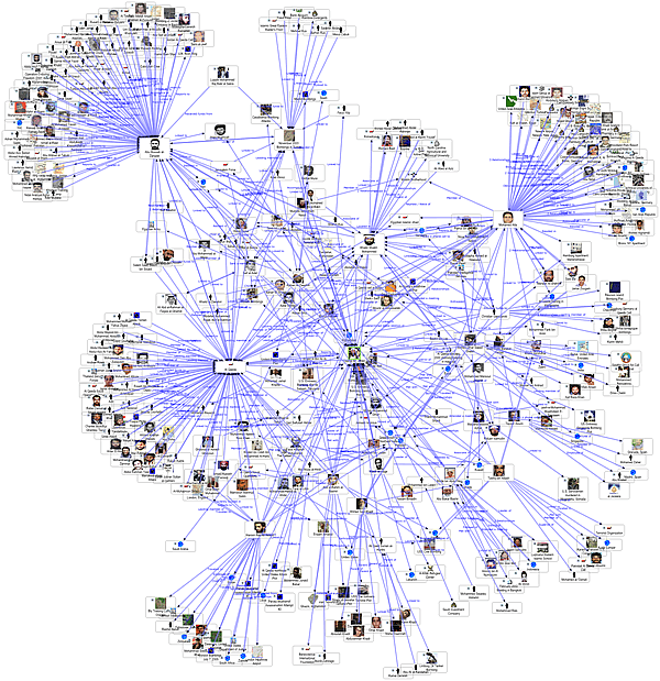
When I think of networks, I immediately think of social networks. As a “millennial” our lives are completely intertwined with social networks.  Most of our interactions are even through social networks like Facebook or twitter.  After reading this article, I tried to relate it to what I believe is the most notable social network: Facebook.  It was easy for me to identify that people were the nodes, so in Facebook terms, each profile would be considered a node.

I determined that although Facebook is a vast and complicated network.  In the terms that I had just learned, I could only make sense of Facebook as a unimodal network. If Facebook mainly just contains simple connections between one type of node, each friendship would be considered an edge.  Because there is so much more that goes into Facebook, I was confused that there were not more types of edges, and that I couldn’t see it as a multimodal network. I thought of the different groups that were made on Facebook and how that could be displayed visually without being confused for friendships.

I can see how people on Facebook, if not connected by friendships, could each be connected to the groups they belong to, in a multimodal network. This would form a very interesting web, but only be illustrating the group aspect of Facebook, and disregarding the friendship aspect.  Overall, I am excited to have made progress understanding networks, and although I believe I could make interesting specific networks relating to real life, there are still many things I don’t understand about the networks I interact with in daily life.

Facebook

Week 6: Networks and Friendship Paradox

I started this week’s readings off with Kieran Healy’s post, “Using Metadata to find Paul Revere”. His research into the analysis of personal metadata got me thinking of what constitutes a breach of privacy and when does a governing entity go too far in looking through our personal lives in the name of security. However, I won’t dedicate my post to any alarmist ideas or writings on the need to respect privacy any more than I already have, instead I will write about an interesting aspect of social networks that I heard about a while ago, the friendship paradox.

I originally heard about this as a short story that made it onto the daily news; it does not really have much to do with cutting edge news, but nevertheless it caught my attention. The idea behind the friendship paradox is that, on average, a person has fewer friends than their friends have. This tallying of friends is most easily done on social networking sites where there are friend lists available to immediately quantify the number of social network friends in one’s life. It is fairly easy to log onto social media sites and take a quick look to see if this is true; some of my Facebook friends have over one thousand friends each, easily outstripping me, my Instagram follows are much lower than those of the people who follow me, and a general look over Twitter shows that most people follow at least one celebrity or relatively famous account that can have thousands or even millions more followers than their own. There is actually an article available on JSTOR from the American Journal of Sociology that is dedicated to this phenomenon if you’re interested in reading more about it! If you don’t want to spend quite as much time there is a helpful Wikipedia article that presents the paradox more succinctly and seems reliable (as far as I can tell).

The friendship paradox is loosely related to our foray into network analysis, and could provide interesting data if analyzed in the same way Healy conducted his research or in other ways of analyzing networks. For example, with a sampling of one’s friends from a social media site it is possible to see if there are any other correlational elements that connect the friends with more friends to each other. Perhaps there is a relation between “popularity” on social media sites with frequent posting of statues or photos, or maybe serial posting has the opposite effect and reduces the number of friends. There may even be a specific personality type that attracts more friends that could become apparent when examining their “likes” on Facebook or hashtag patterns on other social medias.

The Social Network of Instagram

After reading this week’s articles about networks, the various social networks I use were the first things to pop up in my mind (probably since I use these almost every day). For example, Instagram is a social network where friends can connect and share pictures with each other. Also, people can follow various celebrities and or favorite business to stay updated on all of their activities they wish to share. The two nodes involved with this social media are the user and their pictures. Thus, Instagram is a bimodal network. These two nodes are connected by an asymmetric edge; the edge in this case being “is the photographer of.” For example, “user A is the photographer of picture B.” However, one cannot switch the two nodes around, as in “picture B is the photographer of user A,” thus the asymmetry of this edge, called a directed edge.

However, Instagram is considered a social network because there are edges not just between user and picture, but between users and other users, other users and pictures, and pictures and other users. Users can connect with other users by following them, in which the second user may choose (or not choose) to follow back. Depending on if the following is reciprocal or not, this edge is either an undirected edge with a symmetric relationship (“user A is following user B” and equally “user B is following user A”) or a directed edge with an asymmetric relationship (“user A is following user B” but not vice versa because user B did not follow user A back). Users can “like” another user’s photo, thus connecting other users with other photos in an asymmetric directed edge (“user B likes user A’s photo”). One user’s photos may have tags of other users in them, connecting photos with different users in another asymmetric directed edge (“user A is tagged in user B’s photo”). From my understanding of what a dense network is (which may or may not be correct), Instagram serves as an example of one. A user and his photos are connected to other users and their photos in multiple edges, linking the social world together through a variety of interwoven relationships. Algorithms can detect trends in connections and put together a string of suggested photos a user may like based on similar connections of the other users they follow. More and more so, social networks are becoming a platform to discover new interests and people to connect with, in addition to connecting to friends and interests one already has.


http://instagram.com

Week 6

The “Demystifying Networks” article immediately made me think of my interpretation of the Google search engine. The discussion prompts me to understand algorithms as a modern form of a community. This approach lends itself to the idea of digital humanities. I understand algorithms as communities because they dictate exactly what we see on the Internet based on our previous searches. These dictations are different for every individual, and can shield people from gaining a complete and well-rounded view of the world. Similarly, communities of people establish the ways that individuals understand the world because historically they have been sheltered from seeing views outside of their own.

algorithm


When I type the word “Europe” into Google, I receive links to travel websites and news articles because in recent searches I have been planning my study abroad trips and looking up news articles for my classes. If my roommate who is a Dance Major types the word “Europe” into Google she gets links to performances and travel locations. This difference in results is key. My roommate will not receive nearly as many news articles about Europe and will thus not be informed of global happenings, despite the fact that she is interested in that aspect of society. Even further, if a stranger who has no interest in travel and who could not point out Europe on a map types the word “Europe” into a Google search, their results will be even more different. This reality shows the danger of blindly trusting algorithms. Weingart’s quote “Nothing worth discovering has ever been found in safe waters. Or rather, everything worth discovering in safe waters has already been discovered, so it’s time to shove off into the dangerous waters of methodology appropriation, cognizant of the warnings but not crippled by them” can act as a warning against complete algorithms and be advice to push past what is initially given to us and to discover new information.

W5 – Information Visualization Cont. & The Refugee Project

In “Humanities Approaches to Graphical Display,” Johanna Drucker suggests that we “rethink the foundation of the way data are conceived as capta by shifting its terms from certainty to ambiguity and find graphical means of expressing interpretive complexity.” She begins her paper by differentiating between “capta” (knowledge constructed through interpretive processes) and data (that which is observed and recorded). For her, the problem with information visualizations in the field of digital humanities is that they render capta as if it were data. She writes, “the digital humanities can no longer afford to take its tools and methods from disciplines whose fundamental epistemological assumptions are at odds with humanistic method.”


She proposes several approaches for representing the temporality of time and space in visualizations. Her modifications to a bar chart showing the number of new novels put into print by a single publisher in the years 1855-1862 (Fig. 3) is notable because it displays so much more than just numbers. It displays publication data in relation to the time of writing, acquisition, editing, pre-press work, release, etc. with color-coded timeline elements superimposed on the time axis. In this way, it presents the interpretive process behind the information displayed. However, non-traditional representations such as this add extra layers of complexity to information visualizations. Although this example is pretty straightforward – only one publication year is broken down into it’s relational components – things can get ugly quickly. Imagine a large data set displayed like this or like Fig. 9. There comes a point when Drucker’s approach confuses the reader and impedes their understanding of the information, which opposes the purpose of information visualization in the first place. In this way, there will always be a tradeoff between representing information in a way that conveys its true nature and context and representing information in a way that is easily understandable to the reader.


refugee_project_2


The Refugee Project ( http://www.therefugeeproject.org ) is an interactive, narrative, temporal map of refugee migrations since 1975. “UN data is complemented by original histories of the major refugee crises of the last four decades, situated in their individual contexts.” This visualization is a great example of information rendered in a way that is simple to understand, yet multi-faceted and descriptive in nature. The map view displays numbers of refugees per country (represented by circles of various sizes) and where they fled to (on mouse hover). Statistics and quantitative information are linked to historical events with narrative information. In addition, there is a timeline feature for the map and different view options (country of origin/country of asylum, refugees/[refugees/population]). Although the people are in the end treated as numbers, The Refugee Project does an excellent job of presenting “the big picture.”

W6 – Networks and Software Flow

In his blog post “Demystifying Networks: An Introduction,” Scott Weingart explains the underlying concepts behind networks and how they can be applied to digital humanities work. His most basic definition of a network is “stuff and relationships.” He outlines several compatibility issues that arise when subjective digital humanities stuff is linked by complex and interpretive relationships. First, he argues that the tools available to graph networks are not suitable for nuanced stuff. He writes, “as it stands now, network science is ill-equipped to deal with multimodal networks. 2-mode networks are difficult enough to work with, but once you get to three or more varieties of nodes, most algorithms used in network analysis simply do not work.” In addition, digital humanities data often must be cut or cleaned to fit existing network methodologies and algorithms. Second, networking is not suitable for all datasets and it can create misleading relationships. Network relationships often add “a layer of interpretation not intrinsic in the objects themselves.” Despite these challenges “network analysis remains a viable methodology for answering and raising humanistic questions – we simply must be cautious, and must be willing to get our hands dirty editing the algorithms to suit our needs.”

uiFlow


Weingart’s blog post got me thinking of other uses for networks. One of the most interesting applications of networks is user interface (UI) design. UI designers are tasked with designing software interfaces that can accommodate a dizzying array of use cases. Site maps, wireframes, and UI flows are important methods of visualizing the relationships between the content, screens, and code of an app, website, or other piece of software. All of these things qualify as networks although they are different in nature from the networks described in Weingart’s blog post. First, most UI networks are uni-modal, meaning that there is only one type of stuff. For example, site maps are networks of pages where each page is a node connected by explicit edges on the web. Second, most UI networks have asymmetrical, directed edges. In his blog post, “A shorthand for designing UI flows,” Ryan of Basecamp explains his method of sketching out flows ( https://signalvnoise.com/posts/1926-a-shorthand-for-designing-ui-flows ). The relationship between these event nodes are asymmetrical in nature because node order matters; “what the user sees next” doesn’t cause “what the user sees.” This kind of chronology is inherent in UI networks because their purpose is to present many, interconnected use cases. Ryan’s networking scheme is useful because it combines the visuals information of wireframes and with the functional information of UI flows. Each node contains visual and functional information to provide a bigger picture of how the interface drives the user and the other way around. Ryan’s shorthand is unique because it allows for bimodal networks in a field of largely unimodal ones.

323-flow-template

325-login-flow


Week Six: Network Analysis

alisnetwork-1-1


The first thing that came to mind when reading Demystifying Networks was infamously creepy social network LinkedIn. Weingart introduces the basics of networks along with the inevitable challenges that come with them. The blog post is directed, as Weingart notes, to digital humanists. Therefore, the issues are directed at humanist scholars who face the challenge of dealing with data that is “uncertain, open to interpretation, flexible, and not easily definable”.

This is where I began thinking about social networks. Weingart warns of the dangers of using networks to analyze data. First, “networks can be used on any project. Networks should be used on fewer”. Second, “methodology appropriation is dangerous”; scientific approach, as we know, does not always map on neatly to a humanist one. Social networks connect people. I am not sure how nodes and edges work within social networks, but I assume that these are in use for websites’ features like “People You May Know”.

There are many articles online that question LinkedIn’s analysis techniques. For example, David Veldt’s article LinkedIn: The Creepiest Social Network for Interactually.com takes a critical look at some of the site’s functions and features. I don’t personally have a LinkedIn account but know from friends and family that use it that they often see the most random, unexpected people pop up in their LinkedIn “People You May Know” section. Veldt lists a couple examples of his own experience with “People You May Know”. The suggestions it comes up with are often inexplicable – it seems that LinkedIn has no possible way of knowing that this person is your mailman’s cousin! It even sometimes suggests the name of someone you know, but is not actually that person (just the same name).

Veldt attempts to analyze LinkedIn’s established network. Although I am not positive, it is pretty safe to assume that LinkedIn has some system of “edges”, which Weingart defines as descriptive links that connect nodes. I believe this is what Veldt is after – what is LinkedIn using to inform its edges? LinkedIn’s Help Center quotes only two factors that the “People You May Know” section is based on: “Commonalities between you and other members. For example, you may have common connections, similar profile information and experiences, work at the same company or in the same industry, or attend the same school” and “Members you’ve imported from other address books in your Contacts list”. Veldt discovers that there are pre-checked boxes within his account that allow LinkedIn to share his data with third party applications as well as giving information about his site visits to pages that use LinkedIn plugins. However, Facebook (as Veldt suspected) is not listed as one of these plugins. The mystery remains…

I am genuinely interested in how LinkedIn succeeds in such creepiness. This example resonates with Weingart’s opinion on humanist approach to data (as far as I understand how LinkedIn works). Weingart argues, “Unfortunately, given that humanist data are often uncertain and biased to begin with, every arbitrary act of data-cutting has the potential to add further uncertainty and bias to a point where the network no longer provides meaningful results. The ability to cut away just enough data to make the network manageable, but not enough to lose information, is as much an art as it is a science”. Plotting links between human relationships seems so complicated, but LinkedIn somehow masters it to an uncomfortable degree.


http://www.interactually.com/linkedin-creepiest-social-network/

Six Degrees of Separation

2000px-Six_degrees_of_separation.svg

Scott Weingart in this week’s reading “Demystifying Networks” discusses the basics of networks. He describes networks as “a net-like arrangement of threads, wires, etc...It later came to stand for any complex, interlocking system.” Networks cannot stand on their own; they are interdependent on connections between all of the little parts that make them up. Weingart further explains, “Network analysis generally deals with one or a small handful of types of stuff, and then a multitude of examples of that type.” In Weingart’s example, he uses books and authors as his nodes—which are basically an assortment of stuff. Nodes also have attributes, like page number, title, birth and death, etc. The combination of books and authors makes it a bimodal network and if we add publishers, then it is multimodal. By doing this, each book is connected to an author, who is then connected to one or more publishers (Weingart). Ultimately, as expected, these connections form relationships and, in this case, an authorship relationship.

This concept of networks and everything that they are comprised of (nodes, relationships, types, etc.) immediately made me think of six degrees of separation. Six degrees of separation is “the theory that everyone and everything is six or fewer steps away, by way of introduction, from any other person in the world, so that a chain of “a friend of a friend” statements can be made to connect any two people in a maximum of six steps” (Wikipedia). Everyone is essentially connected to each other through a vast web of friends, acquaintances, and strangers. The creator of this theory, Frigyes Karinthy, proposed that “the modern world was ‘shrinking’ due to [the] ever-increasing connectedness of human beings…He [believed] that despite great physical distances between the globe’s individuals, the growing density of human networks made the actual social distance far smaller.” This was back in 1929 when the “technological advances” in communication and travel were far less developed than they are today. Due to the progress in modern technology, the six degrees, nowadays, is probably more around three.

JA-Degrees-of-Separation

I have personal experience in this “six degrees of separation” phenomenon. Because of the multitude of social networks available on the Internet it is hard to not be constantly in contact with people across the world. When I was accepted into college and looking for a roommate I was contacted by and put into contact with many friends of friends, or many “my best camp-friend’s older brother’s ex-girlfriends” who I happened to know of through seeing pictures of them on Facebook. In the ever-increasing technological world, instances like this will only become more common and maybe even one day there will only be a two or one degree of separation.

Works cited:

Scott Weingart, “Demystifying Networks

http://en.wikipedia.org/wiki/Six_degrees_of_separation

Week 6: Social Network Analysis

SNA Graph

This week’s readings got me interested in the science behind social network analysis. Network theory involves nodes, which represent individuals within the network, along with ties, which show the various ways these individuals come together. This could be through a number of factors, including friendships, organizations, hobbies, and other topics of that nature. A social network diagram shows nodes represented by points, and ties as lines. Social network analysis has been able to provide a mathematical way of analyzing human relationships. For example, management consultants have implemented it with their business clients for what they call Organizational Network Analysis. Scott Weingart’s blog post “Demystifying Networks” looks at how networks are being created so frequently that it’s difficult to keep up with the network’s true meaning. His definition of network as “a net-like arrangement of threads and wire” gives an easy visualization to what is actually a complicated subject. His use of authors and books set a simple stage for me before diving into wide array of social network analysis topics.

Team Sports

While typing in “social network analysis of…” on Google, the first auto fill options were “…terrorist organizations in India, …Alice and Wonderland, …a criminal hacker community.” I didn’t know where to start; all the options seemed equally obscure but attention grabbing. After looking through a few of these various, unorthodox topics that could be studied through social network analysis, I stumbled across, “The Application of Social Network Analysis to Team Sports,” by Dean Lusher. The study allowed for the simultaneous examination of social relations with the individual-level qualities from members of the team. By incorporating a range of attitudes, behaviors, along with other individual-level attributions, an examination was reached on how these may affect and be affected by team structures. Players were asked whom they considered friends on their team along with whom they saw as the most influential. After, they were asked who they viewed as the ‘best’ player on the team, and anyone who received more than five notes was denoted with a black node. The image above shows how the ‘best’ players on a team formed their own group that was connected, but still separate from the other white nodes. This illustration shows two social networks (friendship and influence) coupled with an individual-level attribute (playing ability). It was interesting to see a digital angle applied to this very human subject.

Link 1

Link 2

Link 3

Week 6 Blog Post

network data and our newly digital interactions with information

“Data visualization is the presentation of data in pictorial or graphical format. For centuries, people have depended on visual representations such as charts and maps to understand information more easily and quickly.” Data Visualization: What it is and why it is important.

Digitized archives and data visualizations are incredibly powerful tools. They give users the ability to make sense of large amounts of information—allowing them to form questions, make predictions, learn lessons and even plan future actions. As these new mediums of displaying information become more prominent, it is important to understand their limitations and drawbacks, as well as to understand how they are transferred from raw data to their meaningful digitized form. In my blog post last week I discussed in relatively more detail an approach that might be taken when learning from and interpreting data visualizations. Just as we are taught in our statistics classes, for example, to approach graphs and charts skeptically—to ensure they are not misleading or mistaken—we as scholars should also approach data visualizations with a bit of skepticism. In order to best utilize tools such as digital archives or data visualizations, we must first understand the process by which this information is transposed. A great overview of how data can be sorted and “networked” was given in the blog post Demystifying Networks. The author first recognizes that “humanities scholars are often dealing with the interactions of many types of things, and so the algorithms developed for traditional network studies are insufficient for the networks we often have.” He then goes to note “humanists also struggle with fitting square pegs in round holes. Humanistic data are almost by definition uncertain, open to interpretation, flexible, and not easily definable.” Not only is humanities data not easily transferrable in to a digital form, but many initial decisions must be made before the information is transformed—so that the digital form presents the information in a way that supports the author’s arguments or intentions. When interacting with live maps, timelines or online archives for example, we rarely consider the work and decisions that had to be made to publish those works. Lauren Klein, in The Image of Absence: Archival Silence, Data Visualization, and James Hemings, makes the point that “as scholars, we do not see the labor involved in transcribing manuscripts into machine-readable text, nor do we think of the discussions—equal parts technical and theoretical—that contribute to the development of the encoding standards and database design that allow us to perform our search queries”. We live and learn in an age of digitized information, and since digital form is relatively new, people don’t quite understand the inputs that make it possible. Because of these tools we can interact with data in a completely new way, we just need to educate ourselves on the inputs that are required for the tools as final products. We must understand these inputs, just as we must understand chart and graph standards in statistics, especially so we can look for and correct mistakes—with new, powerful tools like google refine.

The inputs we must understand include data networking and mapping, employing controlled vocabularies when entering information in to a database, and potential errors and bias that may be present in visualizations.

Although the video below is relatively dry it emphasizes the importance of controlled vocabularies, and again highlights the incredible amount of back work that must be completed for this tools to be usable.