Week Nine: 3D Modeling

imgres

In Diane Favro’s Meaning in Motion: A Personal Walk Through Historical Simulation Modeling at UCLA, she examines the advantages and disadvantages of three-dimensional modeling as means of historical analysis. Having taken Professor Favro’s class and actually having first-hand experience with her 3D model, I have experienced some of these advantages and disadvantages myself. Favro begins by citing Cicero, “wherever we walk, we set foot in some history”. She continues in her own words in context to ancient Romans, “A walk through a city was equivalent to, or even preferred to, reading a text. Buildings, statues, inscriptions, and urban occupants all operated as signifiers that elicited potent associations…the Romans imbued each place with a spirit or genius whose identity was shaped by past and future actions”.

Favro talks about the development of HyperCities which came about in collaboration with USC, CUNY, and community partners. The software emerged from “a flash-based flash-based mapping project into a robust participatory, multimodal platform that brings together the analytic tools of GIS, the geo-markup language KML, and traditional methods of humanistic inquiry utilizing Google’s Map and Earth Application Programming Interface (API) released in 2005-06”.

With improved modeling, came further challenges. For one, by the viewer sitting and scrolling on a mouse to navigate, the model relies on “ocularcentracism” as its singular sense (ignores sound, smell, etc.). Simulating space, speed, processing, and temporal factors is also very difficult. Providing enough cultural context brought up many questions, “Did the Romans in the Forum privilege movement or sigh over smelling, or were all aspects experienced in a fog of urban distinction?” Ultimately, the advancement in representation posed an issue that is pertinent to all of the digital humanities field in general; “If a picture is worth a thousand words, and interactive 3D interaction is worth tens of thousands. Yet there is not agreement about scholarly assessment”. In other words, we do not yet have stable criteria to approach the analysis of these moving, interactive experiences.

Although this is not an example of an actual historical 3D reconstruction, a story in Italo Calvino’s Invisible Cities really struck me as an abstract example of what Favro is talking about. Calvino’s novel is split into short descriptions/stories of seemingly impossible cities. The city that reminded me of Favro’s research outlook is called Zobeide;


Men of various nations had an identical dream. They saw a woman running at night through an unknown city; she was seen from behind with long hair, and she was naked. They dreamed of pursuing her. As they twisted and turned, each of them lost her. After the dream the set out in search of that city; they never found it, but they found one another; they decided to build a city like the one in the dream. In laying out the streets, each followed the course of his pursuit; at the spot where they had lost the fugitive’s trail, they arranged the spaces and walls differently from the dream, so she would be unable to escape again.


The story of Zobeide offers a conceptual example of formatting influenced space in reality. Space is informed by experience – how do we realize this in three dimensional space? I read Invisible Cities for a studio class in which we were then asked to draw maps of the cities we chose. I didn’t choose Zobeide but the representations were strong attempts at representing two-dimensional maps of a conceptual city. I would love to see how someone might map this city in three dimensional space…


Week Seven: Working through Space

Screen Shot 2014-11-16 at 5.02.43 PM

Jim Detwiler’s Introduction to Web Mapping outlines the basic history and understanding of web mapping. Detwiler begins by stating the advantages and disadvantages of both digital maps and paper maps. There is a lot of current debate about the value of digital maps – there seems to be a lost sense of adventure/exploring with the advent of digital maps. However, one clear advantage of digital maps is their relative low expense to produce compared to traditional maps. They are also easier to distribute to a larger audience. Because they are online, it is also so much easier to update them – no need to redraw, reprint, and redistribute. Digital maps also have the capability for interactivity.

However, this is not to discount the advantages of traditional maps. Digital maps require the Internet – and if you think about the nature of needing a map, you are most likely exploring somewhere you are unfamiliar with – will this location even have Internet? Not necessarily; therefore, digital maps are “vulnerable to problems of servers and networks going down” (Detwiler). This is where paper maps have the upper hand – they are actually much more reliable in this sense. Also, paper maps have far superior resolution (1200-3400 DPI). This is advantageous when you need to see the map very clearly (which is probably most of the time).

Reading through the web map categorization by Dutch cartographer Jan-Menno Kraak that Detwiler includes in his overview, I remembered an app that I read about. A London-based company POKE developed an app called Pints in the Sun, which helps users to find the nearest pub that’s out of the shade. The necessity for an app like this is distinctly British – but nonetheless interesting as an example that embodies multiple kinds of web maps. Users can find a pub in one of two ways – “searching for a specific spot, or just browsing the map to find one that you like the look of” (Dombrosky). The next step is to adjust the ‘sun timeline’ at the bottom of the map to indicate the time of day (which then projects shadows on the three-dimensional buildings).

Pints in the Sun could be classified as several different types of maps, including most obviously an Analytic Web Map and a Collaborative Web Map. For example, POKE developers used HTML5 geolocation and the FourSquare API (Application Programming Interface) “to locate a suitable list of pubs before loading building outline data from OpenStreetMap and rendering it in 3D using three.js (map projection conversion courtesy of the D3 library)” (www.pokelondon.com). Its use of OpenStreetMap classifies it as a collaborative map, in that it uses a “distributed network of people to create and maintain the map” (Detwiler). Pints in the Sun classifies as a Analytic Web Map in several ways, but most distinctly in its use of Solar Almanac Calculation through SunCalc (implemented in JavaScript).


Dombrosky, Pete. “Want to Find a Pub in the Sun? There’s an App for That.”Thrillist.

Thrillist.com, 12 June 2014. Web. 16 Nov. 2014.

Jim Detwiler, “Introduction to Web Mapping

“Pints in the Sun: A Minimal Viable Side Project | POKE.” Pints in the Sun: A Minimal

    Viable Side Project | POKE. N.p., 5 June 2014. Web. 16 Nov. 2014.

Week Six: Network Analysis

alisnetwork-1-1


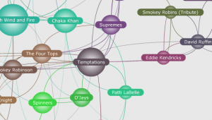
The first thing that came to mind when reading Demystifying Networks was infamously creepy social network LinkedIn. Weingart introduces the basics of networks along with the inevitable challenges that come with them. The blog post is directed, as Weingart notes, to digital humanists. Therefore, the issues are directed at humanist scholars who face the challenge of dealing with data that is “uncertain, open to interpretation, flexible, and not easily definable”.

This is where I began thinking about social networks. Weingart warns of the dangers of using networks to analyze data. First, “networks can be used on any project. Networks should be used on fewer”. Second, “methodology appropriation is dangerous”; scientific approach, as we know, does not always map on neatly to a humanist one. Social networks connect people. I am not sure how nodes and edges work within social networks, but I assume that these are in use for websites’ features like “People You May Know”.

There are many articles online that question LinkedIn’s analysis techniques. For example, David Veldt’s article LinkedIn: The Creepiest Social Network for Interactually.com takes a critical look at some of the site’s functions and features. I don’t personally have a LinkedIn account but know from friends and family that use it that they often see the most random, unexpected people pop up in their LinkedIn “People You May Know” section. Veldt lists a couple examples of his own experience with “People You May Know”. The suggestions it comes up with are often inexplicable – it seems that LinkedIn has no possible way of knowing that this person is your mailman’s cousin! It even sometimes suggests the name of someone you know, but is not actually that person (just the same name).

Veldt attempts to analyze LinkedIn’s established network. Although I am not positive, it is pretty safe to assume that LinkedIn has some system of “edges”, which Weingart defines as descriptive links that connect nodes. I believe this is what Veldt is after – what is LinkedIn using to inform its edges? LinkedIn’s Help Center quotes only two factors that the “People You May Know” section is based on: “Commonalities between you and other members. For example, you may have common connections, similar profile information and experiences, work at the same company or in the same industry, or attend the same school” and “Members you’ve imported from other address books in your Contacts list”. Veldt discovers that there are pre-checked boxes within his account that allow LinkedIn to share his data with third party applications as well as giving information about his site visits to pages that use LinkedIn plugins. However, Facebook (as Veldt suspected) is not listed as one of these plugins. The mystery remains…

I am genuinely interested in how LinkedIn succeeds in such creepiness. This example resonates with Weingart’s opinion on humanist approach to data (as far as I understand how LinkedIn works). Weingart argues, “Unfortunately, given that humanist data are often uncertain and biased to begin with, every arbitrary act of data-cutting has the potential to add further uncertainty and bias to a point where the network no longer provides meaningful results. The ability to cut away just enough data to make the network manageable, but not enough to lose information, is as much an art as it is a science”. Plotting links between human relationships seems so complicated, but LinkedIn somehow masters it to an uncomfortable degree.


http://www.interactually.com/linkedin-creepiest-social-network/

Week Five: Information Visualization, Continued; Text Analysis

5474039-25383714-thumbnail

Johanna Drucker’s article Humanities Approaches to Graphical Display discusses the prevalent challenges and approaches to visualizing and understanding data. First, she calls attention to the distinction between ‘data’ and ‘capta’. Acknowledging the difference between the two is of key importance – as they delineate “constructivist and realist approaches” (Drucker). Data is the information that surrounds us – existing independently and without human interpretation. Capta is the data that we interpret – “taken and constructed” (Drucker). The distinction between data and capta acts as the basis for a more comprehensive construction of data visualization. Instead of viewing bar charts and maps as absolute truth, we take capta as a caveat – this information is mediated.

Drucker discusses the huge impact this challenge offers. She writes, “If we don’t engage with this challenge, we give the game away in advance, ceding the territory of interpretation to the ruling authority of certainty established on false claims of observer-independent objectivity in the ‘visual display of quantitative information’” (Drucker). As we move into this stage of a digital world where scholars contribute work, we have to confront this issue head on. Drucker suggests that capta display “ambiguity and complexity”. This is an important step towards greater clarity in data presentation. Drucker explains, “Nothing in intellectual life is self-evident or self-identical, nothing in cultural life is mere fact, and nothing in the phenomenal world gives rise to a record or representation except through constructed expressions” (Drucker). This is all to say that any information we view must be mediated through humanistic approach.

A keen example of Drucker’s argument is Julia Belluz’s infographic for an online article The Truth about the Ice Bucket Challenge. The data visualization is titled Where We Donate vs. Diseases That Kill Us, which illustrates color coordinated circles that correspond to the amount of money donated to causes compared to the highest death causing diseases in the country. However, a blog post on Cool Infographics by Randy Krum points out that the size of the circles do not accurately depict the proportional values. Krum warns, “Designers make the mistake of adjusting the diameter of circles to match the data instead of area, which incorrectly sizes the circles dramatically. It takes some geometry calculations in a spreadsheet to find the areas and then calculate the appropriate diameters for each circle” (Krum). Krum proves his point by actually correcting the infographic. The result is much less impactful, as the size of the circles in each table level out considerably.

Bullez’s article has since been corrected by the website it was run on, Vox Media, but its mistake offers an insight into Drucker’s argument. In her “polemic call to humanists to think differently about the graphical expression in use in digital humanities” (Drucker), Drucker asks that capta shifts its terms from “certainty” to “interpretive complexity” For example, who donates to these causes and why? Who are the people who die of these leading-causes diseases and what are their stories? Although this is daunting, Drucker argues that it is all the more enlightening to the humanist approach to knowledge and understanding.

Krum, Randy. “False Visualizations: Sizing Circles in Infographics.” Web log post. Cool Infographics. N.p., 29 Aug. 2014. Web. 2 Nov. 2014.

Week Four: From Data to Database

Screen Shot 2014-10-26 at 9.33.15 PM

The most applicable and clear example of a database system I can think of from personal experience is UCLA’s Degree Audit Reporting System (DARS). DARS is “a document that evaluates your progress toward meeting UCLA graduation requirements in your major. The system is “a critical tool you will use to select classes and plot your academic course” (admission.ucla.edu). From much first-hand experience, DARS is definitely a well-configured database system that presumably includes all four of the components Kroenke lists within his definition of database systems in Database Concepts; the database, database management system (DBMS), database application, and users.

The database, a “self-describing collection of related records” (13), of DARS contains every course at UCLA.  The specifications are most likely refined into tables labeled something like “Undergraduate General Education Courses”, “Lower Division Major Courses”, “Upper Division Major Courses”, etc. These are the bits of data that are pulled to create the audit report.

The most complicated element of any database system, the database management system is a conglomerate of “related tables” and other configurations of the system. The DBMS is a complex computer program that “receives requested encoded in SQL (Structured Query Language) and translates those requests into actions on the database” (12). I was not surprised to learn that the companies that use database systems almost never write the DBMS programs. They are almost always outsourced to an outside software vendor. Therefore, UCLA most likely did not write its own DBMS program. I looked into finding out what company the university used to create DARS’s DBMS, but was unsuccessful.

Next, the application program has three functions within itself. First, it creates and processes forms. Next, the application program processes user queries – meaning it responds to a user who needs to find a piece of information. Lastly, the program formats the found results of the user’s request as a report (16). This process of the application program is very clear-cut in regards to DARS. As a student user, I inquire about my current progress with my courses. I click a few options, including my expected graduation date, major, and minor and nearly immediately am presented with a formatted report. It is clear that the application program is calling upon the related tables within the DBMS to determine what I have and have not completed thus far in my enrollment at UCLA.

Lastly, as the user, I am the final component of this database system. What is the point in making such a complex system? It seems so simple as I enter a few requisites that I sometimes take for granted how calculated and detailed DARS really is. Sure, one could make a list of all the courses at UCLA and simply check off which of the ones I have completed. However, in order to supply me with correct information, DARS employs much more contingent data, i.e. the courses I need to complete my major, minor, etc. Kroenke concludes his overview of database systems by explaining why we have database systems anyway, “The purpose of a database is to help people keep track of things. Lists can be used for this purpose, but it a list involved more than one topic, problems occur when data are inserted, updated, or deleted” (19). I cannot imagine how difficult it would be to keep track of my progress (including inserting completed courses, updating my minor, etc.) without the advent of a database like DARS.

Week Three: Classification, Continued; Research Techniques

Picture8

Alexis C. Madrigal’s article How Netflix Reverse Engineered Hollywood was really fascinating to read. As an avid Netflix user, I used to take these genre titles at face value. I recognized that my watching patterns were probably noted by the Netflix system and therefore suggested similar titles. I was shocked to find out the back-end of this categorization system. Not only does Madrigal’s unique research technique illustrate the complexity of rationalizing such a gigantic database, it also suggests the ideological effects of various systems of classification.

In Sorting Things Out, authors Geoffrey C. Bowker and Susan Leigh Star define classification as “a set of boxes (metaphorical or literal) into which things can be put to then do some kind of work – bureaucratic or knowledge production”. They identify the three key characteristics of an ideal classification system as “There are unique classificatory principles in operation…These categories are mutually exclusive…The system is complete” (10-11). However, Bowker and Star continue their argument to say that “no real-world working classification system that we have looked at meets these ‘simple’ requirements and we doubt that any ever could” (11). The Netflix genre generator does indeed have “literal” which are checked on a rating system. Its classification system does produce knowledge to the company, informing it of its consumers’ likes and dislikes, an obvious advantage in gaining and retaining viewers.

Madrigal explains Netflix’s tagging system in laymen’s terms, “Using large teams of people specially trained to watch movies, Netflix deconstructed Hollywood. They paid people to watch films and tag them with all kinds of metadata. This process is so sophisticated and precise that taggers receive a 36-page training document that teaches them how to rate movies on their sexually suggestive content, goriness, romance levels, and even narrative elements like plot conclusiveness…they even rate the moral status of characters” (Madrigal). While there is a human input to this system, the Netflix genre generator acts as an unprecedented catalyst between man and machine. Madrigal observes, “There’s something in the Netflix personalized genres that I think we can tell is not fully human, but is revealing in a way that humans alone might no be”. In this way, Netflix is “a tool for introspection”. Its unique categorization system sheds light on human’s reliance on machines to even tell us what we like. Can a machine capture the innate, complex human tendency to feel emotionally drawn to something?

A similar project that came to mind (which was actually mentioned in the article) is Pandora’s Music Genome Project. Much like Netflix, Pandora analyzed millions of songs “using up to 450 distinct musical characteristics by a trained musical analyst. These attributes capture not only the musical identity of a song, but also the many significant qualities that are relevant to understanding the musical preferences of listeners” (Pandora.com). Before really reading anything about the Music Genome Project specifically, I had a thought that the categorization of music would be much harder than movies. Relatively, movies tend to follow trends, while music has a longer history and many, many iterations. While it tries to do something similar to the Netflix personalized genres, it is much more ambitious of Pandora to distill this medium. For example, critics of the Music Genome Project pointed out the social aspect of music, “Music is traditionally a more collective experience…that aspect shows itself very powerfully in the way we consume music in society. We want what other people are having” (Wilkinson). Although Pandora is invested in advertising to its listeners in a similar way to Netflix, the medium of music definitely has its limitations.

Week Two: Selecting, Sorting, Classifying

5907672591_b48c691972_z

The first thing that came to mind while reading this week’s reading covering selecting, sorting, and classifying is the Dewey Decimal Classification. In Classification and its Structures, C.M. Sperberg-McQueen actually mentions this system as an example of a classification scheme that operates within n-dimensional space. The DDC “assigns class numbers in the 800s to literary works. Within the 800s, it assigns numbers in the 820s to English literature, in the 830s to German literature, the 840s to French, etc. Within the 820s, the number 821 denotes English poetry, 822 to English drama, 823 English fiction, and so on. Further digits after the third make even finer distinctions” (Sperberg-McQueen). Creating a “tree-like hierarchy”, the DDC designated the widest, most important label first (i.e. country of origin), then refines it farther and farther into a classified system.

Researching more about the DDC, I wondered why and how Melvil Dewey decided “American” would be assigned number one, “English” number two, etc. in 1876. In a 2012 post to the Association for the Library Service to Children blog, guest contributor Tali Balas Kaplan emphasizes the outdated quality of the DDC, arguing, “Successful systems have clear logic and the different pieces are connected in ways that make sense to people who’re using the system. Students may be able to navigate the numbers if you spend enough time teaching Dewey and find pieces of it, such as the 636.7 books or the 745.5 books. But the logic, the sense of it, will escape them because it’s based on criteria that are unknown or irrelevant to them” (Kaplan). Answering my own question, the DDC has also received criticism for its bias towards Anglo-American voice in its hierarchical designations.1

This particular disadvantage of the DDC relates closely with Julia Gaffield’s article Haiti’s Declaration of Independence: Digging for Lost Documents in the Archives of the Atlantic World. The process of filtering information, “by identifying the properties relevant for such judgments of similarity and dissimilarity can make explicit a particular view concerning the nature of the objects being classified” (Sperberg-McQueen). In the beginning of her research, her associates warned Gaffield of the very few resources available on the early period of Haiti’s independence. Nonetheless, Gaffield devised a new research strategy, in which she traveled to six other countries besides Haiti, including Jamaica, Great Britain, France, the United States, Netherlands and Denmark in order to “emphasize the interconnectedness of the Atlantic World” (Gaffield). In doing so, Gaffield discovered the long lost original copy of Haiti’s Declaration of Independence at the National Archives of the United Kingdom.

Further, Gaffield’s curation of her research process reveals “the interconnectedness of empires, colonies, and countries in the early modern period. Historians are beginning to conduct their research in new ways, traveling to archives in multiple countries and researching in several languages” (Gaffield). When confronted with a mass body of material like a library of a country’s history, one must decide how and why they curate information. The implications of both the DDC and Gaffield’s work show that their responsibility is enormous. The impact and voice of this information within culture is up to the way in which it is classified.

1. Fandino, Marta (2008). “UDC or DDC: a note about the suitable choice for the National Library of Liechtenstein”. Extensions and Corrections to the UDC. Retrieved 12 October 2014.

Works Cited

Balas Kaplan, Tali. “Done with Dewey.” Web log post. ALSC Blog. Association for Library Service to Children, 17 Apr. 2012. Web. 12 Oct. 2014.

Gaffield, Julia. “Haiti’s Declaration of Independence: Digging for Lost Documents in the Archives of the Atlantic World. The Appendix 2, no. 1 (October 2014)

Sperberg-McQueen, “Classification and its Structures,” in Schreibman et al., ed., Companion to Digital Humanities (Malden, Mass: Blackwell, 2004)