W9 – 3D Modeling and Interactive Environments

As technology around us continues to progress at lightning speed, new media allows us to recreate the world around us (and others) with incredible accuracy. 3D modeling is one of these new media that is changing how we understand our world.

Interactive environments filled with buildings, characters, and other objects modeled in 3D can act as virtual extensions of our reality. Some 3D video games leverage this kind of experience in their promotions. Hyper-realistic graphics and first-person views contribute to high levels of user immersion in AAA video games like Crysis, Battlefield 3, Elder Scrolls V: Skyrim, and Grand Theft Auto IV. For many players, realistically rendered game worlds allow for an escape from reality into a virtual reality. Whether it is old-world fantasy quests, modern day escapades, or visions of a space-age future, the power of 3D models lie in their authentic spatial dimensionality.

3D modeling’s potential is not limited to entertainment and gaming. Digital Humanities scholars can use virtual environments to their advantage. In “Virtual Reality for Humanities Scholarship,” Lisa M. Snyder writes, “within virtual environments created to academically rigorous standards, it is now possible to explore reconstructed buildings and urban spaces, re-create the experience of citizens of other eras, challenge long-held reconstruction theories, and gain insights into the material culture of past civilizations in ways never before possible.” Snyder is part of UCLA’s Institute for Digital Research and Education, a cooperative of faculty and technologists working to advance the existing body of computing knowledge and expertise at UCLA. Snyder and colleagues saw the potential for virtual reality and 3D modeling to not only create new worlds, but also recreate old ones. These kind of virtual realities are promising for scholars who have been without 3D visualization tools for so long. Why look at 2D archeology site plans when you can walk around the rendered campsite? The challenge this technique presents is that these environments are only as useful as their models are accurate. Therefore, the level of detail achieved in video game worlds is not feasible.

Last Winter quarter I took AUD 10A with Diane Favro. For one of our projects, we described a historically accurate narrative that took place in the Roman Forum. The tool we used in class was VSim, a IDRE Research Technology Group Project led by Snyder and others. The software visualization tool came preloaded with the Roman Forum models and a timeline slider that allowed the environment to be viewed at different time periods. Although the environment was very plain, the ability to wander across an architectural landscape thousands of years in the past was incredible. The experience was similar to a video game, but instead of creating a new story, I was reliving a past one. I used VSim to recreate a funeral procession across the Roman Forum in 211 and it was my favorite project from Favro’s class.

W8 – Interfaces and User Experience

Interface design is a field I am interested in pursuing after graduation, so this week’s readings struck close to home. In his article “‘So the Colors Cover the Wires’: Interface, Aesthetics, and Usability,” Matthew G. Kirschenbaum describes the role of interface in past, present, and future (digital) humanities work. I have always looked at interfaces from a designer’s point of view so it was interesting to read about their applications in the context of digital humanities scholarship.

According to Kirschenbaum, one of the biggest challenges of interface design is that it’s under-appreciated. “Donald A. Norman writes: ‘The real problem with interface is that it is an interface. Interfaces get in the way. I don’t want to focus my energies on interface. I want to focus on the job’ (2002: 210). Nicholas Negroponte holds that the ‘secret’ of interface design is to ‘make it go away’ (1995: 93)” (Kirschenbaum). I agree that the best interface fades into the background. Interfaces mediate between content and user; the best interfaces simply this process and make it easy for the user to access content, navigate through it, and interact.


Screen Shot 2014-11-24 at 1.21.03 PM


One of my favorite interfaces in recent memory is the site UI for Designspiration ( http://designspiration.net ). The content of the site (images) are stacked in a grid. They are displayed by date. Typing anywhere on the screen opens a large search box that fills the display window. The user can also search by up to 5 colors. The site navigation (and ad banner) is pushed to the left side of the display window, out of the way of the main content. The interface doesn’t distract from the content flow; instead, it aids the user’s search and directs to other less important elements of the site. The white space also works to unify the diverse range of colors and forms present in the images.

However, Designspiration’s UI is not perfect. There are several instances when the interface bends and breaks to reveal it’s clunky skeleton. Responsive web design is a growing trend that allows site content to flex to fit a variety of screen sizes (desktop and mobile being the two biggest categories). Designspiration’s grid is not responsive. When I try viewing the content in a smaller screen, the content is cropped and gives way to the chrome of the browser. The site is at it’s weakest point when the interface draws attention to itself or competes with the content/user goals.

W7 – Mapping Twitter Data

I have always been fascinated with web mapping, so this week’s readings were particularly interesting. I really enjoyed the presentation of Alan McConchie and Beth Schechter’s, “Anatomy of a Web Map.” It’s interesting to see the progression of web maps from static images to interactive tile-based layers to multi-level data-driven interfaces for exploring the world. I have seen maps load tiles before, but I was surprised to learn that these are raster images. I had always assumed maps used vector tiles for scalability. I was also impressed by the amount of free and open source tools, libraries, and Application Programming Interfaces (APIs) available. The level of customization achieved through Stamen and TileMill is incredible. My favorite custom tile sets include “Ísland” by Konstantin Käfer, “Shadow Play” by Tom MacWright, and “Baltimore Retro” by Mapbox. I would love to build a custom tile set if I had the time and resources.

This week’s readings also appealed to me because I am building a custom map for my group’s final project. My first mapping idea for our topic, Food Trucks of LA, involved GPS tracking devices on food trucks. However, GPS devices are too expensive to supply each truck with their own device and there is little value in tracking only one or two at a time. Although most food trucks have regular schedules, they communicate their location to followers via social media (primarily twitter). The various Twitter APIs are free to use and well documented, so some kind of Twitter-Google Maps mashup seemed appropriate for our small budget project. I couldn’t find any mapping tools online that supported twitter data, so I asked Miriam. She recommended I speak with Yoh Kawano, campus GIS coordinator and member of the Digital Humanities Collaborative at UCLA. Yoh’s project “Mapping Twitter” ( http://gis.ats.ucla.edu/sandbox/maptwitter/ ) was very close to how I had envisioned my food truck map to work. It displays the “what and where” of Twitter via Google Maps API and real-time Twitter data. After meeting with Yoh, he agreed to help me make my map and graciously offered to share his code with me. The main difference between our maps is how the twitter search function works. Yoh’s site uses keywords to search all tweets within a user-defined radius while my data is restricted to only the most recent tweets from a list of popular food trucks in LA. Yoh’s code includes custom JavaScript functions that parse and display the JSONs (JavaScript Object Notation) returned by PHP (PHP: Hypertext Preprocessor) queries to Twitter. I have been tweaking Yoh’s user search function to display the location of each food truck tweet. The biggest challenge so far is that less than 1% of all tweets are made on geo-enabled devices. An even smaller portion of these geo-tagged tweets is made from the trucks’ actual location and not in-route. Further testing is needed to assess the feasibility of using geo.coords to track the locations of food trucks in LA.


W5 – Information Visualization Cont. & The Refugee Project

In “Humanities Approaches to Graphical Display,” Johanna Drucker suggests that we “rethink the foundation of the way data are conceived as capta by shifting its terms from certainty to ambiguity and find graphical means of expressing interpretive complexity.” She begins her paper by differentiating between “capta” (knowledge constructed through interpretive processes) and data (that which is observed and recorded). For her, the problem with information visualizations in the field of digital humanities is that they render capta as if it were data. She writes, “the digital humanities can no longer afford to take its tools and methods from disciplines whose fundamental epistemological assumptions are at odds with humanistic method.”


She proposes several approaches for representing the temporality of time and space in visualizations. Her modifications to a bar chart showing the number of new novels put into print by a single publisher in the years 1855-1862 (Fig. 3) is notable because it displays so much more than just numbers. It displays publication data in relation to the time of writing, acquisition, editing, pre-press work, release, etc. with color-coded timeline elements superimposed on the time axis. In this way, it presents the interpretive process behind the information displayed. However, non-traditional representations such as this add extra layers of complexity to information visualizations. Although this example is pretty straightforward – only one publication year is broken down into it’s relational components – things can get ugly quickly. Imagine a large data set displayed like this or like Fig. 9. There comes a point when Drucker’s approach confuses the reader and impedes their understanding of the information, which opposes the purpose of information visualization in the first place. In this way, there will always be a tradeoff between representing information in a way that conveys its true nature and context and representing information in a way that is easily understandable to the reader.


refugee_project_2


The Refugee Project ( http://www.therefugeeproject.org ) is an interactive, narrative, temporal map of refugee migrations since 1975. “UN data is complemented by original histories of the major refugee crises of the last four decades, situated in their individual contexts.” This visualization is a great example of information rendered in a way that is simple to understand, yet multi-faceted and descriptive in nature. The map view displays numbers of refugees per country (represented by circles of various sizes) and where they fled to (on mouse hover). Statistics and quantitative information are linked to historical events with narrative information. In addition, there is a timeline feature for the map and different view options (country of origin/country of asylum, refugees/[refugees/population]). Although the people are in the end treated as numbers, The Refugee Project does an excellent job of presenting “the big picture.”

W6 – Networks and Software Flow

In his blog post “Demystifying Networks: An Introduction,” Scott Weingart explains the underlying concepts behind networks and how they can be applied to digital humanities work. His most basic definition of a network is “stuff and relationships.” He outlines several compatibility issues that arise when subjective digital humanities stuff is linked by complex and interpretive relationships. First, he argues that the tools available to graph networks are not suitable for nuanced stuff. He writes, “as it stands now, network science is ill-equipped to deal with multimodal networks. 2-mode networks are difficult enough to work with, but once you get to three or more varieties of nodes, most algorithms used in network analysis simply do not work.” In addition, digital humanities data often must be cut or cleaned to fit existing network methodologies and algorithms. Second, networking is not suitable for all datasets and it can create misleading relationships. Network relationships often add “a layer of interpretation not intrinsic in the objects themselves.” Despite these challenges “network analysis remains a viable methodology for answering and raising humanistic questions – we simply must be cautious, and must be willing to get our hands dirty editing the algorithms to suit our needs.”

uiFlow


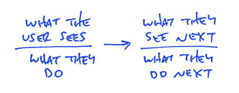
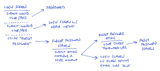
Weingart’s blog post got me thinking of other uses for networks. One of the most interesting applications of networks is user interface (UI) design. UI designers are tasked with designing software interfaces that can accommodate a dizzying array of use cases. Site maps, wireframes, and UI flows are important methods of visualizing the relationships between the content, screens, and code of an app, website, or other piece of software. All of these things qualify as networks although they are different in nature from the networks described in Weingart’s blog post. First, most UI networks are uni-modal, meaning that there is only one type of stuff. For example, site maps are networks of pages where each page is a node connected by explicit edges on the web. Second, most UI networks have asymmetrical, directed edges. In his blog post, “A shorthand for designing UI flows,” Ryan of Basecamp explains his method of sketching out flows ( https://signalvnoise.com/posts/1926-a-shorthand-for-designing-ui-flows ). The relationship between these event nodes are asymmetrical in nature because node order matters; “what the user sees next” doesn’t cause “what the user sees.” This kind of chronology is inherent in UI networks because their purpose is to present many, interconnected use cases. Ryan’s networking scheme is useful because it combines the visuals information of wireframes and with the functional information of UI flows. Each node contains visual and functional information to provide a bigger picture of how the interface drives the user and the other way around. Ryan’s shorthand is unique because it allows for bimodal networks in a field of largely unimodal ones.

323-flow-template

325-login-flow


W4: Databases and iCloud

This week’s readings really opened my eyes to the role databases (and data) play in my day-to-day life. I didn’t know much about data management, but now that I do, I have a greater appreciation for DBMSs and back-end developers.

The idea that nearly every aspect of my technological life is recorded, classified, and then organized in a meaningful way is mind-blowing. Big data can be intimidating; creating an efficient, flexible, and secure database to handle big data is a daunting task, especially when the data is inconsistent (it always is!). How would our lives be different if databases didn’t exist?

S0001_iCloudBasics

Apple’s iCloud database ( https://help.apple.com/icloud/#/mmfc0efea4 ) is one of the most important databases in my life. Its contents include personal information (photos & videos, contacts, geotags, etc.), account information (passwords, credit cards, etc.), and backups for electronic devices and apps (iPhone, iPod, etc.). What makes iCloud so powerful – and dangerous – is that all of this information can be accessed with one user account. Also, because this database is stored remotely (in the cloud), I can access the information anywhere and on any device.

iCloud backup is one of the most compelling features of Apple’s cloud-based database system. It keeps all of your data up-to-date and secures the most recent version in their remote servers. For example, iCal data can be synced across many iCloud enabled devices. I love this feature because I can set an event with reminders on my computer and when the event rolls around I will receive notifications on my phone as well. This approach to database design is very convenient, but it definitely has it’s problems. For example, when I change the login info to one of my email accounts, the database has trouble updating the various instances of this data across all my devices. This may be the cause for the server and login error messages I receive every once and awhile.

W3 – Data-mining, Classification, and Research

How a Math Genius Hacked OkCupid to Find True Love

This week’s readings reminded me of an interesting article about a Chris McKinlay, a UCLA grad student who “hacked OK Cupid to find the girl of his dreams.” Some friends shared it on Facebook months ago; apparently he was a TA in one of their lower-div math classes. It was interesting to read about his process and the visualizations included in the article were striking as well.


Chris McKinlay used Python scripts to riffle through hundreds of OkCupid survey questions. He then sorted female daters into seven clusters, like “Diverse” and “Mindful,” each with distinct characteristics.


His mathematical approach to online dating reminds me of how Alexis C. Madrigal reverse engineered Netflix’s vocabulary and grammar in “How Netflix Reverse Engineered Hollywood.” Both McKinlay and Madrigal started their projects with data-mining scripts. Once they had a sizable data set, they looked for patterns and then ran tests to (dis)prove these hypotheses. However, before they could do this, they needed a classification system. In McKinlay’s case, this meant “seven statistically distinct clusters based on…[women’s] questions and answers.” Once grouped into seven clusters such as “God,” “Tattoo,” and “Samantha” (nomenclature was nonstandard) with distinct characteristics, McKinlay could target women from a specific cluster with a profile tailored to their interests. For Madrigal, classification meant organizing genre descriptors into categories such as “Region,” “About…,” and “Based on….” A Netflix genre was a subset of these components that followed specific grammar rules.


McKinlay and Madrigal’s situation was unique because they were both hacking an established data set. Their data was pre-tagged, which made the process of classifying and pattern hunting much easier. In Madrigal’s case, Netflix’s movie taggers broke down movie content into “quanta” or “microtags” that could be fed into computer algorithms. The 76,897 altgenres scraped by Madrigal’s script were the product of these algorithms. In this way, Madrigal was working with “metametadata” or data about data about data. In contrast, the authors of Plateau Peoples’ Web Portal had to build their dataset from the ground up. According to the “About” page of the site, they were faced with the daunting task of curating a diverse collection of Native people’s cultural materials with varying metadata. A classification standard was set that would allow for both consistency and flexibility throughout the collection: “There are nine main categories (users can use the browse section of the portal to view these) within the portal. Each tribe can then add their own subcategories refining the typology further to allow for greater precision and flexibility in searching.”


Although McKinlay and Madrigal’s classification process may not have been as extensive as the the authors of Plateau Peoples’ Web Portal, their approach to metametadata was fascinating. I enjoyed reading about reverse-engineering large, cryptic datasets and using them in new ways.

W2 – Classification and Typography

In “Classification and its Structures,” C. M. Sperberg-McQueen argues, “classification schemes are felt more useful if the classes are organized around properties relevant to the purpose of the classification.” This is true because any kind of organization system implies knowledge of the subject. Without this insight, the classification becomes arbitrary. For example, one might classify paintings by acidity for an analysis of Renaissance art & culture. What would be gained from this work? Acidity is irrelevant to the classification subject and project scope. Instead, scholars must first decide which information is relevant to the topic and then decide on a classification system that is relevant to the information. The implications of these decisions are numerous and important to the overall project.

Type Classification

One of the most interesting classification systems that I am familiar with is for typefaces. According to Ellen Lupton’s Thinking With Type, three main classes were introduced in the 19th century: humanist, transitional, and modern. These classes correspond roughly to the Renaissance, Baroque, and Enlightenment periods in art and literature. Although these letterforms may seem similar to the untrained eye, small changes in transitions, angles, and serifs represented huge shifts in print culture. In this case, the classification is useful because it serves both purposes outlined by M. Sperberg-McQueen: “by grouping together objects which share properties, it brings like objects together into a class… [and] by separating objects with unlike properties into separate classes, it distinguishes between things which are different in ways relevant to the purpose of the classification.” Historians and typography critics have since created more serif-based classifications (e.g. slab-serif, humanist sans-serif, and geometric sans-serif) and “proposed more finely grained schemes that attempt to better capture the diversity of letterforms” (Lupton).

Hierarchy

Finally, classification also reminded me of another aspect of typography: hierarchy. Just as a classification system exposes similarities and differences between objects, “a typographic hierarchy expresses the organization of content, emphasizing some elements and subordinating others” (Lupton). Hierarchies help readers navigate through text similar to how classifications make data analysis and visualizations easier for scholars. Although there are infinitely many ways to accomplish either task, their implications are much the same. Sometimes one difference is emphasized at the expense of another or some information is omitted from the system because it does not easily fall in to any of the groups. This cannot be avoided; instead, designers and scholars must optimize their organization systems based on the scope, data, and end user’s needs.