Class Blog

Week 5- Locating London’s Past

For this blog post, I chose the map “Locating London’s Past.” This map uses a GIS interface in order to enable researchers to visualize and map data about London from the seventeenth and eighteenth centuries. This is done against a 1746 map of London created by John Rocque and the first accurate OS map. The project was carried out by several English Universities and institutions with the help of grant funding. They created their own online geocoding tool in order to carry out automated matching of location data as well as manual checking of that data.

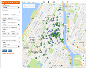
The map allows you to choose between 5 layers which are 1746, 1869-1880, blank, map, and satellite. Then you can choose what data you want mapped by selecting one or more datasets such as Old Bailey Proceedings, Coroner’s Records, Criminal Justice, Four Shillings in the Pound Tax, Fire Insurance, Plague Deaths, Glass, and Population and Area Data. From there you can narrow down the data to specific parameters such as gender, keywords, and dates. The data that matches these parameters will then be mapped based on the geolocation of the records.

Turnbull states “a map is always selective. In other words, the mapmaker determines what is, and equally importantly, what is not included in the representation.” This definitely applies to Locating London’s Past. The mapmakers have decided to focus on mapping data from legal documents such as death records, insurance records, hospital records, and criminal records. It comes from the point of view of the government, given that these are documents that governing bodies collected. Furthermore, it reflects the viewpoint of the Universities that created the map because they are the ones who decided to use these specific datasets.

The map reveals how different points of data are geographically situated in regards to each other. For example, when looking at data from the plague datasets, you see that the deaths are all located very close to one another. However this map obscures the historical contexts in relation to these data points. That being said, you can research the datasets on the website and find out what mapping these points can show, but it isn’t readily available. For example, the authors state that by mapping the four shillings in the pound tax data set, you get an idea of the wealth distribution about London during that time. However, by having to toggle back and forth between that information and the visualization, the website does not provide a cohesive experience. I would suggest redesigning the map so that the historical relevance about the datasets were present when you mapped the information so that users get a better understanding of what the data actually shows about London’s past.


Blog Post #7: Digital Harlem

The Digital Harlem project presents viewers with social, political, and historic information related to Harlem NY between the years 1915-1930. The map on the site is linked to a search toggle, allowing users to probe for particular events, people, and places that have a connection to the map. The Digital Harlem project uses a variety of sources — including District Attorney files, Probation Dept. files, newspapers, as well as a few other publications from the time.

After perusing the site for a bit, I found myself a little confounded by the aims of Digital Harlem. The ‘about’ page states that the creators were invested in developing a project that focused on the banal, or quotidian aspects of early 20th c. Harlem. The developers of the Digital Harlem project believe that discourse surrounding Harlem NY is often arranged in a way that centers the Harlem Renaissance– Black artists and thinkers post-WW1 and pre the Great Depression. This assumption alone is predicated on the Harlem Renaissance as “common knowledge”. With that said, the creators gear their interest towards the Black citizens who lived outside of Black arts movements (and outside solid middle class status).

The project begins by fetching most of its content from legal documents and judicial reports. I go back and fourth with this methodology — part of me is suspicious, why utilize criminal records as your primary source when cultivating an image of “everyday Black life” ? But on the other hand — it’s naive for me to think that everyday Black life in the early 20th c. wasn’t already thoroughly criminalized by the state!! It’s a disturbing thought to reconcile– it’s probably possible to explore avenues of Black sexuality, Black vernacular, or Black hobbies via historic records that perceive such processes as illicit.

The map mixes a number of happenings, such as criminal charges with community festivities. For example, the project allows users to delve into cases of sodomy, while in a separate search a YMCA bowling contest. It’s a big endeavor to try and comprehend how these two events both inform an understanding of the ‘Black everyday’. While the rhetoric of the project is initially alarming (i.e., “charge”, “conviction”, and overwhelmingly negative occurrences), the nuance and complexity of the project is illuminated after a few minutes browsing the various search options. If I were to re-envision an alternative GIS project, I would focus not on alternative sources, but alternative ways of organizing search options and the format of information.

Blog Post 6 – Digital Harlem

This week I chose the Digital Harlem  project to analyze the mapping techniques utilized to represent such data. This project chose to visualize everyday life in Harlem city of New York, by drawing from legal records and newspapers in the time period 1915-1930. The map is extremely interactive and consists of multiple layers that you can overlap to view to data according to your needs. The map also depicts details of that particular event when you click on it if the user wants to go more in depth.

bp

This map is definitely subjective since they used newspaper articles and records to depict “everyday life”. Since newspapers only cover significant events, the map mostly depicts events of crime or arrests that would commonly appear in the local news at that time. Additionally, this data is presented from the perspective of the police officers, who were predominantly white males which skews the data. This creates the bias of an unsafe or “bad” neighborhood that was mainly occupied by black people since most of the crimes are concentrated on one area on the map.

If I had to accurately depict everyday life, I would add more features like events happening around the area or community gatherings. I would also depict the popularity of these events or community places, by recording the number of people attending and so on. In this way the map could be used to understand how most people spent their lives during that time rather than cover events of crime.


Week 7 – Digital Harlem

This week I decided to look at Digital Harlem: Everyday Life 1915-1930. This is a map that describes itself as a visualization of New York City’s Harlem neighborhood in the years 1915 – 1930. The information presented is compiled from various legal records, newspapers, and other archival and published sources. When first interacting with the project, a welcome blurb is displayed as well as a search bar to the left, a map in the center, and predetermined search filters on the right.

In the search filters to the left, the field “charge/conviction” immediately stuck out to me. I think this conveys a very specific narrative to new users of this project. It puts a very crime centric spin on the project and it makes it an integral part of the search. In addition to this, the majority of the events in the predetermined search filters on the right showcase arrests and crimes. While I do not think there is a problem with this type of visualization, I think there is an inherent problem with the name of the project. This could be useful information for some people, but to label it as “Everyday Life” is painting the community in a bad light. Yes, there are meetings and public events highlighted, but these are significantly outweighed by the number of crimes presented.

The project provides additional insights through its sources as well as additional maps in the “featured” section. The source section adds contexts to the events on the map, and also say that the crimes are not necessarily representative of hardened criminals. While this may be true, it still presents the surface level visualization of crime. Some users may not delve deeper than the map, and won’t understand the context behind it. To carry the name of “Everyday Life” I think it’s important to include so much more information. Who lived in what communities? What businesses and restaurants were on each block? What did some of these blocks look like? What was the average week for these citizens? To have this static map where people are presented solely by their crime or transgression is not only a disservice to them, but to Harlem as a whole.

This map displays a particular narrative, and is quite selective in its subject material. I would be curious to hear from the creators of this project why they decided to label the project as everyday life and if they had considered any other times. There were some other interesting maps in the featured section such as Harlem’s Hospitals, Harlem & Baseball in the 1920s, and more. I think even these would have been better at showcasing everyday life than the default featured maps on the right.

Vilna Ghetto

I chose to look at Exploring the Vilnius Ghetto: A Digital Movement. The site provides an in depth history of the Vilna Ghetto which was established in Nazi Germany. The site provides multiple maps describing events that were related to the operation and evolution of the Ghetto as well as the perimeter of the location within the context of Poland during World War II. The Ghetto was used as a geographical location of oppression and ostracization for Jewish citizens. Vilna became a place of horrific abuse, mass shootings, imprisonment, and forced labor.

That maps depict a time line of events and their geographic relationship to the Vilnius Ghetto. The events are displayed with clickable points on the map which once clicked go into further detail about the story described. To the left is a legend that indicates what story is represented by color of the dot. The stories begin in 1941 with the formation of the Ghetto and follow all the way up till the end in 1943. hThe information given is comprehensive and allows a linear read of the events while still providing room to expand these individual events virtually through the use of the map. In this way the user is not confined by linear narrative, but alternatively it operates as a a loose guideline to understand the progression and evolution of these events.

Though the events appear to be presented in a relatively neutral manner, the information of events given is horrendous. This juxtaposition between context and data visualization creates a gap between the subjective experience of the landscape and how it was perceived by the occupants of the Ghetto compared to its dry and seemingly neutral betrayal within the map. We are left to create our own narrative about these atrocities but are missing a key component of the perspective as the map displayed is relatively detached from these subjective experiences. Obviously the map is important in conveying this information but I think it is important to note the deep psychological impact that these experiences had and the failure to capture them just by data alone.

Blog: Digital Harlem

I decided to choose “Digital Harlem” as a DH mapping project to look at. Digital Harlem Map depicts the everyday life in Harlem between 1915-1930. It uses legal records, newspapers, and other published and archival sources obtained from district attorney’s files, probation department files, and newspapers. The map depicts the borders of black settlements in 1920, 1925, and 1930.

screen-shot-2016-11-07-at-12-23-35-pm

Website’s visitors are able to navigate through the site by using the search option panel available. You are able to narrow the results by selecting the type of event, date, charge/conviction, birthplace of participant, occupation of participant, race, gender, or by street name and location type. Although this attempts to show the everyday life of black settlements, it seems that the data is one sided and only shows the ontology of police officers and district attorneys or the state in general instead of showing the views and perspectives of the community. As Turnbull asserts that all mapping of data is always subjective and perspectival and speaks to the narrative of its author, it is also true in this case. As it has come to light recently with improved phone cameras and the ability for anyone to record at any moment, police officers are over patrolling African-American communities and treating that community more harshly than others. It stands to reason that almost a hundred years ago, relationship between the police and black community was more at odds than now. With the limited to no rights given to the black community made them an easy target for police officers.

This data doesn’t show the other side to the story. For instance, it could be improved if they also took in account of the defenses offered by the public defender’s office (if those convicted were given a public defender). A new map could also show how many of those convictions were based on a trial where the jurors found them guilty and those that simply took the plea deal. Therefore, I would like to see sources that don’t always side with the district attorney’s office. For instance, the police officers and district attorneys work together closely and would never turn on one another. This is the main reason why police officers who do atrocious acts do not see criminal charges brought against them.

Week 7 Map Blog Post

For this weeks blog post, I chose to analyze the map, Digital Harlem. This is described as a collaborative research project focusing on everyday life in Harlem between 1915 and 1930. It was created by 4 historians from the University of Sydney.

The assumptions made by this map are problematic. After simply reading the about page of this project, I can see that the map is not an accurate description of life in Harlem. The description of the map outwardly states that it focuses on the lives of “ordinary African New Yorkers.” Harlem is a historically black town, but this map makes it seem like the population of Harlem is 100% black. Because of the time period this was from, it could be deducted that most law enforcement and government officials, as well as journalists, were White people because of the prejudice that black people encountered while trying to find jobs. Already, the viewer is aware of the divide between the black ordinary citizen and the white law enforcer and journalist. Furthermore, the about page states that the way it encompasses the ordinary life of these people is primarily through legal records. Already, this casts a huge stigma on the project. It seems as though these people’s lives are only documented through legal records. This is an extremely dehumanizing and quite racist approach to the map. It’s basically placing an entire culture, way of life, and community into nothing but legal records. It tells the viewer that these people are only characterized by the crimes they committed, and nothing else. This is the main assumption that this map makes- the idea that this community should only be known by its crimes and legal records.

This map, in my opinion, could not come from a more problematic perspective. The creators of this map are from Australia. I think is worth noting that they are from a completely different country, with absolutely no idea of what real life in Harlem was like. They also never mentioned employing real people from Harlem for an inside perspective or anyone with any real knowledge of Harlem. Clearly, the perspective of the map comes from these historians from Australia. However, because they relied so heavily on legal records, the perspective of the map is also from the legal force such as the police, as well as government officials such as judges, lawyers, etc. This is hugely problematic as well because the legal system is often found to be corrupt and racist. Because this project is from the historical times of Harlem, I have no doubt that some of those legal records are shadowed in racism and prejudice.

This map reveals the multitude of legal records from Harlem between 1915 and 1930. These records come from the District Attorney’s Closed Case Files, the Probation Department Case Files, various newspapers, the Committee of Fourteen Papers (investigation reports on women arrested for prostitution), and the Writers Program Collection. It is worth noting that the only one of these sources to portray citizens of Harlem in a positive light is the Writers Program Collection. This collection has research on institutions and life in Harlem and includes information on churches, schools, and various organizations. All of the other sources used for this map only report the criminal, negative, and newsworthy things that happened. Because an event must be dramatic enough to be reported, it is often also a negative event. This map does not reveal much at all. It simply gives me a multitude of various offences and legal occurrences that happened, where they happened exactly, who was involved, the race and gender of those involved, and the convictions they faced.

This map obscures many things. The map does NOT reveal the everyday life of citizens, nor does it tell me anything about this thriving, fascinating, and interesting community. It gives me no context for any of the events it portrays. It gives me no history or background on the community or any of its citizens. It does not even give me positive events which happened in the city. It is restricted to only the bad things that happened.

If I were to create an alternate map, I would provide a point of view from people who actually lived from Harlem or are from Harlem. This would include sources such as narratives, interviews, journals, essays, etc. with people who have a perspective from Harlem. I would try to find sources that were created only by members of the community, and not just law enforcement or journalism. I would incorporate more cultural aspects of the community, and focus on things such as music, food, dance, literature, etc. As Turnbull accurately stated, maps are selective in that the mapmaker determines its contents. The mapmaker has the ability to choose what is and is not represented in the map, and in my opinion this mapmaker did a poor job of choosing what to represent in order to provide a picture of ordinary life in Harlem.

Week 7: DH mapping critique

I examined Revilna, a site dedicated to “Exploring the Vilnius Ghetto.” Upon entering the site, it was pretty difficult for me to readily understand what the site’s purpose was. I personally had no idea what the Vilna Ghetto was on opening the site, and the site’s landing page didn’t lend me any insight. The copy only refers to the Lithuanian ghetto area as “the Ghetto” and offered no real further clarification, even upon browsing through the site’s various pages.

I ventured into the mapping narrative and found it also to be a tad confusing. I couldn’t readily identify the data that each map meant to present. Some presented types of institutions, some presented data in a more timeline-esque map visualization, others presented sites of events. When browsing through the different maps and pages, these shifted data types weren’t addressed, which made it hard to fully comprehend the narrative the site meant to present.

I also couldn’t find the source of their presented data, making it hard to understand and analyze the point of view of the narrative. Not knowing the credibility or purpose of the images/location data/general information really prohibited me from being able to pick out the biases and perspectival weaknesses of the narrative. The map itself, though, seems to leave out a lot of data, since there are a lot of spaces between the data points. It leads me to wonder what the spaces are between these institutions and event locations. Are they neighborhoods, are they government buildings, are they empty lots? Contextually, I’m not sure what’s going on there. In saying that, though, there is a good breadth of data addressing the various types of institutions that were in this ghetto, giving insight to what structures were in place for people residing in the area to engage with. The interactions of the residents with these various institutions are somewhat well represented in the brief descriptions and image galleries presented alongside the mapped data. I wonder, though, who had access to these various institutions and if there was a stark difference in access based on socioeconomic status.

Perhaps a better map of the area would present data about the people who were actually living in the Vilnius Ghetto (economic status/age/occupation/marital status), since the landing page does claim to describe “how the residents lived.” I think that presenting a clear legend/key to the data points and keeping it consistent throughout the site would have also been very helpful. A more layered map with all various “stories” and narratives as toggle options would have been helpful as well, in order to get a more holistic picture while having access to the details of the data points.

Analyzing Digital Harlem

In the Digital Harlem project, just under its title at the top, it reads “Everyday Life 1915-1930.”  However, I argue, the map project doesn’t necessarily achieve this goal of presenting the everyday life of those who lived in Harlem during this time period, and, rather, skews the views of its viewers as to what that daily life would look like.

In the “Welcome” box, a description of the project reads that it gathered its data from legal records, newspapers, and other archived and published sources and it says from that we can draw conclusions about Harlem’s every day life.  When someone looks at legal records, they are solely looking at crimes that happened, rather than simply everything going on in Harlem.  From my previous blog post, I discussed how looking only at a homicide data visualization would make a person assume that homicide is a major cause of death in America.  The same goes here for crime.  If we look at crime and legal records as a descriptor of the Harlem community, that would cause us to assume crime is a major factor in their everyday lives, even though there is a high chance that is not true.

Furthermore, in using newspaper clippings, there is a lack of “everyday” realism to this project.  Newspaper clippings are written about noteworthy pieces of information that the people living everyday lives would want to know.  Often, in newspapers, individuals aren’t learning about the everyday things.  They wouldn’t read that Jimmy ate a bowl of cereal for breakfast, because that isn’t news-worthy.  Rather, they learn about such and such crime or scandal, or even the major accomplishments of the community, neither of which fall in the realm of everyday life.

Then, should you choose the Numbers Arrests map option on the right, a slew of dots will pop up, and if you click some of them, you will find that many cases shown were dismissed.  In looking at cases that were dismissed, we get a further skewed view about the amount of crime in the area, thus further skewing our idea of what conflicts arise in Harlem’s “everyday life.”  If you look at the top, you can mark black settlement in the area to layer with the number arrests, which seems to make a mental connection between black settlement and crime in Harlem, which may not be a fair image to create for the everyday lives of the people of Harlem.

Then, if you go to January 1925, the description itself says it left out recurrent events, which is at the core of what “everyday life” is, it is a series of recurrent events.  It seems almost ridiculous that recurrent events like church services would be left out, because church is clearly an important part of these individuals’ lives.  The fact that they selected to leave out key sets of data further emphasizes the sense of agenda laced into this map.  Instead of the daily activities, we get who was murdered where, who robbed who, and who was arrested for prostitution with the occasional alumni club meeting thrown in.  This isn’t the everyday life.

For the site, in its About, to say it is about “the lives of ordinary African New Yorkers” is simply preposterous and, to be honest, angering.  Rather, they try to argue that out of the “suffering” these Harlemites are facing, they turn to crime, but that narrative is lost.  We learn nothing of the daily life, the family life, the work life, of these individuals.  Had this map incorporated family photos, personal narratives, films, and other information about this area, I might’ve found it to be more true to these Harlemites’ daily lives.


Locating London’s Past

The DH mapping project I chose to investigate was Locating London’s Past, which allows users to locate various artifactual data, such as plague deaths and fire insurance, on John Rocque’s 1746 map of London. This project incorporates datasets from various different sources–mainly institutional (churches, hospitals, etc.)–to compare and contrast happenings throughout London’s history. The map uses Geocoder, which automatically matches and checks names of places on a map. The Museum of London Archaeology conducted this research product to be able to catch a glimpse of London’s historical data through georeferencing–slicing up the original map, warping it, and placing it on a more current understanding of the spherical globe. This feat is an act of obscuring the original data. Thus, the original map had to be altered and manipulated a little bit to relate it to the Museum’s narrative and understanding of London today. Then, one can compare Rocque’s map to the first accurate OS map of London (1869-80), interchangeable with a drop down menu on the home page.

In conjunction with Turnbull’s contention that all maps are perspectival and subjective, this map definitely reinforces those ideals. The Museum of London Archaeology has created a loose narrative, seemingly up to our interpretation, based on its multiple datasets. Unfortunately, the map itself makes it hard to display these multiple datasets on the one map at the same time without it being too messy-looking. Also, many of the datasets are “unable” to be mapped because of their lack of full information… the records given are blank spaces to be filled in with names/streets/etc. that must be researched (in the datasets themselves) or known before searching the dataset, in order for it to be later placed on the map. This openness may be interesting to someone from London with a long family history there, but leaves the newcomer without any previously-known records to input in these blank spaces. Therefore, the project assumes that the map-user is a scholar or researcher, or at the very least is well-versed in London’s archaeological history.

If I were to alter this map, I would give more options in searching datasets through a drop-down menu, instead of using blank spaces, in order to make the map easier to use for the naive user. The map reveals London’s archaeological past, but it obscures what can be found based on overly specific records–some of which are unable to be mapped because they have to match up with data found in the dataset. I think the georeferencing of the map is fine, but I was unable to fully map any of the datasets onto either of the maps due to my lack of knowledge of a person’s name matching up to a parish, for example. To alleviate this issue, I would make a pop-up window with the full dataset that the user can click on in order to find out how/where it could be mapped onto each map. The site luckily gives ample information on each of the datasets’ backgrounds and I wish this had been incorporated better into the map’s interface, since everything is on a separate page. Overall, the map is interesting, but I did not find out as much as I had wanted to due to my lack of knowledge of specific records–this is the main thing I would alter. Also, the webpage is quite bland in color and design, so I would also change these aspects to draw the users in more in order to help the user create a more specific narrative to follow.