Class Blog

Network Analysis of “That First Time”

For this week’s blog post, I chose to read the short story “That First Time” by Christopher Coake. This story appeared in 2007 in the Granta 97: Best of Young American Novelists 2 and uses third person narration to chronicle Bob “Bobby” Kline’s retrospective discovery after he is notified about the death of a woman whom he briefly hooked up with when he was 17 years old, Annabeth “Annie” Cole, by her best friend, Vicky Jeffords. Nearly 20 years later, Bob is forced to recognize his responsibility in breaking another’s heart, only to learn her best friend had been in love with her the whole time. The narrator illuminates the pain of death with the pain of divorce, using Bobby’s incipient divorce as a vessel for him to understand the depth of the pain of others.

Although there are very few characters in the story (relative to longer, more developed stories), I chose to first create my edge list based on character name and with whom they appeared in a scene or recalled memory with. Bobby Kline transitions between his qualms with the present to his qualms from his past, so I determined this a “scene” when characters were mentioned together. Additionally, I added a third column of weight, which is based on the number of scenes the characters appeared in together—the higher the number of scenes, the higher weight the relationship was given.

I created my network graph via Google Fusion Tables and can be seen below as well as accessed here. I chose to not change the color based on column because my network graph is only between unique characters and no other entities.

Network Graph of "That First Time" created via Google Fusion Tables
Network Graph of “That First Time” created via Google Fusion Tables

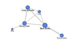
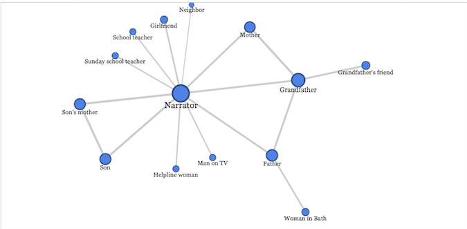
The size of the circle (node) is based on how many unique characters the person appeared in a scene with. For example, Bob, the main character by which the story is centered around, has the largest circle because he appears in a scene with nearly every character. Moreover, the width of the line extending between the nodes is my weight component from the edge list, so a thicker line denotes that the characters appeared in multiple scenes/memories with one another.

On an initial viewing of my network graph, one would be able to discern that Bobby is most likely the main character, due to the size of his node as well as the weights of his edges/lines. The interconnection between Annie, Vicky, Bobby, and Lew brings attention to a possible significant relationship. Yvonne is Bobby’s soon-to-be ex-wife, and my network graph shows how this relationship is significant (by weight) but also isolated from the rest of the characters.

I actually enjoy the shape my network graph took on because the square between Bobby, Annie, Vicky, and Lew almost resembles the table by which they sat at in a pizza restaurant during their adolescence in one of Bobby’s memories. This meeting ultimately transpired into Bobby and Annie’s brief and fleeting relationship that concluded in her heartbreak.

However, my network graph also has significant limitations that ought to be addressed. Although “That First Time” uses third person narration as its mode, the story is told through Bobby’s lens and thus the relationships are within that context. Rick the man who Annie married; however, my network graph shows this relationship as insignificant (if evaluated based on size and appearance). This is because Rick is briefly mentioned in the story, as most of it is recalled from a memory of being 17, which was before Annie met Rick. This limitation occurred based on the ontology I created for my edge list because I used “weight” based simply on how many scenes the characters appeared in together in the story. However, if I used weight based on my understanding of how “strong” the relationship is (i.e. marriage, engagement) then Rick and Annie’s relationship would appear much stronger.

“Aftermath” by Peregrine Hodson

For my story, the narrator does a great deal of introspection and has very little dialogue with other characters. Given the low number of characters in the story, I decided to include every single character that is mentioned by the narrator, even if it’s merely a single reference.

screen-shot-2016-11-14-at-9-29-00-am

The story focuses around a family with three different generations suffering from PTSD after serving in war: the narrator, the narrator’s father, and the narrator’s grandfather. Interestingly, the network graph shows that the narrator and his grandfather have the most connections, and the father has one less edge than the grandfather, though it appears at first, from reading the story, that the father and the grandfather are given equal weight. Also, for the amount of time the narrator spends discussing his son and his son’s mother in the story, those two characters have no connections other than to the narrator and to each other.

One thing I think is interesting about the connections in this particular story is how they tie in to the subject matter: aside from their immediate families, none of the three men suffering from PTSD have any strong connections to other people. The narrator’s interactions with neighbors, teachers and counselors are shallow and artificial. The grandfather’s friend and the father’s acquaintance in Bath – their only non-familial connections – are both dead. I think this is a telling point about the sense of isolation that occurs with soldiers who return from war with PTSD; none of these three characters seem to fit in easily into civilian life, and their interactions with others are stilted and limited.

Week 8 Blogpost

For this week’s blog post, I decided to write my piece on the “Eight Trains.” The Eight Trains is about a man living in rural Japan, writing a narrative about his journey to and from his workplace.  There are 8 trains he must take every day, 4 to get to the workplace, and the same 4 trains going back.  He writes down all the details that stands out to him about the people in each train that he takes every Tuesday.

For my edge list, I used the columns of person and train. The persons column consists of only the narrator, because the story is being told in his point of view.  Unlike many other stories, where there are multiple characters with multiple interaction between different sets of people, this story is about from the author’s point of view.  Furthermore, I decided to use trains because each sets of train means different sets of interactions and people.  I also decided to include the weight here.  The weights are there, with one weight indicating one person that the author felt interesting enough to explain in his short narrative.

Thus, my network graph looks as follows.

screen-shot-2016-11-14-at-12-24-30-am

Clearly from the graph, we can see that each train (and thus, different sets of people) have less or more influence.  The first noteworthy observation for those who didn’t know the story is that all the trains are connected to the narrator, there are no interactions between the trains.  There is a clear center point here, indicating that there is a sort of “main character,” in this case being the author of the short story writing about his experience with Japanese train system.  Another observation from the graph that train 2 had the most interesting sets of people.  Not only is the train 2 the biggest node with the thickest edges, it is the most separate from the other groups.  

Unfortunately, there are some limitations, in which some information are missing. For example, it would have been nice to Train 1-8 circle around the train in numerical order.  If this was the case, we can sort of see the general trend of how interested the author was in each train. If we change the graph with the aforementioned changes, we would clearly be able to see that the author was more alert in the morning especially with train 2.  However, as the day progresses, he loses more and more interest.  Especially after train 5, which is his ride home, it becomes clear that the author has no more interest and is only thinking about getting home.  

“First Semester”

After clicking on a variety of posts that merely only contained two characters in the short stories, I finally came across the short story, “First Semester” by Rachel B. Glaser and John Maradik, containing many characters. It’s interesting to see that this story was written by two people… I wonder how they interacted in their process to complete this creative task. I chose to make a list of all the characters that actually had direct and explicit interactions with one another. My “social network” is shown, having used Google Fusion Tables from my edge list, which contained multiple other columns of information, as well. I decided the direct interactions network graph looked most interesting, in comparison to sex, for example, because the other networks bunched together and were hard to read.

My network graph illuminates each main characters’ direct interactions, but it does not show how well one knows another person (or not). Sarah, our protagonist, is nicely shown in the center of the graph due to the story following her many interactions with family and friends. I did not include relationships expressed in the story that may have formed prior to the tale taking place, but were not explicitly shown through dialogue or personal interaction. I chose to do this because I wanted to maintain a sense of uniformity in the data, and I wanted the network graph to look a lot more like a “social network”… with its main characters at its center, and minor characters surrounding. These minor characters perhaps also act as foil characters to the main characters in the story. For example, the Dean and his wife remain in a binary, yet mutual, relationship, though they also may have had many direct interactions with each of the students in the larger section of the graph, due to his occupation. This was not explicitly stated in the story. My network graph does reflect how removed the main character is from David’s “Other Worlds Girl” – quite symbolic, if you are able to read the full story.

The network graph’s main limitation is that this graph does not show potential relationships with people prior to or after the story took place; these relationships could drastically alter the look of the social networks formed in this story. Also, it does not show how strong or weak each relationship is, such as “Random ‘What are you…’ Dude” (from a party) remaining in the same relationship strength as “Colin”, who Sarah forms an actual loving relationship with. Alternately, the color addition did not make much sense to true meaning of the network graph itself, either.

Overall, using Google Fusion Tables was not a difficult task, and I found that my data nicely formatted into the network graph format. This was mainly due to my finding of a story that had many characters in it… otherwise the network graph would have been binary and somewhat boring, aesthetically speaking.

Week 7: Network Analysis

For this week’s blog post I chose to read Whatever Happened to Interracial Love, a short story by Kathleen Collins that appears in Granta 136: Legacies of Love.

Whatever Happened to Interracial Love follows the experience of Cheryl (whose name is only revealed at the very end of the story), an African American woman living in NYC in 1963. Cheryl is in an interracial relationship with Alan (identified as “white freedom rider” initially), and much of the story revolves around how people in Cheryl’s life react to the relationship. There’s Charlotte, her bohemian college-liberal roommate, and her yuppie friend group who react a little too enthusiastically, contrasted with her and Alan’s parents reaction of disgust. Cheryl is a dynamic character trying to come to terms with the expectations she places on herself, along with those placed by her parents and society going through an upheaval.

I made a simple network graph using Google Fusion Tables to outline the various relationships that exist in the story. I defined a relationship as any interaction one character has with another (whether it is active conversation, flashback, or the narrator mentions each other being together, all of these interactions are weighted equally). The characters are the nodes while their interactions are the edges connecting them.

network-analysis

My network graph’s strength lies in its display of centrality. It is clear that Charlotte and Cheryl are the main characters due to their centrality in the network. They exhibit degree centrality, for they are the one’s who have the most interactions in the story, thus they have more edges connecting to more nodes.

My graph leaves much to be desired in terms of analysis; it is an unweighted network. While it shows who the main characters are, it does not demonstrate the significance of the side characters, for each is weighted equally. For example, Skip and Alan’s dad are both off to the sides of the network, giving off an impression of equal insignificance, but Alan’s dad actually plays a much more prominent role than Skip.

If I were to go deeper with my network graph, I would correct it for significance by making certain nodes (of the more important characters) larger. I would also incorporate different colors to show who belongs to what friend group (Alan’s Parents are one color, Charlotte’s friends another).

Week 8: “Mona’s Story” Network Graph

This is the link to the network graph for “Mona’s Story” by Urvashi Butalia. The titular character, Mona, is a hijra in India. Hijra are understood as individuals who are assigned male at birth who, for some reason or another, choose to take on feminine forms of dress and behaviour. While many hijra feel that they were born the wrong gender, the term does not cleanly adhere to our understanding of transgender females. Some have described the term as a “third gender.”

The network graph illustrates connections between Mona and the various groups of people in her life that are mentioned in the story. Her family members, unnamed, constitute one group that interact with each other but not with the other groups. Chaman and Nargis are members associated with the hijra community that Mona becomes a part of, while Ayesha is her adopted daughter who is also under the care of the former two individuals. Chaman and Nargis eventually cut off contact between Mona and Ayesha for most of the girl’s childhood. Chand, Ankit, Dharmendra and Jugnu are described as “young men transitioning (if one can use that word) from maleness to femaleness,” who come to Mona for advice.

The three groups depicted in the graph do not have connections with one another, only within themselves, but all of them are closely connected with Mona. The graph thus illustrates how the various parts of Mona’s life are sectioned off from one another. However, the graph is unable to illustrate the nature of these relationships, nor depict a timeline in which these relationships take place. The latter would have been helpful for this story since Mona’s significant interactions with these individuals took place at different times of her life.

Network Graphing

This week, I read a short story by Callan Wink, entitled “One More Last Stand”, and created a network graph using Google Fusion Tables.  This network graph serves to visualize the relationships between characters in the story.  If characters mentioned or interacted with one another, I considered it a connection and used such data points to build an edge list.  Network graphs are a neat way to display associations in a more understandable way.  But, as with any graphic, there are restrictions to the amount of detail and accuracy included.

screen-shot-2016-11-13-at-11-04-43-pm

The resulting network graph [pictured below] successfully illuminates the frequency certain characters saw each other and accurately demonstrates who spent the most time together.  However, it failed to accurately represent the closeness of all the relationships.  For example, the story follows the main character, Perry, and the Indian women he is having an affair with, Kat Realbird, at an annual historical war reenactment.  The graph clearly shows the weight of Perry and Kat’s affair, because they spent so much time together (they have 14 connections).  However, it does not necessarily show the true importance and influence of other relationships they have – Perry to Andy, his wife, and Kat to John, her husband.  Even though these are marriages and therefore close connections, the network graph only illustrates their weight as 4 and 2, respectively (as opposed to the affair that had a much stronger weight). 

screen-shot-2016-11-13-at-11-03-52-pm

Another example of this type of graph’s limitations can be demonstrated regarding the relationships with the weight of “1”.  Since I built the edge list around anytime characters interacted or mentioned each other, some connections seemed to have equal “weight”, when in fact the true relationships were very different.  For instance, in the beginning of the short story, Perry asks about Nolan, and old friend who he has known for years.  Later, Perry encounters a random stranger (labelled as “Pretend Dead”) who played dead in the war reenactment.  Perry doesn’t not even talk to this stranger- he only shares a scene in the reenactment with him.  However, both of these connections are given a “1” weight, and therefore seem equivalent on the network graph when they, in fact, are not.  Mathematically, the relationships are the same, but in reality, Perry was close friends with one man and had never spoke to the other.  These examples demonstrate the clear limitations to how much detail a network graph can really serve to show.

Blog Post, Week 8:

I created my network analysis on the characters of the short story, “First Semester” by Rachel B. Glaser and John Maradik, published online October 31st, 2016 in the Granta 136: Legacies of Love. The story focuses primarily on Sarah, who is experiencing her first semester of college and the whirlwinds of friendships, love, and campus legends. The network analysis therefore, is centered around her relationships, based upon conversations or repeated interactions with that person. To create the chart, I had two columns for character name, and the character in relation.

screen-shot-2016-11-13-at-9-01-11-pm

There were many characters involved as the protagonist progresses through her semester in college and this network analysis graph helps illustrate all the connections. The network analysis, however, is limiting because there were many random groups of people she met that I had trouble incorporating into the graph. Additionally, the network treats all the connections equally and it is difficult to gauge how important the characters are too the story.

For example, Sarah has fairly limited interactions with her Mom, Dad, and little brother, particularly in just one scene. However, she has multiple and crucial interactions with Colin and David, who contribute the most to the plot and yet, there are equally represented in the graph.

Blog Post Week 8

For my week 8 blog post I decided to look at the short story called Exotics by Callan Wink within the American Wild Granta magazine.

This fusion table shows the protagonist James Colson, and his degree of connection to each of the supporting characters. I created the nodes to represent each character and the edges connect a relationship between each of the characters for how they are associated with James Colson.

The story begins with James talking to Molly Hanchet, one of his 6th grade students who wished him a good summer. Then James continues to his mistress Carina who is a teacher for troubled girls where he vents about his ex-girlfriend leaving him and taking her belongings. Carina had faced trouble at work where one of her students Ellen Realbird had committed suicide that day by cutting her wrists. James, upset with his current love life left where he arrives at his brother Casey’s and has multiple interactions with him and his wife Linda, whom he met through his brother. After his reflection period at his brother and sister-in-laws he takes a summer job as a rancher and is employed by a farmer named Karl.

The network graph does portray how he knows each of the other characters, and who he met them through or heard about second hand. The limitation with this visual is it does not show the depth of strength of the relationship or the label on each of the connections between the characters. The graph also does not explain the complexity behind the characters and the internal struggle of each relationship and how they met one another. The graph illuminates that the relationships are all equal, but some are simply acquaintances, some are family members and some are people he has just heard about through another connection; the visual does not explain how much he likes, dislikes, etc. each of the other characters.

He Had His Reasons

For this weeks assignment, I selected the short story He had his Reasons by Colin Barrett from Granta Magazine, edition 136 – Legacies of Love, published October 31, 2016.

The story revolves around the murder suicide of a family and particularly zooms in on the life of the father, Alan who murdered his three sons and wife. The authors main theme concerns the question as to why people question the motives of a murder-suicide and associate it generally with mental illness as opposed to just being evil.

To create a model of the social network, I created an edge list to include every character named, addressed and described by the author. I ended up having around 10 characters which I created appropriate links for. I gave these characters a weight regarding whether they were murdered (1), if they were linked to the murderer but were not murdered (2) and if they published anything about the story (3).

For example, Alan murders Clodagh (his wife) so I gave this a weight of 1. I also included Alan murdering Alan as he committed suicide with a weight of 1.

The network graph highlights the importance of Alan and how this whole case revolves around him. It is interesting to also see how news coverage of stories mainly revolve around the murderer rather than recognizing the victims of the situation. This is evident by the links reaching Alan rather than his children and wife.

The limitations of the graph is that it does not directly show the association between the links and also does not have much of a narrative.


I used Professor Posner’s tutorial in order to create a Social Network and this is my table.