The Republic of Letters Case Studies page
The website I decided to reverse engineer is The Republic of Letters . It acts as a network analysis of correspondences sent throughout Europe during the Renaissance. It is similar in purpose and material as the website Kindred Britain that we reviewed in class this week. In fact, both sites were developed through Stanford’s Digital Humanities program, and therefore both projects may have been worked on by some of the same people.
The three levels of a digital humanities project are Sources, Process, and Presentation. Each plays an integral role in the development of a site, and each of the three levels can be observed within The Republic of Letter digital humanities project.
Sources (assets): The Source Level can be defined as the data points a team uses to create a project. It is the foundation of any digital humanities project. The sources used for this project was a collection of correspondences between Enlightenment thinkers in 17th Century Europe. Interestingly, the website does not contain the actual sources, and the only way in which I knew that these correspondences were the foundation of the data provided was through a video introduction on the front page. The data bank CKCC is listed as a partner, but it is not certain that this is the original location of the website’s sources.
Another aspect Source Level information found on the site is from scholarly work relating to the topic. The team in charge of this project gathered a large collection of publications and presentations that relate to the topic at hand.
Process (services): The Process Level can be defined as how data is organized, quantified, and or digitized into a Digital Humanities Project. Within the Republic of Letter’s project, the process level is quite abnormal, due to the lack of overt source level information. The data provided by these unseen correspondences are organized into varying categories. Firstly, the scholarly publications and presentations are grouped together in a tab labeled “Publications,” while the information contained in the case studies is presumably grouped by person in a tab labeled “Case Studies.” Any other modifications to the data falls into the final level of website development.
Presentation (display): The Presentation Level can be defined as how processed data is visualized, mapped, or interacted with. The team clearly spent the most amount of time considering the level of project development, as this is the most fleshed out of the three levels.
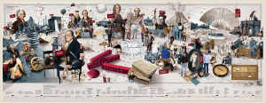
Narrative Panorama of Project
The site opens with a graphical timeline of important events and people, entitled, “Narrative Panorama of Project.” The data is colored and paired with exciting drawing of the people and places referenced in the timeline. Unfortunately, the photo is formatted poorly, and so it is incredibly hard to read the data presented. The opening page also has a video introduction to the site, which showcases the DH team as they revisit their reasoning’s behind the project. It has the TED musical score behind it, giving the video a sense of intrigue and ingenuity typically reserved for TED talks.
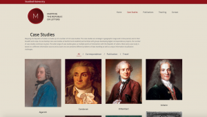
Scrolling through the various case studies, it becomes clear that visualizing data was a primary concern of the developers. In only one case study involving Galileo Galilee, there was a histogram depicting the amount of correspondences he sent through his life, a pie chart about the recipients of his letters, and an interactive map on the relationship between him and Voltaire’s correspondences. The site is visually impressive, and through these visuals users can easily see patterns and draw conclusions that would not have seen had they sifted through 20,000 letters themselves. The site pairs a painting of each thinker next to his/her name, adding a human element to the correspondences and data.