The absolutely fascinating though suspicious data set can be found here from the Los Angeles Data Set Control Panel. The direct link can we found here:
https://controllerdata.lacity.org/Finance/All-City-Departments-by-Payroll/f6ve-4yux
Data Types
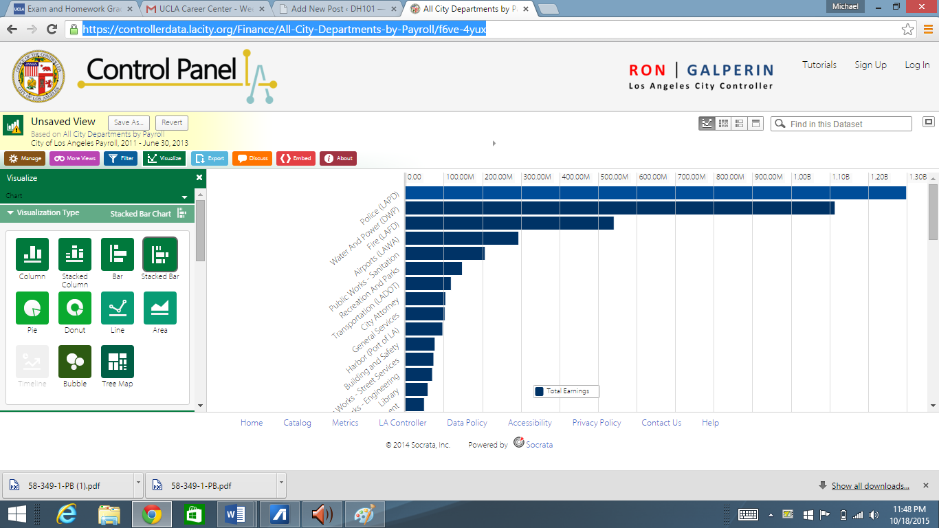
The type of data represented in this dataset is the payroll of many of the different city departments, presumably paid for by taxes from L.A. taxpayers (the common citizen). This dataset is completely open to the public, which provides a wonderful resource for taxpayers to see exactly where there money is being distributed to. These data points take into account payrolls from 2011 to June 30 2013. The data is represented by showing the records of how much money in total was paid to a variety of city departments; take the Los Angeles police department or the Water and Power department. Combined, these departments were paid more than the rest of the departments on the payroll put together. The data can be represented in a multitude of ways, as evidenced by the attached photograph; look at the left side of the screen. You can choose to represent the data in a pie or chart, or a bar graph, or even as bubbles. All of these methods of displaying the data help serve to illustrate the data that is accessible to the viewer, and in this regard they have done an excellent job. Have trouble conceptualizing data in a pie chart? Well the creators of this data set have been generous enough to allow the user to choose a way to examine the data in a way that makes it the most visually discernible for them. The bar graphs in particular do an excellent job of capturing the large gaps in payroll across the varying departments, as the length of the bars appear meager in comparison to that of the leading aforementioned departments.
Ontology
Ontology is a philosophical term literally means the nature of being. In a less abstract digital humanities sense, Wallack and Srinivasan discuss ontology as multiple ways a data set can be interpreted depending on the group of individuals examining the data. Differing groups may choose to interpret the data in a way that is more compatible with the specific information they wish to acquire. There is no rigid ontology for the data set; rather each groups inherent biases will get to pick and choose the way in which they interpret their data, and how this data offers a more broad picture of the large gap between some departments and not in others.
As to who will find this ontology as making the most sense, it seems rather obvious to me that it is those who are merely slivers in the pie chart that should be most profoundly affected. It is incredible that just from bar graphs and a crunch of numbers, one can discern clear inherent gaps between various city departments. In this sense, Digital Humanities can inspire social movements in which, say, the librarians are making significantly less than other professions that are not eons more important than librarians. This may inspire the political action necessary in order for librarians to demand a more fair share of the community payroll. This is fascinating to me that merely a list of data points can reveal obvious pay gaps across different careers, and hopefully aspire to acquire more funding (it should be noted that here, I am biased. I found libraries to be an extremely important social service that seem to be slowly dying.)
Data Set
I can infer, and am rather shocked, that so much of our tax payers money is put into LAPD. This might be a stretch, so bear with me here, but I would argue that librarians may not be quite as important as police officers in terms of protection, but is this all that matters? I would adamantly argue that the spread of knowledge is just as important as our safety. The phenomena gives me this unsettling feeling that way too much money is being put into public safety as opposed to the fostering of knowledge itself.
The main thing that gets left out is the payroll of higher state officials, and those in power. I think taxpayers would absolutely want to know how their money is being distributed, especially by those who are responsible for dishing out the payrolls. If the date set chose to include a few government officials, this may assist in taxpayers regaining a trust in their respective state officials. True, a state official is not a city department, but by including this information a common man would be able to contrast the payroll from city departments from the state officials, which would contribute to the individuals judgment on whether these payrolls are fair and equitable.
If I were to start over I would definitely describe a different persons ontology. The ontology here, the purpose for its being, seems to merely show differences in payrolls; this is too superficial for me though. I would prefer to see an ontology that instead of showing tax payers distribution of funds, shows the inherent gaps between varying aspects across the city departments. I believe that this kind of ontology would appeal to the lower class as they are (arguably) unfairly getting paid significantly less, and would bring attention to the disparaging gaps. This is one of the many ways digital humanities is able to inspire social reform.