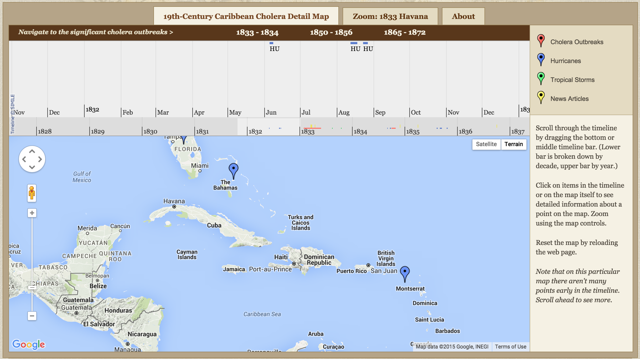
The 19th Century Caribbean Cholera Timemap is both a timeline and a map, locating all documented cases of Cholera outbreak, hurricanes, tropical storms, and news articles in the Caribbean. The top has a scrollbar timeline dating years, with color coded pinpoints corresponding on the map. It seems that a Google mapping tool was used for this particular project.
This map follows the point of view of the mass media, as the the hurricanes and tropical storms are by pure if/not happened, but the news articles are from major journals and newspapers from the time. Whether its original in English, or translated, they are written for the public. This map assumes that all cholera outbreaks are recorded, however, it is not inclusive of every case. This contributes to our class discussion earlier in the quarter on “if it’s not documented, did it actually happen?” When a viewer looks at this map, they will assume that these are all of the hurricanes, outbreaks, and storms that existed over the decades of years. However, it is very likely, considering the location and the time era, that there are many cases that went undocumented, therefore, are not reflected on this map because there is no way to trace it without a recorded paper trail.
Regarding design, this map is very simple and very straightforward and easy to understand at first sight. The legend, descriptions, and timeline portray the story well. In general, I think Google’s tools, fusion tables, etc, are always a good go-to because it is easy to navigate and very familiar for most people. However, for this map, I feel that another mapping tool, perhaps could have been used like CartoDB. There are more functions than Google, with more variation in mapping visuals and adding filters. Because the records are of long periods of time, it is hard to see each year one by one.
In conjunction, I personally did not like the scroll feature of the timeline. I felt as though I was scrolling through ages (literally) to find one period of time. Perhaps some filters not only on the year, but the specific cases (Cholera, hurricanes, tropical storms, news articles) would have been a more ideal choice.
If I were to redesign this map, something like Mapping the Letters of the Republic, where it is a simple stationary map, with the ability to add years [time], and people [outbreaks, storms, etc] would be a more efficient map. It would still serve as a timeline to fulfill that component, but not be a literal scroll through timeline.