![]()
The map I looked at this week was the 19th-Century Caribbean Cholera TimeMap, created by the 2011 Haiti Lab of the John Hope Franklin Humanities Institute. This is an interactive global map that uses different colored markers to indicate cholera outbreaks, news articles about the outbreaks, hurricanes, and tropical storms. The user has the ability to scroll through the years of 1833 through 1872 to see how the outbreaks progressed and news spread. Additionally, each year is broken down into the 12 months, which shows the thorough representation of the data. The map itself is interactive: the user can zoom in or out, or drag the map to change the center focus.
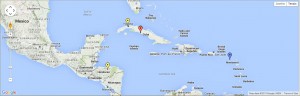
Above the interactive map is the interactive timeline; as said before, the timeline can be explored by scrolling through, or dragging the marker on the timeline. Above the timeline there are color-coded descriptions of the matching colored markers on the map (e.g. specifying the content of a news article). These descriptions are reflected in the timeline itself, too, as there are small icons on the timeline that correspond to the descriptions above.

Since the website has been archived, and is therefore outdated, all the features of the “About” page of the project did not load properly. The only page I could access was the one that listed the people who worked on the project, though I am assuming the project does not technically reflect their point of view. Researchers are ideally as unbiased as possible, and this project does seem to be presented from a neutral perspective. It is focused specifically on the Caribbean, so it seems the point of view for this project is geographic: looking at the spread of cholera, news about it, and severe weather patterns in the Caribbean. The map does not necessarily assume that cholera was only an issue in this region and not other parts of the world, and therefore does not imply that only the Caribbean had to deal with the repercussions of this disease.
While the map reveals extensive factual records of the spread of cholera in society and the media, as well as tropical storms and hurricanes, it inadvertently obscures the correlation between these objects. Though again, this could be due to the fact that the website has been archived and I cannot access any informational pages on the site that could shed light on the purpose for selecting these data points. Even so, this time map could use some revamping. If there is a correlation between weather patterns and the spread of cholera – though it does not seem to be clearly evident just scrolling through the timeline – then maybe the descriptions above the timeline could indicate their relationship. Instead of using solid lines or bubble bullet points as in the current version, the descriptions might be accompanied by some sort of small graph or other graphical representation of their correlation, which would make this information much more parsable to the user. Additionally, there is a strange feature of the map: you are able to scroll back to years preceding 1833, though there is no information recorded for those years. And it will just keep letting you scroll! I scrolled all the way back to 1770 before losing interest in seeing blank descriptions. So for a new and improved timeline map, I would set limits on the ability to scroll, having the timeline start and end with the years being examined. This would create a cleaner project that is less distracting and does not have pointless features.