For this week’s assignment I looked at the Mapping Decadence site, a mapping project showing the locations of the Parisian dwellings of prominent Decadent 19th century writers as well as the publishers they worked with.
The goal of the site from what I can understand is to show how the relationship between writers and publishers was influenced by location. The maps were created using ArcGIS and in order to look more closely at the maps provided for each of the four authors or the main Mapping Decadence map the site leads you to each maps ArcGIS page where you can interact with each map clicking on the various points or lines to get more information about location or relationship. Each author has their own individually colored pin to avoid confusion on the main map, and when you click on any of the publishers on the main map it lists which author(s) they worked with.
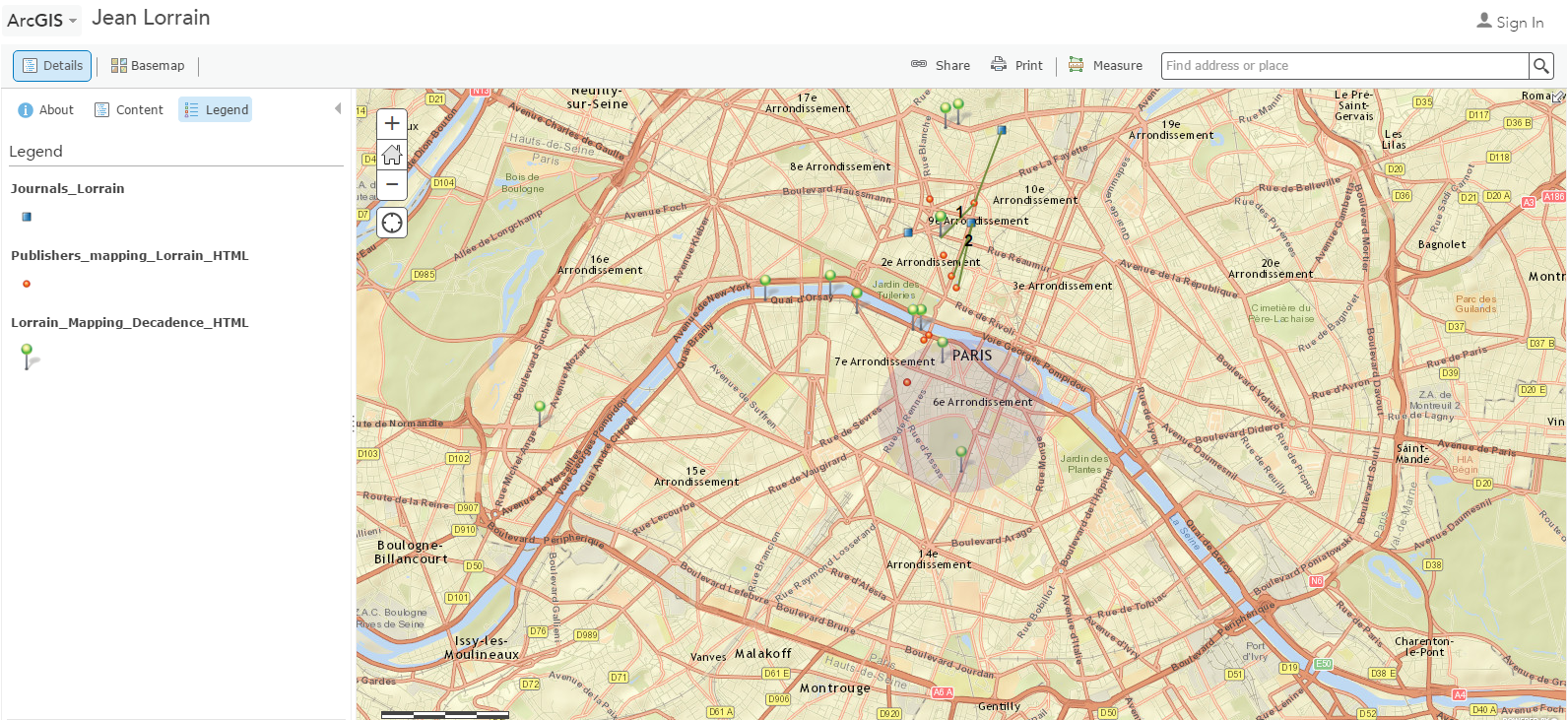
This is the individual map that shows the places where author Jean Lorrain lived as well as the specific publishers he worked with. Of all the individual maps I felt like this one was the hardest to interepret since he had so many places where he lived and there were only a few lines drawn showing the connection from his location to his publisher’s location. It isn’t clear to me why there aren’t relationship lines coming off of all of the publisher locations, and so more contextual information would’ve been nice to help frame what the maps are actually saying since it seems obvious that a writer would work with a publisher situated in close proxmity to themselves, even though that isn’t always true as seen in with Lorrain’s life.
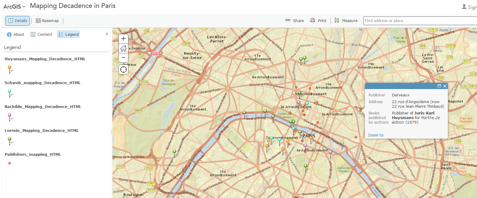
With the main Mapping Decadence map the user is able to see all the authors and publishers together on one map, indicating the importance of that specific area in Paris as a hotbed for Decadent writers in the 19th century. Unfortunately with this map we lack the lines drawn between author location and publisher location which offer context to the relationship. Without those lines you have to click on each publisher location to understand which author published there, an act which feels tedious.
This site doesn’t come off as very thorough or even complete since there is, to me, a lack in the clarity of the maps in terms of what they are meant to mean. The relationships that the site strives to show, when they are clearly shown, don’t say very much to me except the obvious, that close proxmity is conducive to the author publisher relationship, but not strctly necessary. My personal lack of recognition of the importance of the maps might be due to my lack of background knowledge on the topic at hand, but putting that aside there is still room for improvement in the maps. If I were to create different map I would ensure that each publishing location had a line connecting it to the author’s location at the time of publication or if the author was not in that area at the time I would make sure that was noted. I might also increase the size of the red point denoting the location of a publisher if multiple authors used them to publish.