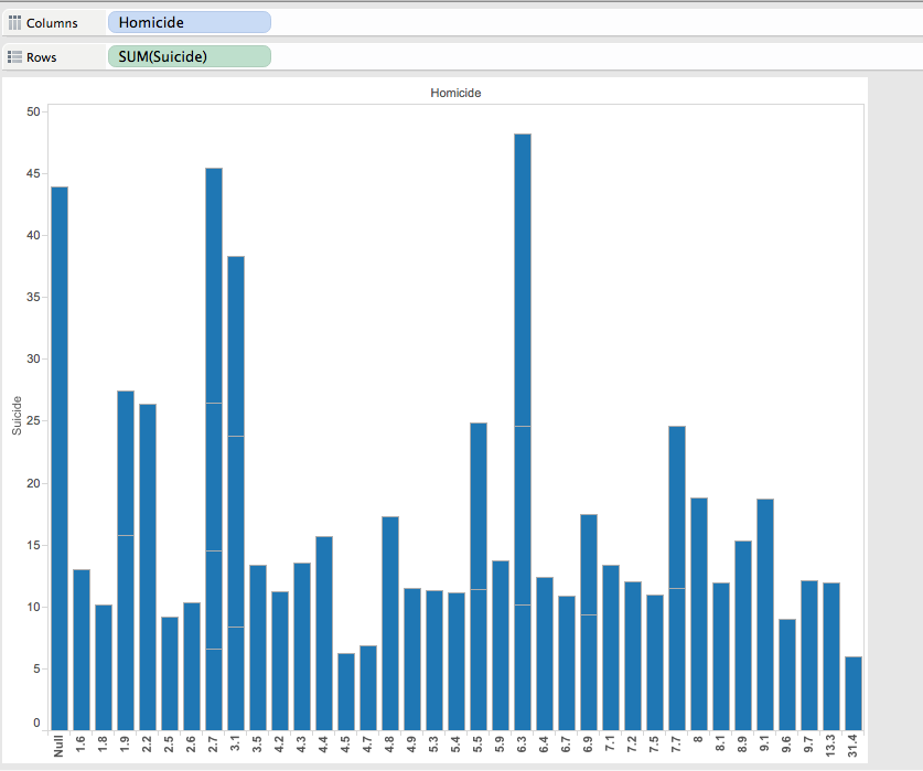
The data visualization I chose to use was Tableau because it demonstrate an easy and efficient way to graph and color coordinate data in a way that can be better understood visually then through a mess of data. I first began looking at the Data Set in relation to deaths. I decided to pick two topics in order to visually decide which was more common. I picked Homicide and Suicide. While morbid, it was used to see which was more of a common occurrence each year and how can it be graphed visually. Additionally it showed the distribution of age and demographics for which we can then see which was more common for a particular age, homicide or suicide, additionally so which was more common among a particular sort of demographic.
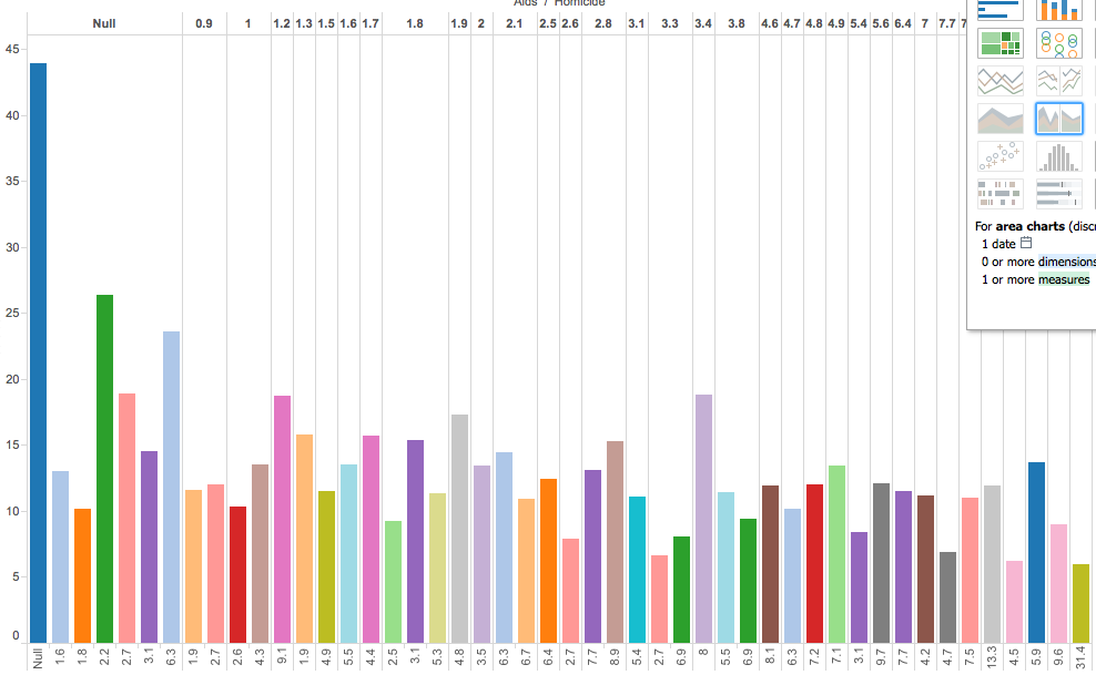
I additionally included AIDS to show and distribute different forms of death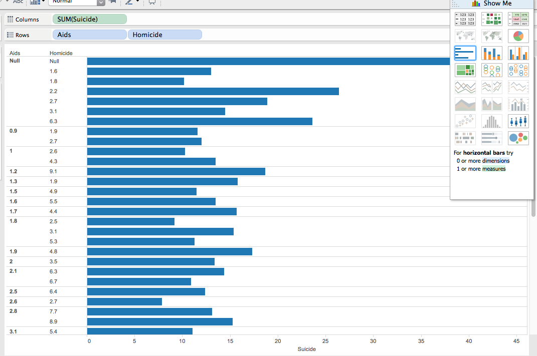
Tableau is an excellent way to visualize a particular data tool, because there many different graphing options and ways in which to set up a particular data set. Additionally you can upload more than one data set to the app, therefore creating data across many different variations.
Within this data set, and Tableau you can move your cursor over the bar, and It can be shown that in 6 homicides there are in fact 23 suicides. This graph can accurately represent that suicide is the main cause in death in most of the people used throughout this study. Additionally, you can also notice that AIDS is the lowest out of the 3 options in which death occurs.

This graph represent Homicide in relation to Heat Attack, Flu, Diabetes, Cancer, Alzheimers, Accid, etc.
While Tableau can easily represents figure. It may be hard for the everyday user (like myself) to figure out how to work it. Luckily, UCLA has LYNDA in order for to watch tutorials in which Tableau becomes simple. However, for the everyday user making these graphs and downloading the app could be a bit more difficult then say, Google Fusion or Google Tables. Google Fusion requires an online database whereas tableau you must download. I do however, believe that for this visualization both google fusion and tableau could have been utilized efficiently.