Course blog

Week 7: “I Honestly Don’t Know How We Managed So Well Without GPS”

picture-242Thomas_Guide_Los_Angeles_County_Easy_to_Read_2009


Traditional maps are said to date back 8,000 years ago as cave drawings in Ancient Mesopotamia. Fast forward through the 16th and 17th centuries when cartographers realized that the world is not in fact flat, all the way up to the digitization of maps, it is undeniable the incredible transformation maps have made in the past 20 years, let alone the past 8,000.

Upon reading through the Anatomy of a Web Map presentation by McConchie and Schechter, I found myself nostalgic of the times when I was younger and watched my parents input addresses into MapQuest online. The more I thought about how useful MapQuest was to my family in the early 2000’s, the more I wondered how the heck did people get around to unknown locations before the invention of web maps? Of course there were paper maps, but how were people able to account for traffic, or choose the quickest routes to a location with just a paper map? I proceeded to text my mom the same question and she promptly responded…

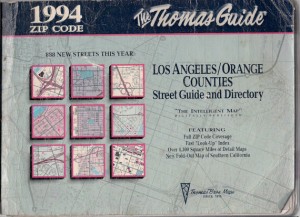
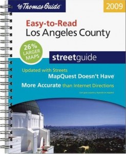
“We used Thomas Guide, or went to AAA to get specific city maps. Every gas station worker/owner would give you directions, but I honestly don’t know how we managed so well without GPS.”

The same could be said about the invention iPhones. Every American seemed to be able to function quite well upon the era of the “flip phone,” but ever since Steve Jobs’ legendary technological invention, individuals have no idea how they would be able to carry out their lives without this device in their presence each and every day–myself included. We are a generation that is becoming more and more dependent on new technologies, and in effect, we are seemingly less functional if we are ever not in the presence of these devices. In Information Studies 20 last year, Professor Srinivasan forced us to take a “Digital Detox” day, where you were not allowed to use any technology for a full 24 hours. Based off a camp in Northern California where campers are stripped of all technologies in order to find their personal peace again, the assignment really taught myself and all my fellow classmates how much of a presence these devices are in our everyday lives. At the end of the day, we need to be able to detach ourselves and “unplug” from the digital environment in order to ensure the only presence we have is not an online one.

Week 7: Web Map Anatomy and Hoon Kim’s Broadway Soundscapes

walk-01

http://whynotsmile.com/project/walkshow.html

Alan McConchie and Beth Schechter provided a very minimal, but informative presentation on the basic structure of a web map via the hackable “Big” system which I fully enjoyed. First off, I truly appreciate this presentation tool and the way it implements minimal hacking to whip up a browser-based presentation that can be shared easily and quickly. I hope to see this form of presentations to be utilized and accessible by a simple click of a hypertext.

Moving on to the content of the presentation, McConchie and Schechter basically dissect the anatomy of a web map, comparing it to the likes of our own human body and how we have systems that are interconnected. They then go more in depth about the layers that create this multi-layered data cake of a creation. Being able to identify and dissect each layer allowed me to approach web maps with more confidence. I’m especially glad to be learning about what makes a web map since there is a definite trend of creative map design that may look geographically accurate, but are in fact based on the designer’s subjective associations which lean more towards a mind map.

Data and content layers definitely sparked my attention since I felt that this was where the creative direction came in. Data layers can essentially be simply points, lines, and polygons marking the tiles that formulate the base layer. However, I can see the vast potential with data layers and its design direction. I also realized at this point that the addition of data layers is ultimately establishing the narrative and objective of your web map. The base layer is your map and your data layers are your pins and tacks.

Although my reference is not a web map, designer Hoon Kim and Sarah William’s research collaboration used various geo-reference data like satellite images and documentary data like NYC 311 Noise Complaints which are logged by location and time. The result of this research was “Walk on Red EX1”, a book and exhibition that showcases an analysis of the registered noise complains in Manhattan in correlation to population densities and mixed property usages around four Manhattan neighborhoods including SoHo, Wall Street, Midtown, and Inwood. Although ambitious, “Walk on Red Ex1” is a very intriguing attempt to visualize the geo-spatiality of sound related events. Kim and Williams utilize the data layers of found web maps of the Manhattan neighborhoods to serve their objective of analyzing and visualizing the neighborhoods’ unseen soundscape. I can definitely see this project expanding into a web based map which would be a nice way to tie up the loose ends of this project seeing that the research for this project first began with web map references.

Week 7: Mapping

webmapping

Every time you’re going for a drive to an unfamiliar place chances are you’re going to open up the maps app on your smartphone to avoid the struggle of getting lost. Jim Detwiler’s Intro to Web Mapping provides a brief history and understanding of these web maps. He looks at the advantages, which include that web maps are cheap, easy to constantly update, readily accessible, and interactive. A con he pointed out that at times they are not as reliable as the good old-fashioned paper maps. Most notably if you are stuck in an area that is distanced from an internet connection or phone service, or the possibility of the map server being down. I was doing a bit of research on GPS, which stands for Global Positioning System, and learned that it was created the US Defense Department was originally meant to be kept a secret from the public. It was developed back in the 60s but was not deemed fully operational until 1995.

It got me thinking of all the apps we use today that use mapping systems. Tinder, the popular matching making app, uses GPS to connect users within a specific radius. Apps to find food such as Yelp and Urbanspoon connect users not with other people, but retail stores and restaurants. Even Instagram offers a ‘geotag’ options that allows users to show their followers where the photo was taken.

I remember when I was just a little kid, we would whip out our trusty Thomas Guide when going for a road trip. I was content just flipping through the pages to find our location and destination and never thought there would be a faster or easier way created in my lifetime. That transitioned to printing out MapQuest instructions from my PC to take with me on foreign drives for soccer games. Then finally today I sit with my iPhone in my lap as my good friend Siri reads off directions through my car’s speakers. It’s amazing to see the progression of mapping in our devices how in just a few years it went from everyone using fold out paper maps to a little handheld device that can riddle off directions.

For my last GE requirement I was looking at taking Geography 7, which is titled Introduction to Geographic Information Systems (GIS), so this week’s articles gave a welcomed introduction to the subject. I know for our project we are looking at using web mapping when looking at the locations of past Olympic Games, which I hope we execute well.

Link 1

Link 2

Link 3

Disaster Relief Through Google

In Michael F. Goodchild’s piece titled “What does Google Earth Mean for the Social Sciences?” he begins my mentioning that Google Earth “presents a subject for social research in its own right” as well as the need to “address some of the issues identified in the earlier social critiques of cartography”. Google Earth has provided each and every person with the ability to explore the world’s geography at the touch of a few buttons. Google Earth has found ways to avoid daunting problems associated with mass amounts of data required to display the millions of data elements that create the picture of earth’s surface. They are able to store data locally, which is made possible through requiring users to download the program. The ability for users to view the earth in different levels of detail allows for the analysis of a certain location from many different aspects. All of these tools have rendered Google Earth as a great tool for research at both the scientific and explorative levels. As we continue to make technological advancements, the exploration of our world, and what lies beyond it, has become increasingly more tangible with these types of geographic information systems.

Google Earth allows for the integration of unique layers within its program to access different information. For example, updates related to current earthquakes can be integrated through a live access feed. This helpful concept directly relates to the idea behind Google Crisis Map. This tool that is integrated within Google Maps puts “critical disaster-related geographic data in context” by using the map program to highlight the key areas that are affected in real-time. It is also able to integrate links to fundraising sites or help hotlines during major times of crisis around the world. This allows for users to stay up to date on current disasters and all of the different ways they can ensure their safety as well as the safety of others. The ability to interact with this data and both contribute and download it instantly, shows the potential that these geographic information systems have to help the world. This level of disaster-related broadcasting and communication would never have been possible without this type of system. Its ability to efficiently define the spatial and geographical data has aided social-science research exponentially, and will continue to keep users up to date on all of the major events occurring on a given day.


Sources:

  1. http://www.google.org/crisismap/weather_and_events
  2. Michael Goodchild, “What Does Google Earth Mean for the Social Sciences?”

Where did MapQuest Go?

Accessibility to step-by-step directions from point A to point B has gone from being a luxury to a necessity since the early 2000s. When I was younger, I remember being entrusted with our family Thomas Guide, an old and quite thick booklet of maps we kept in our car to navigate freeways and streets on long car trips. As I got older, we stopped carrying around the Thomas Guide and transitioned to using the internet to map out our journey in the most efficient way possible. When planning these trips, MapQuest was our go-to route planning site.

il_570xN.439968747_ahrl
I think my family actually owned a copy of this 1994 LA County Thomas Guide. Now it’s old enough to be considered vintage and is available for purchase in an Etsy shop.

As Jim Detwiler writes in “Introduction to Web Mapping,” MapQuest helped break new ground in the age of digital mapping technology. It was part of the first generation of sites in the web mapping industry and even when other websites started to outpace it, the site continued to update its services. When Google made its map interface public so did MapQuest, and from there, a whole new generation of custom mapping applications was born.

I recall using MapQuest as my default mapping website up until around 2009 or so when I decided Google Maps offered a more convenient service. (This convenience was mostly due to the fact that Google was the homepage for my family computer and it was far easier to click on the “Maps” tab than it was to type MapQuest’s URL.) A 2009 Business Insider article addresses MapQuest’s decline at this time and comments on the increasing site space being devoted to advertisements, while Google Maps kept its interface clean and to the point. The article also goes on to give MapQuest some advice to turn their company around and return to its role as a leading online map service, a key point being that presentation of the site is important (something we can all relate to now after learning about the importance of data visualization techniques).

It’s been a few years since 2009 now, so I wanted to go back and see how MapQuest is doing and how the site has evolved over time. The layout of the site is very similar to the (now) older Google Maps layout, with directions and options on the left side and a map on the right. There was one momentary flaw in MapQuest’s direction system; when I inputted “UCLA Young Research Library” on both sites I was met with an unexpected surprise. Google Maps gave me a direct image of UCLA’s campus with YRL pinpointed on it but MapQuest got confused and gave me “related” locations in Pennsylvania. Only 2400 miles off.

Screen Shot 2014-11-16 at 10.58.35 PM
Google Maps search result


Screen Shot 2014-11-16 at 10.58.58 PM
MapQuest search result


Week Seven: Women in GIS

Sara McLafferty’s, “Women and GIS: Geosptial Technologies and Feminist Geographies,” discusses the intersection between feminism, GIS technologies, and the impact of these technologies in women’s lives. McLafferty mentions the shift from a “pro-techonology” stance to an “anti-technology” stance within gender and technology discourse, primarily caused by the view that technology merely “perpetuate[s] and reproduce[s] gendered social relations” rather than liberating women from said constructs. However, there is a more nuanced view that “acknowledges technologies can have both positive and negative impacts at the same time…[these] vary among diverse social groups.” The way in which technologies are either positive or negative depend exclusively on why these technologies develop, and “how, where, and by whom [this technologies] are used.” Negative uses of technology can be most prominently seen when technological tools are used in attempts to control or monitor others for the sake of exerting power or dominance.

McLafferty mentions the increasing presence of geographical technologies within the realm of surveillance and monitoring. She mentions “closed-circuit TV cameras, high-resolution satellite imagery, tracking devices, and cell phones” as examples of specific instances of surveillance-monitoring equipment. However, since the publication of McLafferty’s article in 2006, cell phones have become capable of much more, and thereby contain more sensitive information. The sheer amount of data collected and retained within smartphones can lead people with malicious intentions desiring access over them. This is especially likely to happen with women who are in domestic abuse situations.

mspy
Cyberstalking victims often don’t know they’re being tracked through their own phone because spyware apps like mSpy use misleading labels (labeled “android.sys.process” here) and don’t take up much data. NPR

In NPR’s report, “Smartphones Are Used To Stalk, Control Domestic Abuse Victims,” the various ways abusive partners use technology for negative use is discussed in detail. According the report, “cyberstalking is now a standard part of domestic abuse in the U.S.” Many abusive partners use spyware and other tools to monitor domestic abuse victims who either attempted to leave and are in shelter situations, or are still within the abusive relationship. Many domestic abuse counselors require new arrivals to participate in a “digital detox,” which requires a complete shut down of a cellphone’s GPS and Wi-Fi, as well as staying away from Facebook. This is because:

Eighty-five percent of the shelters [NPR] surveyed say they’re working directly with victims whose abusers tracked them using GPS. Seventy-five percent say they’re working with victims whose abusers eavesdropped on their conversation remotely — using hidden mobile apps [such as MSpy]. And nearly half the shelters [NPR] surveyed have a policy against using Facebook on premises, because they are concerned a stalker can pinpoint location.

This NPR report is a modern day example of geoslavery, “in which the master coercively or surreptitiously monitors or exerts control over the location of another individual.” While tracking can be beneficial for parents wanting to make sure their children are safe and accounted, when used by the wrong people for the wrong goals, the results can be horrifying, as seen in NPR’s example. This report shows the ways technology can be used to control and surveil woman in an exclusively gendered way.

Sara McLafferty, “Women and GIS: Geosptial Technologies and Feminist Geographies”

Aarti Shahani, “Smartphones Are Used To Stalk, Control Domestic Abuse Victims.” NPR. NPR, 15 Sept. 2014. Web.


Week 7: Mapping and GIS

This week I very much enjoyed reading Introduction to Web Mapping. In Spring 2014 I took Geography 7, Introduction to GIS, here at UCLA. I really enjoyed this class and hoped to incorporate some of what I had learned in that class into what I was creating for my digital humanities project. Although I had at least heard most of the information in the lesson, it was a very good refresher.

In Geography 7, I learned the basics of QGIS and created a new project each week, and they continued to get hard and harder as the weeks progressed. By the end of the quarter I was able to make a project that I was extremely proud of. In this project I had downloaded a map with all of the voting districts in California and chose on in the Los Angeles area to focus on. I then found the voting information from the 2012 elections. After linking this information to the map, I was able to create many versions of a static map. These included maps based on results from the 2012 General election in terms of voter registration, voter turnout, and voter political preference. With this information, I then created maps that showed precincts to either target or avoid when campaigning in an upcoming election, based on my earlier previous maps.

At the time of creating these maps, I didn’t refer to them as static web maps, but after reading this article, I realized that is what they were. In addition to being static though, these maps are also personalized because, although the data collected represents a snapshot in time, I created the color scheme, classification method, title, legend, scale bar, and other aspects that can be created in QGIS.

The most new information for me, involved the history of Internet mapping because in Geography 7, we had mostly focused on how to actually map. I am constantly impressed by virtual map technologies like Google Earth and Microsoft’s Virtual Earth, so it was incredibly interesting to see how these systems developed. It is hard to believe that this many steps in virtual mapping have been made in the only 21 years since the first Internet map viewer was produced in 1993. Although I don’t understand the coding being referenced in each of the progressions from generation to generation, I can understand, in words, some of the capabilities that were developed. I am very excited for this week because we will be talking about something I am at least slightly familiar with and eager to help my group with that.

Below I included some examples of the maps that were included in my Geography 7 class that I described.

FinalMap3 FinalMap4 FinalMap5 FinalMap7

Wikimapia

As of this year, since I am living further from campus, I have started riding my bicycle to school, which means sticking to designated bicycle riding areas (i.e., not Bruin Walk) if I don’t want to get a ticket, but also finding spots to lock up my bike. Surprisingly, this can be difficult, especially when you are not thinking clearly because this will be the third time you are late to work this week or because you slept through your alarm and want to catch at least the last five minutes of discussion so you can get marked for attendance. Not that either of those have ever happened to me. While reading “Anatomy of a Web Map” and Jim Detwiler’s “Introduction to Web Mapping,” I was dying to see if there would be any online interactive maps that would revolutionize my life completely introduced. Well, this isn’t completely true, but I checked out OpenStreetMap and was thoroughly impressed with the site. OpenStreetMap allows users full control, much like Wikipedia, to edit the content on the site. I registered with the site (which is for free), and allowed the site to find my location (hopefully you all are okay with this too), and boom. Of course at first it just looks like your average web map, but it is user friendly, not only in navigation, but also in the data that it presents. Different landmarks, buildings, and fields are labeled with appropriate symbols; pedestrian walkways are also distinct from roads. Sure, most of this information can be shown on other web maps, but then I saw the bicycle symbol for bicycle parking. Victory! Finally, a resource where I can locate bicycle parking spots for my convenience so I never have to worry about finding a spot to lock my bike when I only have five minutes to get to class or work and waiting for the elevator always takes at least four. What this really means is that a map like this is open to possibilities. Take a look at Wikipedia. You can find information you never even knew existed in a simple search and click of a button. Professors may not like it when you cite Wikipedia, but it definitely more often than not points you in a great direction, whether this is by providing resources or simply making you think in a certain way. Just like Wikipedia, OpenStreetMap has the same possibilities since it is ran by the users. Unlike other public API maps, this map can be some personalized and humanized that it could even help you find the nearest toilet. This would require a smart phone app, which probably already exists, but this is not the point, it is the principle. This map could be a great tool for tourism: tourists would be able to know all the hidden gems and lore of where ever they go, as long as users took time to contribute. I will take stand and do my part, starting with bicycle parking spots. Will you?

Screenshot 2014-11-16 18.51.03

Take a look here at an ATM point; also notice the bike symbols, and how many people have edited it (bottom left corner)


Waze paving the Way for us all

http://cdn.arstechnica.net/wp-content/uploads/2012/10/ios_maps_waze.jpg


Waze is a sophisticated interactive digital map app that collects every driver’s data that has downloaded the app and uses it to indicate the speed of traffic and what others have seen recently on the road so they can report crashes, obstacles in the road like a fallen tree branch or can warn others about patrolling police enforcement. Their website claims that you will “Get the best route, every day, with real–time help from other drivers,” so their map is not only real-time but it is also personalized and you can choose to select various things like avoid tolls or freeways. Waze is useful because when you sign up, it asks for your permission to access your GPS location while using the app and that way it can collect your data and compare it to the Waze users around you. The map encourages communication by giving you points if you are driving with a passenger and they are able to report traffic accidents. The points don’t really help with anyone in real life, but in the Waze world in can show you an a baby Waze icon (when you’re brand new to the system) or you can become older and get yourself a new icon that best represents you. Besides showing you where you are going and what is along the way, there aren’t any more visualization tools and I think that helps the map serve it’s purpose since after all it is really about getting from point A to point B.
Even still, the map is especially interactive and really lays down a foundation that builds trust within the user community. When people report a cop, they really watch how they are driving, and if they see the cop has left or moved they can also report that. The really cool thing about Waze is that if you want to get home and there is a big accident on the way, it will show you what side streets you can use to get home faster and avoid the traffic. It’s interesting that once you are a Waze user, it’s easy to spot who is one as well. Instead of sitting in traffic they will be behind or in front of you, taking all the same crazy turns you’re taking to get to where they are going. And it really does help. What’s also cool is that you can communicate to other users if you’re really bored or what to have some small talk with a stranger. If you’re going somewhere kind of remote, like Joshua Tree or some hipster event like Coachella, you can possibly even become friends even before you get to where your going. The icons can serve as conversation starters and it’s pretty groovy to see how a map can create friendships and get you to wherever your going in a way that is fast, smart and creative.

Better Learning

People interested in web design are always trying to think of the next big way to draw in users to view their website. They have to consider what people are drawn to, what would interest a large population, why read their website rather than anyone elses? My freshman year of UCLA I thought I wanted to be a psychology major and focus on working for an advertising company some day. Adversting sounded like the perfect job for me out of college because I liked studying why people do what they do? What makes people more attracted to a certain clothing website? Why do people prefer Coke to Pepsi? Is it because Coke chose the simplicity of red and white as their brand colors?

What Alan McConchie and Beth Schechter did was sometime very radical in the web design world by making the website more hands on and interactive.  The person viewing the site must stay focused and alert when reading the site because it is presented with large texts, different colors, and visuals to keep the viewer entertained. The new author of, “How We Learn: The Surprising Truth About When, Where, and Why It Happens”, Benedict Carey says, “The brain wants variation.” The website is formatted from another website called “Big” which allows people to make creative presentations. (http://www.macwright.org/big/) There are many slides that are inconsequential. What I mean by this is that there are slides that are there as enforcers to make things more interesting and fun. By doing this McConchie and Schechter push a user along to stay engaged and continue learning about web mapping.

I have learned a lot about web mapping tonight from McConchie and Schechter’s presentation of the “Anatogy of Web Mapping.” Web mapping is different from a digital or analog map. Web maps are a kind of digital map that are viewed in a browser. Mapquest was the first to use this kind of web service in 1996, but in 2005 Google Maps made tiles faster to load, scroll, and zoom. A map is a composite of these tiles. Each zoom level on a map has its own set of tiles. For example, if the zoom level is 0 and there is one tile of the whole world. With each zoom level the tile number increases. Zoom level 1 has 4 tiles with a closer image of world spread out on those 4 tiles. Tiles are usually rendered in adcanced and store in a cache so no one has to recreate a map.

I love this kind of presentation. It forces users to reiterate what they just learned with an interactive visual.  Carey says that embedding information in one’s memory in two contexts makes the memory stronger. For example, McConchie and Schechter explained what Raster tiles are in text format as the map’s base layer. Layers such as markers are then put on top of the map. They are categorized as data, content, feature, or vector layers. Once I read this I said it my head, “Okay, but what does that look like?” When I continued, the next sides answered my questions. They had an image of a map and everytime I clicked my arrow to the next slide, the map was edited with layers and described what each kind of layer would physically look like. I also really like the layout of the slideshow. By being instructional and personal the presentation reminded me of flashcards to a larger more interactive degree. There is a website/app I use to make flashcards called, StudyBlue, which is similar to this site. It also takes up the whole screen so users are compelled to look only at the large texts in front of  them.

This got me thinking about study strategies. I’m constantly racking my brain to find easier ways to learn rather than to just read and use flashcards. Who doesn’t want to be able to retain knowledge better and faster? With all this new technology individuals are constantly coming up with new ways to answer this question. I think this way of learner is a great way to help people absorb information better.  A lot of the time people take notes on paragraphs after paragraphs of a textbook and then never look at those notes again. How well can anyone say that information was obtained? New ways of studying and obtaining information makes people have more time to do other things like….solve world hunger. By making things more interactive and engaging this can help students of all ages learn and make studying more sophisticated and valuable.


http://well.blogs.nytimes.com/2014/10/06/better-ways-to-learn/?_r=0

http://maptime.io/anatomy-of-a-web-map/#0