Virtual Tours: Google Art Project

Hello everyone! It is a miracle I am here! My mom’s desktop has so many viruses it’s insane, because of that I wasn’t able to download flash and so what I will write about the Louvre will be from memory… unfortunately… I’m sorry (I tried).  Anyway, this weekend I read “Meaning in Motion “by Diane Favro and she argues that a lot of factors go into executing an interesting, accurate and engaging 3D model.  Academics can be limited by “availability of data, the technology used, time allotted for creation,” funding and more, not to mention the need an artistic eye. One of the projects they worked on, was actually a collaboration piece with a production company and that really helps with the look of things. While reading the article I thought it would be really cool it more Hollywood production companies were to get involved in this sort of academic work. Favro explained how often viewers in the audience would propose the idea or request that their be other walking figures in the virtual maps or portals, and while the graphics students would try over and over it never quite looked right and would distract from the buildings and narration. Favro states that “currently, there are no accepted scholarly guidelines for interaction with digital reconstructions,” I believe that a set or limited vocabulary and some guidelines could be very helpful so that a standard is created for what is academic reconstruction of a scene and what is fantasy based off historical happenings.

Favro claims that knowledge and understanding is forged and strengthened through movement” and that the “study of ancient sculptures and inscriptions must consider observes kinetic, experimentally rich engagement within the original physical context.” I agree with completely because as a artist I know that the way you show something is almost as important as what you are showing. Placement, height and everything like that has a huge effect on how people interpret what is being exhibited. For example, if an artist scatters all the paintings on the floor in the center of the room or if they hang them all level in elegant frames, the audience will perceive them differently and walk away with a different story to tell. If someone were to make a 3D model of a statue, it is important to place the viewers eyes in relation to where a typical person’s eyes might be. It would be really cool if they could add a feature where you could type in your height and then see if from that perspective, as if you were actually there. The UCLA students and faculty who worked on the UCLA project wanted to make cool bird’s eye views’ of the locations, but it seemed to break the continuity of the “walk through” idea that had originally come up with. What I found like it is the tour of the Louvre, which was really popular when it came out and you can see how things look in the context of the building. My favorite part about digitizing this sort of work is that now people who might be unable to fly to France (say the sick, elderly or disabled) can still see the work and better imagine how it might feel to be there  🙂
http://www.louvre.fr/en/visites-en-ligne

ALSO My computers having a heart attack so there will be no images for this post
If you want to see cool things, pelase look here:

http://blog.dk.sg/2011/02/07/google-art-project-street-view-in-art-museums/

THANKS <3
Waze paving the Way for us all

http://cdn.arstechnica.net/wp-content/uploads/2012/10/ios_maps_waze.jpg


Waze is a sophisticated interactive digital map app that collects every driver’s data that has downloaded the app and uses it to indicate the speed of traffic and what others have seen recently on the road so they can report crashes, obstacles in the road like a fallen tree branch or can warn others about patrolling police enforcement. Their website claims that you will “Get the best route, every day, with real–time help from other drivers,” so their map is not only real-time but it is also personalized and you can choose to select various things like avoid tolls or freeways. Waze is useful because when you sign up, it asks for your permission to access your GPS location while using the app and that way it can collect your data and compare it to the Waze users around you. The map encourages communication by giving you points if you are driving with a passenger and they are able to report traffic accidents. The points don’t really help with anyone in real life, but in the Waze world in can show you an a baby Waze icon (when you’re brand new to the system) or you can become older and get yourself a new icon that best represents you. Besides showing you where you are going and what is along the way, there aren’t any more visualization tools and I think that helps the map serve it’s purpose since after all it is really about getting from point A to point B.
Even still, the map is especially interactive and really lays down a foundation that builds trust within the user community. When people report a cop, they really watch how they are driving, and if they see the cop has left or moved they can also report that. The really cool thing about Waze is that if you want to get home and there is a big accident on the way, it will show you what side streets you can use to get home faster and avoid the traffic. It’s interesting that once you are a Waze user, it’s easy to spot who is one as well. Instead of sitting in traffic they will be behind or in front of you, taking all the same crazy turns you’re taking to get to where they are going. And it really does help. What’s also cool is that you can communicate to other users if you’re really bored or what to have some small talk with a stranger. If you’re going somewhere kind of remote, like Joshua Tree or some hipster event like Coachella, you can possibly even become friends even before you get to where your going. The icons can serve as conversation starters and it’s pretty groovy to see how a map can create friendships and get you to wherever your going in a way that is fast, smart and creative.

newsfeed, newsfeed, on the wall, what’s the relationship in them all

Locals vs. Tourists The Paul Revere article by Kieran Healy was really fun to read, the authors style was different from anyone else’s and he basically prided himself in not knowing anything about Paul Revere except what he was able to extract from the data.   The author also explains what relational matter is her methods of collecting data and that shows the links between people and Paul Revere. It was interesting seeing all the connections that linked back to him and I think Kieran Healy is saying that it’s data can help the understanding of history and vice versa but they will still need each other to have a genuine understanding of what you’re looking at.  A really cool article


http://www.fastcompany.com/3013208/these-amazing-twitter-metadata-visualizations-will-blow-your-mind#1


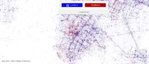
I found on metadata this week also has to do with traveling and messages being sent. Author Neal Ungerleider says, “metadata in twitter posts lets readers in on your geographic location, the language you speak, the phone you use, and more. They’re also a mapmaker’s best friend.” He was able to distinguish who was a local and who was a tourist and then map out who went where. As someone who lived in New York for five years, I never once went to the statue of liberty, and on the map one can see that it is a huge tourist hot spot. Its kind of weird how you really don’t have to have any pre-conceived notions to collect data. You can know nothing, like Healy claims and then discover a wealth of knowledge or at least facts that might help lead to some sort of conclusion. It’s a lot like science where you can have a hypothesis and then look for results (data) and then compare what you found out. The last paragraph of the Paul Revere article does mention the power of data could be used to control people and that data could become like a “weapon.” I feel like that is something we should definitely watch out and it’s kind of how ads try their best to find an extremely specific target market. With social network analysis come great responsibilities I guess you could say. If you can find connections and common themes such as the amount of people who visited with a single person (Paul Revere) then you can also find out things like Ungerleider did when he mapped out where different languages are spoken just based of Twitter. While some of it may seem obvious, like Chinese being heavily used in Chinatown, it can also illuminate things that where not being observed before which is why digital humanities is so cool. You get to look at the world in a new way which is what Healy is trying to show us.

music and suicide (two separate ideas, one blog post)

Screen Shot 2014-11-02 at 8.47.17 PM

While the Jefferson Paper’s article is concerned with race and the way it was silenced due to the little attention it received in preserved records, my primary source deals with how more independent music is also silenced in a way.

Jefferson, like Pandora, have both worked very hard to collect and preserve the things they want to see in the future, but like a person, no one computer or machine is perfect and not every song that has ever existed can exist on Pandora. Jefferson had “eighteen thousand documents” he wrote himself  and pandora has thousands and thousands of songs as well so we are dealing with a lot of information.On the pandora website they explain that independent artists can upload their music but I feel like every time I use pandora they just play the same well known bands, and often you do hear new music, but the people are equally famous. I feel like more popular music will always be played and I tend to hear the same songs once a week, which just seems weird when they have the world at their fingertips. They could play something more more obscure and if I didn’t like it the worse that could happen is that I would give the song a thumbs down. I also wonder if the company is biased and is having these bigger bands pay them to play their songs more often.  (I tried looking that up but am not finding much information about it.)  Pandora does not have any data visualizations and I feel like that would be helpful for people. For whatever reason they keep their library hidden and I’m not sure why.

In the other article by Drucker, I liked the idea that a humanities approach to data can change how we see things. While Dr. Snows’s map of a cholera epidemic in London helped save lives and showed people where not to go,  the graphic by  Eskandar feels more personal and has humanistic qualities because actual people are representing the deaths of people and so instead of hearing about lives lost, or seeing dots, you see physical representations that remind us of ourselves.  The same goes for the data visualization of suicides around the world that someone else posted about. In many ways, seeing the data makes it feel more real and puts it in better perspective. It makes you ask why certain things seem to be happening in certain places and from there we can look for solutions.


http://www.humanosphere.org/science/2014/08/visualizing-the-surprisingly-massive-toll-of-suicide-worldwide/#prettyPhoto

iTunes data

momouse
my library

The above image is a screenshot of my iTunes library. While the the first two chapters of Kroenke’s book DataBase included many examples for each new vocabulary word, the iTunes library is a little easier for me to relate to.   The rows contain data about a song entry. The columns contain data about attributes of the entity such as who is the artist, how long the track is or what genre it belongs to. When I download music sometimes there are null values. Some musicians, like Beck, cannot fit into any particular genre because their body of work is so diverse and crosses many types of genres. This sometimes complicates things because it makes his work harder to find and classify. As of now, iTunes still does not have the ability to list something under two genres and I’m sure music enthusiasts and DJ’s could really appreciate such a new feature. The first chapter explains how tables can be more useful than lists because information can be lost if it is deleted from a list where everything is linked, instead of a few tables that are related but can be reconfigured and still maintain data that is important. The text Databases by Stephen Ramsay states that “humanist inquiry reveals itself as an activity fundamentally dependent upon the location of pattern” Dealing with pattern necessarily implies the cultivation of certain habits of seeing; as one critic has averred ‘Recognizing a pattern implies remaining open to gatherings, groupings, clusters, repetitions, and responding to the internal and external relations they set up’.” With this being said, I feel like iTunes has already recognized many patterns but could always make room to improve.

ITunes is a relational database table because you can look at data from different perspectives and things relate in a certain way. For example, if the Rolling Stones are listed under “Rock n’ Roll” and you want to change the genre to “Rock,” you can do it in such a way that does not delete all the other information. My making sure you use a restricted or set vocabulary you can make sure it will be easier to find different types of music. Because much of the vocabulary was so new to me I am not sure what the SQL (Structured Querey Language) of iTunes might be and am I not sure what the normalization process for it might be…. But I think the primary key could be the album because then it means that genre and artist are linked to it and have to agree to be part of the same album, but I am not completely sure. If anyone has any ideas, let me know in your comments on what you think the Keys in iTunes might be.

UCLA Dininghall metadata #yum

I absolutely loved the article about netflix and felt like sharing it with everyone I know that watches netflix. I do stand up comedy and the joke photos were so funny, it’s such good material to make jokes about….. but honestly the work done by the computer programs like AntCon and Alexis Madrigal was incredible. Regarding Netflix, I sometimes didn’t like how specific the altgenres get… for example, say you babysit a little kid and watch a show with them, for the next month you get suggestions for little kid TV shows…. which I always thought was kind of dumb. Sometimes I want to see things that are completely new to me. But I do understand their approach and I think it has been very successful for the most part.  It especially creates the conditions for binge watching which is kind of an American epidemic.
Anyway, I was going to talk about how cool Pandora’s Music Genome Project is, but reading this article on Howstuffworks.com made me realize that I myself have been part of a metadata analysis group right here at UCLA.

I still would like to compare what I did, to the Pandora project and below is an except from HowStuffWorks:

“Pandora relies on a Music Genome that consists of 400 musical attributes covering the qualities of melody, harmony, rhythm, form, composition and lyrics.It’s a project that began in January 2000 and took 30 experts in music theory five years to complete. The Genome is based on an intricate analysis by actual humans (about 20 to 30 minutes per four-minute song) of the music of 10,000 artists from the past 100 years. The analysis of new music continues every day since Pandora’s online launch in August 2005. As of May 2006, the Genome’s music library contains 400,000 analyzed songs from 20,000 contemporary artists. ”

When I was living in the dorms my senior year I became a part of the Distinguished Palate Committee, and that pretty much meant I got to eat food for free at the dining halls and then rate dishes and the over all atmosphere of the dining halls. At the dining hall Feast, they specifically targeted students of Asian descent so they could make sure each dish retained it’s authenticity and the students were considered experts in their field, kind of like the experts in music theory mentioned in the quote above. They also had computers at the front of each restaurant where students got to rate dishes based on temperature, presentation, taste, etc.  And because I worked as a taste tester I got to learn about how long it took them to develop the Bruin Plate menu and it actually took them years because of the balance they had to create between being healthy and also delicious.
I think the main thing to take away from all these articles and occurrences, is the illuminating understanding that it really takes a lot of work and data to make things such a song selection or plate of food look simple and easy.
http://computer.howstuffworks.com/internet/basics/pandora.htm


Vintage fashion data


Vintage Fashion Data

http://vintagefashionguild.org/label-resource/town-travel-ware/


While the importance of preserving valuable artifacts and data may seem like common sense, Noriega emphasizes and explains in detail all the reasons as to why it is so critical to maintain catalogues and records of what has come before us. One thing that I love is vintage clothing.  If it were not for people taking the time to document the clothing tags, and photographing different brands and their styles, over time, it would become very difficult to know what garment of clothing came from what decade. I feel like knowing minor details like that makes clothing feel particularly unique. I have a swim suit form the mid seventies and it was thanks to the website listed below which has a huge “Label Resource” page where you can see how the logos of different companies have changed over the years. I feel like knowing a bit of history gives it better context in the world at large and that allows us to tell better stories about those objects.

The cool thing about vintage clothing is that it never really goes out of style and that designers are always looking back to it for inspiration, as art collector Armando Durón stated, “no one can tell what the ‘historical cut’ will be 100 years from now—that is, what or who will be seen as important or forgotten” (Noriega, 10).  Thus it is important to try and catalogue everything so that nothing is missed or overlooked in the future.  You never know what will be trendy in the next few decades, so you might as well have access to as much of the past as you can.


Another important thing to keep in mind about preservation is that natural disaster can destroy material things and if things are digitized, they can be saved forever.  Sadly, “during the summer of 2001, a short circuit in the air conditioning system caused a fire on the roof that might have destroyed the building… But the event provided a harsh reminder about the fragility of the historical building and its contents” (Noriega, 12). It would be really tragic if a beautiful collection of vintage clothes were to be flooded or something, but if there were at least photo documentation, new designers could try and replicate old patters, especially if the patterns were saved as well.


And finally, after reading Classification and it’s structures, I learned it is important not to cross classify because things can easily get lost and confused and so for the vintage clothing website they have a few broad categories such as furs, fabrics, and labels which all have their own sub categories that are easy to distinguish.