Evolution of Maps

http://www.archaeology.org/travel/interactivemap-texas/

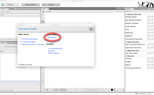
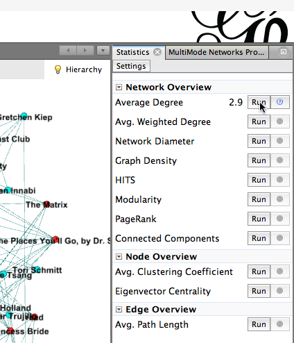
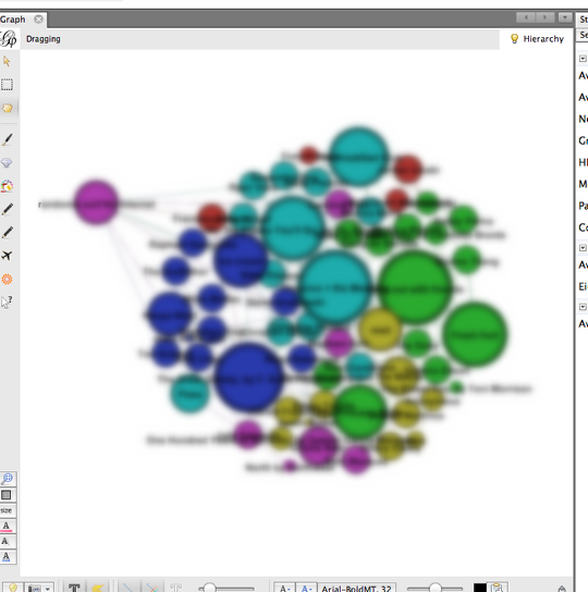
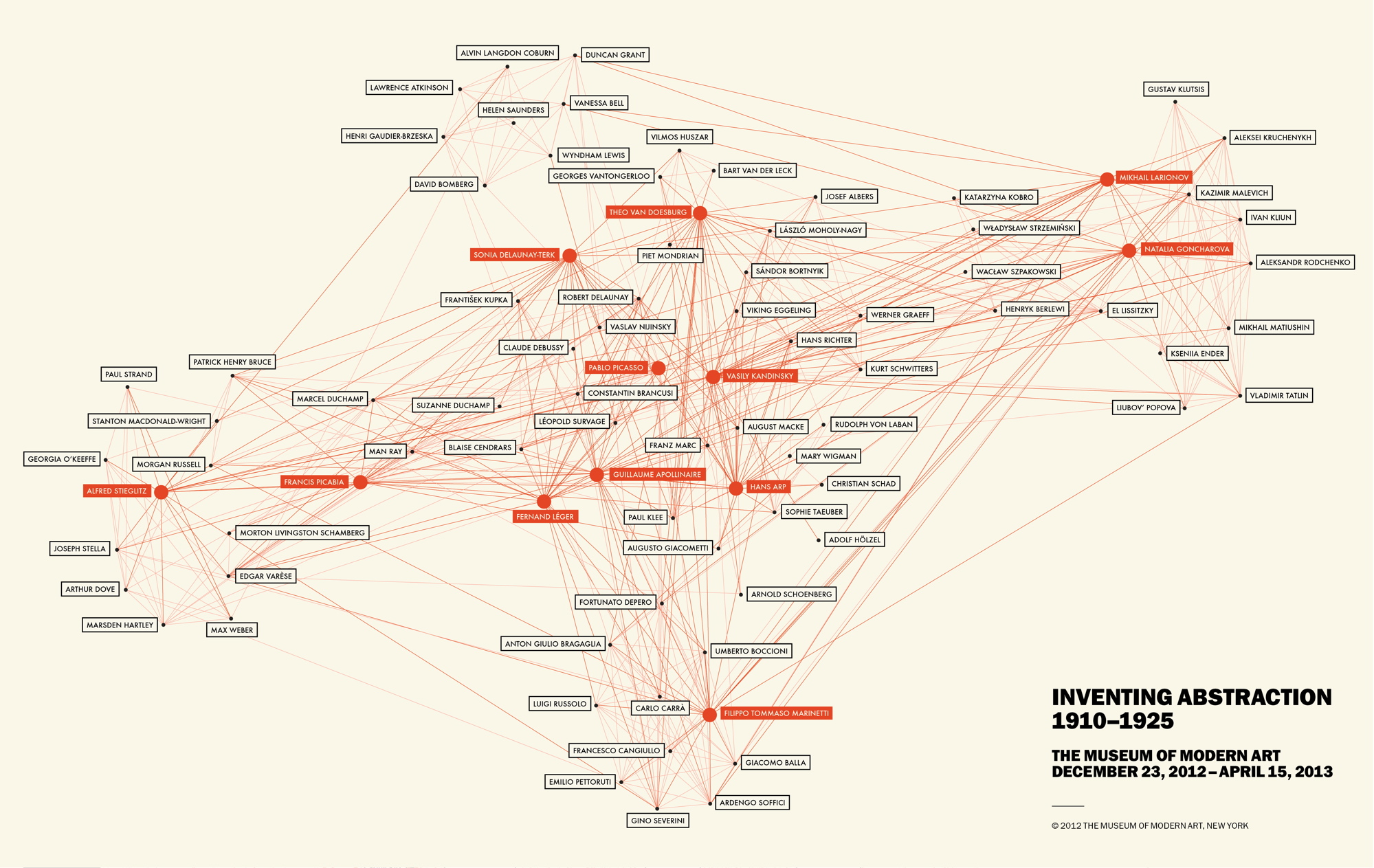
Both the Intro to Web Mapping and Anatomy of a Web Map were excellent tools in understanding the development of web maps over time. This evolution began with the incredibly simple static map, which was essentially a paper map that had been digitized, and is still very commonly used in research or visual representations. The first great evolutionary leap was to dynamic or distributed maps, which reflected changing data by loading and presenting a new, current data set each time. These dynamic maps are ideal for things which we need up-to-the-minute information on, although they are also applicable for use with data sets which change more slowly. The next step were animated maps, and “real-time” maps that are essentially dynamic maps automated and linked to sensors which provide the real time data. Finally along came Google Maps (interactive maps) with their ability to toggle layers on and off, link map features to external websites, etc., followed by the analytic map  which used these interactive features for more in depth analysis of the data. The final stage, collaborative maps, are connected with distributive maps in that they have multiple sources – in collaborative mapping, anyone can contribute. A good example of an interactive, potentially analytic map is the one linked about about the different types of archaeological sites in Texas.

However, I wonder why no one has made mention that the use of maps for analysis, and even interactive maps (though not in the digital sense), existed long before the web, when maps were only on paper. Detwiler only details this evolution within web or digital maps themselves, even though humanist scholars have been using maps for analysis for decades. In much the same way as the Texas map above allows you to click on a site and read about it, so paper maps had sites or buildings within sites marked in order to reference you to a discussion somewhere else in the text. For instance, archaeological site reports often have a map with locations or buildings labeled (toggle ON your label layer), which you can then reference in the text (not quite a pop-up explanation box, but the same concept). Also in trying to understand the development of the state, archaeologists often plotted things like trade routes of least energy consumption (‘shortest route’ option rather than the ‘lightest traffic’ option).

DH101 Preferences

Jane Eyre, by Charlotte Bront�
4
Jane Eyre, by Charlotte Bront�
Oh, the Places You’ll Go, by Dr. Seuss
12
Oh, the Places You’ll Go, by Dr. Seuss
One Hundred Years of Solitude, by Gabriel G�rcia M�rquez
4
One Hundred Years of Solitude, by Gabriel G�rcia M�rquez
The Bluest Eye, by Toni Morrison
2
The Bluest Eye, by Toni Morrison
The Great Gatsby, by F. Scott Fitzgerald
13
The Great Gatsby, by F. Scott Fitzgerald

1
Florence + the Machine
14
Florence + the Machine
Grizzly Bear
7
Grizzly Bear
Justin Bieber
1
Justin Bieber
Kanye West
8
Kanye West
The National
4
The National

Week 6: Networking with LinkedIn

Networking in this day and age is extremely important, and in some cases, it may be more important than the major listed on your degree, or your previous work experience. Through some of the most popular, modern day networking sites like Facebook and LinkedIn, users can establishes connections based on similar job experiences, interests, and professional relationships with coworkers. Upon searching through LinkedIn’s website, I discovered an article discussing the importance of networking in the connection sense, but also about networks in the visualization sense. Through LinkedIn’s new product titled, InMaps, users can envision their professional network through an intensive visualization.alisnetwork-1This interactive, visual representation of an individual’s network helps to understand the relationships one has with their connections. With this graphic, one is able to identify job opportunities, gather important insights, or leverage the visualization to seek helpful advice. The map is colored coded to help distinguish between different groups, companies and other affiliations. It also helps to separate out connections that are based from high school, college, or past job experiences.

What I thought was really unique about the visualization was seeing how one’s professional network was created over time. Unfortunately, upon attempting to create my own InMap, I discovered this tool was discontinued. However, the information and connections established on personal profiles can easily be copied over and put into another visualization application to create a similar graphic. Stat Silk is a site that creates a variety of interactive visualizations when sufficient data is input. One of the features from Stat Silk that I found particularly useful was the map function. This will be extremely useful for my group’s final project, which is based on geotagging Food Trucks in Los Angeles. It has interactive qualities which will be helpful in constructing a user-friendly site where consumers can click around a map of Los Angeles to see where specific food trucks are at the current time.

Although networks are important, they shouldn’t be applied to everything, according to Weingart’s article, Demystifying Networks. In a humanities sense, this complex interlocking system of relationships is uncertain, flexible, and not easily defined; however, they help assert a sense of organization. Through LinkedIn’s unique data visualization, InMap, professionals are capable of seeing how their connections establish a broad and diverse network over time, and help to organize them into different fields to make the research process more efficient.

Personality in Network Analysis

For me, I have a hard time pinning exactly what I like and who I am as an individual. My mind is easily distracted I know that, but I’ve never really figured out if I’m quite a visual or verbal learner, social or shy, indecisive or lazy, a multiple-choice test taker or better short answerer, a cancer or a leo…the list goes on and on..I guess one could call me a humanist. I’m filled with “fuzzy thoughts and feelings,” as Professor Posner likes to say. I would like to be able to describe and interpret all these characteristics at the same time, but really should stop and think about them individually.

The reason for my rant of my “struggle” through life is because of a quote from Scott Weingart’s article, Demystifying Networks. He states, “Humanistic data are almost by definition uncertain, open to interpretation, flexible, and not easily definable.” Aka the daily battle young adolescence and college kids go through.

However, when it comes to network analysis, it generally deals with one or a small amount of types of things. Scott uses the example of a book and a type of book is called a node. Computer scientists work with only one or a few types of nodes when creating network analysis softwares.

While reading this article I start to think about how I wish my life was more simple like a node. “Node types are concrete; your object either is or is not a book.” I like this interpretation because it would be so much easier to own and know unchanging characteristics. Humanists struggle with using this software because they want to put all of the data into one place.

Humanists usually care more about the differences than the regularities. This is helpful for a humanist because it shows how objects are unique rather than what makes it similar. However, that expansion of information they are likely to lose by defining their objects as nodes.This also reminded me of when I first got to UCLA I attacked the career center. They have personality tests there to help one figure out what type of personality you are to fit with what job. “Edges” are a way to make these connect relationships. A “dense” network is apparently rarely useful to use. ‘The ability to cut away just enough data to make the network manageable, but not enough to lose information, is as much an art as it is a science.” I really like this interpretation of bring the math and humanities together.


Creating a Network Graph with Gephi

Gephi is a powerful tool for network analysis, but it can be intimidating. It has a lot of tools for statistical analysis of network data — most of which you won’t be using at this stage of your work.

Open Gephi

wpid1422-media_1415764952532.png

Be sure you’re on the Windows side of your computer and that you’re opening Gephi version 8.2. (Gephi 8.2 for Mac doesn’t work; if you want to use Gephi at home and you have a Mac, be sure and download 8.1.)

Create a new project

wpid1423-media_1415764994676.png

Click on New Project on the “Welcome to Gephi” popup window.

Do not freak out.

wpid1424-media_1415765063318.png

The Gephi workspace looks really confusing and intimidating. Do not freak out.

Click on "Data Laboratory."

wpid1425-media_1415765120149.png

This is where you’ll upload your data.

In the Data Laboratory, click on "Import Spreadsheet."

wpid1426-media_1415765232521.png

Click on Import Spreadsheet in order to upload your data.

Import "DH101 6B Dataset 2 node list" as a Node table

wpid1434-media_1415825873076.png

1) Click on the button with the three dots on it to select a file and click on DH101 6B Dataset 2 node list.
2) Be sure you choose Nodes table from the box that allows you to choose between an edge table and a node table.
3) Finally, click Next to move on to the next screen and Finish on the window that follows.

Import "DH101 6B Dataset 2 edge list" as an Edges table

wpid1427-media_1415765443727_1.png

1) Click on the button with the three dots on it to select a file and click on DH101 6B Dataset 2.
2) Be sure you choose Edges table from the box that allows you to choose between an edge table and a node table.
3) Finally, click Next to move on to the next screen and then Finish on the following screen.

What is this, it’s confusing and I hate it.

wpid1435-media_1415826061496.png

This is where you can manipulate the data you’ve uploaded. If you click on the Nodes or Edges tab, you can toggle between spreadsheets. For the time being, however, we’re not going to change anything.

Click on "Overview."

wpid1428-media_1415766104116.png

OK, we can finally start visualizing. Click on Overview to go to the pane that will show your network graph.

Cool, I guess?

wpid1429-media_1415766174887.png

You now have a network diagram! You can’t really see much, though.

Manipulate your diagram so it’s more legible.

wpid1430-media_1415766404514.png

Use the scroll wheel to zoom in and out. 1) Use the hand icon to move the diagram around. 2) Turn labels on by clicking the T. 3) Adjust the size of the labels with the scrubber.

What are we looking at?

wpid1431-media_1415766589106.png

This is a bimodal network graph, meaning it contains two different kinds of things: students and preferences. Each student is connected to his or her preferences with an edge. It’s still a little hard to see anything, though.

Separate "students" from "preferences."

wpid1436-media_1415826267400.png

Let’s add some color so we can distinguish between students and their preferences. On the upper left-hand portion of the screen, you’ll see a box that has two tabs: Partition and Ranking. Be sure that the Partition tab is selected (1). Then, within the Partition tab, be sure that the Nodes tab is selected (2). Click the button with the two green arrows to refresh your selection (3). Then, from the dropdown menu, select node-type (4). Finally, click Apply (5).

Now you can distinguish students from their preferences.

wpid1437-media_1415826514714.png

Calculate average degree.

wpid1438-media_1415826612705.png

Let’s make the more popular nodes bigger, to indicate that more students have chosen them. To do that, we need to calculate the nodes’ Average Degree. To do this, head to the right side of your Gephi window, where you’ll find a Statistics page. Click the Run button that appears to the right of Average Degree. Then close the Degree report that pops up.

Size nodes according to their popularity.

wpid1439-media_1415826800548.png

Now let’s use the average degree, which we just calculated, to size the nodes. Head back to the left side of the Gephi window, and this time click on the Ranking tab (1). Within that tab, click on Nodes (2), and from the drop-down menu, click on Degree (3). Click on the tiny red diamond to rank nodes by size (4). Then hit Apply (5).

Now you can see who chose what, and how popular those choices were!

wpid1440-media_1415827018211.png

Calculate modularity.

wpid1432-media_1415766945927.png

Let’s see if we can identify clusters of students who have things in common. To do this, we’ll calculate modularity. On the Statistics pane (at the right of your screen), click on the Run button that appears next to Modularity. In the next popup window, click OK, then click OK in the next window.

Color your nodes by community.

wpid1433-media_1415767097847.png

Now that we’ve calculated modularity, we can color nodes according to their communities. To do that, go to the Partition pane (on the left side of the Gephi window) and click on the little Refresh icon (1). From the dropdown window, select Modularity Class. Finally, click

Now we have communities.

wpid1441-media_1415827116734.png

Now we can see which students’ preferences bind them together into communities. Students who have the most in common are colored the same color, along with their common preferences.

Save and share!

wpid1442-media_1415827196481.png

You can save your Gephi graph as a Gephi file, so you can open it up again later and edit it. You can also take a screenshot from the Overview panel (click on the tiny camera). You can also click on the Preview pane to see a somewhat nicer presentation of your network diagram, and you can change the look of it on the left-hand side of that pane. (Be sure to click Refresh after each change.) Once you’re happy, click on the SVG/PDF/PNG button to export it as an image file.

newsfeed, newsfeed, on the wall, what’s the relationship in them all

Locals vs. Tourists The Paul Revere article by Kieran Healy was really fun to read, the authors style was different from anyone else’s and he basically prided himself in not knowing anything about Paul Revere except what he was able to extract from the data.   The author also explains what relational matter is her methods of collecting data and that shows the links between people and Paul Revere. It was interesting seeing all the connections that linked back to him and I think Kieran Healy is saying that it’s data can help the understanding of history and vice versa but they will still need each other to have a genuine understanding of what you’re looking at.  A really cool article


http://www.fastcompany.com/3013208/these-amazing-twitter-metadata-visualizations-will-blow-your-mind#1


I found on metadata this week also has to do with traveling and messages being sent. Author Neal Ungerleider says, “metadata in twitter posts lets readers in on your geographic location, the language you speak, the phone you use, and more. They’re also a mapmaker’s best friend.” He was able to distinguish who was a local and who was a tourist and then map out who went where. As someone who lived in New York for five years, I never once went to the statue of liberty, and on the map one can see that it is a huge tourist hot spot. Its kind of weird how you really don’t have to have any pre-conceived notions to collect data. You can know nothing, like Healy claims and then discover a wealth of knowledge or at least facts that might help lead to some sort of conclusion. It’s a lot like science where you can have a hypothesis and then look for results (data) and then compare what you found out. The last paragraph of the Paul Revere article does mention the power of data could be used to control people and that data could become like a “weapon.” I feel like that is something we should definitely watch out and it’s kind of how ads try their best to find an extremely specific target market. With social network analysis come great responsibilities I guess you could say. If you can find connections and common themes such as the amount of people who visited with a single person (Paul Revere) then you can also find out things like Ungerleider did when he mapped out where different languages are spoken just based of Twitter. While some of it may seem obvious, like Chinese being heavily used in Chinatown, it can also illuminate things that where not being observed before which is why digital humanities is so cool. You get to look at the world in a new way which is what Healy is trying to show us.

Muddled Networks: The Humanistic Interpretation of Complex Uncertainties

facebook-usage-network-communication-privacy_50290c471aedd_w1500

Oh whats in a network? Our concept of networks are continually changing as new ways of connecting are developed. Scott Weingart describes network as “a complex interlocking system” filled with stuff and plenty of relationships( 2011).  But what can this tell us about human interactions and connections? Our world is filled with data, but most of this knowledge is open for interpretation; nothing be simply defined, and every translation is malleable.  The humanities have a much different approach to data then say a scientist. We firmly believe in the power of perception and the complexities that exist when attempting to display something as concrete.  There is always ambiguity and uncertainty in every systems, and with this varied nature many models will seem as though they are incomplete. Humanist follow the pattern of diversity and variation, rather than similarity and connections. I believe that connections can always be made, but discovering something special and unique is truly profound. But how can this information be constructed into a system which thrives off of narrow categories? I personally find this to be an issue when researching. Weingart discusses the importance of nods, which are concrete points, for example it is one thing or another, there is very little variation. I understand this concept, and the actual reality of a nod, such as in a communication network. There is a physicalness to nods; you can think of it more as a tangible display or transfer of stuff. I sit here and think about how I can translate this information into a real life display, and the first thing that comes to mind is the majestic Facebook.

Facebook has to be one of the largest social communication networks to date. Of course it is apart of a the larger Internet community, the fact of that one site has obtained over 1.3 billion users is not just astounding, its mind-boggling. Think of the assortment and diversity just within the user population. Facebook is a complex realm of real-time interactions, where agents from all over the globe can meet and interconnect. To understand Facebook, is to understand networks. The site is the system in which every nod is connected too. The people and profiles are concrete, and although their are an assortment users, each user has a separate homepage and account. This is a multimodal system that works by having people organize themselves into different categories or organizations. Although their still are uncertainties within the Facebook network, it shows how data can be separated and grouped together, through relationships and collaboration. Not every network will be as easy to differentiate and assort, even Facebook has its complexities. We all appropriate information in order to fit within individual limitations with data, but what is important to recognize is there is always more than what meets the eye!

Week 6: Demystifying Networks

1


When reading Scott Weingart’s article and about the many uses of networks, I immediately thought networks would be greatly used in art history. There are so many things to network together, whether it be by artwork, movement, medium, country, etc etc. There are many possibilities! But when I saw that the Museum of Modern Art (in New York City) had an exhibition called “Inventing Abstraction” and they created a great network of the collaborations between different artists, with special highlights for the great/popular artists, like Picasso.

While the map is very confusing and very difficult to actually follow the lines from one person to another, I doubt that is the point here, to properly educate on who collaborated with Picasso. While I am sure the information is 100% accurate, and if one tried you could see the relationships, I feel like this map was created to attract and to “wow.” We all knew Kandinsky collaborated with a plethora of people, it is really fascinating when seeing it in such a obvious and VISUAL way. These are the fathers and mothers of abstraction and this also shows it was a collaborative effort. It was not ONE person who invented the abstract movement, but people inspiring, talking, and creating with one another.

It is great to see who will be the pivotal artists of the exhibition, which are all boxed in bright, orange colors. This shows that these certain artists were pioneers and were grand in the art world. It also shows that they probably inspired the others. Visually, this map is very appealing (aside from the fact that the lines are very blurred together). The limitation of colors and the bolding create a simple aesthetic.

Ultimately this map, in an academic setting, would not be too successful. The artists written in black have very very tiny dots that don’t allow the view to separate the thin, thin lines. There are far too many lines and it is impossible to differentiate them, or follow them through one artist to another. Again, this seems like it was simply created to show the massive collaboration involved within the abstract movement. It would have been far more successful if there was a limitation of artists, but that again defeats the purpose of showcasing the collaboration. I really cannot think of a more effective way of displaying such information in a visual matter, but I think this does just fine (as long as there is a written data set of each relationship!)

The Power of Metadata!

Metadata, if used correctly, can gather together a wide array of information through connections and assumptions. By reading Kieran Healy’s article “Using Metadata to Find Paul Revere,” I realized how powerful metadata can be, even without specific data. I feel a sense of security seeing how our country’s government uses techniques similar to the ones in Healy’s article to protect the people from terrorist groups or potential terrorist attacks. I also recognize the alarming authority they potentially hold over the lives of the people by generating data on them through metadata assumptions. One of the articles that Healy provides in her own article (https://www.eff.org/deeplinks/2013/06/why-metadata-matters) highlights how much can be revealed through the metadata that the government collects from everyone’s phone calls. Although the assumptions made might be incorrect or based of off coincidence, the possibility and potential of this metadata is nonetheless unnerving.

I have noticed that other sites use a similar strategy of using users metadata to target them by advertisements, related news, etc. I always see links to articles or product advertisements on the side of Facebook that I am generally interested in, which might make some people react in a positive, “Wow, Facebook! You know me so well! You really shouldn’t have!” type of way, but I get a much more uncanny feeling instead. How does Facebook do this? What data are they analyzing? Are they only making these assumptions through metadata? What level of privacy do I have? ASking questions about privacy actually do not make much sense when users like myself are trusting people who have created an online social networking service with endless information about ourselves that could be sold for identity theft purposes, or even worse, given to the government. I found this article online, and although it is over a year old, it answers the question of how the government can gather information on citizens, but questions the privacy of Facebook as well: http://www.propublica.org/article/nsa-data-collection-faq. Facebook revealed private data, or rather metadata (the same kind of information shown in examples of “Why Metadata Matters” by Kurt Opshal–see link above), of many users. Answers concerning privacy aren’t necessarily given through articles or this type of research, but more or less initiates more questioning. My biggest question I’ve had doing this post is: Why Does the Internet Know Me Better than I Do?

Week 6: Digital Humanities Network

Stanford Analysis of Digital Humanities definition using MALLET and GEPHI

Scott Weingart’s article about Demystifying Networks was both informative and eye-opening. It does seem like some digital humanists have a tendency to try and analyze everything they come into contact with. Especially with the number of resources that we’re discovering on the internet, it becomes difficult to restrain oneself from putting too much into one tool or combining the wrong sets of data with the wrong type of tool. He talks about the differences of a multimodal network and the complications with fitting a bimodal dataset into software that is meant to analyze single mode networks.

What ties back to Drucker’s article from last week is the idea that “humanistic data are almost by definition uncertain, open to interpretation, flexible, and not easily definable.” Furthermore, Weingart explains that node types are concrete and it gets difficult when a digital humanist is trying to mold data into a shape it’s not meant to be in. And it’s definitely interesting to note that depending on the context that someone views the data, it can easily distort what that data means when being placed in the network.

I found a project online from Stanford that uses the MALLET topic modeling kit to analyze a small corpus of the Digital Humanities definition by members of the DH community. Of the data collected, they were defined by faculty, graduate students, and staff in academia. The author used Gephi as well to run two separate interpretations of the data end product by MALLET. It was interesting to look at someone else’s process of analyzing text found online. Even though he didn’t address the type of network and how that shaped his methodology, it made me more aware of its potential influence and how the data can be looked at and presented differently.