Week 8: Interfaces

Digital Humanities has greatly advanced the humanities fields, making it accessible to a larger range of people with visualizations such as mapping, graphs, and interactive mediums. It allows scholars to reach a new dimension, and does not restrict them to simple text fields. But sometimes, I feel, simplicity is best.

While Evan Bissell and Eric Loyer’s project “The Knotted Line” offers a great interactive timeline with paintings and informational links, to me, it was very confusing. At first I was not sure if it was chronological, but as I explored more I realized it was. The squiggly lines and the act of having to expose the paintings yourself was very difficult for me. At times the small informational red dots were hard to find and it made for a very confusing tool. Since it is set up in a timeline form, I think it would have been more efficient to at least display the years throughout, so the viewer can easily land on a certain year that they are interested in.


When telling history, especially if you are trying to reach an audience who is not familiar with the digital age very well, it can be easier to simplify. I personally think that digital humanities can make certain studies more accessible to the public with visualizations, but if the digitization is done in a simplistic way. “The Knotted Line” would be a tool that would have to be used by a group more advanced with digital tools.

Screen Shot 2014-11-23 at 1.42.40 PM


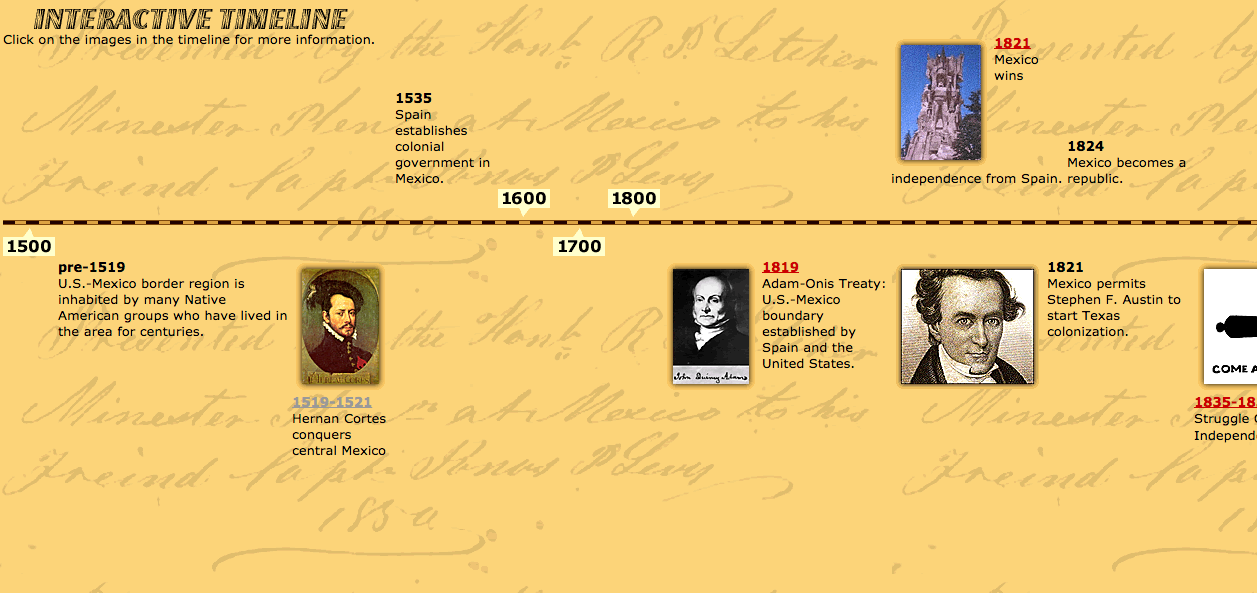
I found a website, http://www.pbs.org/kpbs/theborder/history/interactive-timeline.html, that timelines border history in a concrete and simplistic way. Each pinpoint is clickable and sends you to a different page where it informs you of that certain event. It is easy to use and provides information in an efficient way. The years are clearly displayed, there are photos attached, and one can easily scroll throughout the timeline.

Timelines are a great way of displaying information to an audience in an visualized way. With every type of digital tool, there is a certain audience in mind. Not every tool will resonate with everyone. While I think that The Knotted Line is a very cool tool, it can only be used by a certain, digitally savvy, audience.


Week 7: Intro to Web Mapping

Screen Shot 2014-11-17 at 10.24.43 AM

Jim Detwiler talked about all the different types of web mapping, and it was really interesting to think about mapping websites I’ve used and realize what type of mapping it was. Web mapping is used so much nowadays! You can find it anywhere, and we often use it a lot (Google Maps, anyone?). I thought a really cool website to talk about is Roadtrippers.com. It is a super interactive website where one can find different places to visit/lodge/eat around the United States. The different options and features available make this a super interactive web map. You can personalize which city you’d like to visit, and you can even look at different routes! The fact that one can choose a route makes this also an analytic web map. It gives you options to “scenic routes” and also has pre-made routes depending on what type of activities you enjoy. Not only is this website interactive and analytical, it is also collaborative. Each site can be reviewed by others who have visited therefore each location has a “heart” with a number out of 5. There are also “stories” that one can look through, which gives further suggestions on where to go (example: America’s Six Most Insane Oddest Natural Wonders).

Roadtrippers is an amazing tool that uses many different types of web mapping, making it super interactive, customizable, and collaborative for anyone to use. All these features do have a downside, although. I feel like the website has A LOT going on and it sometimes gets a big confusing and overwhelming. When you first go on the website, you don’t really know where to go first. It is necessary to just click around the website to know what feature you’d like to use. The “trips,” “collections,” and “stories” options are all similar and all work towards the same goal, so at times it may seem a bit repetitive. Nonetheless, the website has many amazing features. For example, when you want to find accommodations, you click on the blue bed icon and little blue dots appear on the map. You can narrow your search further by clicking on the different types: hostel, chain hotel, spa, cottage/cabin, etc.


You can also click multiple icons, let’s say accommodations (in blue) and attractions (in light blue) and they’ll both appear on the map so you can know which ones are near to each other so you can efficiently plan your trip.

Screen Shot 2014-11-17 at 10.22.45 AM


Overall, the website may be a BIT too much, but still very cool and helpful nonetheless.

Week 6: Demystifying Networks

1


When reading Scott Weingart’s article and about the many uses of networks, I immediately thought networks would be greatly used in art history. There are so many things to network together, whether it be by artwork, movement, medium, country, etc etc. There are many possibilities! But when I saw that the Museum of Modern Art (in New York City) had an exhibition called “Inventing Abstraction” and they created a great network of the collaborations between different artists, with special highlights for the great/popular artists, like Picasso.

While the map is very confusing and very difficult to actually follow the lines from one person to another, I doubt that is the point here, to properly educate on who collaborated with Picasso. While I am sure the information is 100% accurate, and if one tried you could see the relationships, I feel like this map was created to attract and to “wow.” We all knew Kandinsky collaborated with a plethora of people, it is really fascinating when seeing it in such a obvious and VISUAL way. These are the fathers and mothers of abstraction and this also shows it was a collaborative effort. It was not ONE person who invented the abstract movement, but people inspiring, talking, and creating with one another.

It is great to see who will be the pivotal artists of the exhibition, which are all boxed in bright, orange colors. This shows that these certain artists were pioneers and were grand in the art world. It also shows that they probably inspired the others. Visually, this map is very appealing (aside from the fact that the lines are very blurred together). The limitation of colors and the bolding create a simple aesthetic.

Ultimately this map, in an academic setting, would not be too successful. The artists written in black have very very tiny dots that don’t allow the view to separate the thin, thin lines. There are far too many lines and it is impossible to differentiate them, or follow them through one artist to another. Again, this seems like it was simply created to show the massive collaboration involved within the abstract movement. It would have been far more successful if there was a limitation of artists, but that again defeats the purpose of showcasing the collaboration. I really cannot think of a more effective way of displaying such information in a visual matter, but I think this does just fine (as long as there is a written data set of each relationship!)

Week 5 / The Real Faces of White Australia

When one imagines the people of Australia, white faces are prominent. But the website, The Real Faces of White Australia, one can see that that is not the case. The world has been so mixed throughout the decades, it is ignorant to think that one country only has one type of face. The diversity of each country is important to note, and sometimes there are unexpected realities to the races of different countries.

For example, Brazil has the largest population of Japanese people outside of Japan. If you lack education in Brazilian or Japanese history, then you would not expect this. The diaspora of so many different races happen all around the world. It is known that the United States has the greatest diversity among its citizens: Europeans, Latin Americans, Africans, Asians. There is a large number of different ethnicities. But when one thinks of Mexico or Korea, there is no huge mix of cultures.

Why do we tend to broaden certain countries? The indigenous Australians were descendants of Africans and Asian migrants. They were not of European descent and it was not until the British settled in the land that Australia’s major ethnicity became “white.”

This reading can also relate to the article shown in class, “The Changing Face of America” in National Geographic(http://ngm.nationalgeographic.com/2013/10/changing-faces/schoeller-photography). Since the Japanese are now heavily mixing with the Brazilians (who themselves are mixed, as well) there are new traditions and cultures blooming. In the United States there are so many mixed cultures that start their own traditions and it is shown with the National Geographic article. We see Asians mixed with Latinos or African-Americans with European ethnicity. So much mixing is happening in the world that soon there will be no dominant ethnicity.

What happens when countries start to mix and there is no standard race? This is unlikely going to happen in recent years, as certain countries are keen on keeping pureness alive, but maybe in a few centuries it will happen. And Japanese-Brazilians are a sure sign of it. It is a beautiful thing to see two contrasting cultures come together. Just as the United States is a country made of immigrants, perhaps the rest of the world will be the same.

Week 3: Netflix

“How Netflix Reverse Engineered Hollywood” by Alexis C. Madrigal really focused on how Netflix came up with such a large number of genres that the users could pick from. As an avid Netflix user, I have myself witnessed movie suggestions: after watching The Walking Dead I was suggested other zombie-like movies right after. And I have experienced this with numerous websites/apps!

I’m also an avid Instagram user and have been using it for the past 2+ years. Recently I have noticed that right after I click the “follow” button when I come upon a new user I like, a little drop-down section falls right under it with 3 “suggested users.” I found this extremely strange as I wonder what is the criteria that makes these users of a potential interest to me. If I follow a friend from high school, let’s say, maybe I recognize a friend of that user will pop up in the “suggested user” space. This makes sense to me as maybe they’ve tagged each other in pictures. This friend make have only had 100 followers or maybe followed themselves 100 people. The pool is much smaller to choose those suggested users from.

But sometimes I follow users that have 80,000+ followers (maybe because they post pleasant nature pictures!) and maybe they follow themselves 500 people. The pool to choose the suggested users is greater. Where do these 3 users come from?

One possibility I can think of is similar hashtags. Maybe the suggested users use many of the same hashtags? But this seems unlikely because if one person inputs #nature, there are probably thousands of entries for that hashtag. Another possibility is the similarity in users. If there are multiple people who are into nature pictures, they will follow many users that post about nature. But without hashtags how does instagram know what the content of the picture is? Maybe if they post a relevant caption or use the geotag. It gets messy really soon. It is incredibly difficult for me to decipher it, but like Netflix, Instagram must have a algorithm to everything.

Another feature instagram has is “explore.” I have gone to this feature multiple times and each time is something different. Perhaps the first time it was full of nature pictures but the second time it was full of make-up pictures. It is obviously trying to cater to my interest – but how does it know my interests? I soon realized it depends on recently viewed photos.

Maybe someday someone will try to figure out Instagram’s algorithm, although I am sure it is not as crazy as Netflix’s!

For reference:

http://www.instagram.com

http://www.technobuffalo.com/2014/07/11/instagram-suggested-user-feature-quietly-rolls-out/

Week 2: Haiti

Upon reading Julia Gaffield’s “Haiti’s Declaration of Independence: Digging for Los Documents in the Archives of the Atlantic World,” the Maya Codex came to mind. The Haitian’s declaration of independence’s unknown whereabouts, and Gaffield’s attempt to further uncover it, was a great in-debt research through many different sources. Haiti’s history would not be fully accountable if it were not for the different travellers from different areas documenting it in their own accounts (even if there was some sort of bias). The Mayan culture is widely known for their unique language and creation of the Mayan codices. There are only four known surviving Mayan Codex manuscript, and it is incredibly difficult to decipher. Scholars studied the codex for years: comparing it to other languages, attributing some of the images as representations of animals, and finally coming up with a translation that may or may not be perfect.

The Maya lived in parts of Mexico and Central America, until the Spanish conquered them. The Spanish destroyed majority of the Maya writing, only leaving the four, as mentioned above. It is interesting because many of the documentation we have of the Maya is through Spanish accounts, just like Haitian history was documentation was found in Britain, Denmark and the United States, among other places. The four remaining Mayan Codex are in Paris, Madrid, Dresden, and New York. History is never accounted by one point-of-view. History is collected through different people, cultures, and biases.

While the Haitian declaration of independence was thankfully found through hours and hours of research, the Mayan culture is not so lucky. Despite popular belief, the Mayan culture still exists in many regions of Mexico/Central America. Even though we cannot bring back all those burned Mayan manuscripts, the living Maya are trying to continue the language. There are classes that teach the codex and are trying to keep in alive. There has to be an effort from scholars and the living Maya to keep the language alive. The surviving manuscript should not only be seen as an artifact of a supposedly dead culture, but it should be studied and seen by the remaining Maya.

To conclude, Haitian history would be harder to track down if it were not for the account of foreign travelers. The declaration of independence would not have been found if it were not for the consistent effort of a scholar to uncover it. Foreign travelers document the Maya culture, as well. There has to be communication between different countries in order to know more about the Maya and Haiti history, because it seems that their history has spread out to the rest of the world.

You can view examples of the Mayan Codex on ARTstor: http://library.artstor.org/library/welcome.html#3%7Csearch%7C6%7CAll20Collections3A20maya20codex%7CFiltered20Search%7C%7C%7Ctype3D3626kw3Dmaya20codex26geoIds3D26clsIds3D26collTypes3D26id3Dall26bDate3D26eDate3D26dExact3D26prGeoId3D26origKW3D

Screen Shot 2014-10-13 at 10.58.05 AM


Madrid Codex