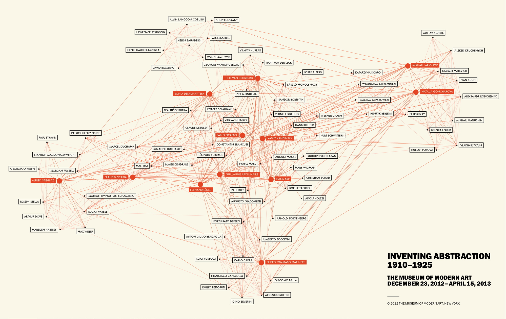
When reading Scott Weingart’s article and about the many uses of networks, I immediately thought networks would be greatly used in art history. There are so many things to network together, whether it be by artwork, movement, medium, country, etc etc. There are many possibilities! But when I saw that the Museum of Modern Art (in New York City) had an exhibition called “Inventing Abstraction” and they created a great network of the collaborations between different artists, with special highlights for the great/popular artists, like Picasso.
While the map is very confusing and very difficult to actually follow the lines from one person to another, I doubt that is the point here, to properly educate on who collaborated with Picasso. While I am sure the information is 100% accurate, and if one tried you could see the relationships, I feel like this map was created to attract and to “wow.” We all knew Kandinsky collaborated with a plethora of people, it is really fascinating when seeing it in such a obvious and VISUAL way. These are the fathers and mothers of abstraction and this also shows it was a collaborative effort. It was not ONE person who invented the abstract movement, but people inspiring, talking, and creating with one another.
It is great to see who will be the pivotal artists of the exhibition, which are all boxed in bright, orange colors. This shows that these certain artists were pioneers and were grand in the art world. It also shows that they probably inspired the others. Visually, this map is very appealing (aside from the fact that the lines are very blurred together). The limitation of colors and the bolding create a simple aesthetic.
Ultimately this map, in an academic setting, would not be too successful. The artists written in black have very very tiny dots that don’t allow the view to separate the thin, thin lines. There are far too many lines and it is impossible to differentiate them, or follow them through one artist to another. Again, this seems like it was simply created to show the massive collaboration involved within the abstract movement. It would have been far more successful if there was a limitation of artists, but that again defeats the purpose of showcasing the collaboration. I really cannot think of a more effective way of displaying such information in a visual matter, but I think this does just fine (as long as there is a written data set of each relationship!)