Week 5: Infographics and Data Visualizations

“Infographics of infographics of infographics…”

As with many other new digital humanities minors, I found that I had struggled in the beginning to give a precise definition about what the subject entails to other students. Yet in Smith’s blog post, it seems like there is one general consensus about the greatest potential in the field, which is the analysis of text. Furthermore, I realized that often times I had also used this as an example of using digital tools to investigate and present data in a different way for clarity and research purposes.

Because this is a relatively new field of academic scholarship, there is bound to be projects based on utilizing these digital tools for the sake of analyzing evidential texts to prove the obvious. I believe that some critics are too harsh and should give room for the field to grow and time to flesh out creative ways to approach, mine, and present data. As a proponent for a more humanities approach to graphical display, Johanna Drucker raises awareness about approaching data differently as a capta, which is “taken” rather than “given.” Thus, the former allows for a more interpretive aspect to making visualizations whereas data that is given is recorded and observed in a more fixated manner.

In the article, the differences between figures 16 and 17 are not only found in the purposes of those charts, but also in the level of complexity and what they’re set out to measure. Drucker illustrates that there is a lot more information visualization can display as soon as one uses a more humanistic approach to analyzing the capta. It is important to address multiple questions when attacking an issue and analyze the data through all sorts of dimensions such as time and space as well as other categories such as gender and age.

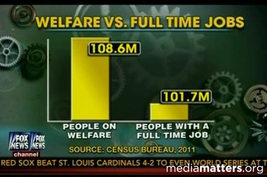
These articles reminded me of another popular type of visualization, called infographics, which are making its rounds in social media and deployed as a marketing tool. In this blog post, Vincey adamantly criticizes the confusion that the public seems to have with using infographics interchangeably as data visualization. The blog makes some interesting points, especially about the fact that some infographics try to pile too much information that emphasizes qualitative data over quantitative data that its message gets lost in the chaos. Although I do agree with some of his opinions, the bottom half of the post seems to be arguing for more simplicity and clarity when compiling data. This alludes to the idea that there is a fuzzy boundary between what is too much, too little, or just the right amount of qualitative information one can display on a data visualization.

Works Cited: http://insights.qunb.com/why-we-hate-infographics-and-why-you-should/

http://pastspeaks.com/2011/08/21/the-promise-of-digital-humanities/

http://digitalhumanities.org/dhq/vol/5/1/000091/000091.html

The National Sex Offenders Registry Database

Primary Source: familywatchdog.us/default.asp

Reading through the Criminal Intent and Old Bailey projects got me interested in the documentation of crime. The nature of the crime, verdict in the trial, or even the behavior of the criminal does not matter, anyone who committed a crime between 1674 and 1913 who was tried at the Old Bailey Courthouse is included in the database. Take the case of Thomas Poddy, who in 1710 was tried for “intent to sodomize” another man. Although the evidence against Poddy was not strong enough for conviction, he is included in the database. However, this cannot really harm Poddy’s life, as he dies many years ago and the availability of this information cannot affect his life in a negative way.

This got me thinking about modern criminal registries. Not only do we have newspaper police logs which are usually available online, we have nationwide criminal registries. In comparison to the Old Bailey, many of these do not include details of the crime committed, which can lead to misconceptions about the criminals one may read about online. I searched for the National Sex Offender registry and was directed to familywatchdog.us/default.asp, a “free service to help you locate sex offenders in your neighborhood”. I plugged in UCLA’s zipcode, 90024. There are two ways you can view the results, on a map which shows the addresses of sex offenders and other types of criminals with boxes which are color coded to indicate the type of crime committed. There are also white boxes, indicating schools and playgrounds, and if you click these you can see offenders who live within 1000 feet of this location and offenders within half a mile. You can also view the results as a list, which gives the name and current address of the offender, with those who are closest to your designated location at the top. There are 8 offenders and 16 non-mappable offenders, which means there is no full address available for the offender, or the map does not recognize the address. Clicking on the list I noticed there are 2 offenders living in 90024, and one who actually has “UCLA” included in his address. H0wever, the type of crime or date of crime is not available for these offenders, anyone who committed a sex crime after 1997 is included in the database, which can lead to unnecessary panic if you see that a sex offender is registered in your area.

In comparison, I searched for my home zip code, 03458, corresponding to my home town in New Hampshire. There are six sex offenders in my neighborhood, and one of them is actually my neighbor! Although of course there are more sex offenders living in Los Angeles, they are simply random names in a sea of thousands of apartment buildings and houses.  Seeing the names of people you know in the sex offender registry is extremely frightening. Although my neighbor’s crime could have occurred long ago and might well not have anything to do with pedophelia or violent assault, it does make me slightly apprehensive about this man. Although I should let his personality speak for itself, seeing him on a sex offender registry changes my opinion about him, and I probably won’t be so keen if my parents want to invite him over for dinner this Thanksgiving.

Week 5 / The Real Faces of White Australia

When one imagines the people of Australia, white faces are prominent. But the website, The Real Faces of White Australia, one can see that that is not the case. The world has been so mixed throughout the decades, it is ignorant to think that one country only has one type of face. The diversity of each country is important to note, and sometimes there are unexpected realities to the races of different countries.

For example, Brazil has the largest population of Japanese people outside of Japan. If you lack education in Brazilian or Japanese history, then you would not expect this. The diaspora of so many different races happen all around the world. It is known that the United States has the greatest diversity among its citizens: Europeans, Latin Americans, Africans, Asians. There is a large number of different ethnicities. But when one thinks of Mexico or Korea, there is no huge mix of cultures.

Why do we tend to broaden certain countries? The indigenous Australians were descendants of Africans and Asian migrants. They were not of European descent and it was not until the British settled in the land that Australia’s major ethnicity became “white.”

This reading can also relate to the article shown in class, “The Changing Face of America” in National Geographic(http://ngm.nationalgeographic.com/2013/10/changing-faces/schoeller-photography). Since the Japanese are now heavily mixing with the Brazilians (who themselves are mixed, as well) there are new traditions and cultures blooming. In the United States there are so many mixed cultures that start their own traditions and it is shown with the National Geographic article. We see Asians mixed with Latinos or African-Americans with European ethnicity. So much mixing is happening in the world that soon there will be no dominant ethnicity.

What happens when countries start to mix and there is no standard race? This is unlikely going to happen in recent years, as certain countries are keen on keeping pureness alive, but maybe in a few centuries it will happen. And Japanese-Brazilians are a sure sign of it. It is a beautiful thing to see two contrasting cultures come together. Just as the United States is a country made of immigrants, perhaps the rest of the world will be the same.

Week 5 People Projects

The Invisible Australians website caught my attention because of the way it is presented and the data that is presented on it. The invisible people of Australia or the colored people of Australia in the early 1900s living through the White Australia Policy were discriminated against and forgotten about. The message of this website is to document these people who were denied their place as Australians.

The about page mentions that it is all about the people, hence the opening page portrays the faces of the invisible Australian people. When you click on the faces the document of a certificate documenting their ‘temporary’ exit from the Commonwealth of Australia.

After reading the about page and searching the home page the message becomes more clear that the point of this browser is to acknowledge the existence of the people who once were not acknowledged as Australians because of the color of their skin.  One of the researchers that created this database, Tim Sherratt mentioned that it was important that he did not “re-imprison” these people as non-white non-Australians.

This database reminded me of a portrait project known as The Memory Project (http://www.memoryproject.org/index.php). The Memory Project’s mission is to provide the youth from around the world who have been “neglected, orphaned, or disadvantaged” with portraits created by art students. They send photographs of children to art teachers around the world and then art students create a portrait of these children, which are then delivered to these children. The website shows some examples of the portraits, which reminded me of the Invisible Australian website’s emphasis of the people and the faces.

Both the Invisible Australian website and The Memory Project focus on documenting the people and acknowledging their existence. Videos on the memory project website show children from underprivileged areas thanking the art students for the portraits saying that it is nice to know that “there are more people in this world who love us.” These projects allow us to remember history and the importance that any human can have on history. The Invisible Australian project analyzes humanity in the 1900s but also allows for people to reflect on humanity today and the importance of people all over the world.

Ambiguity within Data Visualizations

Johanna Drucker wrote an amazing article on interpretations of graphical representations, which honestly enlightened my perception of knowledge and experience in the fields of social science. It made me reconsider what my first interpretations of these expressions, and furthered my intuitions, by asking questions like “what is” or could something actually be as one simple “real”. Things like database visualizations can easily create a space where you no longer feel the need to critic or analysis, but rather enjoy and experience. When reading or processing data, you examine more clearly, personally I think because of the depth it takes to analyze words into individual local knowledge and vocabulary found in your brain. But with these data visualizations it is so easy to persuade the audience. With a couple neat colors and transitions, the audience can experience a visual presentation with little thought involved. For example, college campuses like UCLA use a pie chart to breakdown their budget and spending, but these categories exist because of the ambiguity in their titles. How do truly know what is spent where? imgresHere we are as students spending $12,000 individually on tuition alone to attend this school, I mean multiple that to the number of students attending, and or attended in the past 95 years; where has that money gone? There is so much ambiguity that exists and truly allow ourselves to suspend our beliefs. But I mean in the world we live in, it could be seen as something almost necessary. Did you know that our minds process around 36GB a day? (Prezi Fact) We need some sort of break anytime we can get. It is much easier to grasp a concept with a visual, then to break down and process words. Although I do not appreciate feeling as though every time I look at data visualizations I might be getting punked. Naturally I am a very trusting, but seeing how easily things can be twist and manipulated to create a story and stir up emotions, make me want to look on everynewscast and see what, and how they are attempting to portray the world to their users.imgres-2

This article makes me what to ask more questions, is the information I am given enough, and what are they tryign to make me think? The author uses the saying “claims of certainty” with this visual “facts”, when really all we have is perception. We make attempts to display knowledge on an obtainable level, but even basic concepts are interpreted expressions. Whether it is something as simple as language, for example the understandings between Lou and Restroom, or the thought of gender as binary category.

Week 5: An Application of “Humanities Approaches to Graphical Display”

The theme of this week’s readings seemed to be responsibly representing humanities-related information visually. In the article “Humanities Approaches to Graphical Display,” Johanna Drucker expresses concern that the way people are approaching graphical displays of information lends them too much authority, especially when the graph’s subject is not easily quantifiable, a common problem in humanistic work. When confronted with data visualization, people often forget that what they are viewing is an interpretation of phenomena rather than a duplication of the phenomena. She introduces the idea of differentiating between “data” and “capta,” capta being the constructivist equivalent of data used in humanistic inquiry.20130810_GDC178_1190_1

Drucker’s article about the limitations of data visualization led me (naturally) to start thinking about controversial data visualization. Instead, I found a chart about controversial topics in different languages, and although it was not exactly what I set out to find, I found it interesting, especially when I tried to think about it in the context of some of Drucker’s arguments.

At the end of her article, for example, Drucker begins discussing a map that displays the frequency of cholera outbreaks and their geographical location. However, the visualization as it has been composed does not take into consideration an individual’s “profile, age, size, health, economic potential, family, and social roles.” Likewise, The Economist’s chart only displays what articles on Wikipedia have received the most “reverts,” and although it is not difficult to guess why, in some cases, an article was so frequently edited, the article itself does not reveal the reason the content of an article would be contested, making it challenging to interpret international results.

Additionally, it seems important to Drucker that assumptions about data not be made too readily. Therefore, it is important that the results not be interpreted too broadly. It would be misleading to assume that the graph represented the most controversial topics in a given country, because people who edit articles on Wikipedia is a bit of a niche, and therefore the articles they give the most attention to do not necessarily represent the priorities of the general population. The average English-speaker, for example, probably does not have any opinion on WWE personnel, but the people who do might be argumentative and active enough online that the frequency of changes made to that Wikipedia page register among the five most contested topics.

“Humanities Approaches to Graphical Display,” along with the other articles we read the last two weeks, provided helpful information about approaching data visualization. While most charts and graphs, like this one, are not misleading, intentionally or accidently, the people responsible for data visualization set parameters deliberately, so it is important to try to understand their reasoning when determining the validity of the finished product.

Week 5 – Bridging the Gap

Whenever I tell anyone I am a Digital Humanities minor, they always ask me what that is and what can I do with it.  Since it is a small and new minor, a lot of people have never even heard of it before. I am usually able to give them my own brief interpretation of the still vague concept of digital humanities, but sometimes struggle with how it will help me later on in life. The article, “The Promise of Digital Humanities” by Adam Smith gave a great example of how using data mining, a tool that falls under the category of digital humanities, can be beneficial and enhance our understanding of historical data. In the article, Smith states “Proponents of data mining herald the approach for its alleged potential to close the gap between the ‘two cultures’ of the humanities and the hard sciences by allowing us to subject historical texts to quantitative analysis”.  Data mining is a practical, tangible thing that can be used in the future to make better use of the information we have.  It can take our current understanding to a whole new level by offering a further analysis of data.


Smith’s statement reminded me of phrases I’ve read regarding my major, Human Biology and Society, here at UCLA. For example, the about page for Human Biology and Society says, “[it] bridges the cultural divide between life sciences and human sciences effectively as it uses interdisciplinary teams of scientists to address essential research questions”. I had never really made such a connection between my major and minor before, but now it is apparent that there is a lot of overlap between the two and they are both based around the idea of bringing in different areas of study and technology to enhance our understanding of data and research. I really am drawn to the idea of intersections in education because I think it is important to be intellectually well rounded. The “society” part of my major can help me apply the science facts that I learn to real life and the “digital” portion of my education will help me further convey this information and make it accessible and easy to understand.   I am also very indecisive and am unsure of what I want to do with myself so having broad, intersectional majors appeals to me. My major and minor do not clearly fit under the traditional categories of north campus or south campus, life sciences or humanities or social sciences. I think in the future, there will be more degree programs like these that serve as a bridge between various areas of study because the world is also becoming less and less traditional.


UCLA Institute for Society and Genetics

Week 5 Blog Post

We are currently focusing a lot on information visualizations: extremely useful, modern tools that are intended to present a large amount of data to the reader quickly and in a meaningful way. Data mining is a process that examines large databases in order to find and later present new information. It seeks to close the gap between the hard sciences and humanities—an impressive task, taken on by the authors of Data Mining with Criminal Intent. As visualizations become a more common way of presenting information—tools that are both slick and efficient—we must consider some of their drawbacks. Data visualizations can be presented in countless forms: ranging from interactive maps, to correlation based lined graphs, to artistic “pie charts”. Because of the nature of these visualizations—glossy tools that are meant to present a large amount of data, in order to show a point or persuade—they can easily be presented with mistakes or in a misleading way. Like the examples we saw in class, visualizations can be altered by truncating an axis, omitting data, assigning causation with correlation, and simply not following convention. Not only do we take these visualizations for granted, but we also are less likely to catch mistakes or misinformation because of how they are presented to us—in a quick news clip, or while we are scrolling through a website. Modern society processes information processes information in soundbites and milliseconds, so for the designers of visualizations it is relatively easy to impact opinions and subsequent behavior.

In class we noticed how visualizations make a presenter seem more credible—with the extra props, we are just naturally inclined to believe them! As University of Miami Communications Professor Alberto Cairo notes in his article Lying with Infographics and Visualization, this is interestingly in contrast to the way we process static sources of information: “our eyes are trained to process the visual environment as evidence, and to process the products of language as arguments”. The professor argues, “as long as we do this, there will be those who will continue to tell these visual-lies, convincing us, and often themselves, that evidence will make itself evident and that subjective culture and political biases won’t creep in”. When presenting information through visualizations, there will always be human bias and potential for error—meaning we need to approach them with new, and unnatural scrutiny. Established statistician and author Howard Wainer noted in one of his works: “when we see a chart or diagram, we generally interpret its appearance as a sincere desire to inform. In the face of this sincerity, the misuse of graphical material is a perversion of communication, equivalent to putting up a detour sign that leads to an abyss”.

Although these visualizations are relatively newer ways of presenting information, it is important we recognize how they can be manipulated and consequently approach them with scrutiny. Because even though visualizations are relatively new and are quickly presented and absorbed, they can form lasting opinions and bias. For example, check out this satirical video that presents the Mercator map bias.


Week 5- Graphic Displays of Gothic France

Reading Johanna Drucker’s “Humanities Approaches to Graphical Display,” made me appreciate the highly nuanced application of information visualization in the humanities.  This article serves as a “call to action,” in a way, asking the reader to reconsider the ideological ramifications of un-modified graphical display in humanities research.  Drucker explains throughout how “data” can be altered, from the traditional method of statistical presentation, so that it responsibly represents the humanities scholarship behind it.  One of conceptual shifts brought up is the notion that all data must be “reconceived” as capta (2).  Drucker goes on to explain that “capta is ‘taken’ actively while data is assumed to be a ‘given’ able to be recorded and observed” (2).  The two verbs “taken” and “given” bring up notions of how the information perceived.  For me, it brought up the notion of is this information a product of reading “in-between the lines” (taken) or simply reading the “lines” (given). The difference between the two terms broadens when considering the purpose of “humanistic inquiry,” which Drucker explains to be deeply rooted in the “(acknowledgment of)  the situated, partial, and constitutive character of knowledge production” (2).  In thinking of humanities “data” as something which is a product of careful “construction,” it raises the stakes of how to construct and present this data.  While graphics seem to err on a side of design simplicity, simplicity is a main culprit in giving out a reductive or misleading message.

I was intrigued by the example presented in the Figure 2 bar chart and this got me thinking about how data visualizations are used to guide the viewer through information.  This particular bar chart is highly unconventional because its points spill out of the bars in a gradient-like fashion. This display is used to convey a departure from the binary in graph and thus allows for a depiction of flow, cultural difference, and personal interpretation of the question asked.  As Drucker explains that this allows the information to “(shift) from self-evident ‘fact’ to constructed interpretation motivated by a human agenda” (6).

The element of human interpretation is perhaps what guides the individual through information visualization.  This made me think of the project, Mapping Gothic France.  Based out of Columbia and Vasser, the project is a multimedia database which seeks to guide the user through 12th and 13th century France, particularly its ecclesiastical architecture, through space, time, and narrative.  Although data visualization, through form of charts and interactive maps, is only part of the project, what captured my attention the most when re-examining the site was thinking of each “pathway” (space, time and narrative) as a greater information visualization with bias. For example, most of the energy put into the site is focused on the interoperation of space, rather than time and narrative.  This perhaps alines the function of the site with its title, “Mapping Gothic France,” as it is much easier to access the presentation of spatial information on the site than any other kind of information.  The definition of scope is perhaps also a key to success when presenting humanities data.

Reading this article left me with even more questions about how data visualizations are made, used, and read.  As my post is running over in length, I am curious to know what other people think of the graphical displays on Mapping Gothic France through the lens of Drucker’s article!

Graphical Display of Text Messages

While reading Drucker’s article “Humanities Approaches to Graphical Display,” I tried to think of various ways how certain data, although always sharing direct meaning, can be misinterpreted by slight changes in the appearance and presentation of the data. I was reminded how earlier this quarter in a class I am taking, the professor broke down the purpose of text messages by stating that they simply are tiny units of data sent from person to person via mobile data collector. From first-hand experience, I can also testify that these tiny units of data are constantly being misinterpreted by slight changes of appearance. I think we can all agree that the following two messages, although spoken exactly the same, elicit different interpretations and responses because of their presentation:

IMG_5681 IMG_5682

Both words mean exactly the same thing: OK. And they are also displaying the same data/message from recipient to sender: Whatever was previously said by the recipient of the message is okay with the sender. But there are slight obvious differences that completely change the expected interpretation and response. First of all, the first text “Ok” requires much less effort to type out than the second. Secondly, the second message includes a smiley face, which expresses positive emotions from the sender to the recipient without any extra words. Because the first message is just “Ok,” it is less likely for the recipient to respond to it because there is less to respond to. The message with the smiley face, although no more words are used, is more likely to receive a response, maybe even a smiley face from the recipient. Stated in the article, all data must be seen as capta. Taking a look at these text messages as capta rather than data explores the source of each message. The message with the smiley face not only captures the response, but also the emotion from the sender, which in turn provides more information to be presented and observed.

This example relates to the way data visualization graphs, timelines, etc. can be misinterpreted because of the presentation. There can be a lot lost in translation if data is merely an “expression of the subjective” rather than a “subjective expression of perceived phenomena,” which were both differentiated descriptions mentioned in the Ducker article. Visualizations really must be specific with what they are presenting, not only to present the correct data, but also so that viewers can understand exactly what this data means. The interpretation of the data by collectors must be allowed to be interpreted exactly the same way by the viewers of the collection.