The theme of this week’s readings seemed to be responsibly representing humanities-related information visually. In the article “Humanities Approaches to Graphical Display,” Johanna Drucker expresses concern that the way people are approaching graphical displays of information lends them too much authority, especially when the graph’s subject is not easily quantifiable, a common problem in humanistic work. When confronted with data visualization, people often forget that what they are viewing is an interpretation of phenomena rather than a duplication of the phenomena. She introduces the idea of differentiating between “data” and “capta,” capta being the constructivist equivalent of data used in humanistic inquiry.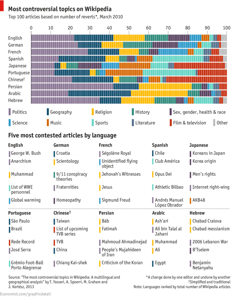
Drucker’s article about the limitations of data visualization led me (naturally) to start thinking about controversial data visualization. Instead, I found a chart about controversial topics in different languages, and although it was not exactly what I set out to find, I found it interesting, especially when I tried to think about it in the context of some of Drucker’s arguments.
At the end of her article, for example, Drucker begins discussing a map that displays the frequency of cholera outbreaks and their geographical location. However, the visualization as it has been composed does not take into consideration an individual’s “profile, age, size, health, economic potential, family, and social roles.” Likewise, The Economist’s chart only displays what articles on Wikipedia have received the most “reverts,” and although it is not difficult to guess why, in some cases, an article was so frequently edited, the article itself does not reveal the reason the content of an article would be contested, making it challenging to interpret international results.
Additionally, it seems important to Drucker that assumptions about data not be made too readily. Therefore, it is important that the results not be interpreted too broadly. It would be misleading to assume that the graph represented the most controversial topics in a given country, because people who edit articles on Wikipedia is a bit of a niche, and therefore the articles they give the most attention to do not necessarily represent the priorities of the general population. The average English-speaker, for example, probably does not have any opinion on WWE personnel, but the people who do might be argumentative and active enough online that the frequency of changes made to that Wikipedia page register among the five most contested topics.
“Humanities Approaches to Graphical Display,” along with the other articles we read the last two weeks, provided helpful information about approaching data visualization. While most charts and graphs, like this one, are not misleading, intentionally or accidently, the people responsible for data visualization set parameters deliberately, so it is important to try to understand their reasoning when determining the validity of the finished product.