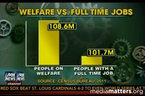
We are currently focusing a lot on information visualizations: extremely useful, modern tools that are intended to present a large amount of data to the reader quickly and in a meaningful way. Data mining is a process that examines large databases in order to find and later present new information. It seeks to close the gap between the hard sciences and humanities—an impressive task, taken on by the authors of Data Mining with Criminal Intent. As visualizations become a more common way of presenting information—tools that are both slick and efficient—we must consider some of their drawbacks. Data visualizations can be presented in countless forms: ranging from interactive maps, to correlation based lined graphs, to artistic “pie charts”. Because of the nature of these visualizations—glossy tools that are meant to present a large amount of data, in order to show a point or persuade—they can easily be presented with mistakes or in a misleading way. Like the examples we saw in class, visualizations can be altered by truncating an axis, omitting data, assigning causation with correlation, and simply not following convention. Not only do we take these visualizations for granted, but we also are less likely to catch mistakes or misinformation because of how they are presented to us—in a quick news clip, or while we are scrolling through a website. Modern society processes information processes information in soundbites and milliseconds, so for the designers of visualizations it is relatively easy to impact opinions and subsequent behavior.
In class we noticed how visualizations make a presenter seem more credible—with the extra props, we are just naturally inclined to believe them! As University of Miami Communications Professor Alberto Cairo notes in his article Lying with Infographics and Visualization, this is interestingly in contrast to the way we process static sources of information: “our eyes are trained to process the visual environment as evidence, and to process the products of language as arguments”. The professor argues, “as long as we do this, there will be those who will continue to tell these visual-lies, convincing us, and often themselves, that evidence will make itself evident and that subjective culture and political biases won’t creep in”. When presenting information through visualizations, there will always be human bias and potential for error—meaning we need to approach them with new, and unnatural scrutiny. Established statistician and author Howard Wainer noted in one of his works: “when we see a chart or diagram, we generally interpret its appearance as a sincere desire to inform. In the face of this sincerity, the misuse of graphical material is a perversion of communication, equivalent to putting up a detour sign that leads to an abyss”.
Although these visualizations are relatively newer ways of presenting information, it is important we recognize how they can be manipulated and consequently approach them with scrutiny. Because even though visualizations are relatively new and are quickly presented and absorbed, they can form lasting opinions and bias. For example, check out this satirical video that presents the Mercator map bias.