beyond education & contextualization: creativity

A museum should aim to educate the public about art, history, culture, etc., engaging with them in creative ways to communicate their significance and relevance to the current generation. It goes without saying then, that a museum’s digital presence should support this mission. The videos, articles and other forms of online content that a museum shares with the public should have a distinct purpose – to educate and contextualize – rather than to market and induce “likes” on social media, although in today’s digital age, an institution’s social capital seems to be a key (and to some degree, false) indicator of its legitimacy.

When it comes to art museums, I expect creativity and continuous effort to push the envelope even more so than I do from history museums, for instance. Art has always been a field that praises self-expression, progress and innovation – a lively spirit that I somehow expect to see transferred on to a museum’s digital space.

That being said, I don’t think I’d want to watch an online class about the influence of Modernism on American art or the techniques of Renaissance artists. I would however, watch a class about the influence of super hero comics on the meaning of social justice or the role of social media in democratizing the medium of photography.

Clearly, creativity is one aspect that I appreciate from a museum’s digital presence. One digital storytelling piece that I truly find creative is the piece about sound and urban architecture by Michael Kimmelman, architecture critic for The New York Times and pianist. In “Dear Architects: Sound Matters,” Kimmelman discusses the importance of sound as an architectural material in shaping people’s experience of buildings, contrasting the distinct “feel” of New York landmarks like the New York Public Library, High Line and Penn Station by the sound they each produce. The digital team at The New York Times makes the story an interactive one, including muted clips of the landmarks that become audible once readers hover their mouse over the clips. They are interspersed throughout the text and allow readers to immediately hear how each place that Kimmelman refers to differs from the rest.

The caption reads: Hover for sound. This article uses three-dimensional audio. The effect is only apparent if you listen with headphones.
The caption reads: “Hover for sound. This article uses three-dimensional audio. The effect is only apparent if you listen with headphones.”

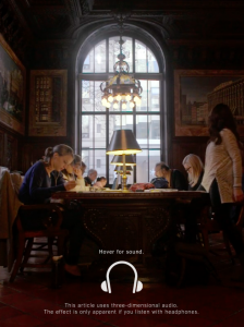
Users can instantly feel how sound distinguishes one experience from another by hovering over the clips. Also, they are very much integrated with the text. Readers can find out for themselves what Kimmelman is saying about each place. And I find it so interesting how a short clip, shot from a fixed angle, can be so powerful in conveying a message. I don’t think a video could have achieved the same effect. Perhaps it’s the interactive aspect of the clip.

Multimedia Journalism + Online Museum Publications = ?

The reading that really got me thinking this week was the Rhizome piece by Orit Gat, “Global Audiences, Zero Visitors: How to measure the success of museums’ online publishing.” Gat argues that museums should not use online publishing solely as a means to expand their audience, although online presence seems like a no-brainer in this digital age.

I agree with Gat. The purpose of a museum is to advance knowledge and encourage discussion about culture, history and heritage. And online publishing, along with any effort by a museum should serve to advance this goal. According to Gat, the success of a museum’s online publishing can be measured in terms of the innate value that it specifically brings to its digital audience (i.e. zoomable images and interactive features that print magazines lack) and the meaningful conversations that it creates.

That being said, I guess the million-dollar question that we’ve all been trying to grapple with in class discussions is, how the heck do we imbue value to digital platforms used by museums – specifically, online publications in this case? One solution is to make the connection between text and multimedia more seamless and meaningful, and I think this is something that museum curators can learn from multimedia journalists. Of course, I am by no means saying that one is better or worse than the other.

For example, The New York Times creates beautiful and immersive visual stories that marry the benefits of multimedia and the written word. One example is Desperate Crossing, a story about the journey of 733 migrants across the Mediterranean Sea, most of whom were trying to escape the poverty of subsaharan Africa or the violent wars in the Middle East. The visual story offers readers an experience, not just facts and ideas. The full-screen photos and videos, which are specific to the bite-sized text displayed, add real-life context and continually project it in the readers’ minds, as opposed to images and videos intermittently embedded between paragraphs which I’ve seen in some online publications by museums. I can see the same multimedia style being applied to digital artworks that use photos and videos or for editorial content that aims to give visitors further context about a certain artist or artwork.

Screen Shot 2016-02-01 at 4.40.36 PM

And we can already see the same immersive multimedia/long-form style being applied to arts-related topics. Take this New York Times piece about architecture for instance: “Dear Architect: Sound Matters.” It incorporates both sound and video! I can see museums incorporating the same idea for digital tours of exhibitions.

It says: Hover for sound.

Also, this piece about the newly opened Whitney Museum of American Art in New York, “A New Whitney.” The 3D animation really enhances readers’ understanding of the space.

Screen Shot 2016-02-01 at 4.59.02 PM

Another benefit to using this multimedia narrative form is that it encourages collaboration across various art fields: photography, film, 3D visualization, animation, etc.

The possibilities are limitless.

Week 4 Blog

Charles Zange argues that museums can play a bigger role in connecting the general public to community-makers and their community-driven digital projects, which are political endeavors, in a sense, of promoting one narrative over competing ones. He also suggests that museums and community-makers collaborate on projects to give their works the wide exposure they need. However, that many of us think that museum exhibition is a zero-sum game of sorts; giving space to one group deprives another of the chance to display their objects. Therefore, it is essential for museums to distinguish themselves as an objective third-party. One way of achieving this is by letting the community members speak for themselves so that they don’t misconstrue their narrative.

One example of such attempt is shown by the South Asian American Digital Archive (SAADA), an online collection of digitized items that testify to the rich South Asian culture in American society. It is crowd-sourced, meaning members of the community contribute to the expanding collection of items. For viewers, such narrative has more value and credibility, given that they’re hearing the story directly from the person who has a personal connection with the item. Of course, it is important to keep in mind that people’s memories fade. Oral stories, especially, have the tendency to get modified as they are told over time. The storytellers themselves may only be left with a vague feeling or impression of what happened in the past, which begs the question, is their story true? Museums can bolster the individual efforts of these communities and bolster their narratives in clarity and credibility by using their vast network and resources to fill in the holes and gaps. In a sense, museums can play a bigger role than simply connect. They can provide viewers with a more immersive and valuable experience by helping these communities build a stronger case for their narrative.

Week 3 Blog Post

Frankly, I think data visualizations, when butchered, sap the charm and wonder out of art works displayed in museums. The act of quantifying certain aspects of an art work – dimensions, color and creditline – is definitely a nod to the scientific method, which yields practical insight, but it is not a priority for viewers, especially in a nuanced, nebulous and creative humanities field like art.

(Note that I’m specifically talking about art museums. All the readings for this week are about the way open data is utilized by art museums like the MoMA and Cooper-Hewitt, so I figured I’d make them the topic of my blog post.)

Visualizations of the nationality of artists represented in museums, trend in color use and top donors of museums (as shown in the post by Helen Wall) may be useful for academics, curators and other professionals who work in the industry, but beg the question of so what, why should we care for viewers. I would imagine that for a viewer who paid either in money or time to see a collection, he or she would be more interested in the collection itself, not the minute, out-of-context details about the collection. Would you read about the dimensions of Michelangelo’s artworks from early- to mid-1500s while standing in front of David?

Also, objectifying and quantifying a masterpiece like William Turner’s “Fishermen at the Sea” adds formality and rigidity to the natural thought process that occurs when one stands in front of an artwork. Data visualizations of art works, more often than not, I think, inhibit resonance and wonder which evoke personal connections, deep thoughts and feelings – stuff that allows viewers to form a more lasting connection to a museum.

Personally, if I were in Paris, I would choose a visit to the Louvre over a flip through data visualizations of art works by da Vinci that are displayed in the Louvre. And that is precisely what I did when I visited France a few summers ago. The line at the Louvre was unforgivingly long that day, and my very very impatient father half-jokingly asked, “What if we come back tomorrow? You know, there are so many e-tours, articles and data visualizations of the collections.” Knowing my dad (who’s a stats and data junkie by the way), I knew that the chances of him suddenly becoming more patient the next day was close to none. So, I said no and we waited hours and hours. And I am so glad that we did because I still remember how thrilled I felt when I saw “July 28: Liberty Leading the People.” It’s art, not data visualizations, that make you feel.

Week 2 Blog Post

According to Stephen Greenblatt’s article, “Resonance and Wonder,” we interpret history, just as we interpret works of art. The social practices that we study aren’t immediately accessible to us. We read about them. And their relevance to the present are not static either; the connection between the circumstances in which the text was written and our own are dynamic, rendering the idea of a “correct” or “valid” interpretation meaningless. Therefore, the key to interpreting historical texts or art is to contextualize the issue of interest, or more specifically, to make cultural connections at a given moment in both its history and our own.

Greenblatt argues that it is this contextualization of objects that leads to resonance, or the ability of an object to evoke cultural connections in the viewer. In order to contextualize displayed objects in museums, Greenblatt suggests that museums be more willing to get in touch with “aesthetic openness,” that is, share with the public details that show the object’s fragility – its wear and tear and state of imperfection that give insight into the circumstances in which the object came about.

Greenblatt’s idea of “aesthetic openness” reminded me of an installation that I saw last winter at the National Museum of Modern and Contemporary Art (MMCA) called “Home within Home within Home within Home within Home” by Do Ho Suh. It’s a life-size, fabric installation of the house where Doh lived when he was studying art in Providence, Rhode Island. By meticulously measuring every inch of the apartment where he was residing and making a precise and detailed cast of it out of fabric, the artist defined a “home” as one’s intimate, clothing(skin)-like space. The installation includes not so perfect hand-stitched door-knobs, crooked etches of Doh’s and his American neighbors’ names on the mail box, cracks in the windows and wear and tear of the Victorian facade – details that seem to reach out and pull the viewer into not only the embedded message or theme of the object but also the artist’s surrounding.