For this assignment, I chose to explore death rates of each state for various causes: heart disease, cancer, stroke, respiratory disease, accidents, vehicle-related accidents, diabetes, Alzheimer’s, flu, nephritis, suicide, homicide, and AIDS. The dataset also provides information on population, age distribution, and urbanization, which may allow viewers to find correlations between these factors and the various causes (e.g. higher deaths caused by respiratory disease in more urban regions). However, the time period on these death rates was not provided so I was unable to tell which year these deaths occurred in.
Since the data was already categorized by state, it would make the most sense to present it on a map. However, as the data contains various data types and measures, it may be difficult to present all the information without overloading too much on a single map. What I have done to divide up the dataset is separate each data type into different maps, which would make it easier for the viewers to comprehend the data. In addition, the maps are color-coded with the darker-colored circles showing higher rates and the lighter-colored circles showing lower rates. The size of the population is proportional to the size of the circle. Thus, the bigger the circles are, the larger the populations are and the smaller the circles are, the smaller the populations are. Hovering over each circle can offer more details about each state.
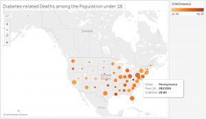
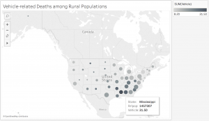
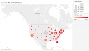
While geocoded maps are great at pointing out which states have the highest death rates for each cause, they make it difficult to establish correlations between the causes and the factors such as age or urbanization. In addition, in order to better determine these relationships, more information would be necessary. For example, data on other factors, such as air pollution or vehicle use, would be very useful in order to figure out if urbanization contributes to higher rates of respiratory diseases and related deaths. Since the dataset covered so many various causes, but lacked detail on the factors that could play a role in these deaths, it was difficult to create an overall visualization that would sum up the dataset. Perhaps a stacked bar graph would have been a good option for data visualization because the comparison of the ratios of deaths to the populations would be more visible.
Great observations in your last paragraph. I often find that while my immediate impulse is to put geolocated data on a map, a map doesn’t always make the most sense. For example, if you wanted your readers/viewers to observe geographical patterns in the distribution of deaths, then a map makes sense. But if you just want them to be able to compare states, then a stacked bar chart is probably easier for them to understand.
I thought your data set was very interesting and informative. I really appreciated how your map not only showed a geographical location but also showed a numerical value through the image. Great Work!
I enjoyed the different approach you took to this dataset. It would make sense as to why you wanted to map the data to a picture of the United States. While it did show the proportion of people according to state, I agree with your point that it was hard to find certain correlations between the causes of death.
I really enjoyed looking at your visualizations. It was interesting to see the comparison between different states laid out in this manner. While a stacked bar graph may have made for more direct comparison, I thought it was an asset to be able to see if states close to each other tend to have similar rates of death (there seems to be some kind of trend for the visualizations you showed.)
I really appreciate the narrative that you crafted in presenting your data with an emphasis on levels of urbanization. I definitely see this approach to prove extremely helpful in a death rate dataset of countries instead of states, too, as the range of urbanization would be differ more widely between countries, I would presume. I like that the distinct maps organize your data more efficiently for viewers. I think that you’re right that a bar graph would add different insight to the visualization, so maybe crafting different visualizations for one dataset would be the most ideal scenario!
I like the narrative that you created with your geocoded maps through this dataset! There’s a lot that you could do with this dataset, and I am intrigued by your geographical approach to the data. I would have liked to know your decision making process with the different data visualization applications more, though I also like your use of different color schemes in your data.