The Data + Design was super interesting to read and provided a lot of really valuable information. I wish I found it earlier because I could have applied a lot of the information on data presentation to my assignments for a cartography class I’m taking. For the assignment I linked above I did not collect the data myself so I can’t relate it to the “Collecting Data” section of the online book but I did find the “Visualizing Data” and “What not to do” sections very relevant. The style of the online book has that classic mac sleek look to it. In my experience, a lot of websites or info-graphics that do this often over simplify or misrepresent data. However, I feel like this book did a good job in presenting its information. Due to all the different “chapters”I feel that the information got represented fully.
The methods of data collecting were really well explained in both text and visual format. The importance of accurately presenting information through a visual medium is being ever more important. Because visuals are often widely used and understood it’s important to make sure that they portray the correct information and this is mostly controlled by the presenter. In cartography there are four “quadrants” in the cartographic process but these can be applied to any representation of data. The two quadrants determined by the presenter are pattern-recognition and encoding. In general pattern-recognition is deciding what data to use and encoding is deciding how to represent that data. The viewer’s two quadrants are decoding and spatial cognition. Decoding is how the viewer understands the information presented and spatial cognition is how that information effects their view of the world. Although the spatial cognition quadrant is mostly restricted to cartography, the rest of the quadrants can be easily applied to any sort of data.
In the “Perception Deception” chapter the most relevant section for me in terms of my cartography assignment was the small paragraph about the contrast between level differences. Luckily the map-making tool I was using, Google API uses a color gradient assigned to the data values so that level difference isn’t an issue. However, if you want you, can define colors for specific data values if you want in the Google API code. Because this type of map (a choropleth map) is purely based on the color of an area, as the value of the color is the ‘symbol’, it’s super important that the colors are chosen wisely.
Month: October 2014
Blog Post Week 4

This week I first read Stephen Ramsay’s “Databases” in A Companion to Digital Humanities. Ramsay states that “databases are an ubiquitous feature of life in the modern age, and yet the most all-encompassing definition of the term ‘database’.” Database systems, and in particular computerized databases, have allowed digital humanists to compile mass amounts of information available for easy retrieval. After Ramsay’s work I then explored Emory University’s “Trans-Atlantic Slave Trade Database”. This eye-opening database has information on more than 35,000 slave voyages that forcibly embarked over 12 million Africans for transport to the Americas between the sixteenth and nineteenth centuries. It is described as “[offering] researchers, students and the general public a chance to rediscover the reality of one of the largest forced movements of peoples in world history. After observing both of these works, my mind began to wander towards another unfortunate period history where people kept extremely detailed records of the movements, ages, deaths, etc. of their victims—the Holocaust.
During World War II, the Nazi’s kept meticulous records about their Holocaust victims. They kept track of every body, every murder, every age, location, and movement of each prisoner in their concentration camps. They treated the horrible acts they committed like a business operation, where everything had to be recorded down to the very last detail. When I went to Poland last spring, I saw first hand just how detailed and comprehensive these records actually are.

These documents were collected after the War, and allowed the public to discover not only the atrocities of what happened, but also enabled them to track the movements of their family members. Recently, my grandmother longed to find out where her extended family ended up after the War (her side of the family immigrated to Brooklyn, NY after World War I after feeling escalating resentment towards the Jews in Poland and Germany). To find out this information, she went to a Holocaust museum and searched through their databases for her family name. She discovered that the family members who did not make it out of Europe during the War perished in one of the concentration camps. Because the databases that organizations compiled from the Nazi’s extensive records, people today can discover what happened to their ancestors.
Works Cited:
Stephen Ramsay, “Databases,” in Companion to Digital Humanities, edited by Susan Schreibman, Ray Siemens, and John Unsworth (Oxford: Blackwell Publishing Professional, 2004)
Emory University, Trans-Atlantic Slave Trade Database
Week 4 Blog Post
Although it’s not a database of historical or research information, throughout this week’s readings I couldn’t help thinking about the website of the company I work for currently. I work for Pinnacle Exhibits, a brand management company that specializes in 3D exhibits and installations. We create temporary environments to change minds, motivate behavior and leave a lasting impression. We are a diverse band of branders, builders, designers, makers, communicators, advertisers and engineers united by a hunger to wow people in 3D. Through my position and time with the company I have learned the great importance of each of these roles—it takes all the talents I listed above to complete each project we take on. I really valued the comment in Meirelles, Design for Information: “It is my hope that this book help broaden the dialogue and reduce the gap between two communities—designers and scientists—and foster problem-solving skills in designing information.” I, and my colleagues at Pinnacle, consider bridging this gap our mission. We employ our diverse talents and specializations to create 3D experiences, and strive to connect consumers with brands.
As Pinnacle continues to grow and evolve as a brand management company, so does our own brand. Our rebranding process has been heavily involved in many aspects of the company, but we especially want to produce an impressionable website. The site is a work in progress, but has already greatly evolved since I joined the company. In the past, the site only incorporated “beauty” shots of our work. At first glance the site was very appealing, but it was not interactive or welcoming. We work to connect brands with consumers, and yet online exhibits of our work did not showcase those consumers interacting in the space! So, our solution to this problem was to incorporate more welcoming, human elements in our online exhibits. The section in Data + Design considered the differences between print and web-based media, as well as static versus interactive exhibits. As a company, we are moving towards all digital and interactive presentations for our clients, so it was interesting to read more on this comparison. Moving forward, it our goal to progress with the digital world. Photos are quickly being replaced by gifs, and short videos. Now homepages and backgrounds of websites use video clips instead of still images—and we want to follow that trend. You can check out our first attempt at chronicling our work through video here. Eventually our goal is to create a portfolio of still images and rich videos on our website that fully represent the Pinnacle brand and work.
I relate this experience to the final project we are creating for this class. Instead of creating exhibits of our work, like we do for Pinnacle, we will be creating exhibits of research information—but the principal is the same. We will have to make important decisions about the message we want to convey, and the elements we need to incorporate in our site in order to convey that message successfully.
Week 4: No Databases for Sex Trafficked Victims
SlaveVoyages.org is a website that “is the culmination of several decades of independent and collaborative research by scholars drawing upon data in libraries and archives around the Atlantic world.” The website took two years of research and information to collect. The fact that the creators of this site were able to have access to primary sources which documented the people that were illegally captured is mind-blowing to me. The sources were coming from hard copy volumes of voyages from different ports. What went through my mind was that how fortunate we are (recognizing that this was a very dark and dishonorable spot in history) that we have historical evidence in documentation form. This made me think of how many names we do not have because of the sex trades that occur today.
For example, Yahoo posted an article about the tourist wonder that is Dubai is having women from Pakistan sold to nightclubs and brothels. Hundreds of women are taken hostage and threatened to become sex workers. In the case of the Yahoo article, the women are coerced by being lied to obtaining beauty parlor work. Unfortunately no progress is made in stopping this horrid trafficking problem in Pakistan because the gangs in charge have influential power and connections to politicians and the police. This is just one country’s problem with trafficking to Dubai. Millions of people are trafficked every year, according to the UN, and 800,000 are trafficked internationally. Those names are not documented. Those names are lost. How do we determine that we want something documented, such as slavery? Would it be that we do not want to document names of people, not just because it is illegal and inhumane, but is seen as a cause of shame? How do we determine ethically what should be database-d and what shouldn’t? The TransAtlantic Slave Trade Database is history to us that we should never forget. Then why should we forget those who are still sold today?
Sources:
Soroptomist faqs: Sex Slavery & Trafficking facts
Database: The Trans-Atlantic Slave Trade Database
Yahoo Article: Agony of Pakistani Women Enslaved by Dubai Sex Trade
Database: Set of Relationships
It stated in the reading for this week that a database can be thought as a set of relations. This automatically made me think of how a database could be applied to a set of relationships, which made me think of my large Italian family and how we could be broken up for storage in a database; although, in a way, we already have been. One of my grandmother’s sisters created a book in the past decade or so that documents the up-to-date history of the Gagliardini family, beginning from the days of poverty in Cupramontana, covering the years of migration, from Italy to Ellis Island to Madera, California, and eventually, even mentioning all the great-great-grandchildren, like myself. The original reason for the creation of this “database,” much like others, is for the storage and retrieval of information about my family. Essentially, it has helped family members keep track of each other as well as appreciate the difficult journey our family went through for us to be here right now; in addition, it also has acted as a treasure chest for all the stories told throughout the years, and many photographs as well. For practical reasons, all the “data” has been designed and split up into categories and specific order; family history comes first, starting chronologically, but also focusing on certain aspects, such as food. There is another section that purely focuses on family records. There are documents for each family, starting with my great-great-grandparents’ family, then a page for each of their children’s family, then so on, and so forth. These documents have actually helped me very much to put a name to certain faces that I might have seen at a family reunion, although could not keep track of. There is also detailed information, like date of birth, which helps the family keep track of birthdays easily. Although this book is not digitized like most databases, it still acts as a database in the way it stores information; and although there is no form of searching like in digitized databases, the table of contents aids in the search, but the way it is split up also allows easy retrieval of information.

“Gargliardini Family Reunion ’14”
Untitled
This week’s readings immediately made me think of Spotify’s music library. Though it is not an index of multiple different types of data, it does hold immense amounts of information. As a Spotify user, I am able to enter into different genres, artists, and playlists easily and efficiently in everyday life. If I remember a song from my childhood, or need to remember the lyrics of a song, I can instantly access that information. Spotify acts as an example of a database that I utilize every single day, however the importance of these electronic databases extends past convenient music on demand.
As a World Arts and Cultures major, databases have become a saving grace for me during finals weeks. Through museums such as the Fowler and Hammer, I am able to access art pieces based on the specific requirements I need. To elaborate upon the concept of databases being used to “help people keep track of things”, these museums’ databases give individuals an understanding of not only the specific dimensions of an artwork, but also an understanding of the culture it comes from and the ideas behind the piece.
In a world that is constantly evolving and reinventing itself, databases ensure that we will not loose the very aspects of society that have come to define us. Historical documents, controversial articles and photographs of protest help our present society to progress, while still considering the steps that were taken in the past to get to the present. .
Just as Spotify helps me to discover new and old music, art databases help me to discover new cultures and new ways of thinking. I am able to learn about the artist, witness the final project, and gain insight into more information about the piece. Both aspects of culture help to support a constantly growing and changing society because they give society an opportunity to preserve the past, without being altered, as changes continue to develop. Essentially, databases can be snapshots of history, each documenting a different aspect of the human experience.
Week 4: Disparate Arrivals, Ellis Island and Slave Journeys
In Companion to Digital Humanities, Stephen Ramsay asserts that: “The design of [databases] has been a mainstay of humanistic endeavor for centuries; the seeds of the modern computerized database being fully evident in the many text-based taxonomies and indexing systems which have been developed since the Middle Ages.” This analysis, coupled with Emory University’s Trans-Atlantic Slave Trade Database got me thinking about the origins of my own family in California, and ultimately the United States.
Back in 2001, I took a trip to New York with my mom and dad on vacation. Unsurprisingly, we visited Ellis Island in hopes of discovering our long-lost relatives names on one of the ship’s manifests. If my memory serves correctly, I was able to find several passengers on my father’s side that emigrated from Ireland during the fin de siècle era.
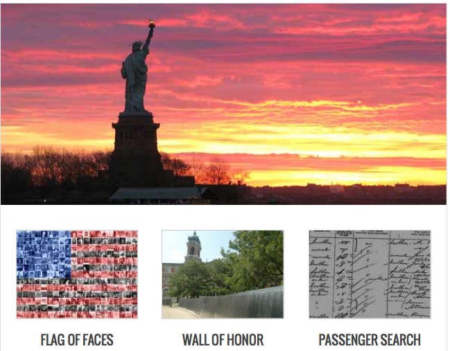
After exploring the Emory database this weekend, I got curious not so much about the content of registry at Ellis Island, but how this data is displayed online today in comparison with that of the Trans-Atlantic Slave Trade Database. I registered myself as a user at http://www.libertyellisfoundation.org/. Obviously both databases seek to tell the story of demographic historical shifts, however the presentation of information on both reflects the starkly different story told by the journeys reflected in the data. The Ellis Island database projects color, imagery and an aura of excitement through its user interface, while the Emory database limits photos and presents African passengers in a much less human light than the stories highlighted in the former.
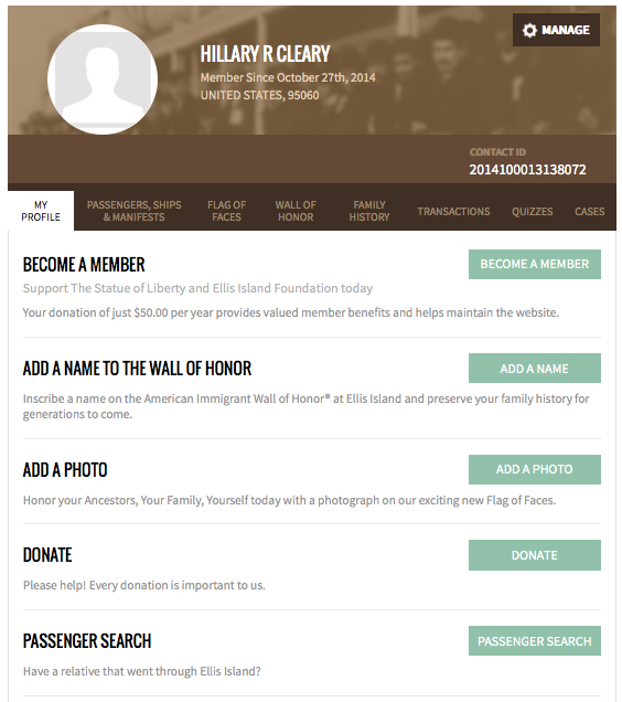
After I signed up, the Ellis Island database asked me to “Become a Member” by contributing just $50.00 per year, and adding a photo in order to “Honor [my] Ancestors, [my] Family and [myself].” The rhetoric of honoring my family and the very personal connection the database attempts to make with its audience contrasts starkly with that of the Emory database.
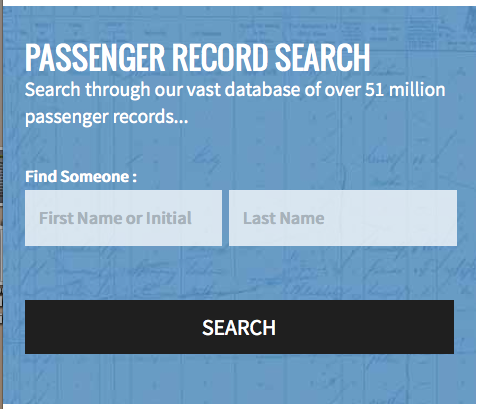
The very function of searching someone by name, a crucial component of many immigrant’s stories and identities who entered the U.S. through Ellis Island during the early 20th century is not even an option within the Trans-Atlantic Slave Trade Database. In the basic Ellis Island search there isn’t even another input field other than first name, initial or last name! I find it fascinating how today we can access and view information through digital databases that still overtly reflect the historical period or population on which they are based.
Databases at the Mall
When I went shopping this weekend with my sister, I didn’t expect to run into a situation that related to my digital humanities studies. After trying on a dress that was too small, I asked the woman in the store if they had the next size up that I could try. Instead of searching through hundreds of racks to find one particular item of clothing, all she had to do was walk over to the computer, scan the barcode on the dress, and up popped a screen that looked much like image here:

The woman located the item on a database and from there, was able to tell me that the store was currently out of stock in that particular size, but it was available to purchase at a few other specific malls close by. When I asked her how much longer the dress was in the larger size, she was able to expand on the item’s details and tell me that exact information.
This store, like many department stores, uses a database to track all the items in its inventory. The rows list individual articles of clothing differentiated by an item number, while the columns contain data about the elements of an article of clothing, such as its manufacturer, its department category, its product sub-category, its size, and its availability. Using a fixed vocabulary for this data, it is easy to keep track of the same types of products without them being separated from each other. I believe this serves as an example of the Relational Model database design, where the different data points can relate to each other in interaction, and entire data sets would not be deleted if other items were. The independence of one item from another is established by the primary key, “a unique value associated with each individual record in a table” according to Ramsay. In the store’s database, the Item # serves as the primary key. When the bar code is scanned on a particular item of clothing, the system reads the code and connects it to the product listed in the database by connecting to its primary key.
After seeing the use of databases in the clothing store, I noticed other instances used throughout my day. Ordering at a fast food restaurant, scanning my Bruin Card to use the dining hall, my iTunes library, and internship search engines are just a few of the many databases I encounter on a day to day basis.
http://www.csharpkey.com/visualcsharp/adonet/forms/deptstore2j.gif
Disaster Prevention Through Database Utilization
The first sentence of David Kroenke’s piece, Database Concepts, provides the reader with a simple yet appropriate definition of what databases do: “help people keep track of things”. Database management systems lie at the core of all databases and are responsible for keeping the database wheels turning. These self-describing “collections of related records” are responsible for holding endless amounts of tables made up of like data that can be used later for analysis or simple reference. The number of instances in which databases can be useful or helpful is endless, and in today’s digital era they are becoming more crucial than ever.
This article I came across (link) illustrated the increasing importance of databases tied to the exponential advances in technology. The recent outbreak of Ebola throughout West Africa has kept the world on its toes, no one sure of where the next positive diagnosis might occur. Health specialists are in the process of developing effective methods to help track the geographical movement of the viruses associated with Ebola in order prepare the areas that are in potential danger. The article stresses the key role that data and metadata collection/interpretation can play in the attempt to thwart the spread of the deadly disease. It specifically references Harvard’s HealthMap service, which gathers and analyzes millions of social media posts in order to track where potential “global disease outbreaks” are occurring in real time. This service uses a massive database to store information collected from around the world and processes all of it to geographically locate where certain key words associated with various diseases are appearing. Relief organizations are aiming to use technology similar to this to be able to anticipate where diseases such as Ebola are heading, in order to be more prepared for immediate aid and support.
The collection of mass amounts of cell phone data, including both phone calls and text messages sent, has been one specific method of disease-related data collection that has provided promising results. Using the databases of cell providers, relief organizations have been able to see the patterns connected to disease outbreaks. Data collation and analysis by the cellular database management systems allows experts to see where high concentrations of emergency calls are being made, helping to pinpoint problem towns and regions. The article highlights how vital the development of large-scale data collection is in the near future, in order to collect and sort through data in a timelier manner. If we are able to utilize databases and the helpful data and metadata they store to their full potential, we will be able to more efficiently track world disasters as well as ensure that all those involved in helping the cause are up to date with what is occurring at all times.
Sources:
- Ebola Crisis and Big Data – http://recode.net/2014/10/24/the-ebola-crisis-and-where-big-data-can-help/
- David M Kroenke and David J Auer, Database Concepts (Upper Saddle
River, N.J.: Pearson Prentice Hall, 2008), chapter one (link).
Infographics and Data Visualization
Many of us are familiar with the easy knowledge acquisition opportunity presented to us through infographics. I know that when I encounter a hefty article online I look to see if there are any visual aids to break up the monotony of reading through all that information or better yet, if there is an image that digests and summarizes the main point of the article.
Reading through the Data + Design online book, I began realizing just how much work goes into constructing an appealing infographic. In addition to actually making the graphic there is so much thought that goes into how to effectively collect data to display. The book dedicates pages, and even chapters, to describing some of the best modes of data collection for research; researchers have to be careful in the language they choose for questions and the format in which they present the questions and possible answers. Once the information has been collected, there is a long process of data cleaning and prepping (who knew data needed so much attention before going out into the big world!). This cleaning involves sorting through things that are relevant to the research question/goal and figuring out a way to organize it nicely so that it can become the best visualization it can be.
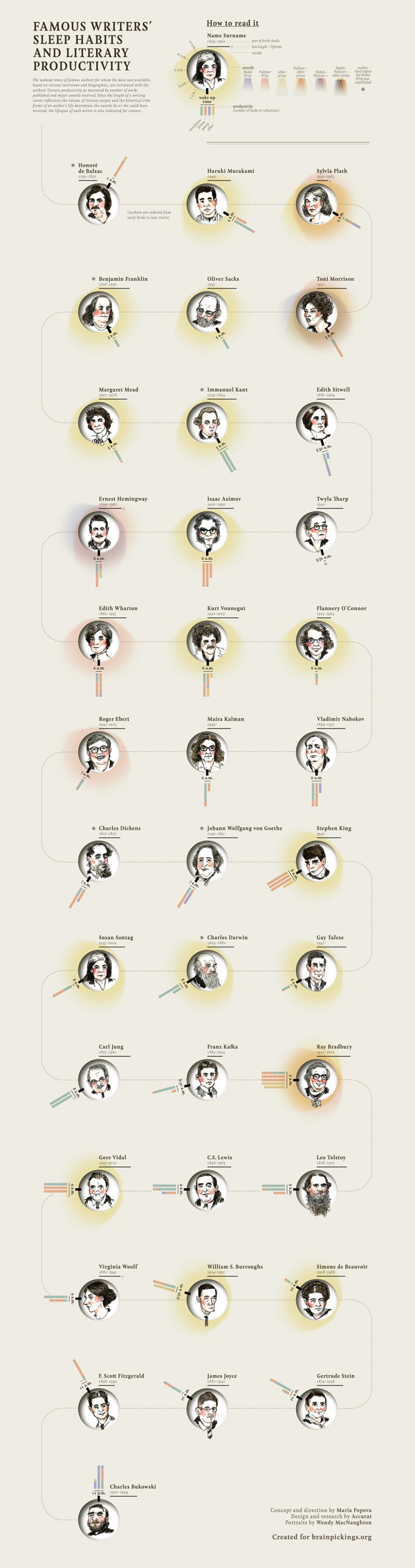
Browsing through this lengthy process gave me so much more respect for the work that anonymous internet people do in making up these easy to use and disseminate informative images. One of my favorite sites that has some really great infographics/visualized data is Brain Pickings. (The creator, Maria Popova, actually got a mention in the Data + Design foreword!) What I love about this site is that Popova does so much research on some very interesting topics, usually on literary or art related topics. In many of her articles she includes images from the books she is discussing, or hand-drawn visualizations of quotes from famous literary folk.

Reading a quote from someone is one thing, but having a way to interact with the author’s ideas in a new way gives it a level of engagement that continues to fascinate and bring me back to their words.

I recently came across an article on the Brain Pickings site about Infographics and some key principles to keep the visualization interesting and trustworthy. This article features designs that compile information on jazz musicians from the 1920s, junk emails, and the London Tube. This goes to show that data visualization does not always have to come in graph form or present information on groundbreaking sociopolitical topics. As with any presentation of data though, there is the possibility that data is incorrect or skewed in some way, so there is always that thought to keep in mind. With that said, however, here are two of my favorite images from this article that organize two very different types of information – statistics about the world’s makeup and sleep habits of famous writers.

